
Busy day at Google today: the company rolled out version 2.0 of its Gemini AI assistant (previously announced in December) with a variety of new and updated models to more users. From the Google blog:
\n\n\n\n Today, we’re making the updated Gemini 2.0 Flash generally available via the Gemini API in Google AI Studio and Vertex AI. Developers can now build production applications with 2.0 Flash.
\nWe’re also releasing an experimental version of Gemini 2.0 Pro, our best model yet for coding performance and complex prompts. It is available in Google AI Studio and Vertex AI, and in the Gemini app for Gemini Advanced users.
\nWe’re releasing a new model, Gemini 2.0 Flash-Lite, our most cost-efficient model yet, in public preview in Google AI Studio and Vertex AI.
\nFinally, 2.0 Flash Thinking Experimental will be available to Gemini app users in the model dropdown on desktop and mobile.\n
Google’s reasoning model (which, similarly to DeepSeek-R1 or OpenAI’s o1/o3 family, can display its “chain of thought” and perform multi-step thinking about a user query) is currently ranked #1 in the popular Chatbot Arena LLM leaderboard. A separate blog post from Google also details the new pricing structure for third-party developers that want to integrate with the Gemini 2.0 API and confirms some of the features coming soon to both Gemini 2.0 Flash and 2.0 Pro, such as image and audio output. Notably, there is also a 2.0 Flash-Lite model that is even cheaper for developers, which I bet we’re going to see soon in utilities like Obsidian Web Clipper, composer fields of social media clients, and more.
\nAs part of my ongoing evaluation of assistive AI tools, since Gemini’s initial rollout in December, I’ve been using it in place of ChatGPT, progressively replacing the latter. Today, after the general release of 2.0 Flash, I went ahead and finally swapped ChatGPT for Gemini in my iPhone’s dock.
\nThis will probably need to be an in-depth article at some point, but my take so far is that although ChatGPT gets more media buzz and is the more mainstream product1, I think Google is doing more fascinating work with a) their proprietary AI silicon and b) turning LLMs into actual products for personal and professional use that are integrated with their ecosystem. Gemini (rightfully) got a bad rap with its initial release last year, and while it still hallucinates responses (but all LLMs still do), its 2.0 models are more than good enough for the sort of search queries I was asking ChatGPT before. Plus, we pay for Google Workspace at MacStories, and I like that Gemini is directly integrated with the services we use on a daily basis, such as Drive and Gmail.
\nMost of all, I’m very intrigued by Gemini’s support for extensions, which turn conversations with a chatbot into actions that can be performed with other Google apps. For instance, I’ve been enjoying the ability to save research sessions to Google Keep by simply invoking the app and asking Gemini what I wanted to save. I’ve searched YouTube videos with it, looked up places in Google Maps, and – since I’ve been running a platform-agnostic home automation setup in my apartment that natively supports HomeKit, Alexa, and Google Home all at once – even controlled my lights with it. While custom GPTs in ChatGPT seem sort of abandonware now, Gemini’s app integrations are fully functional, integrated across the Google ecosystem, and expanding to third-party services as well.2
\nEven more impressively, today Google rolled out a preview of a reasoning version of Gemini 2.0 that can integrate with YouTube, Maps, and Search. The idea here is that Gemini can think longer about your request, display its thought process, then do something with apps. So I asked:
\n\n\n I want you to find the best YouTube videos with Oasis acoustic performances where Liam is the singer. Only consider performances dated 1994-1996 that took place in Europe. I am not interested in demos, lyrics videos, or other non-live performances. They have to be acoustic sets with Noel playing the guitar and Liam singing.\n
Surely enough, I was presented with some solid results. If Google can figure out how to integrate reasoning capabilities with advanced Gmail searches, that’s going to give services like Shortwave and Superhuman a run for their money. And that’s not to mention all the other apps in Google’s suite that could theoretically receive a similar treatment.
\n
Bonehead playing the piano? Yes please.
However, the Gemini app falls short of ChatGPT and Claude in terms of iOS/iPadOS user experience in several key areas.
\nThe app doesn’t support widgets (which Claude has), doesn’t offer any Shortcuts actions (both Claude and ChatGPT have them), doesn’t have a native iPad app (sigh), and I can’t figure out if there’s a deep link to quickly start a new chat on iOS. The photo picker is also bad in that it only lets you attach one image at a time, and the web app doesn’t support native PWA installation on iPhone and iPad.
\nClearly, there’s a long road ahead for Google to make Gemini a great experience on Apple platforms. And yet, none of these missing features have been dealbreakers for me when Gemini is so fast and I can connect my conversations to the other Google services I already use. This is precisely why I remain convinced that a “Siri LLM” (“Siri Chat” as a product name, perhaps?) with support for conversations integrated and/or deep-linked to native iOS apps may be Apple’s greatest asset…in 2026.
\nUltimately, I believe that, even though ChatGPT has captured the world’s attention, it is Gemini that will be the ecosystem to beat for Apple. It always comes down to iPhone versus Android after all. Only this time, Apple is the one playing catch-up.
\nFounded in 2015, Club MacStories has delivered exclusive content every week for nearly a decade.
\nWhat started with weekly and monthly email newsletters has blossomed into a family of memberships designed every MacStories fan.
\nClub MacStories: Weekly and monthly newsletters via email and the web that are brimming with apps, tips, automation workflows, longform writing, early access to the MacStories Unwind podcast, periodic giveaways, and more;
\nClub MacStories+: Everything that Club MacStories offers, plus an active Discord community, advanced search and custom RSS features for exploring the Club’s entire back catalog, bonus columns, and dozens of app discounts;
\nClub Premier: All of the above and AppStories+, an extended version of our flagship podcast that’s delivered early, ad-free, and in high-bitrate audio.
\nLearn more here and from our Club FAQs.
\nJoin Now", "content_text": "Busy day at Google today: the company rolled out version 2.0 of its Gemini AI assistant (previously announced in December) with a variety of new and updated models to more users. From the Google blog:\n\n Today, we’re making the updated Gemini 2.0 Flash generally available via the Gemini API in Google AI Studio and Vertex AI. Developers can now build production applications with 2.0 Flash.\n We’re also releasing an experimental version of Gemini 2.0 Pro, our best model yet for coding performance and complex prompts. It is available in Google AI Studio and Vertex AI, and in the Gemini app for Gemini Advanced users.\n We’re releasing a new model, Gemini 2.0 Flash-Lite, our most cost-efficient model yet, in public preview in Google AI Studio and Vertex AI.\n Finally, 2.0 Flash Thinking Experimental will be available to Gemini app users in the model dropdown on desktop and mobile.\n\n\nGoogle’s reasoning model (which, similarly to DeepSeek-R1 or OpenAI’s o1/o3 family, can display its “chain of thought” and perform multi-step thinking about a user query) is currently ranked #1 in the popular Chatbot Arena LLM leaderboard. A separate blog post from Google also details the new pricing structure for third-party developers that want to integrate with the Gemini 2.0 API and confirms some of the features coming soon to both Gemini 2.0 Flash and 2.0 Pro, such as image and audio output. Notably, there is also a 2.0 Flash-Lite model that is even cheaper for developers, which I bet we’re going to see soon in utilities like Obsidian Web Clipper, composer fields of social media clients, and more.\nAs part of my ongoing evaluation of assistive AI tools, since Gemini’s initial rollout in December, I’ve been using it in place of ChatGPT, progressively replacing the latter. Today, after the general release of 2.0 Flash, I went ahead and finally swapped ChatGPT for Gemini in my iPhone’s dock.\nThis will probably need to be an in-depth article at some point, but my take so far is that although ChatGPT gets more media buzz and is the more mainstream product1, I think Google is doing more fascinating work with a) their proprietary AI silicon and b) turning LLMs into actual products for personal and professional use that are integrated with their ecosystem. Gemini (rightfully) got a bad rap with its initial release last year, and while it still hallucinates responses (but all LLMs still do), its 2.0 models are more than good enough for the sort of search queries I was asking ChatGPT before. Plus, we pay for Google Workspace at MacStories, and I like that Gemini is directly integrated with the services we use on a daily basis, such as Drive and Gmail.\nMost of all, I’m very intrigued by Gemini’s support for extensions, which turn conversations with a chatbot into actions that can be performed with other Google apps. For instance, I’ve been enjoying the ability to save research sessions to Google Keep by simply invoking the app and asking Gemini what I wanted to save. I’ve searched YouTube videos with it, looked up places in Google Maps, and – since I’ve been running a platform-agnostic home automation setup in my apartment that natively supports HomeKit, Alexa, and Google Home all at once – even controlled my lights with it. While custom GPTs in ChatGPT seem sort of abandonware now, Gemini’s app integrations are fully functional, integrated across the Google ecosystem, and expanding to third-party services as well.2\nEven more impressively, today Google rolled out a preview of a reasoning version of Gemini 2.0 that can integrate with YouTube, Maps, and Search. The idea here is that Gemini can think longer about your request, display its thought process, then do something with apps. So I asked:\n\n I want you to find the best YouTube videos with Oasis acoustic performances where Liam is the singer. Only consider performances dated 1994-1996 that took place in Europe. I am not interested in demos, lyrics videos, or other non-live performances. They have to be acoustic sets with Noel playing the guitar and Liam singing.\n\nSurely enough, I was presented with some solid results. If Google can figure out how to integrate reasoning capabilities with advanced Gmail searches, that’s going to give services like Shortwave and Superhuman a run for their money. And that’s not to mention all the other apps in Google’s suite that could theoretically receive a similar treatment.\nBonehead playing the piano? Yes please.\nHowever, the Gemini app falls short of ChatGPT and Claude in terms of iOS/iPadOS user experience in several key areas.\nThe app doesn’t support widgets (which Claude has), doesn’t offer any Shortcuts actions (both Claude and ChatGPT have them), doesn’t have a native iPad app (sigh), and I can’t figure out if there’s a deep link to quickly start a new chat on iOS. The photo picker is also bad in that it only lets you attach one image at a time, and the web app doesn’t support native PWA installation on iPhone and iPad.\nClearly, there’s a long road ahead for Google to make Gemini a great experience on Apple platforms. And yet, none of these missing features have been dealbreakers for me when Gemini is so fast and I can connect my conversations to the other Google services I already use. This is precisely why I remain convinced that a “Siri LLM” (“Siri Chat” as a product name, perhaps?) with support for conversations integrated and/or deep-linked to native iOS apps may be Apple’s greatest asset…in 2026.\nUltimately, I believe that, even though ChatGPT has captured the world’s attention, it is Gemini that will be the ecosystem to beat for Apple. It always comes down to iPhone versus Android after all. Only this time, Apple is the one playing catch-up.\n\n\nPlus, o1-pro’s coding performance for large codebases is unrivaled. But it also costs $200/month – way more than any regular user interested in assistive AI tools for their personal workflow should pay. ↩︎\n\n\nI’d love to see a Todoist extension for Gemini at some point. ↩︎\n\n\nAccess Extra Content and PerksFounded in 2015, Club MacStories has delivered exclusive content every week for nearly a decade.\nWhat started with weekly and monthly email newsletters has blossomed into a family of memberships designed every MacStories fan.\nClub MacStories: Weekly and monthly newsletters via email and the web that are brimming with apps, tips, automation workflows, longform writing, early access to the MacStories Unwind podcast, periodic giveaways, and more;\nClub MacStories+: Everything that Club MacStories offers, plus an active Discord community, advanced search and custom RSS features for exploring the Club’s entire back catalog, bonus columns, and dozens of app discounts;\nClub Premier: All of the above and AppStories+, an extended version of our flagship podcast that’s delivered early, ad-free, and in high-bitrate audio.\nLearn more here and from our Club FAQs.\nJoin Now", "date_published": "2025-02-05T20:34:36-05:00", "date_modified": "2025-02-07T11:49:19-05:00", "authors": [ { "name": "Federico Viticci", "url": "https://www.macstories.net/author/viticci/", "avatar": "https://secure.gravatar.com/avatar/94a9aa7c70dbeb9440c6759bd2cebc2a?s=512&d=mm&r=g" } ], "tags": [ "AI", "gemini", "google", "stories" ] }, { "id": "https://www.macstories.net/?p=77770", "url": "https://www.macstories.net/stories/the-many-purposes-of-timeline-apps-for-the-open-web/", "title": "The Many Purposes of Timeline Apps for the Open Web", "content_html": "
Tapestry (left) and Reeder.
Writing at The Verge following the release of The Iconfactory’s new app Tapestry, David Pierce perfectly encapsulates how I feel about the idea of “timeline apps” (a name that I’m totally going to steal, thanks David):
\n\n\n What I like even more, though, is the idea behind Tapestry. There’s actually a whole genre of apps like this one, which I’ve taken to calling “timeline apps.” So far, in addition to Tapestry, there’s Reeder, Unread, Feeeed, Surf, and a few others. They all have slightly different interface and feature ideas, but they all have the same basic premise: that pretty much everything on the internet is just feeds. And that you might want a better place to read them.
\n […]
\n These apps can also take some getting used to. If you’re coming from an RSS reader, where everything has the same format — headline, image, intro, link — a timeline app will look hopelessly chaotic. If you’re coming from social, where everything moves impossibly fast and there’s more to see every time you pull to refresh, the timeline you curate is guaranteed to feel boring by comparison.\n
I have a somewhat peculiar stance on this new breed of timeline apps, and since I’ve never written about them on MacStories before, allow me to clarify and share some recent developments in my workflow while I’m at it.
\n\nI think both Tapestry and the new Reeder are exquisitely designed apps, for different reasons. I know that Tapestry’s colorful and opinionated design doesn’t work for everyone; personally, I dig the different colors for each connected service, am a big fan the ‘Mini’ layout, and appreciate the multiple font options available. Most of all, however, I love that Tapestry can be extended with custom connectors built with standard web technologies – JavaScript and JSON – so that anyone who produces anything on the web can be connected to Tapestry. (The fact that MacStories’ own JSON feed is a default recommended source in Tapestry is just icing on the cake.) And did you know that The Iconfactory also created a developer tool to make your own Tapestry connectors?
\nI like the new Reeder for different reasons. The app’s animations are classic Silvio Rizzi work – fluid and smooth like nothing else on iOS and iPadOS. In my experience, the app has maintained impeccable timeline sync, and just this week, it was updated with powerful new filtering capabilities, enabling the creation of saved searches for any source within the app. (More on this below.)
\nMy problem with timeline apps is that I struggle to understand their pitch as alternatives to browsing Mastodon and Bluesky (supported by both Tapestry and Reeder) when they don’t support key functionalities of those services such as posting, replying, reposting, or marking items as favorites.
\nMaybe it’s just me, but when I’m using a social media app, I want to have access to its full feature set and be able to respond to people or interact with posts. I want to browse my custom Bluesky feeds or post a Mastodon poll if I want to. Instead, both Tapestry and Reeder act as glorified readers for those social timelines. And I understand that perhaps that’s exactly what some people want! But until these apps can tap into Mastodon and Bluesky (and/or their decentralized protocols) to support interactions in addition to reading, I’d rather just use the main social media apps (or clients like Ivory).1 To an extent, the same applies for Reddit: if neither of these apps allow me to browse an entire subreddit or sort its posts by different criteria, what’s the point?
\nBut: the beauty of the open web and the approach embraced by Tapestry and Reeder is that there are plenty of potential use cases to satisfy everyone. Crucially, this includes people who are not like me. There is no one-size-fits-all approach here because the web isn’t built like that.
\nSo, while I still haven’t decided which of these two apps I’m going to use yet, I’ve found my own way to take advantage of timeline apps: I like to use them as specialized feeds for timelines that I don’t want to (or can’t) have in my RSS reader or add as lists to Mastodon/Bluesky.
\nFor instance, I created a custom MacStories timeline in Tapestry with feeds for all kinds of places on the web where MacStories publishes content or social media posts. I love how Tapestry brings everything together in a unified, colorful timeline that I can use alongside my RSS and social apps to see all sorts of posts by our company.
\n
The colors!
Reeder’s latest addition is also something I’m considering at the moment. The app can now create saved filters, which are based on multiple filtering conditions. These rules can be stacked to create custom views that aggregate specific subsets of posts from sources that, typically, would be their own silos. Want to create an “AI” feed that cuts through RSS, Bluesky, YouTube, and Reddit to find you the latest AI news or products by keyword? How about a filter to show only YouTube videos that mention Nintendo? All of this (and more) is possible with Reeder’s latest update, with an interface that…I’ll just let the screenshots speak for themselves.
\n
Silvio Rizzi’s design taste never disappoints.
Which leads me back to my main point. I feel like thinking about this new generation of apps as social media clients would be wrong and shortsighted; it reduces the scope of what they’re trying to accomplish down to a mere copy of a social media timeline. Instead, I think Tapestry and Reeder are coming at this from two different angles (Tapestry with better developer tools; Reeder with superior user filters), but with the same larger ambition nonetheless: to embrace the open nature of the Web and move past closed platforms that feel increasingly archaic today.
\nThe fact that I can make a timeline out of anything doesn’t mean that Tapestry or Reeder have to be my everything-timelines. It means that the modern web lets me choose what I want to see in these apps. I can’t help but feel that there’s something special about that we must protect.
\nFounded in 2015, Club MacStories has delivered exclusive content every week for nearly a decade.
\nWhat started with weekly and monthly email newsletters has blossomed into a family of memberships designed every MacStories fan.
\nClub MacStories: Weekly and monthly newsletters via email and the web that are brimming with apps, tips, automation workflows, longform writing, early access to the MacStories Unwind podcast, periodic giveaways, and more;
\nClub MacStories+: Everything that Club MacStories offers, plus an active Discord community, advanced search and custom RSS features for exploring the Club’s entire back catalog, bonus columns, and dozens of app discounts;
\nClub Premier: All of the above and AppStories+, an extended version of our flagship podcast that’s delivered early, ad-free, and in high-bitrate audio.
\nLearn more here and from our Club FAQs.
\nJoin Now", "content_text": "Tapestry (left) and Reeder.\nWriting at The Verge following the release of The Iconfactory’s new app Tapestry, David Pierce perfectly encapsulates how I feel about the idea of “timeline apps” (a name that I’m totally going to steal, thanks David):\n\n What I like even more, though, is the idea behind Tapestry. There’s actually a whole genre of apps like this one, which I’ve taken to calling “timeline apps.” So far, in addition to Tapestry, there’s Reeder, Unread, Feeeed, Surf, and a few others. They all have slightly different interface and feature ideas, but they all have the same basic premise: that pretty much everything on the internet is just feeds. And that you might want a better place to read them.\n […]\n These apps can also take some getting used to. If you’re coming from an RSS reader, where everything has the same format — headline, image, intro, link — a timeline app will look hopelessly chaotic. If you’re coming from social, where everything moves impossibly fast and there’s more to see every time you pull to refresh, the timeline you curate is guaranteed to feel boring by comparison.\n\nI have a somewhat peculiar stance on this new breed of timeline apps, and since I’ve never written about them on MacStories before, allow me to clarify and share some recent developments in my workflow while I’m at it.\n\nI think both Tapestry and the new Reeder are exquisitely designed apps, for different reasons. I know that Tapestry’s colorful and opinionated design doesn’t work for everyone; personally, I dig the different colors for each connected service, am a big fan the ‘Mini’ layout, and appreciate the multiple font options available. Most of all, however, I love that Tapestry can be extended with custom connectors built with standard web technologies – JavaScript and JSON – so that anyone who produces anything on the web can be connected to Tapestry. (The fact that MacStories’ own JSON feed is a default recommended source in Tapestry is just icing on the cake.) And did you know that The Iconfactory also created a developer tool to make your own Tapestry connectors?\nI like the new Reeder for different reasons. The app’s animations are classic Silvio Rizzi work – fluid and smooth like nothing else on iOS and iPadOS. In my experience, the app has maintained impeccable timeline sync, and just this week, it was updated with powerful new filtering capabilities, enabling the creation of saved searches for any source within the app. (More on this below.)\nMy problem with timeline apps is that I struggle to understand their pitch as alternatives to browsing Mastodon and Bluesky (supported by both Tapestry and Reeder) when they don’t support key functionalities of those services such as posting, replying, reposting, or marking items as favorites.\nMaybe it’s just me, but when I’m using a social media app, I want to have access to its full feature set and be able to respond to people or interact with posts. I want to browse my custom Bluesky feeds or post a Mastodon poll if I want to. Instead, both Tapestry and Reeder act as glorified readers for those social timelines. And I understand that perhaps that’s exactly what some people want! But until these apps can tap into Mastodon and Bluesky (and/or their decentralized protocols) to support interactions in addition to reading, I’d rather just use the main social media apps (or clients like Ivory).1 To an extent, the same applies for Reddit: if neither of these apps allow me to browse an entire subreddit or sort its posts by different criteria, what’s the point?\nBut: the beauty of the open web and the approach embraced by Tapestry and Reeder is that there are plenty of potential use cases to satisfy everyone. Crucially, this includes people who are not like me. There is no one-size-fits-all approach here because the web isn’t built like that.\nSo, while I still haven’t decided which of these two apps I’m going to use yet, I’ve found my own way to take advantage of timeline apps: I like to use them as specialized feeds for timelines that I don’t want to (or can’t) have in my RSS reader or add as lists to Mastodon/Bluesky.\nFor instance, I created a custom MacStories timeline in Tapestry with feeds for all kinds of places on the web where MacStories publishes content or social media posts. I love how Tapestry brings everything together in a unified, colorful timeline that I can use alongside my RSS and social apps to see all sorts of posts by our company.\nThe colors!\nReeder’s latest addition is also something I’m considering at the moment. The app can now create saved filters, which are based on multiple filtering conditions. These rules can be stacked to create custom views that aggregate specific subsets of posts from sources that, typically, would be their own silos. Want to create an “AI” feed that cuts through RSS, Bluesky, YouTube, and Reddit to find you the latest AI news or products by keyword? How about a filter to show only YouTube videos that mention Nintendo? All of this (and more) is possible with Reeder’s latest update, with an interface that…I’ll just let the screenshots speak for themselves.\nSilvio Rizzi’s design taste never disappoints.\nWhich leads me back to my main point. I feel like thinking about this new generation of apps as social media clients would be wrong and shortsighted; it reduces the scope of what they’re trying to accomplish down to a mere copy of a social media timeline. Instead, I think Tapestry and Reeder are coming at this from two different angles (Tapestry with better developer tools; Reeder with superior user filters), but with the same larger ambition nonetheless: to embrace the open nature of the Web and move past closed platforms that feel increasingly archaic today.\nThe fact that I can make a timeline out of anything doesn’t mean that Tapestry or Reeder have to be my everything-timelines. It means that the modern web lets me choose what I want to see in these apps. I can’t help but feel that there’s something special about that we must protect.\n\n\nSpeaking of which: are the folks at Tapbots considering a Bluesky client? ↩︎\n\n\nAccess Extra Content and PerksFounded in 2015, Club MacStories has delivered exclusive content every week for nearly a decade.\nWhat started with weekly and monthly email newsletters has blossomed into a family of memberships designed every MacStories fan.\nClub MacStories: Weekly and monthly newsletters via email and the web that are brimming with apps, tips, automation workflows, longform writing, early access to the MacStories Unwind podcast, periodic giveaways, and more;\nClub MacStories+: Everything that Club MacStories offers, plus an active Discord community, advanced search and custom RSS features for exploring the Club’s entire back catalog, bonus columns, and dozens of app discounts;\nClub Premier: All of the above and AppStories+, an extended version of our flagship podcast that’s delivered early, ad-free, and in high-bitrate audio.\nLearn more here and from our Club FAQs.\nJoin Now", "date_published": "2025-02-04T21:45:24-05:00", "date_modified": "2025-02-05T20:35:19-05:00", "authors": [ { "name": "Federico Viticci", "url": "https://www.macstories.net/author/viticci/", "avatar": "https://secure.gravatar.com/avatar/94a9aa7c70dbeb9440c6759bd2cebc2a?s=512&d=mm&r=g" } ], "tags": [ "Fediverse", "Social Media", "web", "stories" ] }, { "id": "https://www.macstories.net/?p=77757", "url": "https://www.macstories.net/stories/six-colors-apple-in-2024-report-card/", "title": "Six Colors\u2019 Apple in 2024 Report Card", "content_html": "
Average scores from the 2024 Six Colors report card. Source: Six Colors.
For the past 10 years, Six Colors’ Jason Snell has put together an “Apple report card” – a survey to assess the current state of Apple “as seen through the eyes of writers, editors, developers, podcasters, and other people who spend an awful lot of time thinking about Apple”.
\nThe 2024 edition of the Six Colors Apple Report Card has been published, and you can find an excellent summary of all the submitted comments along with charts featuring average scores for the different categories here.
\nI’m grateful that Jason invited me to take part again and share my thoughts on Apple’s 2024. As you’ll see from my comments below, last year represented the end of an interesting transition period for me: after years of experiments, I settled on the iPad Pro as my main computer. Despite my personal enthusiasm, however, the overall iPad story remained frustrating with its peculiar mix of phenomenal M4 hardware and stagnant software. The iPhone lineup impressed me with its hardware (across all models), though I’m still wishing for that elusive foldable form factor. I was very surprised by the AirPods 4, and while Vision Pro initially showed incredible promise, I found myself not using it that much by the end of the year.
\nI’ve prepared the full text of my responses for the Six Colors report card, which you can find below.
\n\n4/5
\nLook, as we’ve established, I can now use my iPad Pro for everything I do and don’t need a Mac in my life. But I think Apple is doing an outstanding job with its Mac lineup, and I’m particularly envious of those who own the new Mac mini, which is small, powerful, and just exceedingly cute. I would give this category 5 stars; I don’t because Apple still insists on not making touchscreen Macs or more interesting and weird form factors.
\n4/5
\nIt’s been an interesting year in iPhone land for me. After the September event, I purchased an iPhone 16 Pro Max, but my mind kept going to the iPhone 16 Plus. I was fascinated by its color, slimmer form factor, and more affordable overall package. I used the iPhone 16 Plus as my primary phone for two months and loved it, but then something happened: much to my surprise, I realized that I wasn’t taking as many pictures of my dogs, friends, and family as I used to with the iPhone 15 Pro Max.
\nThat’s when it hit me. I thought I wouldn’t need all the features of a “pro” phone – and, honestly, since I’m not a professional cinematographer, I really don’t – but in the end, I was missing the 5x camera too much. In my experience with using a 16 Plus, I was able to confirm that, if I wanted, I could live without a ProMotion display. But it was the lack of a third, zoomed camera on the Plus model that ultimately got me. I rely on the 5x lens to take dozens of pictures of my dogs doing something funny or sleeping in a cute way every day, and its absence on the 16 Plus was preventing me from grabbing my phone out of my pocket to save new memories on a daily basis.
\nI’m glad I did this experiment because it also left me with a couple of additional thoughts about the iPhone line:
\nIf it weren’t for the lack of a foldable form factor in Apple’s iPhone lineup, I would give this category 5 stars. I hope we’ll see some changes on this front within the next couple of years.
\n
3/5
\nWhat can I say about the iPad that I haven’t already documented extensively? I love the iPad Pro’s hardware, and I find the M4 iPad Pro a miracle of hardware engineering with no equal in other similar products. In 2024, I chose to go all-in on the 11” iPad Pro as my one and only computer; in fact, since the MacPad stopped working a few weeks ago (RIP), I don’t even have a Mac anymore, but I can do everything I need to do on an iPad – that is, after a series of compromises that, unfortunately, continue to be the other side of the coin of the iPad experience.
\nGoing into its 15th year (!), the iPad continues to be incredible hardware let down by a lackluster operating system that is neither as intuitive as iOS nor as advanced or flexible as macOS. The iPad is still stuck in the middle, which is exactly what I – and my fellow iPad users – have been saying for years now. I shouldn’t have to come up with expensive hardware-based workarounds to overcome the limitations of a platform that doesn’t want me to use my computer to its full extent. But, despite everything, I persist because no other tablet even comes close to the performance, thinness, and modularity of an iPad Pro.
\n4/5
\nI love my new AirPods 4, and I find the combination of no in-ear tips and basic noise cancellation a fantastic balance of trade-offs and comfort. I didn’t rely on AirPods Pro’s advanced noise cancellation and other audio features that much, so switching to the “simpler” AirPods 4 when they were released was a no-brainer for me.
\nIf we’re counting the Vision Pro in wearables, for as flawed as that product can be (it is, after all, a fancy developer kit with an almost non-existent third-party app ecosystem), I also think it’s an impressive showcase of what Apple can do with hardware and miniaturization if money is not a concern and engineers are free to build whatever they want. I don’t use the Vision Pro on a regular basis, but whenever I do, I’m reminded that visionOS is an exciting long-term prospect for what I hope will eventually be shrunk down to glasses.
\nThat is, in fact, the reason why I’m not giving this category 5 stars. I really want to stop using my Meta Ray-Ban glasses, but Apple doesn’t have an alternative that I can purchase today – and worse, it sounds like their version may not be ready for quite some time still. It seems like Apple is, at this point, almost institutionally incapable of releasing a minimum viable product that doesn’t have to be a complete platform with an entire app ecosystem and a major marketing blitz. I just want Apple to make a pair of glasses that combine AirPods, Siri, and a basic camera. I don’t need Apple to make XR glasses that project a computer in front of my eyes today. And I wish the company would understand this – that they would see the interest in “simple” glasses that have speakers, a microphone, and a camera, and release that product this year. I hope they change their minds and can fast-track such a product rather than wait for visionOS to support that kind of form factor years from now.
\n5/5
\n3/5
\n2/5
\nMy entire apartment is wired to HomeKit, but I don’t love HomeKit because I’m tired of purchasing third-party hardware that doesn’t have the same degree of quality control that Apple typically brings to the table. I’m intrigued by the idea of Apple finally waking up and making a HomePod with a screen that could potentially serve as a flexible, interactive home hub. That’s a first step, and I hope it won’t disappoint. Seriously, though: I just would love for Apple to make routers again.
\n3/5
\n2/5
\nI switched from Apple Music to Spotify last year, so the only Apple services we use in our household now are iCloud storage with family sharing and Apple TV+. I love Apple TV+, but they should make a native app for Android so that I can watch their TV shows on my Lenovo media tablet. As for iCloud, I use it for Shortcuts, app integrations, and basic iCloud Drive storage, but I don’t trust it for work-related assets because it’s so damn slow. For whatever reason, with Dropbox I can upload heavy video files in seconds thanks to my fiber connection, but with iCloud, I have to wait a full day for those assets to sync across devices. iCloud Drive needs more controls and tools for people who work with files and share them with other people.
\n5/5
\nI have never had an Apple product fail on me, hardware-wise, in the 16 years I’ve been covering the company. If there’s one area where Apple is leagues ahead of its competition, I think it’s hardware manufacturing and overall experience.
\n4/5
\n3/5
\n1/5
\nI’m genuinely curious about what Apple is going to do with Apple Intelligence this year. Their first wave of previously announced AI features still hasn’t fully rolled out, and it’s fairly clear that the company is more or less two years behind its competitors in this space. While OpenAI is launching Tasks and Google is impressing the industry with their latest Gemini models and promising AI agents living in the browser, Apple is…letting you create cute emoji and terrible images that are so 2022, it hurts.
\nThat being said, I believe that Apple is aware of the fact that they need to catch up – and fast – and I kind of enjoy the fact that we’re witnessing Apple being an underdog again and having to pull out all the stops to show the world that they can still be relevant in a post-AI society. The company, unlike many AI competitors, has a unique advantage: they make the computers we use and the operating systems they run on. I’m convinced that, long term, Apple’s main competitors won’t be OpenAI, Anthropic, or Meta, but Google and Microsoft. The Apple Intelligence features we saw at WWDC last year made for a cute demo; I think 2025 is going to show us a glimpse of what Apple’s true vision for the future of computing and AI is.
\nFounded in 2015, Club MacStories has delivered exclusive content every week for nearly a decade.
\nWhat started with weekly and monthly email newsletters has blossomed into a family of memberships designed every MacStories fan.
\nClub MacStories: Weekly and monthly newsletters via email and the web that are brimming with apps, tips, automation workflows, longform writing, early access to the MacStories Unwind podcast, periodic giveaways, and more;
\nClub MacStories+: Everything that Club MacStories offers, plus an active Discord community, advanced search and custom RSS features for exploring the Club’s entire back catalog, bonus columns, and dozens of app discounts;
\nClub Premier: All of the above and AppStories+, an extended version of our flagship podcast that’s delivered early, ad-free, and in high-bitrate audio.
\nLearn more here and from our Club FAQs.
\nJoin Now", "content_text": "Average scores from the 2024 Six Colors report card. Source: Six Colors.\nFor the past 10 years, Six Colors’ Jason Snell has put together an “Apple report card” – a survey to assess the current state of Apple “as seen through the eyes of writers, editors, developers, podcasters, and other people who spend an awful lot of time thinking about Apple”.\nThe 2024 edition of the Six Colors Apple Report Card has been published, and you can find an excellent summary of all the submitted comments along with charts featuring average scores for the different categories here.\nI’m grateful that Jason invited me to take part again and share my thoughts on Apple’s 2024. As you’ll see from my comments below, last year represented the end of an interesting transition period for me: after years of experiments, I settled on the iPad Pro as my main computer. Despite my personal enthusiasm, however, the overall iPad story remained frustrating with its peculiar mix of phenomenal M4 hardware and stagnant software. The iPhone lineup impressed me with its hardware (across all models), though I’m still wishing for that elusive foldable form factor. I was very surprised by the AirPods 4, and while Vision Pro initially showed incredible promise, I found myself not using it that much by the end of the year.\nI’ve prepared the full text of my responses for the Six Colors report card, which you can find below.\n\nThe Mac\n4/5\nLook, as we’ve established, I can now use my iPad Pro for everything I do and don’t need a Mac in my life. But I think Apple is doing an outstanding job with its Mac lineup, and I’m particularly envious of those who own the new Mac mini, which is small, powerful, and just exceedingly cute. I would give this category 5 stars; I don’t because Apple still insists on not making touchscreen Macs or more interesting and weird form factors.\nThe iPhone\n4/5\nIt’s been an interesting year in iPhone land for me. After the September event, I purchased an iPhone 16 Pro Max, but my mind kept going to the iPhone 16 Plus. I was fascinated by its color, slimmer form factor, and more affordable overall package. I used the iPhone 16 Plus as my primary phone for two months and loved it, but then something happened: much to my surprise, I realized that I wasn’t taking as many pictures of my dogs, friends, and family as I used to with the iPhone 15 Pro Max.\nThat’s when it hit me. I thought I wouldn’t need all the features of a “pro” phone – and, honestly, since I’m not a professional cinematographer, I really don’t – but in the end, I was missing the 5x camera too much. In my experience with using a 16 Plus, I was able to confirm that, if I wanted, I could live without a ProMotion display. But it was the lack of a third, zoomed camera on the Plus model that ultimately got me. I rely on the 5x lens to take dozens of pictures of my dogs doing something funny or sleeping in a cute way every day, and its absence on the 16 Plus was preventing me from grabbing my phone out of my pocket to save new memories on a daily basis.\nI’m glad I did this experiment because it also left me with a couple of additional thoughts about the iPhone line:\nIf Apple comes out with a completely redesigned, slimmer “iPhone 17 Air” later this year that doesn’t have a 5x camera, I’ll have to begrudgingly pass on it and stick with the 17 Pro Max instead.\nNow more than ever, I truly, fundamentally want Apple to make a foldable phone that expands into a mini-tablet when opened. I don’t care how expensive Apple makes this device. I look at the latest Pixel 9 Pro Fold, and I’m very jealous of its form factor, but I also know that I wouldn’t be able to use Android as the OS for my phone.\nIf it weren’t for the lack of a foldable form factor in Apple’s iPhone lineup, I would give this category 5 stars. I hope we’ll see some changes on this front within the next couple of years.\nThe iPad\n\n3/5\nWhat can I say about the iPad that I haven’t already documented extensively? I love the iPad Pro’s hardware, and I find the M4 iPad Pro a miracle of hardware engineering with no equal in other similar products. In 2024, I chose to go all-in on the 11” iPad Pro as my one and only computer; in fact, since the MacPad stopped working a few weeks ago (RIP), I don’t even have a Mac anymore, but I can do everything I need to do on an iPad – that is, after a series of compromises that, unfortunately, continue to be the other side of the coin of the iPad experience.\nGoing into its 15th year (!), the iPad continues to be incredible hardware let down by a lackluster operating system that is neither as intuitive as iOS nor as advanced or flexible as macOS. The iPad is still stuck in the middle, which is exactly what I – and my fellow iPad users – have been saying for years now. I shouldn’t have to come up with expensive hardware-based workarounds to overcome the limitations of a platform that doesn’t want me to use my computer to its full extent. But, despite everything, I persist because no other tablet even comes close to the performance, thinness, and modularity of an iPad Pro.\nWearables\n4/5\nI love my new AirPods 4, and I find the combination of no in-ear tips and basic noise cancellation a fantastic balance of trade-offs and comfort. I didn’t rely on AirPods Pro’s advanced noise cancellation and other audio features that much, so switching to the “simpler” AirPods 4 when they were released was a no-brainer for me.\nIf we’re counting the Vision Pro in wearables, for as flawed as that product can be (it is, after all, a fancy developer kit with an almost non-existent third-party app ecosystem), I also think it’s an impressive showcase of what Apple can do with hardware and miniaturization if money is not a concern and engineers are free to build whatever they want. I don’t use the Vision Pro on a regular basis, but whenever I do, I’m reminded that visionOS is an exciting long-term prospect for what I hope will eventually be shrunk down to glasses.\nThat is, in fact, the reason why I’m not giving this category 5 stars. I really want to stop using my Meta Ray-Ban glasses, but Apple doesn’t have an alternative that I can purchase today – and worse, it sounds like their version may not be ready for quite some time still. It seems like Apple is, at this point, almost institutionally incapable of releasing a minimum viable product that doesn’t have to be a complete platform with an entire app ecosystem and a major marketing blitz. I just want Apple to make a pair of glasses that combine AirPods, Siri, and a basic camera. I don’t need Apple to make XR glasses that project a computer in front of my eyes today. And I wish the company would understand this – that they would see the interest in “simple” glasses that have speakers, a microphone, and a camera, and release that product this year. I hope they change their minds and can fast-track such a product rather than wait for visionOS to support that kind of form factor years from now.\nApple Watch\n5/5\nVision Pro\n3/5\nHome\n2/5\nMy entire apartment is wired to HomeKit, but I don’t love HomeKit because I’m tired of purchasing third-party hardware that doesn’t have the same degree of quality control that Apple typically brings to the table. I’m intrigued by the idea of Apple finally waking up and making a HomePod with a screen that could potentially serve as a flexible, interactive home hub. That’s a first step, and I hope it won’t disappoint. Seriously, though: I just would love for Apple to make routers again.\nApple TV\n3/5\nServices\n2/5\nI switched from Apple Music to Spotify last year, so the only Apple services we use in our household now are iCloud storage with family sharing and Apple TV+. I love Apple TV+, but they should make a native app for Android so that I can watch their TV shows on my Lenovo media tablet. As for iCloud, I use it for Shortcuts, app integrations, and basic iCloud Drive storage, but I don’t trust it for work-related assets because it’s so damn slow. For whatever reason, with Dropbox I can upload heavy video files in seconds thanks to my fiber connection, but with iCloud, I have to wait a full day for those assets to sync across devices. iCloud Drive needs more controls and tools for people who work with files and share them with other people.\nOverall Reliability of Apple Hardware\n5/5\nI have never had an Apple product fail on me, hardware-wise, in the 16 years I’ve been covering the company. If there’s one area where Apple is leagues ahead of its competition, I think it’s hardware manufacturing and overall experience.\nApple OS Quality\n4/5\nQuality of Apple Apps\n3/5\nDeveloper Relations\n1/5\nOther Comments\nI’m genuinely curious about what Apple is going to do with Apple Intelligence this year. Their first wave of previously announced AI features still hasn’t fully rolled out, and it’s fairly clear that the company is more or less two years behind its competitors in this space. While OpenAI is launching Tasks and Google is impressing the industry with their latest Gemini models and promising AI agents living in the browser, Apple is…letting you create cute emoji and terrible images that are so 2022, it hurts.\nThat being said, I believe that Apple is aware of the fact that they need to catch up – and fast – and I kind of enjoy the fact that we’re witnessing Apple being an underdog again and having to pull out all the stops to show the world that they can still be relevant in a post-AI society. The company, unlike many AI competitors, has a unique advantage: they make the computers we use and the operating systems they run on. I’m convinced that, long term, Apple’s main competitors won’t be OpenAI, Anthropic, or Meta, but Google and Microsoft. The Apple Intelligence features we saw at WWDC last year made for a cute demo; I think 2025 is going to show us a glimpse of what Apple’s true vision for the future of computing and AI is.\nAccess Extra Content and PerksFounded in 2015, Club MacStories has delivered exclusive content every week for nearly a decade.\nWhat started with weekly and monthly email newsletters has blossomed into a family of memberships designed every MacStories fan.\nClub MacStories: Weekly and monthly newsletters via email and the web that are brimming with apps, tips, automation workflows, longform writing, early access to the MacStories Unwind podcast, periodic giveaways, and more;\nClub MacStories+: Everything that Club MacStories offers, plus an active Discord community, advanced search and custom RSS features for exploring the Club’s entire back catalog, bonus columns, and dozens of app discounts;\nClub Premier: All of the above and AppStories+, an extended version of our flagship podcast that’s delivered early, ad-free, and in high-bitrate audio.\nLearn more here and from our Club FAQs.\nJoin Now", "date_published": "2025-02-04T10:57:10-05:00", "date_modified": "2025-02-04T10:57:10-05:00", "authors": [ { "name": "Federico Viticci", "url": "https://www.macstories.net/author/viticci/", "avatar": "https://secure.gravatar.com/avatar/94a9aa7c70dbeb9440c6759bd2cebc2a?s=512&d=mm&r=g" } ], "tags": [ "2024", "apple", "stories" ] }, { "id": "https://www.macstories.net/?p=77746", "url": "https://www.macstories.net/linked/doing-research-with-notebooklm/", "title": "Doing Research with NotebookLM", "content_html": "Fascinating blog post by Vidit Bhargava (creator of the excellent LookUp dictionary app) about how he worked on his master thesis with the aid of Google’s NotebookLM.
\n\n\n I used NotebookLM throughout my thesis, not because I was interested in it generating content for me (I think AI generated text and images are sloppy and classless); but because it’s a genuinely great research organization tool that provides utility of drawing connections between discreet topics and helping me understand my own journey better.\n
Make sure to check out the examples of his interviews and research material as indexed by the service.
\nAs I explained in an episode of AppStories a while back, and as John also expanded upon in the latest issue of the Monthly Log for Club members, we believe that assistive AI tools that leverage modern LLM advancements to help people work better (and less) are infinitely superior to whatever useless slop generative tools produce.
\nGoogle’s NotebookLM is, in my opinion, one of the most intriguing new tools in this field. For the past two months, I’ve been using it as a personal search assistant for the entire archive of 10 years of annual iOS reviews – that’s more than half a million words in total. Not only can NotebookLM search that entire library in seconds, but it does so with even the most random natural language queries about the most obscure details I’ve ever covered in my stories, such as “When was the copy and paste menu renamed to edit menu?” (It was iOS 16.). It’s becoming increasingly challenging for me, after all these years, to keep track of the growing list of iOS-related minutiae; from a personal productivity standpoint, NotebookLM has to be one of the most exciting new products I’ve tried in a while. (Alongside Shortwave for email.)
\nJust today, I discovered that my read-later tool of choice – Readwise Reader – offers a native integration to let you search highlights with NotebookLM. That’s another source that I’m definitely adding to NotebookLM, and I’m thinking of how I could replicate the same Readwise Reader setup (highlights are appended to a single Google Doc) with Zapier and RSS feeds. Wouldn’t it be fun, for instance, if I could search the entire archive of AppStories show notes in NotebookLM, or if I could turn starred items from Feedbin into a standalone notebook as well?
\nI’m probably going to have to sign up for NotebookLM Plus when it launches for non-business accounts, which, according to Google, should happen in early 2025.
\n\u2192 Source: blog.viditb.com
", "content_text": "Fascinating blog post by Vidit Bhargava (creator of the excellent LookUp dictionary app) about how he worked on his master thesis with the aid of Google’s NotebookLM.\n\n I used NotebookLM throughout my thesis, not because I was interested in it generating content for me (I think AI generated text and images are sloppy and classless); but because it’s a genuinely great research organization tool that provides utility of drawing connections between discreet topics and helping me understand my own journey better.\n\nMake sure to check out the examples of his interviews and research material as indexed by the service.\nAs I explained in an episode of AppStories a while back, and as John also expanded upon in the latest issue of the Monthly Log for Club members, we believe that assistive AI tools that leverage modern LLM advancements to help people work better (and less) are infinitely superior to whatever useless slop generative tools produce.\nGoogle’s NotebookLM is, in my opinion, one of the most intriguing new tools in this field. For the past two months, I’ve been using it as a personal search assistant for the entire archive of 10 years of annual iOS reviews – that’s more than half a million words in total. Not only can NotebookLM search that entire library in seconds, but it does so with even the most random natural language queries about the most obscure details I’ve ever covered in my stories, such as “When was the copy and paste menu renamed to edit menu?” (It was iOS 16.). It’s becoming increasingly challenging for me, after all these years, to keep track of the growing list of iOS-related minutiae; from a personal productivity standpoint, NotebookLM has to be one of the most exciting new products I’ve tried in a while. (Alongside Shortwave for email.)\nJust today, I discovered that my read-later tool of choice – Readwise Reader – offers a native integration to let you search highlights with NotebookLM. That’s another source that I’m definitely adding to NotebookLM, and I’m thinking of how I could replicate the same Readwise Reader setup (highlights are appended to a single Google Doc) with Zapier and RSS feeds. Wouldn’t it be fun, for instance, if I could search the entire archive of AppStories show notes in NotebookLM, or if I could turn starred items from Feedbin into a standalone notebook as well?\nI’m probably going to have to sign up for NotebookLM Plus when it launches for non-business accounts, which, according to Google, should happen in early 2025.\n\u2192 Source: blog.viditb.com", "date_published": "2025-01-30T21:15:25-05:00", "date_modified": "2025-01-30T21:15:25-05:00", "authors": [ { "name": "Federico Viticci", "url": "https://www.macstories.net/author/viticci/", "avatar": "https://secure.gravatar.com/avatar/94a9aa7c70dbeb9440c6759bd2cebc2a?s=512&d=mm&r=g" } ], "tags": [ "AI", "google", "NotebookLM", "Linked" ] }, { "id": "https://www.macstories.net/?p=77592", "url": "https://www.macstories.net/linked/i-live-my-life-a-quarter-century-at-a-time/", "title": "\u201cI Live My Life a Quarter Century at a Time\u201d", "content_html": "Two days ago was the 25th anniversary of Steve Jobs unveiling the Aqua interface for Mac OS X for first time at Macworld Expo. James Thomson published a great personal retrospective on one particular item of the Aqua UI that was shown off at the event: the original dock.
\n\n\n The version he showed was quite different to what actually ended up shipping, with square boxes around the icons, and an actual “Dock” folder in your user’s home folder that contained aliases to the items stored. I should know – I had spent the previous 18 months or so as the main engineer working away on it. At that very moment, I was watching from a cubicle in Apple Cork, in Ireland. For the second time in my short Apple career, I said a quiet prayer to the gods of demos, hoping that things didn’t break. For context, I was in my twenties at this point and scared witless.\n
James has told this story before, but there are new details I wasn’t familiar with, as well as some links worth clicking in the full story.
\n\u2192 Source: tla.systems
", "content_text": "Two days ago was the 25th anniversary of Steve Jobs unveiling the Aqua interface for Mac OS X for first time at Macworld Expo. James Thomson published a great personal retrospective on one particular item of the Aqua UI that was shown off at the event: the original dock.\n\n The version he showed was quite different to what actually ended up shipping, with square boxes around the icons, and an actual “Dock” folder in your user’s home folder that contained aliases to the items stored. I should know – I had spent the previous 18 months or so as the main engineer working away on it. At that very moment, I was watching from a cubicle in Apple Cork, in Ireland. For the second time in my short Apple career, I said a quiet prayer to the gods of demos, hoping that things didn’t break. For context, I was in my twenties at this point and scared witless.\n\nJames has told this story before, but there are new details I wasn’t familiar with, as well as some links worth clicking in the full story.\n\u2192 Source: tla.systems", "date_published": "2025-01-07T10:04:17-05:00", "date_modified": "2025-01-07T10:04:17-05:00", "authors": [ { "name": "Federico Viticci", "url": "https://www.macstories.net/author/viticci/", "avatar": "https://secure.gravatar.com/avatar/94a9aa7c70dbeb9440c6759bd2cebc2a?s=512&d=mm&r=g" } ], "tags": [ "Mac OS X", "steve jobs", "Linked" ] }, { "id": "https://www.macstories.net/?p=77589", "url": "https://www.macstories.net/news/nvidia-announces-geforce-now-support-coming-to-safari-on-vision-pro-later-this-month/", "title": "NVIDIA Announces GeForce NOW Support Coming to Safari on Vision Pro Later This Month", "content_html": "With a press release following an otherwise packed keynote at CES (which John and Brendon, my NPC co-hosts, attended in person last night), NVIDIA announced that their streaming service GeForce NOW is going to natively support the Apple Vision Pro…well, sort of.
\nThere aren’t that many details in NVIDIA’s announcement, but the gist of it is that Vision Pro users will be able to stream games by visiting the GeForce NOW website when a new version launches “later this month”.
\n\n\n Get immersed in a new dimension of big-screen gaming as GeForce NOW brings AAA titles to life on Apple Vision Pro spatial computers, Meta Quest 3 and 3S and Pico virtual- and mixed-reality headsets. Later this month, these supported devices will give members access to an extensive library of games to stream through GeForce NOW by opening the browser to play.geforcenow.com when the newest app update, version 2.0.70, starts rolling out later this month.\n
This is all NVIDIA said in their announcement, which isn’t much, but we can speculate on a few things based on the existing limitations of visionOS.
\nFor starters, the current version of Safari on visionOS does not support adding PWAs to the visionOS Home Screen. Given that the existing version of GeForce NOW requires saving a web app to begin the setup process, this either means that a) NVIDIA knows a visionOS software update in January will add the ability to save web apps or b) GeForce NOW won’t require that additional step to start playing on visionOS. The latter option seems more likely.
\nSecond, as we covered last year, there is a workaround to play with GeForce NOW on visionOS, and that is the Nexus⁺ app. I’ve been using the Nexus⁺ app on my Vision Pro to stream Indiana Jones and other games from the cloud, and while the resolution is good enough1, what bothers me is the lack of HDR and Spatial Audio support (which should work with the Web Audio API in Safari for visionOS 2.0) in GeForce NOW when accessed from Nexus⁺’s built-in web browser.
\n
The Nexus⁺ app supports ultra-wide aspect ratios, but HDR is nowhere to be found.
With all this in mind, I’m going to guess that, at a minimum, NVIDIA will support a PWA-free installation method in Safari for visionOS. I’m less optimistic about HDR and Spatial Audio, but as I gravitate more and more toward cloud streaming rather than local PC streaming2, I’d be happily proven wrong here.
\nMy only question is: with the App Store’s “new” rules, why isn’t NVIDIA making a native GeForce NOW app for Apple platforms?
\nFounded in 2015, Club MacStories has delivered exclusive content every week for nearly a decade.
\nWhat started with weekly and monthly email newsletters has blossomed into a family of memberships designed every MacStories fan.
\nClub MacStories: Weekly and monthly newsletters via email and the web that are brimming with apps, tips, automation workflows, longform writing, early access to the MacStories Unwind podcast, periodic giveaways, and more;
\nClub MacStories+: Everything that Club MacStories offers, plus an active Discord community, advanced search and custom RSS features for exploring the Club’s entire back catalog, bonus columns, and dozens of app discounts;
\nClub Premier: All of the above and AppStories+, an extended version of our flagship podcast that’s delivered early, ad-free, and in high-bitrate audio.
\nLearn more here and from our Club FAQs.
\nJoin Now", "content_text": "With a press release following an otherwise packed keynote at CES (which John and Brendon, my NPC co-hosts, attended in person last night), NVIDIA announced that their streaming service GeForce NOW is going to natively support the Apple Vision Pro…well, sort of.\nThere aren’t that many details in NVIDIA’s announcement, but the gist of it is that Vision Pro users will be able to stream games by visiting the GeForce NOW website when a new version launches “later this month”.\n\n Get immersed in a new dimension of big-screen gaming as GeForce NOW brings AAA titles to life on Apple Vision Pro spatial computers, Meta Quest 3 and 3S and Pico virtual- and mixed-reality headsets. Later this month, these supported devices will give members access to an extensive library of games to stream through GeForce NOW by opening the browser to play.geforcenow.com when the newest app update, version 2.0.70, starts rolling out later this month.\n\nThis is all NVIDIA said in their announcement, which isn’t much, but we can speculate on a few things based on the existing limitations of visionOS.\nFor starters, the current version of Safari on visionOS does not support adding PWAs to the visionOS Home Screen. Given that the existing version of GeForce NOW requires saving a web app to begin the setup process, this either means that a) NVIDIA knows a visionOS software update in January will add the ability to save web apps or b) GeForce NOW won’t require that additional step to start playing on visionOS. The latter option seems more likely.\nSecond, as we covered last year, there is a workaround to play with GeForce NOW on visionOS, and that is the Nexus⁺ app. I’ve been using the Nexus⁺ app on my Vision Pro to stream Indiana Jones and other games from the cloud, and while the resolution is good enough1, what bothers me is the lack of HDR and Spatial Audio support (which should work with the Web Audio API in Safari for visionOS 2.0) in GeForce NOW when accessed from Nexus⁺’s built-in web browser.\nThe Nexus⁺ app supports ultra-wide aspect ratios, but HDR is nowhere to be found.\nWith all this in mind, I’m going to guess that, at a minimum, NVIDIA will support a PWA-free installation method in Safari for visionOS. I’m less optimistic about HDR and Spatial Audio, but as I gravitate more and more toward cloud streaming rather than local PC streaming2, I’d be happily proven wrong here.\nMy only question is: with the App Store’s “new” rules, why isn’t NVIDIA making a native GeForce NOW app for Apple platforms?\n\n\nI’d love to know from people who know more about this stuff than I do whether Safari 18’s support for the WebRTC HEVC RFC 7789 RTP Payload Format makes a difference for GeForce NOW streaming or not. ↩︎\n\n\nI’m actually thinking about selling my 4090 FE GPU in an effort to go all-in on cloud streaming and SteamOS in lieu of Windows in 2025. But this is a future topic for NPC. ↩︎\n\n\nAccess Extra Content and PerksFounded in 2015, Club MacStories has delivered exclusive content every week for nearly a decade.\nWhat started with weekly and monthly email newsletters has blossomed into a family of memberships designed every MacStories fan.\nClub MacStories: Weekly and monthly newsletters via email and the web that are brimming with apps, tips, automation workflows, longform writing, early access to the MacStories Unwind podcast, periodic giveaways, and more;\nClub MacStories+: Everything that Club MacStories offers, plus an active Discord community, advanced search and custom RSS features for exploring the Club’s entire back catalog, bonus columns, and dozens of app discounts;\nClub Premier: All of the above and AppStories+, an extended version of our flagship podcast that’s delivered early, ad-free, and in high-bitrate audio.\nLearn more here and from our Club FAQs.\nJoin Now", "date_published": "2025-01-07T09:38:54-05:00", "date_modified": "2025-01-08T11:25:56-05:00", "authors": [ { "name": "Federico Viticci", "url": "https://www.macstories.net/author/viticci/", "avatar": "https://secure.gravatar.com/avatar/94a9aa7c70dbeb9440c6759bd2cebc2a?s=512&d=mm&r=g" } ], "tags": [ "CES 2025", "games", "nvidia", "safari", "Vision Pro", "visionOS", "news" ] }, { "id": "https://www.macstories.net/?p=77499", "url": "https://www.macstories.net/stories/ipad-pro-for-everything/", "title": "iPad Pro for Everything: How I Rethought My Entire Workflow Around the New 11\u201d iPad Pro", "content_html": "
My 11” iPad Pro.
For the past two years since my girlfriend and I moved into our new apartment, my desk has been in a constant state of flux. Those who have been reading MacStories for a while know why. There were two reasons: I couldn’t figure out how to use my iPad Pro for everything I do, specifically for recording podcasts the way I like, and I couldn’t find an external monitor that would let me both work with the iPad Pro and play videogames when I wasn’t working.
\nThis article – which has been six months in the making – is the story of how I finally did it.
\nOver the past six months, I completely rethought my setup around the 11” iPad Pro and a monitor that gives me the best of both worlds: a USB-C connection for when I want to work with iPadOS at my desk and multiple HDMI inputs for when I want to play my PS5 Pro or Nintendo Switch. Getting to this point has been a journey, which I have documented in detail on the MacStories Setups page.
\nThis article started as an in-depth examination of my desk, the accessories I use, and the hardware I recommend. As I was writing it, however, I realized that it had turned into something bigger. It’s become the story of how, after more than a decade of working on the iPad, I was able to figure out how to accomplish the last remaining task in my workflow, but also how I fell in love with the 11” iPad Pro all over again thanks to its nano-texture display.
\nI started using the iPad as my main computer 12 years ago. Today, I am finally able to say that I can use it for everything I do on a daily basis.
\nHere’s how.
\n\nIf you’re new to MacStories, I’m guessing that you could probably use some additional context.
\nThrough my ups and downs with iPadOS, I’ve been using the iPad as my main computer for over a decade. I love the iPad because it’s the most versatile and modular computer Apple makes. I’ve published dozens of stories about why I like working on the iPad so much, but there was always one particular task that I just couldn’t use the device for: recording podcasts while saving a backup of a Zoom call alongside my local audio recording.
\nI tried many times over the years to make this possible, sometimes with ridiculous workarounds that involved multiple audio interfaces and a mess of cables. In the end, I always went back to my Mac and the trusty Audio Hijack app since it was the easiest, most reliable way to ensure I could record my microphone’s audio alongside a backup of a VoIP call with my co-hosts. As much as I loved my iPad Pro, I couldn’t abandon my Mac completely. At one point, out of desperation, I even found a way to use my iPad as a hybrid macOS/iPadOS machine and called it the MacPad.
\nFast forward to 2024. I’ve been recording episodes of AppStories, Connected, NPC, and Unwind from my iPad Pro for the past six months. By and large, this project has been a success, allowing me to finally stop relying on macOS for podcast recording. However, none of this was made possible by iPadOS or new iPad hardware. Instead, I was able to do it thanks to a combination of new audio hardware and Zoom’s cloud recording feature.
\nWhen I record a show with my co-hosts, we’re having a VoIP call over Zoom, and each of us has to record their own microphone’s audio. After the recording is done, all of these audio tracks are combined in a single Logic project, mixed, and exported as the finished MP3 file you listen to in your podcast client of choice. It’s a pretty standard procedure. When it comes to the iPad, there are two issues related to this process that iPadOS alone still can’t provide a solution for:
\nAs you can see, if I were to rely on iPadOS alone, I wouldn’t be able to record podcasts the way I like to at all. This is why I had to employ additional hardware and software to make it happen.
\nFor starters, per Jason Snell, I found out that Zoom now supports a cloud recording feature that automatically uploads and saves each participant’s audio track. This is great. I enabled this feature for all the scheduled meetings in my Zoom account, and now, as soon as an AppStories call starts, the automatic cloud recording also kicks in. If anything goes wrong with my microphone, audio interface, or iPad at any point, I know there will be a backup waiting for me in my Zoom account a few minutes after the call is finished. I turned this option on months ago, and it’s worked flawlessly so far, giving me the peace of mind that a backup is always happening behind the scenes whenever we record on Zoom.
\n
Being able to have backups for video and audio recordings is a great Zoom feature.
But what about recording my microphone’s audio in the first place? This is where hardware comes in. As I was thinking about this limitation of iPadOS again earlier this year, I realized that the solution had been staring me in the face this entire time: instead of recording my audio via iPadOS, I should offload that task to external hardware. And a particular piece of gear that does exactly this has been around for years.
\nEnter Sound Devices’ MixPre-3 II, a small, yet rugged, USB audio interface that lets you plug in up to three microphones via XLR, output audio to headphones via a standard audio jack, and – the best part – record your microphone’s audio to an SD card. (I use this one.)
\n
The MixPre-3 II.
That was my big realization a few months ago: rather than trying to make iPadOS hold a Zoom call and record my audio at the same time, what if I just used iPadOS for the call and delegated recording to a dedicated accessory?
\nI’m here to tell you that, after some configuration, this works splendidly. Here’s the idea: the MixPre-3 acts as a USB interface for the iPad Pro, but at the same time, it can also record its microphone input to a WAV track that is kept completely separate from iPadOS. The recording feature is built into the MixPre’s software itself; the iPad has no idea that it’s happening. When I finish recording and press the stop button on the MixPre, I can then switch the device’s operating mode from USB audio interface to USB drive, and my iPad will see the MixPre’s SD card as an external source in the Files app.
\n
Grabbing audio files from the MixPre when mounted in the Files app.
Then, from the Files app, I can grab the audio file and upload it to Dropbox. For all my issues with the Files app (which has only marginally improved in iPadOS 18 with a couple of additions), I have to say that transferring heavy files from the MixPre’s SD card has been reliable.
\n
With a good SD card, transfer speeds aren’t too bad.

The menu I have to use when I’m done recording.
The trickiest aspect of using the MixPre with my iPad has been configuring it so that it can record audio from a microphone plugged in via XLR locally while also passing that audio over USB to the iPad and receiving audio from the iPad, outputting it to headphones connected to the MixPre. Long story short, while there are plenty of YouTube guides you can follow, I configured my MixPre in advanced mode so that it records audio using channel 3 (where my microphone is plugged in) and passes audio back and forth over USB using the USB 1 and 2 channels.
\nIt’s difficult for me right now to encapsulate how happy I am that I was finally able to devise a solution for recording podcasts with call backups on my iPad Pro. Sure, the real winners here are Zoom’s cloud backup feature and the MixPre’s excellent USB support. However, I think it should be noted that, until a few years ago, not only was transferring files from an external drive on the iPad impossible, but some people were even suggesting that it was “wrong” to assert that an iPad should support that feature.
\n
Finally.
As I’ll explore throughout this story, the, “An iPad isn’t meant to do certain things,” ship sailed years ago. It’s time to accept the reality that some people, including me, simply prefer getting their work done on a machine that isn’t a MacBook.
\n
My desk setup.
A while back, I realized that I like the idea of occasionally taking breaks from work by playing a videogame for a few minutes in the same space where I get my work done. This may seem like an obvious idea, but what you should understand about me is that I’ve never done this since I started MacStories 15 years ago. My office has always been the space for getting work done; all game consoles stayed in the living room, where I’d spend some time in the evening or at night if I wasn’t working. Otherwise, I could play on one of my handhelds, usually in bed before going to sleep.
\nThis year, however, the concept of taking a quick break from writing (like, say, 20 minutes) without having to switch locations altogether has been growing on me. So I started looking for alternatives to Apple’s Studio Display that would allow me to easily hop between the iPad Pro, PlayStation 5 Pro, and Nintendo Switch with minimal effort.1
\nBefore you tell me: yes, I tried to make the Studio Display work as a gaming monitor. Last year, I went deep down the rabbit hole of USB-C/HDMI switches that would be compatible with the Studio Display. While I eventually found one, the experience was still not good enough for high-performance gaming; the switch was finicky to set up and unreliable. Plus, even if I did find a great HDMI switch, the Studio Display is always going to be limited to a 60Hz refresh rate. The Studio Display is a great productivity monitor, but I don’t recommend it for gaming. I had to find something else.
\nAfter weeks of research, I settled on the Gigabyte M27U as my desk monitor. I love this display: it’s 4K at 27” (I didn’t want to go any bigger than that), refreshes at 160Hz (which is sweet), has an actual OSD menu to tweak settings and switch between devices, and, most importantly, lets me connect computers and consoles over USB-C, HDMI, or DisplayPort.
\n
Another angle.
There have been some downgrades coming from the Studio Display. For starters, my monitor doesn’t have a built-in webcam, which means I had to purchase an external one that’s compatible with my iPad Pro. (More on this later.) The speakers don’t sound nearly as good as the Studio Display’s, either, so I often find myself simply using the iPad Pro’s (amazing) built-in speakers or my new AirPods Max, which I surprisingly love after a…hack.
\nFurthermore, the M27U offers 400 nits of brightness compared to the Studio Display’s 600 nits. I notice the difference, and it’s my only real complaint about this monitor, which is slim enough and doesn’t come with the useless RGB bells and whistles that most gaming monitors feature nowadays.
\nIn using the monitor, I’ve noticed something odd about its handling of brightness levels. By default, the iPad Pro connected to my CalDigit TS4 dock (which is then connected over USB-C to the monitor) wants to use HDR for the external display, but that results in a very dim image on the M27U:
\n
With HDR enabled, the monitor gets very dim, and the colors are off.
The most likely culprit is the fact that this monitor doesn’t properly support HDR over USB-C. If I choose SDR instead of HDR for the monitor, the result is a much brighter panel that doesn’t make me miss the Studio Display that much:
\n
SDR mode.
Another downside of using an external monitor over USB-C rather than Thunderbolt is the lack of brightness and volume control via the Magic Keyboard’s function keys. Neither of these limitations is a dealbreaker; I don’t care about volume control since I prefer the iPad Pro’s built-in speakers regardless, and I always keep the brightness set to 100% anyway.
\nThe shortcomings of this monitor for Apple users are more than compensated for by its astounding performance when gaming. Playing games on the M27U is a fantastic experience: colors look great, and the high refresh rate is terrific to see in real life, especially for PS5 games that support 120Hz and HDR. Nintendo Switch games aren’t nearly as impressive from a pure graphical standpoint (there is no 4K output on the current Switch, let alone HDR or 120Hz), but they usually make up for it in art direction and vibrant colors. I’ve had a lovely time playing Astro Bot and Echoes of Wisdom on the M27U, especially because I could dip in and out of those games without having to switch rooms.
\n
This monitor is terrific for gaming.
What truly sells the M27U as a multi-device monitor isn’t performance alone, though; it’s the ease of switching between multiple devices connected to different inputs. On the back of the monitor, there are two physical buttons: a directional nub that lets you navigate various menus and a KVM button that cycles through currently active inputs. When one of my consoles is awake and the iPad Pro is connected, I can press the KVM button to instantly toggle between the USB-C input (iPad) and whichever HDMI input is active (either the PS5 or Switch). Alternatively, if – for whatever reason – everything is connected and active all at once, I can press the nub on the back and open the ‘Input’ menu to select a specific one.
\n
Multiple inputs for a desktop monitor – what a concept.
I recognize that this sort of manual process is probably antithetical to what the typical Apple user expects. But I’m not your typical Apple user or pundit. I love the company’s minimalism, but I also like modularity and using multiple devices. The M27U is made of plastic, its speakers are – frankly – terrible, and it’s not nearly as elegant as the Apple Studio Display. At the same time, quickly switching between iPadOS and The Legend of Zelda makes it all worth it.
\nLooking ahead at what’s coming in desktop monitor land, I think my next upgrade (sometime in late 2025, most likely) is going to be a 27” 4K OLED panel (ideally with HDMI and Thunderbolt 5?). For now, and for its price, the M27U is an outstanding piece of gear that transformed my office into a space for work and play.
\nYou may remember that, soon after Apple’s event in May, I decided to purchase a 13” iPad Pro with standard glass. I used that iPad for about a month, and despite my initial optimism, something I was concerned about came true: even with its reduction in weight and thickness, the 13” model was still too unwieldy to use as a tablet outside of the Magic Keyboard. I was hoping its slimmer profile and lighter body would help me take it out of the keyboard case and use it as a pure tablet more often; in reality, nothing can change the fact that you’re holding a 13” tablet in your hands, which can be too much when you just want to watch some videos or read a book.
\nI had slowly begun to accept that unchanging reality of the iPad lineup when Apple sent me two iPad Pro review units: a 13” iPad Pro with nano-texture glass and a smaller 11” model with standard glass. A funny thing happened then. I fell in love with the 11” size all over again, but I also wanted the nano-texture glass. So I sold my original 13” model and purchased a top-of-the-line 11” iPad Pro with cellular connectivity, 1 TB of storage, and nano-texture glass.
\n
I was concerned the nano-texture glass would take away the brilliance of the iPad’s OLED display. I was wrong.
It’s no exaggeration when I say that this is my favorite iPad of all time. It has reignited a fire inside of me that had been dormant for a while, weakened by years of disappointing iPadOS updates and multitasking debacles.
\nI have been using this iPad Pro every day for six months now. I wrote and edited the entire iOS and iPadOS 18 review on it. I record podcasts with it. I play and stream videogames with it. It’s my reading device and my favorite way to watch movies and YouTube videos. I take it with me everywhere I go because it’s so portable and lightweight, plus it has a cellular connection always available. The new 11” iPad Pro is, quite simply, the reason I’ve made an effort to go all-in on iPadOS again this year.
\nThere were two key driving factors behind my decision to move from the 13” iPad Pro back to the 11”: portability and the display. In terms of size, this is a tale as old as the iPad Pro. The large model is great if you primarily plan to use it as a laptop, and it comes with superior multitasking that lets you see more of multiple apps at once, whether you’re using Split View or Stage Manager. The smaller version, on the other hand, is more pleasant to use as a tablet. It’s easier to hold and carry around with one hand, still big enough to support multitasking in a way that isn’t as cramped as an iPad mini, and, of course, just as capable as its bigger counterpart when it comes to driving an external display and connected peripherals. With the smaller iPad Pro, you’re trading screen real estate for portability; in my tests months ago, I realized that was a compromise I was willing to make.
\nAs a result, I’ve been using the iPad Pro more, especially at the end of the workday, when I can take it out of the Magic Keyboard to get some reading done in Readwise Reader or catch up on my queue in Play. In theory, I could also accomplish these tasks with the 13” iPad Pro; in practice, I never did because, ergonomically, the larger model just wasn’t that comfortable. I always ended up reaching for my iPhone instead of the iPad when I wanted to read or watch something, and that didn’t feel right.
\n
Using the 11” iPad Pro with one hand is totally fine.
Much to my surprise, using the 11” iPad Pro with old-school Split View and Slide Over has also been a fun, productive experience.
\nWhen I’m working at my desk, I have to use Stage Manager on the external monitor, but when I’m just using the iPad Pro, I prefer the classic multitasking environment. There’s something to the simplicity of Split View with only two apps visible at once that is, at least for me, conducive to writing and focusing on the current task. Plus, there’s also the fact that Split View and Slide Over continue to offer a more mature, fleshed-out take on multitasking: there are fewer keyboard-related bugs, there’s a proper window picker for apps that support multiwindowing, and replacing apps on either side of the screen is very fast via the Dock, Spotlight, or Shortcuts actions (which Stage Manager still doesn’t offer). Most of the iOS and iPadOS 18 review was produced with Split View; if you haven’t played around with “classic” iPadOS multitasking in a while, I highly recommend checking it out again.
\n
I still love the simplicity of Split View.
One of the other nice perks of Split View – a feature that has been around for years now2, but I’d forgotten about – is the ease of multitasking within Safari. When I’m working in the browser and want to compare two webpages side by side, taking up equal parts of the screen, I can simply drag a tab to either side of the screen to create a new Safari Split View:
\n
When I drag a link to the side, Split View instantly splits the screen in half with two Safari windows.
Conversely, doing the same with Stage Manager opens a new Safari window, which I then have to manually resize if I want to compare two webpages:
\n
So far, I’ve focused on the increased portability of the 11” iPad Pro and how enjoyable it’s been to use a tablet with one hand again. Portability, however, is only one side of this iPad Pro’s story. In conjunction with its portable form factor, the other aspect of the 11” iPad Pro that makes me enjoy using it so much is its nano-texture glass.
\nLong story short, I’m a nano-texture glass convert now, and it’s become the kind of technology I want everywhere.
\nMy initial concern with the nano-texture glass was that it would substantially diminish the vibrancy and detail of the iPad Pro’s standard glass. I finally had an OLED display on my iPad, and I wanted to make sure I’d fully take advantage of all its benefits over mini-LED. After months of daily usage, I can say not only that my concerns were misplaced and this type of glass is totally fine, but that this option has opened up new use cases for the iPad Pro that just weren’t possible before.
\nFor instance, I discovered the joy of working with my iPad Pro outside, without the need to chase down a spot in the shade so I can see the display more clearly. One of the many reasons we bought this apartment two years ago is the beautiful balcony, which faces south and gets plenty of sunlight all year long. We furnished the balcony so we could work on our laptops there when it’s warm outside, but in practice, I never did because it was too bright. Everything reflected on the screen, making it barely readable. That doesn’t happen anymore with the nano-texture iPad Pro. Without any discernible image or color degradation compared to the standard iPad Pro, I am – at long last – able to sit outside, enjoy some fresh air, and bask in the sunlight with my dogs while also typing away at my iPad Pro using a screen that remains bright and legible.
\n
Sure, I’m talking about the display now. But I just want to stop for a second and appreciate how elegant and impossibly thin the M4 iPad Pro is.
If you know me, you also know where this is going. After years of struggle and begrudging acceptance that it just wasn’t possible, I took my iPad Pro to the beach earlier this year and realized I could work in the sun, with the waves crashing in front of me as I wrote yet another critique of iPadOS. I’ve been trying to do this for years: every summer since I started writing annual iOS reviews 10 years ago, I’ve attempted to work from the beach and consistently given up because it was impossible to see text on the screen under the hot, August sun of the Italian Riviera. That’s not been the case with the 11” iPad Pro. Thanks to its nano-texture glass, I got to have my summer cake and eat it too.
\nI can see the comments on Reddit already – “Italian man goes outside, realizes fresh air is good” – but believe me, to say that this has been a quality-of-life improvement for me would be selling it short. Most people won’t need the added flexibility and cost of the nano-texture glass. But for me, being unable to efficiently work outside was antithetical to the nature of the iPad Pro itself. I’ve long sought to use a computer that I could take with me anywhere I went. Now, thanks to the nano-texture glass, I finally can.
\nI struggled to finish this story for several months because there was one remaining limitation of iPadOS that kept bothering me: I couldn’t figure out how to record audio and video for MacStories’ new video podcasts while also using Zoom.
\nWhat I’m about to describe is the new aspect of my iPad workflow I’m most proud of figuring out. After years of waiting for iPadOS to eventually improve when it comes to simultaneous audio and video streams, I used some good old blue ocean strategy to fix this problem. As it turns out, the solution had been staring me in the face the entire time.
\nConsider again, for a second, the setup I described above. The iPad is connected to a CalDigit Thunderbolt dock, which in turn connects it to my external monitor and the MixPre audio interface. My Neumann microphone is plugged into the MixPre, as are my in-ear buds; as I’ve explained, this allows me to record my audio track separately on the MixPre while coming through to other people on Zoom with great voice quality and also hearing myself back. For audio-only podcasts, this works well, and it’s been my setup for months.
\nAs MacStories started growing its video presence as a complement to text and audio, however, I suddenly found myself needing to record video versions of NPC and AppStories in addition to audio. When I started recording video for those shows, I was using an Elgato FaceCam Pro 4K webcam; the camera had a USB-C connection, so thanks to UVC support, it was recognized by iPadOS, and I could use it in my favorite video-calling apps. So far, so good.
\nThe problem, of course, was that when I was also using the webcam for Zoom, I couldn’t record a video in Camo Studio at the same time. It was my audio recording problem all over again: iPadOS cannot handle concurrent media streams, so if the webcam was being used for the Zoom call, then Camo Studio couldn’t also record its video feed.
\nOnce again, I felt powerless. I’d built this good-looking setup with a light and a microphone arm and a nice poster on the wall, and I couldn’t do it all with my iPad Pro because of some silly software limitation. I started talking to my friend (and co-host of Comfort Zone) Chris Lawley, who’s also been working on the iPad for years, and that’s when it dawned on me: just like I did with audio, I should offload the recording process to external hardware.
\n
The message that started it all.
My theory was simple. I needed to find the equivalent of the MixPre, but for video: a camera that I could connect over USB-C to the iPad Pro and use as a webcam in Zoom (so my co-hosts could see me), but which I could also operate to record video on its own SD card, independent of iPadOS. At the end of each recording session, I would grab the audio file from the MixPre, import the video file from the camera, and upload them both to Dropbox – no Mac involved in the process at all.
\nIf the theory was correct – if iPadOS could indeed handle both the MixPre and a UVC camera at the same time while on a Zoom call – then I would be set. I could get rid of my MacBook Air (or what’s left of it, anyway) for good and truly say that I can do everything on my iPad Pro after more than a decade of iPad usage.
\nAnd well…I was right.
\nI did a lot of research on what could potentially be a very expensive mistake, and the camera I decided to go with is the Sony ZV-E10 II. This is a mirrorless Sony camera that’s advertised as made for vlogging and is certified under the Made for iPhone and iPad accessory program. After watching a lot of video reviews and walkthroughs, it seemed like the best option for me for a variety of reasons:
\nThe ZV-E10 II seemed to meet all my requirements for an iPad-compatible mirrorless USB camera, so I ordered one in white (of course, it had to match my other accessories) with the default 16-50mm lens kit. The camera arrived about two months ago, and I’ve been using it to record episodes of AppStories and NPC entirely from my iPad Pro, without using a Mac anywhere in the process.
\n
The latest entry in my iPad production workflow.

The ZV-E10 II with the display closed.
To say that I’m happy with this result would be an understatement. There are, however, some implementation details and caveats worth covering.
\nFor starters, the ZV-E10 II notoriously overheats when recording long sessions at 4K, and since NPC tends to be longer than an hour, I had to make sure this wouldn’t happen. Following a tip from Chris, we decided to record all of our video podcasts in 1080p and upscale them to 4K in post-production. This is good enough for video podcasts on YouTube, and it allows us to work with smaller files while preventing the camera from running into any 4K-related overheating issues. Second, to let heat dissipate more easily and quickly while recording, I’m doing two things:
\nIn terms of additional hardware, I’m also using a powerful 12” Neewer ring light for proper lighting with an adjustable cold shoe mount to get my angle just right. I tried a variety of ring lights and panels from Amazon; this one had the best balance of power and price for its size. (I didn’t want to get something that was too big since I want to hide its tripod in a closet when not in use.)
\n
My ring light (and, as you can see, my reflection in the folded-out display).

The other view when the display is open.
The software story is a bit more simplistic, and right in line with the limitations of iPadOS we’re familiar with. If you’ve followed along with the story so far, you know that I have to plug both my MixPre-3 II and ZV-E10 II into the iPad Pro. To do this, I’m using a CalDigit TS4 dock in the middle that also handles power delivery, Ethernet, and the connection to my monitor. The only problem is that I have to remember to connect my various accessories in a particular order; specifically, I have to plug in my audio interface last, or people on Zoom will hear me speaking through the camera’s built-in microphone.
\nThis happens because, unlike macOS, iPadOS doesn’t have a proper ‘Sound’ control panel in Settings to view and assign different audio sources and output destinations. Instead, everything is “managed” from the barebones Control Center UI, which doesn’t let me choose the MixPre-3 II for microphone input unless it is plugged in last. This isn’t a dealbreaker, but seriously, how silly is it that I can do all this work with an iPad Pro now and its software still doesn’t match my needs?
\nWhen streaming USB audio and video to Zoom on the iPad from two separate devices, I also have to remember that if I accidentally open another camera app while recording, video in Zoom will be paused. This is another limitation of iPadOS: an external camera signal can only be active in one app at a time, so if I want to, say, take a selfie while recording on the iPad, I can’t – unless I’m okay with video being paused on Zoom while I do so.
\nWhen I’m done recording a video, I press the stop button on the camera, grab its SD card, put it in Apple’s USB-C SD card adapter, and plug it into the iPad Pro. To do this, I have to disconnect the Thunderbolt cable that connects my iPad Pro to the CalDigit TS4. I can’t plug the adapter into the Magic Keyboard’s secondary USB-C port since it’s used for power delivery only, something that I hope will change eventually. In any case, the Files app does a good enough job copying large video files from the SD card to my iPad’s local storage. On a Mac, I would create a Hazel automation to grab the latest file from a connected storage device and upload it to Dropbox; on an iPad, there are no Shortcuts automation triggers for this kind of task, so it has to be done manually.
\n
My trusty official Apple dongle.

Transferring large video files takes a while, but it works.
And that’s pretty much everything I have to share about using a fancy webcam with the iPad Pro. It is, after all, a USB feature that was enabled in iPadOS 17 thanks to UVC; it’s nothing new or specific to iPadOS 18 this year. While I wish I had more control over the recording process and didn’t have to use another SD card to save videos, I’m happy I found a solution that works for me and allows me to keep using the iPad Pro when I’m recording AppStories and NPC.
\nI’m on the record saying that if the Vision Pro offered an ‘iPad Virtual Display’ feature, my usage of the headset would increase tenfold, and I stand by that. Over the past few weeks, I’ve been rediscovering the joy of the Vision Pro as a (very expensive) media consumption device and stunning private monitor. I want to use the Vision Pro more, and I know that I would if only I could control its apps with the iPad’s Magic Keyboard while also using iPadOS inside visionOS. But I can’t; nevertheless, I persist in the effort.
\nAs Devon covered in his review of visionOS 2, one of the Vision Pro’s new features is the ability to turn into a wireless AirPlay receiver that can mirror the screen of a nearby Apple device. That’s what I’ve been doing lately when I’m alone in the afternoon and want to keep working with my iPad Pro while also immersing myself in an environment or multitasking outside of iPadOS: I mirror the iPad to the Vision Pro and work with iPadOS in a window surrounded by other visionOS windows.
\n
Mirroring to the Vision Pro…

…lets me work with a bigger iPad display on top of my actual iPad.
Now, I’ll be honest: this is not ideal, and Apple should really get around to making the iPad a first-class citizen of its $3,500 spatial computer just like the Mac can be. If I don’t own a Mac and use an iPad as my main computer instead, I shouldn’t be penalized when I’m using the Vision Pro. I hope iPad Virtual Display is in the cards for 2025 as Apple continues to expand the Vision line with more options. But for now, despite the minor latency that comes with AirPlay mirroring and the lack of true integration between the iPad’s Magic Keyboard and visionOS, I’ve been occasionally working with my iPad inside the Vision Pro, and it’s fun.
\nThere’s something appealing about the idea of a mixed computing environment where the “main computer” becomes a virtual object in a space that is also occupied by other windows. For example, one thing I like to do is activate the Bora Bora beach environment about halfway (so that it’s in front of me, but doesn’t cover my keyboard), turn down the iPad’s display brightness to a minimum (so it’s not distracting), and write in Obsidian for iPad – mirrored via AirPlay to the Vision Pro – while other windows such as Messages, Aura for Spotify, and Safari surround me.
\n
This is better multitasking than Stage Manager – which is funny, because most of these are also iPad apps.
Aforementioned limitations notwithstanding, I’ve found some tangible benefits in this setup. I can keep music playing at a medium volume via the Vision Pro’s audio pods, which sound great but also keep me aware of my surroundings. Potentially distracting apps like Messages can be physically placed somewhere in my room so they’re nearby, but outside my field of view; that way, I can send a quick Tapback reaction using hand gestures or type out a quick response using the Vision Pro’s virtual keyboard, which is only good for those types of responses anyway. And most importantly, I can make my iPad’s mirrored window bigger than any external monitor I have in my apartment, allowing me to place a giant Obsidian window at eye level right in front of me.
\n
Bora Bora multitasking.
Since I started using Spigen’s head strap with my Vision Pro, I completely solved the issue of neck fatigue, so I can wear and work in the headset for hours at a time without any sort of pain or strain on my muscles.
\n
The head strap I use with the Vision Pro.
I don’t need to extol the virtues of working with a traditional computing environment inside visionOS; for Mac users, it’s a known quantity, and it’s arguably one of the best features of the Vision Pro. (And it’s only gotten better with time.) What I’m saying is that, even with the less flexible and not as technically remarkable AirPlay-based flavor of mirroring, I’ve enjoyed being able to turn my iPad’s diminutive display into a large, TV-sized virtual monitor in front of me. Once again, it goes back to the same idea: I have the most compact iPad Pro I can get, but I can make it bigger via physical or virtual displays. I just wish Apple would take things to the next level here for iPad users as well.
\nIn the midst of working with the iPad Pro, something else happened: I fell in love with it as a media consumption device, too. Despite my appreciation for the newly “updated” iPad mini, the combination of a software feature I started using and some new accessories made me completely reevaluate the iPad Pro as a computer I can use at the end of the workday as well. Basically, this machine is always with me now.
\nLet’s start with the software. This may sound obvious to several MacStories readers, but I recently began using Focus modes again, and this change alone allowed me to transform my iPad Pro into a different computer at night.
\nSpecifically, I realized that I like to use my iPad Pro with a certain Home and Lock Screen configuration during the day and use a different combo with dark mode icons at night, when I’m in bed and want to read or watch something. So after ignoring them for years, I created two Focus modes: Work Mode and Downtime. The first Focus is automatically enabled every morning at 8:00 AM and lasts until 11:59 PM; the other one activates at midnight and lasts until 7:59 AM.3 This way, I have a couple of hours with a media-focused iPad Home Screen before I go to sleep at night, and when I wake up around 9:00 AM, the iPad Pro is already configured with my work apps and widgets.
\n
My ‘Downtime Focus’ Home Screen.
I don’t particularly care about silencing notifications or specific apps during the day; all I need from Focus is a consistent pair of Home and Lock Screens with different wallpapers for each. As you can see from the images in this story, the Work Mode Home Screen revolves around widgets for tasks and links, while the Downtime Home Screen prioritizes media apps and entertainment widgets.
\nThis is something I suggested in my iPad mini review, but the idea here is that software, not hardware, is turning my iPad Pro into a third place device. With the iPad mini, the act of physically grabbing another computer with a distinct set of apps creates a clear boundary between the tools I use for work and play; with this approach, software transforms the same computer into two different machines for two distinct times of day.
\nI also used two new accessories to smooth out the transition from business during the day to relaxation at night with the iPad Pro. A few weeks back, I was finally able to find the kind of iPad Pro accessory I’d been looking for since the debut of the M4 models: a back cover with a built-in kickstand. Last year, I used a similar cover for the M2 iPad Pro, and the idea is the same: this accessory only protects the back of the device, doesn’t have a cover for the screen, and comes with an adjustable kickstand to use the iPad in landscape at a variety of viewing angles.
\n
The back cover for my iPad Pro.
The reason I wanted this product is simple. This is not a cover I use for protecting the iPad Pro; I only want to attach it in the evening, when I’m relaxing with the iPad Pro on my lap and want to get some reading done or watch some TV. In fact, this cover never leaves my nightstand. When I’m done working for the day, I leave the Magic Keyboard on my desk, bring the iPad Pro into the bedroom, and put it in the cover, leaving it there for later.
\nI know what you’re thinking: couldn’t I just use a Magic Keyboard for the same exact purpose? Yes, I could. But the thing is, because it doesn’t have a keyboard on the front, this cover facilitates the process of tricking my brain into thinking I’m no longer in “work mode”. Even if I wanted, I couldn’t easily type with this setup. By making the iPad Pro more like a tablet rather than a laptop, the back cover – combined with my Downtime Focus and different Home Screen – reminds me that it’s no longer time to get work done with this computer. Once again, it’s all about taking advantage of modularity to transform the iPad Pro into something else – which is precisely what a traditional MacBook could never do.
\nBut I went one step further.
\nIf you recall, a few weeks ago on NPC, my podcast about portable gaming, I mentioned a “gaming pillow” – a strange accessory that promises to provide you with a more comfortable experience when playing with a portable console by combining a small mounting clasp with a soft pillow to put on your lap. Instead of feeling the entire weight of a Steam Deck or Legion Go in your hand, the pillow allows you to mount the console on its arm, offload the weight to the pillow, and simply hold the console without feeling any weight on your hands.
\nFun, right? Well, as I mentioned in the episode, that pillow was a no-brand version of a similar accessory that the folks at Mechanism had pre-announced, and which I had pre-ordered and was waiting for. In case you’re not familiar, Mechanism makes a suite of mounting accessories for handhelds, including the popular Deckmate, which I’ve been using for the past year. With the Mechanism pillow, I could combine the company’s universal mounting system for my various consoles with the comfort of the pillow to use any handheld in bed without feeling its weight on my wrists.
\nI got the Mechanism pillow a few weeks ago, and not only do I love it (it does exactly what the company advertised, and I’ve been using it with my Steam Deck and Legion Go), but I also had the idea of pairing it with the iPad Pro’s back cover for the ultimate iPad mounting solution…in bed.
\n
The gaming pillow paired with my iPad Pro.

All I had to do was take one of Mechanism’s adhesive mounting clips and stick it to the back of the aforementioned iPad cover. Now, if I want to use the iPad Pro in bed without having to hold it myself, I can attach the cover to the gaming pillow, then attach the iPad Pro to the cover, and, well, you can see the result in the photo above. Believe me when I say this: it looks downright ridiculous, Silvia makes fun of me every single day for using it, and I absolutely adore it. The pillow’s plastic arm can be adjusted to the height and angle I want, and the whole structure is sturdy enough to hold everything in place. It’s peak laziness and iPad comfort, and it works incredibly well for reading, watching TV, streaming games with a controller in my hands, and catching up on my YouTube queue in Play.
\n
The mounting clip attached to the back cover.
Speaking of streaming games, there is one final – and very recent – addition to my iPad-centric media setup I want to mention: NDI streaming.
\nNDI (which stands for Network Device Interface) is a streaming protocol created by NewTek that allows high-quality video and audio to be transmitted over a local network in real time. Typically, this is done through hardware (an encoder) that gets plugged into the audio/video source and transmits data across your local network for other clients to connect to and view that stream. The advantages of NDI are its plug-and-play nature (clients can automatically discover NDI streamers on the network), high-bandwidth delivery, and low latency.
\nWe initially covered NDI in the context of game streaming on MacStories back in February, when John explained how to use the Kiloview N40 to stream games to a Vision Pro with better performance and less latency than a typical PlayStation Remote Play or Moonlight environment. In his piece, John covered the excellent Vxio app, which remains the premier utility for NDI streaming on both the Vision Pro and iPad Pro. He ended up returning the N40 because of performance issues on his network, but I’ve stuck with it since I had a solid experience with NDI thanks to my fancy ASUS gaming router.
\nSince that original story on NDI was published, I’ve upgraded my setup even further, and it has completely transformed how I can enjoy PS5 games on my iPad Pro without leaving my bed at night. For starters, I sold my PS5 Slim and got a PS5 Pro. I wouldn’t recommend this purchase to most people, but given that I sit very close to my monitor to play games and can appreciate the graphical improvements enabled by the PS5 Pro, I figured I’d get my money’s worth with Sony’s latest and greatest PS5 revision. So far, I can confirm that the upgrade has been incredible: I can get the best possible graphics in FFVII Rebirth or Astro Bot without sacrificing performance.
\n
My PS5 Pro and N60 encoder next to it.
Secondly, I switched from the Kiloview N40 to the bulkier and more expensive Kiloview N60. I did it for a simple reason: it’s the only Kiloview encoder that, thanks to a recent firmware upgrade, supports 4K HDR streaming. The lack of HDR was my biggest complaint about the N40; I could see that colors were washed out and not nearly as vibrant as when I was playing games on my TV. It only seemed appropriate that I would pair the PS5 Pro with the best possible version of NDI encoding out there.
\nAfter following developer Chen Zhang’s tips on how to enable HDR input for the N60, I opened the Vxio app, switched to the correct color profile, and was astounded:
\n
The image quality with the N60 is insane. This is Astro Bot being streamed at 4K HDR to my iPad Pro with virtually no latency.
The image above is a native screenshot of Astro Bot being streaming to my iPad Pro using NDI and the Vxio app over my network. Here, let me zoom in on the details even more:
\n
Now, picture this: it’s late at night, and I want to play some Astro Bot or Final Fantasy VII before going to sleep. I grab my PS5 Pro’s DualSense Edge controller4, wake up the console, switch the controller to my no-haptics profile, and attach the iPad Pro to the back cover mounted on the gaming pillow. With the pillow on my lap, I can play PS5 games at 4K HDR on an OLED display in front of me, directly from the comfort of my bed. It’s the best videogame streaming experience I’ve ever had, and I don’t think I have to add anything else.
\n
I have now achieved my final form.
If you told me years ago that a future story about my iPad Pro usage would wrap up with a section about a pillow and HDR, I would have guessed I’d lost my mind in the intervening years. And here we are.
\nHere’s a recap of all the hardware I mentioned in this story:
\nIt’s good to be home.
After months of research for this story, and after years of experiments trying to get more work done from an iPad, I’ve come to a conclusion:
\nSometimes, you can throw money at a problem on the iPad and find a solution that works.
\nI can’t stress this enough, though: with my new iPad workflow, I haven’t really fixed any of the problems that afflict iPadOS. I found new solutions thanks to external hardware; realistically, I have to thank USB-C more than iPadOS for making this possible. The fact that I’m using my iPad Pro for everything now doesn’t mean I approve of the direction Apple has taken with iPadOS or the slow pace of its development.
\nAs I was wrapping up this story, I found myself looking back and reminiscing about my iPad usage over the past 12 years. One way to look at it is that I’ve been trying to get work done on the iPad for a third of my entire life. I started in 2012, when I was stuck in a hospital bed and couldn’t use a laptop. I persisted because I fell in love with the iPad’s ethos and astounding potential; the idea of using a computer that could transform into multiple things thanks to modularity latched onto my brain over a decade ago and never went away.
\nI did, however, spend a couple of years in “computer wilderness” trying to figure out if I was still the same kind of tech writer and if I still liked using the iPad. I worked exclusively with macOS for a while. Then I secretly used a Microsoft Surface for six months and told no one about it. Then I created a hybrid Mac/iPad device that let me operate two platforms at once. For a brief moment, I even thought the Vision Pro could replace my iPad and become my main computer.
\nI’m glad I did all those things and entertained all those thoughts. When you do something for a third of your life, it’s natural to look outside your comfort zone and ask yourself if you really still enjoy doing it.
\nAnd the truth is, I’m still that person. I explored all my options – I frustrated myself and my readers with the not-knowing for a while – and came out at the end of the process believing even more strongly in what I knew years ago:
\nThe iPad Pro is the only computer for me.
\nEven with its software flaws, scattershot evolution, and muddled messaging over the years, only Apple makes this kind of device: a thin, portable slab of glass that can be my modular desktop workstation, a tablet for reading outside, and an entertainment machine for streaming TV and videogames. The iPad Pro does it all, and after a long journey, I found a way to make it work for everything I do.
\nI’ve stopped using my MacPad, I gave up thinking the Vision Pro could be my main computer, and I’m done fooling myself that, if I wanted to, I could get my work done on Android or Windows.
\nI’m back on the iPad. And now more than ever, I’m ready for the next 12 years.
\nFounded in 2015, Club MacStories has delivered exclusive content every week for nearly a decade.
\nWhat started with weekly and monthly email newsletters has blossomed into a family of memberships designed every MacStories fan.
\nClub MacStories: Weekly and monthly newsletters via email and the web that are brimming with apps, tips, automation workflows, longform writing, early access to the MacStories Unwind podcast, periodic giveaways, and more;
\nClub MacStories+: Everything that Club MacStories offers, plus an active Discord community, advanced search and custom RSS features for exploring the Club’s entire back catalog, bonus columns, and dozens of app discounts;
\nClub Premier: All of the above and AppStories+, an extended version of our flagship podcast that’s delivered early, ad-free, and in high-bitrate audio.
\nLearn more here and from our Club FAQs.
\nJoin Now", "content_text": "My 11” iPad Pro.\nFor the past two years since my girlfriend and I moved into our new apartment, my desk has been in a constant state of flux. Those who have been reading MacStories for a while know why. There were two reasons: I couldn’t figure out how to use my iPad Pro for everything I do, specifically for recording podcasts the way I like, and I couldn’t find an external monitor that would let me both work with the iPad Pro and play videogames when I wasn’t working.\nThis article – which has been six months in the making – is the story of how I finally did it.\nOver the past six months, I completely rethought my setup around the 11” iPad Pro and a monitor that gives me the best of both worlds: a USB-C connection for when I want to work with iPadOS at my desk and multiple HDMI inputs for when I want to play my PS5 Pro or Nintendo Switch. Getting to this point has been a journey, which I have documented in detail on the MacStories Setups page.\nThis article started as an in-depth examination of my desk, the accessories I use, and the hardware I recommend. As I was writing it, however, I realized that it had turned into something bigger. It’s become the story of how, after more than a decade of working on the iPad, I was able to figure out how to accomplish the last remaining task in my workflow, but also how I fell in love with the 11” iPad Pro all over again thanks to its nano-texture display.\nI started using the iPad as my main computer 12 years ago. Today, I am finally able to say that I can use it for everything I do on a daily basis.\nHere’s how.\n\nTable of ContentsiPad Pro for Podcasting, FinallyiPad Pro at a Desk: Embracing USB-C with a New MonitorThe 11” iPad Pro with Nano-Texture GlassiPad Pro and Video Recording for MacStories’ PodcastsiPad Pro and the Vision ProiPad Pro as a Media Tablet for TV and Game Streaming…at NightHardware Mentioned in This StoryBack to the iPadiPad Pro for Podcasting, Finally\nIf you’re new to MacStories, I’m guessing that you could probably use some additional context.\nThrough my ups and downs with iPadOS, I’ve been using the iPad as my main computer for over a decade. I love the iPad because it’s the most versatile and modular computer Apple makes. I’ve published dozens of stories about why I like working on the iPad so much, but there was always one particular task that I just couldn’t use the device for: recording podcasts while saving a backup of a Zoom call alongside my local audio recording.\nI tried many times over the years to make this possible, sometimes with ridiculous workarounds that involved multiple audio interfaces and a mess of cables. In the end, I always went back to my Mac and the trusty Audio Hijack app since it was the easiest, most reliable way to ensure I could record my microphone’s audio alongside a backup of a VoIP call with my co-hosts. As much as I loved my iPad Pro, I couldn’t abandon my Mac completely. At one point, out of desperation, I even found a way to use my iPad as a hybrid macOS/iPadOS machine and called it the MacPad.\nFast forward to 2024. I’ve been recording episodes of AppStories, Connected, NPC, and Unwind from my iPad Pro for the past six months. By and large, this project has been a success, allowing me to finally stop relying on macOS for podcast recording. However, none of this was made possible by iPadOS or new iPad hardware. Instead, I was able to do it thanks to a combination of new audio hardware and Zoom’s cloud recording feature.\nWhen I record a show with my co-hosts, we’re having a VoIP call over Zoom, and each of us has to record their own microphone’s audio. After the recording is done, all of these audio tracks are combined in a single Logic project, mixed, and exported as the finished MP3 file you listen to in your podcast client of choice. It’s a pretty standard procedure. When it comes to the iPad, there are two issues related to this process that iPadOS alone still can’t provide a solution for:\nIn addition to recording my local audio, I also like to have a backup recording of the entire call on Zoom – you know, just as a precaution. On the Mac, I can easily do this with a session in Audio Hijack. On the iPad, there’s no way to do it because the system can’t capture audio from two different sources at once.\nBackups aside, the bigger issue is that, due to how iPadOS is architected, if I’m on a Zoom call, I can’t record my local audio at the same time, period.\nAs you can see, if I were to rely on iPadOS alone, I wouldn’t be able to record podcasts the way I like to at all. This is why I had to employ additional hardware and software to make it happen.\nFor starters, per Jason Snell, I found out that Zoom now supports a cloud recording feature that automatically uploads and saves each participant’s audio track. This is great. I enabled this feature for all the scheduled meetings in my Zoom account, and now, as soon as an AppStories call starts, the automatic cloud recording also kicks in. If anything goes wrong with my microphone, audio interface, or iPad at any point, I know there will be a backup waiting for me in my Zoom account a few minutes after the call is finished. I turned this option on months ago, and it’s worked flawlessly so far, giving me the peace of mind that a backup is always happening behind the scenes whenever we record on Zoom.\nBeing able to have backups for video and audio recordings is a great Zoom feature.\nBut what about recording my microphone’s audio in the first place? This is where hardware comes in. As I was thinking about this limitation of iPadOS again earlier this year, I realized that the solution had been staring me in the face this entire time: instead of recording my audio via iPadOS, I should offload that task to external hardware. And a particular piece of gear that does exactly this has been around for years.\nEnter Sound Devices’ MixPre-3 II, a small, yet rugged, USB audio interface that lets you plug in up to three microphones via XLR, output audio to headphones via a standard audio jack, and – the best part – record your microphone’s audio to an SD card. (I use this one.)\nThe MixPre-3 II.\nThat was my big realization a few months ago: rather than trying to make iPadOS hold a Zoom call and record my audio at the same time, what if I just used iPadOS for the call and delegated recording to a dedicated accessory?\nI’m here to tell you that, after some configuration, this works splendidly. Here’s the idea: the MixPre-3 acts as a USB interface for the iPad Pro, but at the same time, it can also record its microphone input to a WAV track that is kept completely separate from iPadOS. The recording feature is built into the MixPre’s software itself; the iPad has no idea that it’s happening. When I finish recording and press the stop button on the MixPre, I can then switch the device’s operating mode from USB audio interface to USB drive, and my iPad will see the MixPre’s SD card as an external source in the Files app.\nGrabbing audio files from the MixPre when mounted in the Files app.\nThen, from the Files app, I can grab the audio file and upload it to Dropbox. For all my issues with the Files app (which has only marginally improved in iPadOS 18 with a couple of additions), I have to say that transferring heavy files from the MixPre’s SD card has been reliable.\nWith a good SD card, transfer speeds aren’t too bad.\nThe menu I have to use when I’m done recording.\nThe trickiest aspect of using the MixPre with my iPad has been configuring it so that it can record audio from a microphone plugged in via XLR locally while also passing that audio over USB to the iPad and receiving audio from the iPad, outputting it to headphones connected to the MixPre. Long story short, while there are plenty of YouTube guides you can follow, I configured my MixPre in advanced mode so that it records audio using channel 3 (where my microphone is plugged in) and passes audio back and forth over USB using the USB 1 and 2 channels.\nIt’s difficult for me right now to encapsulate how happy I am that I was finally able to devise a solution for recording podcasts with call backups on my iPad Pro. Sure, the real winners here are Zoom’s cloud backup feature and the MixPre’s excellent USB support. However, I think it should be noted that, until a few years ago, not only was transferring files from an external drive on the iPad impossible, but some people were even suggesting that it was “wrong” to assert that an iPad should support that feature.\nFinally.\nAs I’ll explore throughout this story, the, “An iPad isn’t meant to do certain things,” ship sailed years ago. It’s time to accept the reality that some people, including me, simply prefer getting their work done on a machine that isn’t a MacBook.\niPad Pro at a Desk: Embracing USB-C with a New Monitor\nMy desk setup.\nA while back, I realized that I like the idea of occasionally taking breaks from work by playing a videogame for a few minutes in the same space where I get my work done. This may seem like an obvious idea, but what you should understand about me is that I’ve never done this since I started MacStories 15 years ago. My office has always been the space for getting work done; all game consoles stayed in the living room, where I’d spend some time in the evening or at night if I wasn’t working. Otherwise, I could play on one of my handhelds, usually in bed before going to sleep.\nThis year, however, the concept of taking a quick break from writing (like, say, 20 minutes) without having to switch locations altogether has been growing on me. So I started looking for alternatives to Apple’s Studio Display that would allow me to easily hop between the iPad Pro, PlayStation 5 Pro, and Nintendo Switch with minimal effort.1\nBefore you tell me: yes, I tried to make the Studio Display work as a gaming monitor. Last year, I went deep down the rabbit hole of USB-C/HDMI switches that would be compatible with the Studio Display. While I eventually found one, the experience was still not good enough for high-performance gaming; the switch was finicky to set up and unreliable. Plus, even if I did find a great HDMI switch, the Studio Display is always going to be limited to a 60Hz refresh rate. The Studio Display is a great productivity monitor, but I don’t recommend it for gaming. I had to find something else.\nAfter weeks of research, I settled on the Gigabyte M27U as my desk monitor. I love this display: it’s 4K at 27” (I didn’t want to go any bigger than that), refreshes at 160Hz (which is sweet), has an actual OSD menu to tweak settings and switch between devices, and, most importantly, lets me connect computers and consoles over USB-C, HDMI, or DisplayPort.\nAnother angle.\nThere have been some downgrades coming from the Studio Display. For starters, my monitor doesn’t have a built-in webcam, which means I had to purchase an external one that’s compatible with my iPad Pro. (More on this later.) The speakers don’t sound nearly as good as the Studio Display’s, either, so I often find myself simply using the iPad Pro’s (amazing) built-in speakers or my new AirPods Max, which I surprisingly love after a…hack.\nFurthermore, the M27U offers 400 nits of brightness compared to the Studio Display’s 600 nits. I notice the difference, and it’s my only real complaint about this monitor, which is slim enough and doesn’t come with the useless RGB bells and whistles that most gaming monitors feature nowadays.\nIn using the monitor, I’ve noticed something odd about its handling of brightness levels. By default, the iPad Pro connected to my CalDigit TS4 dock (which is then connected over USB-C to the monitor) wants to use HDR for the external display, but that results in a very dim image on the M27U:\nWith HDR enabled, the monitor gets very dim, and the colors are off.\nThe most likely culprit is the fact that this monitor doesn’t properly support HDR over USB-C. If I choose SDR instead of HDR for the monitor, the result is a much brighter panel that doesn’t make me miss the Studio Display that much:\nSDR mode.\nAnother downside of using an external monitor over USB-C rather than Thunderbolt is the lack of brightness and volume control via the Magic Keyboard’s function keys. Neither of these limitations is a dealbreaker; I don’t care about volume control since I prefer the iPad Pro’s built-in speakers regardless, and I always keep the brightness set to 100% anyway.\nThe shortcomings of this monitor for Apple users are more than compensated for by its astounding performance when gaming. Playing games on the M27U is a fantastic experience: colors look great, and the high refresh rate is terrific to see in real life, especially for PS5 games that support 120Hz and HDR. Nintendo Switch games aren’t nearly as impressive from a pure graphical standpoint (there is no 4K output on the current Switch, let alone HDR or 120Hz), but they usually make up for it in art direction and vibrant colors. I’ve had a lovely time playing Astro Bot and Echoes of Wisdom on the M27U, especially because I could dip in and out of those games without having to switch rooms.\nThis monitor is terrific for gaming.\nWhat truly sells the M27U as a multi-device monitor isn’t performance alone, though; it’s the ease of switching between multiple devices connected to different inputs. On the back of the monitor, there are two physical buttons: a directional nub that lets you navigate various menus and a KVM button that cycles through currently active inputs. When one of my consoles is awake and the iPad Pro is connected, I can press the KVM button to instantly toggle between the USB-C input (iPad) and whichever HDMI input is active (either the PS5 or Switch). Alternatively, if – for whatever reason – everything is connected and active all at once, I can press the nub on the back and open the ‘Input’ menu to select a specific one.\nMultiple inputs for a desktop monitor – what a concept.\nI recognize that this sort of manual process is probably antithetical to what the typical Apple user expects. But I’m not your typical Apple user or pundit. I love the company’s minimalism, but I also like modularity and using multiple devices. The M27U is made of plastic, its speakers are – frankly – terrible, and it’s not nearly as elegant as the Apple Studio Display. At the same time, quickly switching between iPadOS and The Legend of Zelda makes it all worth it.\nLooking ahead at what’s coming in desktop monitor land, I think my next upgrade (sometime in late 2025, most likely) is going to be a 27” 4K OLED panel (ideally with HDMI and Thunderbolt 5?). For now, and for its price, the M27U is an outstanding piece of gear that transformed my office into a space for work and play.\nThe 11” iPad Pro with Nano-Texture Glass\nYou may remember that, soon after Apple’s event in May, I decided to purchase a 13” iPad Pro with standard glass. I used that iPad for about a month, and despite my initial optimism, something I was concerned about came true: even with its reduction in weight and thickness, the 13” model was still too unwieldy to use as a tablet outside of the Magic Keyboard. I was hoping its slimmer profile and lighter body would help me take it out of the keyboard case and use it as a pure tablet more often; in reality, nothing can change the fact that you’re holding a 13” tablet in your hands, which can be too much when you just want to watch some videos or read a book.\nI had slowly begun to accept that unchanging reality of the iPad lineup when Apple sent me two iPad Pro review units: a 13” iPad Pro with nano-texture glass and a smaller 11” model with standard glass. A funny thing happened then. I fell in love with the 11” size all over again, but I also wanted the nano-texture glass. So I sold my original 13” model and purchased a top-of-the-line 11” iPad Pro with cellular connectivity, 1 TB of storage, and nano-texture glass.\nI was concerned the nano-texture glass would take away the brilliance of the iPad’s OLED display. I was wrong.\nIt’s no exaggeration when I say that this is my favorite iPad of all time. It has reignited a fire inside of me that had been dormant for a while, weakened by years of disappointing iPadOS updates and multitasking debacles.\nI have been using this iPad Pro every day for six months now. I wrote and edited the entire iOS and iPadOS 18 review on it. I record podcasts with it. I play and stream videogames with it. It’s my reading device and my favorite way to watch movies and YouTube videos. I take it with me everywhere I go because it’s so portable and lightweight, plus it has a cellular connection always available. The new 11” iPad Pro is, quite simply, the reason I’ve made an effort to go all-in on iPadOS again this year.\n\nThe new 11” iPad Pro is, quite simply, the reason I’ve made an effort to go all-in on iPadOS again this year.\n\nThere were two key driving factors behind my decision to move from the 13” iPad Pro back to the 11”: portability and the display. In terms of size, this is a tale as old as the iPad Pro. The large model is great if you primarily plan to use it as a laptop, and it comes with superior multitasking that lets you see more of multiple apps at once, whether you’re using Split View or Stage Manager. The smaller version, on the other hand, is more pleasant to use as a tablet. It’s easier to hold and carry around with one hand, still big enough to support multitasking in a way that isn’t as cramped as an iPad mini, and, of course, just as capable as its bigger counterpart when it comes to driving an external display and connected peripherals. With the smaller iPad Pro, you’re trading screen real estate for portability; in my tests months ago, I realized that was a compromise I was willing to make.\nAs a result, I’ve been using the iPad Pro more, especially at the end of the workday, when I can take it out of the Magic Keyboard to get some reading done in Readwise Reader or catch up on my queue in Play. In theory, I could also accomplish these tasks with the 13” iPad Pro; in practice, I never did because, ergonomically, the larger model just wasn’t that comfortable. I always ended up reaching for my iPhone instead of the iPad when I wanted to read or watch something, and that didn’t feel right.\nUsing the 11” iPad Pro with one hand is totally fine.\nMuch to my surprise, using the 11” iPad Pro with old-school Split View and Slide Over has also been a fun, productive experience.\nWhen I’m working at my desk, I have to use Stage Manager on the external monitor, but when I’m just using the iPad Pro, I prefer the classic multitasking environment. There’s something to the simplicity of Split View with only two apps visible at once that is, at least for me, conducive to writing and focusing on the current task. Plus, there’s also the fact that Split View and Slide Over continue to offer a more mature, fleshed-out take on multitasking: there are fewer keyboard-related bugs, there’s a proper window picker for apps that support multiwindowing, and replacing apps on either side of the screen is very fast via the Dock, Spotlight, or Shortcuts actions (which Stage Manager still doesn’t offer). Most of the iOS and iPadOS 18 review was produced with Split View; if you haven’t played around with “classic” iPadOS multitasking in a while, I highly recommend checking it out again.\nI still love the simplicity of Split View.\nOne of the other nice perks of Split View – a feature that has been around for years now2, but I’d forgotten about – is the ease of multitasking within Safari. When I’m working in the browser and want to compare two webpages side by side, taking up equal parts of the screen, I can simply drag a tab to either side of the screen to create a new Safari Split View:\nWhen I drag a link to the side, Split View instantly splits the screen in half with two Safari windows.\nConversely, doing the same with Stage Manager opens a new Safari window, which I then have to manually resize if I want to compare two webpages:\n\nSo far, I’ve focused on the increased portability of the 11” iPad Pro and how enjoyable it’s been to use a tablet with one hand again. Portability, however, is only one side of this iPad Pro’s story. In conjunction with its portable form factor, the other aspect of the 11” iPad Pro that makes me enjoy using it so much is its nano-texture glass.\nLong story short, I’m a nano-texture glass convert now, and it’s become the kind of technology I want everywhere.\nMy initial concern with the nano-texture glass was that it would substantially diminish the vibrancy and detail of the iPad Pro’s standard glass. I finally had an OLED display on my iPad, and I wanted to make sure I’d fully take advantage of all its benefits over mini-LED. After months of daily usage, I can say not only that my concerns were misplaced and this type of glass is totally fine, but that this option has opened up new use cases for the iPad Pro that just weren’t possible before.\nFor instance, I discovered the joy of working with my iPad Pro outside, without the need to chase down a spot in the shade so I can see the display more clearly. One of the many reasons we bought this apartment two years ago is the beautiful balcony, which faces south and gets plenty of sunlight all year long. We furnished the balcony so we could work on our laptops there when it’s warm outside, but in practice, I never did because it was too bright. Everything reflected on the screen, making it barely readable. That doesn’t happen anymore with the nano-texture iPad Pro. Without any discernible image or color degradation compared to the standard iPad Pro, I am – at long last – able to sit outside, enjoy some fresh air, and bask in the sunlight with my dogs while also typing away at my iPad Pro using a screen that remains bright and legible.\nSure, I’m talking about the display now. But I just want to stop for a second and appreciate how elegant and impossibly thin the M4 iPad Pro is.\nIf you know me, you also know where this is going. After years of struggle and begrudging acceptance that it just wasn’t possible, I took my iPad Pro to the beach earlier this year and realized I could work in the sun, with the waves crashing in front of me as I wrote yet another critique of iPadOS. I’ve been trying to do this for years: every summer since I started writing annual iOS reviews 10 years ago, I’ve attempted to work from the beach and consistently given up because it was impossible to see text on the screen under the hot, August sun of the Italian Riviera. That’s not been the case with the 11” iPad Pro. Thanks to its nano-texture glass, I got to have my summer cake and eat it too.\nI can see the comments on Reddit already – “Italian man goes outside, realizes fresh air is good” – but believe me, to say that this has been a quality-of-life improvement for me would be selling it short. Most people won’t need the added flexibility and cost of the nano-texture glass. But for me, being unable to efficiently work outside was antithetical to the nature of the iPad Pro itself. I’ve long sought to use a computer that I could take with me anywhere I went. Now, thanks to the nano-texture glass, I finally can.\niPad Pro and Video Recording for MacStories’ Podcasts\nI struggled to finish this story for several months because there was one remaining limitation of iPadOS that kept bothering me: I couldn’t figure out how to record audio and video for MacStories’ new video podcasts while also using Zoom.\nWhat I’m about to describe is the new aspect of my iPad workflow I’m most proud of figuring out. After years of waiting for iPadOS to eventually improve when it comes to simultaneous audio and video streams, I used some good old blue ocean strategy to fix this problem. As it turns out, the solution had been staring me in the face the entire time.\nConsider again, for a second, the setup I described above. The iPad is connected to a CalDigit Thunderbolt dock, which in turn connects it to my external monitor and the MixPre audio interface. My Neumann microphone is plugged into the MixPre, as are my in-ear buds; as I’ve explained, this allows me to record my audio track separately on the MixPre while coming through to other people on Zoom with great voice quality and also hearing myself back. For audio-only podcasts, this works well, and it’s been my setup for months.\nAs MacStories started growing its video presence as a complement to text and audio, however, I suddenly found myself needing to record video versions of NPC and AppStories in addition to audio. When I started recording video for those shows, I was using an Elgato FaceCam Pro 4K webcam; the camera had a USB-C connection, so thanks to UVC support, it was recognized by iPadOS, and I could use it in my favorite video-calling apps. So far, so good.\nThe problem, of course, was that when I was also using the webcam for Zoom, I couldn’t record a video in Camo Studio at the same time. It was my audio recording problem all over again: iPadOS cannot handle concurrent media streams, so if the webcam was being used for the Zoom call, then Camo Studio couldn’t also record its video feed.\nOnce again, I felt powerless. I’d built this good-looking setup with a light and a microphone arm and a nice poster on the wall, and I couldn’t do it all with my iPad Pro because of some silly software limitation. I started talking to my friend (and co-host of Comfort Zone) Chris Lawley, who’s also been working on the iPad for years, and that’s when it dawned on me: just like I did with audio, I should offload the recording process to external hardware.\nThe message that started it all.\nMy theory was simple. I needed to find the equivalent of the MixPre, but for video: a camera that I could connect over USB-C to the iPad Pro and use as a webcam in Zoom (so my co-hosts could see me), but which I could also operate to record video on its own SD card, independent of iPadOS. At the end of each recording session, I would grab the audio file from the MixPre, import the video file from the camera, and upload them both to Dropbox – no Mac involved in the process at all.\nIf the theory was correct – if iPadOS could indeed handle both the MixPre and a UVC camera at the same time while on a Zoom call – then I would be set. I could get rid of my MacBook Air (or what’s left of it, anyway) for good and truly say that I can do everything on my iPad Pro after more than a decade of iPad usage.\nAnd well…I was right.\nI did a lot of research on what could potentially be a very expensive mistake, and the camera I decided to go with is the Sony ZV-E10 II. This is a mirrorless Sony camera that’s advertised as made for vlogging and is certified under the Made for iPhone and iPad accessory program. After watching a lot of video reviews and walkthroughs, it seemed like the best option for me for a variety of reasons:\nI know nothing about photography and don’t plan on becoming a professional photographer. I just wanted a really good camera with fantastic image quality for video recording that could work for hours at a time while recording in 1080p. The ZV-E10 II is specifically designed with vlogging in mind and has an ‘intelligent’ shooting mode that doesn’t require me to tweak any settings for exposure or ISO.\nThe ZV-E10 supports USB-C connection to the iPad – and, specifically, UVC – out of the box. USB connections are automatically detected, so the camera gets picked up on the iPad by apps like Zoom, FaceTime, and Camo Studio.\nThe camera can record video to an SD card while also streaming over USB to an iPad. The recording is completely separate from iPadOS, and I can start it by pressing a physical button on the camera, which plays a helpful sound to confirm when it starts and stops recording. Following Chris’ recommendation, I got this SD card from Lexar, which I plan to rotate on a regular basis to avoid storage degradation.\nThe ZV-E10 II has a flip-out display that can swivel to face me. This allows me to keep an eye on what I look like in the video and has the added benefit of helping the camera run cooler. (More on this below.)\nThe ZV-E10 II seemed to meet all my requirements for an iPad-compatible mirrorless USB camera, so I ordered one in white (of course, it had to match my other accessories) with the default 16-50mm lens kit. The camera arrived about two months ago, and I’ve been using it to record episodes of AppStories and NPC entirely from my iPad Pro, without using a Mac anywhere in the process.\nThe latest entry in my iPad production workflow.\nThe ZV-E10 II with the display closed.\nTo say that I’m happy with this result would be an understatement. There are, however, some implementation details and caveats worth covering.\nFor starters, the ZV-E10 II notoriously overheats when recording long sessions at 4K, and since NPC tends to be longer than an hour, I had to make sure this wouldn’t happen. Following a tip from Chris, we decided to record all of our video podcasts in 1080p and upscale them to 4K in post-production. This is good enough for video podcasts on YouTube, and it allows us to work with smaller files while preventing the camera from running into any 4K-related overheating issues. Second, to let heat dissipate more easily and quickly while recording, I’m doing two things:\nI always keep the display open, facing me. This way, heat from the display isn’t transferred back to the main body of the camera.\nI’m using a “dummy battery”. This is effectively an empty battery that goes into the camera but actually gets its power from a wall adapter. There are plenty available on Amazon, and the one I got works perfectly. With this approach, the camera can stay on for hours at a time since heat is actually produced in the external power supply rather than inside the camera’s battery slot.\nIn terms of additional hardware, I’m also using a powerful 12” Neewer ring light for proper lighting with an adjustable cold shoe mount to get my angle just right. I tried a variety of ring lights and panels from Amazon; this one had the best balance of power and price for its size. (I didn’t want to get something that was too big since I want to hide its tripod in a closet when not in use.)\nMy ring light (and, as you can see, my reflection in the folded-out display).\nThe other view when the display is open.\nThe software story is a bit more simplistic, and right in line with the limitations of iPadOS we’re familiar with. If you’ve followed along with the story so far, you know that I have to plug both my MixPre-3 II and ZV-E10 II into the iPad Pro. To do this, I’m using a CalDigit TS4 dock in the middle that also handles power delivery, Ethernet, and the connection to my monitor. The only problem is that I have to remember to connect my various accessories in a particular order; specifically, I have to plug in my audio interface last, or people on Zoom will hear me speaking through the camera’s built-in microphone.\nThis happens because, unlike macOS, iPadOS doesn’t have a proper ‘Sound’ control panel in Settings to view and assign different audio sources and output destinations. Instead, everything is “managed” from the barebones Control Center UI, which doesn’t let me choose the MixPre-3 II for microphone input unless it is plugged in last. This isn’t a dealbreaker, but seriously, how silly is it that I can do all this work with an iPad Pro now and its software still doesn’t match my needs?\n\nHow silly is it that I can do all this work with an iPad Pro now and its software still doesn’t match my needs?\n\nWhen streaming USB audio and video to Zoom on the iPad from two separate devices, I also have to remember that if I accidentally open another camera app while recording, video in Zoom will be paused. This is another limitation of iPadOS: an external camera signal can only be active in one app at a time, so if I want to, say, take a selfie while recording on the iPad, I can’t – unless I’m okay with video being paused on Zoom while I do so.\nWhen I’m done recording a video, I press the stop button on the camera, grab its SD card, put it in Apple’s USB-C SD card adapter, and plug it into the iPad Pro. To do this, I have to disconnect the Thunderbolt cable that connects my iPad Pro to the CalDigit TS4. I can’t plug the adapter into the Magic Keyboard’s secondary USB-C port since it’s used for power delivery only, something that I hope will change eventually. In any case, the Files app does a good enough job copying large video files from the SD card to my iPad’s local storage. On a Mac, I would create a Hazel automation to grab the latest file from a connected storage device and upload it to Dropbox; on an iPad, there are no Shortcuts automation triggers for this kind of task, so it has to be done manually.\nMy trusty official Apple dongle.\nTransferring large video files takes a while, but it works.\nAnd that’s pretty much everything I have to share about using a fancy webcam with the iPad Pro. It is, after all, a USB feature that was enabled in iPadOS 17 thanks to UVC; it’s nothing new or specific to iPadOS 18 this year. While I wish I had more control over the recording process and didn’t have to use another SD card to save videos, I’m happy I found a solution that works for me and allows me to keep using the iPad Pro when I’m recording AppStories and NPC.\niPad Pro and the Vision Pro\nI’m on the record saying that if the Vision Pro offered an ‘iPad Virtual Display’ feature, my usage of the headset would increase tenfold, and I stand by that. Over the past few weeks, I’ve been rediscovering the joy of the Vision Pro as a (very expensive) media consumption device and stunning private monitor. I want to use the Vision Pro more, and I know that I would if only I could control its apps with the iPad’s Magic Keyboard while also using iPadOS inside visionOS. But I can’t; nevertheless, I persist in the effort.\nAs Devon covered in his review of visionOS 2, one of the Vision Pro’s new features is the ability to turn into a wireless AirPlay receiver that can mirror the screen of a nearby Apple device. That’s what I’ve been doing lately when I’m alone in the afternoon and want to keep working with my iPad Pro while also immersing myself in an environment or multitasking outside of iPadOS: I mirror the iPad to the Vision Pro and work with iPadOS in a window surrounded by other visionOS windows.\nMirroring to the Vision Pro…\n…lets me work with a bigger iPad display on top of my actual iPad.\nNow, I’ll be honest: this is not ideal, and Apple should really get around to making the iPad a first-class citizen of its $3,500 spatial computer just like the Mac can be. If I don’t own a Mac and use an iPad as my main computer instead, I shouldn’t be penalized when I’m using the Vision Pro. I hope iPad Virtual Display is in the cards for 2025 as Apple continues to expand the Vision line with more options. But for now, despite the minor latency that comes with AirPlay mirroring and the lack of true integration between the iPad’s Magic Keyboard and visionOS, I’ve been occasionally working with my iPad inside the Vision Pro, and it’s fun.\nThere’s something appealing about the idea of a mixed computing environment where the “main computer” becomes a virtual object in a space that is also occupied by other windows. For example, one thing I like to do is activate the Bora Bora beach environment about halfway (so that it’s in front of me, but doesn’t cover my keyboard), turn down the iPad’s display brightness to a minimum (so it’s not distracting), and write in Obsidian for iPad – mirrored via AirPlay to the Vision Pro – while other windows such as Messages, Aura for Spotify, and Safari surround me.\nThis is better multitasking than Stage Manager – which is funny, because most of these are also iPad apps.\nAforementioned limitations notwithstanding, I’ve found some tangible benefits in this setup. I can keep music playing at a medium volume via the Vision Pro’s audio pods, which sound great but also keep me aware of my surroundings. Potentially distracting apps like Messages can be physically placed somewhere in my room so they’re nearby, but outside my field of view; that way, I can send a quick Tapback reaction using hand gestures or type out a quick response using the Vision Pro’s virtual keyboard, which is only good for those types of responses anyway. And most importantly, I can make my iPad’s mirrored window bigger than any external monitor I have in my apartment, allowing me to place a giant Obsidian window at eye level right in front of me.\nBora Bora multitasking.\nSince I started using Spigen’s head strap with my Vision Pro, I completely solved the issue of neck fatigue, so I can wear and work in the headset for hours at a time without any sort of pain or strain on my muscles.\nThe head strap I use with the Vision Pro.\nI don’t need to extol the virtues of working with a traditional computing environment inside visionOS; for Mac users, it’s a known quantity, and it’s arguably one of the best features of the Vision Pro. (And it’s only gotten better with time.) What I’m saying is that, even with the less flexible and not as technically remarkable AirPlay-based flavor of mirroring, I’ve enjoyed being able to turn my iPad’s diminutive display into a large, TV-sized virtual monitor in front of me. Once again, it goes back to the same idea: I have the most compact iPad Pro I can get, but I can make it bigger via physical or virtual displays. I just wish Apple would take things to the next level here for iPad users as well.\niPad Pro as a Media Tablet for TV and Game Streaming…at Night\nIn the midst of working with the iPad Pro, something else happened: I fell in love with it as a media consumption device, too. Despite my appreciation for the newly “updated” iPad mini, the combination of a software feature I started using and some new accessories made me completely reevaluate the iPad Pro as a computer I can use at the end of the workday as well. Basically, this machine is always with me now.\nLet’s start with the software. This may sound obvious to several MacStories readers, but I recently began using Focus modes again, and this change alone allowed me to transform my iPad Pro into a different computer at night.\nSpecifically, I realized that I like to use my iPad Pro with a certain Home and Lock Screen configuration during the day and use a different combo with dark mode icons at night, when I’m in bed and want to read or watch something. So after ignoring them for years, I created two Focus modes: Work Mode and Downtime. The first Focus is automatically enabled every morning at 8:00 AM and lasts until 11:59 PM; the other one activates at midnight and lasts until 7:59 AM.3 This way, I have a couple of hours with a media-focused iPad Home Screen before I go to sleep at night, and when I wake up around 9:00 AM, the iPad Pro is already configured with my work apps and widgets.\nMy ‘Downtime Focus’ Home Screen.\nI don’t particularly care about silencing notifications or specific apps during the day; all I need from Focus is a consistent pair of Home and Lock Screens with different wallpapers for each. As you can see from the images in this story, the Work Mode Home Screen revolves around widgets for tasks and links, while the Downtime Home Screen prioritizes media apps and entertainment widgets.\nThis is something I suggested in my iPad mini review, but the idea here is that software, not hardware, is turning my iPad Pro into a third place device. With the iPad mini, the act of physically grabbing another computer with a distinct set of apps creates a clear boundary between the tools I use for work and play; with this approach, software transforms the same computer into two different machines for two distinct times of day.\nI also used two new accessories to smooth out the transition from business during the day to relaxation at night with the iPad Pro. A few weeks back, I was finally able to find the kind of iPad Pro accessory I’d been looking for since the debut of the M4 models: a back cover with a built-in kickstand. Last year, I used a similar cover for the M2 iPad Pro, and the idea is the same: this accessory only protects the back of the device, doesn’t have a cover for the screen, and comes with an adjustable kickstand to use the iPad in landscape at a variety of viewing angles.\nThe back cover for my iPad Pro.\nThe reason I wanted this product is simple. This is not a cover I use for protecting the iPad Pro; I only want to attach it in the evening, when I’m relaxing with the iPad Pro on my lap and want to get some reading done or watch some TV. In fact, this cover never leaves my nightstand. When I’m done working for the day, I leave the Magic Keyboard on my desk, bring the iPad Pro into the bedroom, and put it in the cover, leaving it there for later.\nI know what you’re thinking: couldn’t I just use a Magic Keyboard for the same exact purpose? Yes, I could. But the thing is, because it doesn’t have a keyboard on the front, this cover facilitates the process of tricking my brain into thinking I’m no longer in “work mode”. Even if I wanted, I couldn’t easily type with this setup. By making the iPad Pro more like a tablet rather than a laptop, the back cover – combined with my Downtime Focus and different Home Screen – reminds me that it’s no longer time to get work done with this computer. Once again, it’s all about taking advantage of modularity to transform the iPad Pro into something else – which is precisely what a traditional MacBook could never do.\nBut I went one step further.\nIf you recall, a few weeks ago on NPC, my podcast about portable gaming, I mentioned a “gaming pillow” – a strange accessory that promises to provide you with a more comfortable experience when playing with a portable console by combining a small mounting clasp with a soft pillow to put on your lap. Instead of feeling the entire weight of a Steam Deck or Legion Go in your hand, the pillow allows you to mount the console on its arm, offload the weight to the pillow, and simply hold the console without feeling any weight on your hands.\nFun, right? Well, as I mentioned in the episode, that pillow was a no-brand version of a similar accessory that the folks at Mechanism had pre-announced, and which I had pre-ordered and was waiting for. In case you’re not familiar, Mechanism makes a suite of mounting accessories for handhelds, including the popular Deckmate, which I’ve been using for the past year. With the Mechanism pillow, I could combine the company’s universal mounting system for my various consoles with the comfort of the pillow to use any handheld in bed without feeling its weight on my wrists.\nI got the Mechanism pillow a few weeks ago, and not only do I love it (it does exactly what the company advertised, and I’ve been using it with my Steam Deck and Legion Go), but I also had the idea of pairing it with the iPad Pro’s back cover for the ultimate iPad mounting solution…in bed.\nThe gaming pillow paired with my iPad Pro.\n\nAll I had to do was take one of Mechanism’s adhesive mounting clips and stick it to the back of the aforementioned iPad cover. Now, if I want to use the iPad Pro in bed without having to hold it myself, I can attach the cover to the gaming pillow, then attach the iPad Pro to the cover, and, well, you can see the result in the photo above. Believe me when I say this: it looks downright ridiculous, Silvia makes fun of me every single day for using it, and I absolutely adore it. The pillow’s plastic arm can be adjusted to the height and angle I want, and the whole structure is sturdy enough to hold everything in place. It’s peak laziness and iPad comfort, and it works incredibly well for reading, watching TV, streaming games with a controller in my hands, and catching up on my YouTube queue in Play.\nThe mounting clip attached to the back cover.\nSpeaking of streaming games, there is one final – and very recent – addition to my iPad-centric media setup I want to mention: NDI streaming.\nNDI (which stands for Network Device Interface) is a streaming protocol created by NewTek that allows high-quality video and audio to be transmitted over a local network in real time. Typically, this is done through hardware (an encoder) that gets plugged into the audio/video source and transmits data across your local network for other clients to connect to and view that stream. The advantages of NDI are its plug-and-play nature (clients can automatically discover NDI streamers on the network), high-bandwidth delivery, and low latency.\nWe initially covered NDI in the context of game streaming on MacStories back in February, when John explained how to use the Kiloview N40 to stream games to a Vision Pro with better performance and less latency than a typical PlayStation Remote Play or Moonlight environment. In his piece, John covered the excellent Vxio app, which remains the premier utility for NDI streaming on both the Vision Pro and iPad Pro. He ended up returning the N40 because of performance issues on his network, but I’ve stuck with it since I had a solid experience with NDI thanks to my fancy ASUS gaming router.\nSince that original story on NDI was published, I’ve upgraded my setup even further, and it has completely transformed how I can enjoy PS5 games on my iPad Pro without leaving my bed at night. For starters, I sold my PS5 Slim and got a PS5 Pro. I wouldn’t recommend this purchase to most people, but given that I sit very close to my monitor to play games and can appreciate the graphical improvements enabled by the PS5 Pro, I figured I’d get my money’s worth with Sony’s latest and greatest PS5 revision. So far, I can confirm that the upgrade has been incredible: I can get the best possible graphics in FFVII Rebirth or Astro Bot without sacrificing performance.\nMy PS5 Pro and N60 encoder next to it.\nSecondly, I switched from the Kiloview N40 to the bulkier and more expensive Kiloview N60. I did it for a simple reason: it’s the only Kiloview encoder that, thanks to a recent firmware upgrade, supports 4K HDR streaming. The lack of HDR was my biggest complaint about the N40; I could see that colors were washed out and not nearly as vibrant as when I was playing games on my TV. It only seemed appropriate that I would pair the PS5 Pro with the best possible version of NDI encoding out there.\nAfter following developer Chen Zhang’s tips on how to enable HDR input for the N60, I opened the Vxio app, switched to the correct color profile, and was astounded:\nThe image quality with the N60 is insane. This is Astro Bot being streamed at 4K HDR to my iPad Pro with virtually no latency.\nThe image above is a native screenshot of Astro Bot being streaming to my iPad Pro using NDI and the Vxio app over my network. Here, let me zoom in on the details even more:\n\nNow, picture this: it’s late at night, and I want to play some Astro Bot or Final Fantasy VII before going to sleep. I grab my PS5 Pro’s DualSense Edge controller4, wake up the console, switch the controller to my no-haptics profile, and attach the iPad Pro to the back cover mounted on the gaming pillow. With the pillow on my lap, I can play PS5 games at 4K HDR on an OLED display in front of me, directly from the comfort of my bed. It’s the best videogame streaming experience I’ve ever had, and I don’t think I have to add anything else.\nI have now achieved my final form.\nIf you told me years ago that a future story about my iPad Pro usage would wrap up with a section about a pillow and HDR, I would have guessed I’d lost my mind in the intervening years. And here we are.\nHardware Mentioned in This Story\nHere’s a recap of all the hardware I mentioned in this story:\niPad Pro (M4, 11”, with nano-texture glass, 1 TB, Wi-Fi and Cellular)\nGigabyte M27U monitor\nAirPods Max (USB-C)\nCalDigit TS4 Thunderbolt dock\nSound Devices MixPre-3 II\nNeumann KMS 105 microphone\nSony ZV-E10 II camera\nSD card (for MixPre and camera)\nDummy battery for camera\nNeewer 12” ring light with stand and cold shoe mount\nApple SD card adapter\nSpigen head strap for Vision Pro\nTineeOwl iPad Pro back cover\nGaming pillow\nMechanism Deckmate bundle\nASUS ROG Rapture WiFi 6E Gaming Router GT-AXE16000 central router + ASUS AXE7800 satellite\nPS5 Pro\nKiloview N60 NDI encoder\nBack to the iPad\nIt’s good to be home.\nAfter months of research for this story, and after years of experiments trying to get more work done from an iPad, I’ve come to a conclusion:\nSometimes, you can throw money at a problem on the iPad and find a solution that works.\nI can’t stress this enough, though: with my new iPad workflow, I haven’t really fixed any of the problems that afflict iPadOS. I found new solutions thanks to external hardware; realistically, I have to thank USB-C more than iPadOS for making this possible. The fact that I’m using my iPad Pro for everything now doesn’t mean I approve of the direction Apple has taken with iPadOS or the slow pace of its development.\nAs I was wrapping up this story, I found myself looking back and reminiscing about my iPad usage over the past 12 years. One way to look at it is that I’ve been trying to get work done on the iPad for a third of my entire life. I started in 2012, when I was stuck in a hospital bed and couldn’t use a laptop. I persisted because I fell in love with the iPad’s ethos and astounding potential; the idea of using a computer that could transform into multiple things thanks to modularity latched onto my brain over a decade ago and never went away.\nI did, however, spend a couple of years in “computer wilderness” trying to figure out if I was still the same kind of tech writer and if I still liked using the iPad. I worked exclusively with macOS for a while. Then I secretly used a Microsoft Surface for six months and told no one about it. Then I created a hybrid Mac/iPad device that let me operate two platforms at once. For a brief moment, I even thought the Vision Pro could replace my iPad and become my main computer.\n\nThe iPad Pro is the only computer for me.\n\nI’m glad I did all those things and entertained all those thoughts. When you do something for a third of your life, it’s natural to look outside your comfort zone and ask yourself if you really still enjoy doing it.\nAnd the truth is, I’m still that person. I explored all my options – I frustrated myself and my readers with the not-knowing for a while – and came out at the end of the process believing even more strongly in what I knew years ago:\nThe iPad Pro is the only computer for me.\nEven with its software flaws, scattershot evolution, and muddled messaging over the years, only Apple makes this kind of device: a thin, portable slab of glass that can be my modular desktop workstation, a tablet for reading outside, and an entertainment machine for streaming TV and videogames. The iPad Pro does it all, and after a long journey, I found a way to make it work for everything I do.\nI’ve stopped using my MacPad, I gave up thinking the Vision Pro could be my main computer, and I’m done fooling myself that, if I wanted to, I could get my work done on Android or Windows.\nI’m back on the iPad. And now more than ever, I’m ready for the next 12 years.\n\n\nNPC listeners know this already, but I recently relocated my desktop-class eGPU (powered by an NVIDIA 4090) to the living room. There are two reasons behind this. First, when I want to play PC games with high performance requirements, I can do so with the most powerful device I own on the best gaming monitor I have (my 65” LG OLED television). And second, I have a 12-meter USB4 cable that allows me to rely on the eGPU while playing on my Legion Go in bed. Plus, thanks to their support for instant sleep and resume, both the PS5 and Switch are well-suited for the kind of shorter play sessions I want to have in the office. ↩︎\n\n\nRemember when split view for tabs used to be a Safari-only feature? ↩︎\n\n\nOddly enough, despite the fact that I set all my Focus modes to sync between devices, the Work Mode Focus wouldn’t automatically activate on my iPad Pro in the morning (though it would on the iPhone). I had to set up a secondary automation in Shortcuts on the iPad Pro to make sure it switches to that Focus before I wake up. ↩︎\n\n\nWhen you’re streaming with NDI, you don’t pair a controller with your iPad since you’re merely observing the original video source. This means that, in the case of my PS5 Pro, its controller needs to be within range of the console when I’m playing in another room. Thankfully, the DualSense has plenty of range, and I haven’t run into any input latency issues. ↩︎\n\n\nAccess Extra Content and PerksFounded in 2015, Club MacStories has delivered exclusive content every week for nearly a decade.\nWhat started with weekly and monthly email newsletters has blossomed into a family of memberships designed every MacStories fan.\nClub MacStories: Weekly and monthly newsletters via email and the web that are brimming with apps, tips, automation workflows, longform writing, early access to the MacStories Unwind podcast, periodic giveaways, and more;\nClub MacStories+: Everything that Club MacStories offers, plus an active Discord community, advanced search and custom RSS features for exploring the Club’s entire back catalog, bonus columns, and dozens of app discounts;\nClub Premier: All of the above and AppStories+, an extended version of our flagship podcast that’s delivered early, ad-free, and in high-bitrate audio.\nLearn more here and from our Club FAQs.\nJoin Now", "date_published": "2024-12-18T10:30:18-05:00", "date_modified": "2024-12-18T10:38:31-05:00", "authors": [ { "name": "Federico Viticci", "url": "https://www.macstories.net/author/viticci/", "avatar": "https://secure.gravatar.com/avatar/94a9aa7c70dbeb9440c6759bd2cebc2a?s=512&d=mm&r=g" } ], "tags": [ "iPad", "iPad Pro", "M4", "productivity", "stories" ] }, { "id": "https://www.macstories.net/?p=77486", "url": "https://www.macstories.net/linked/the-strange-case-of-apple-intelligences-iphone-only-mail-sorting-feature/", "title": "The Strange Case of Apple Intelligence\u2019s iPhone-only Mail Sorting Feature", "content_html": "Tim Hardwick, writing for MacRumors, on a strange limitation of the Apple Intelligence rollout earlier this week:
\n\n\n Apple’s new Mail sorting features in iOS 18.2 are notably absent from both iPadOS 18.2 and macOS Sequoia 15.2, raising questions about the company’s rollout strategy for the email management system.
\nThe new feature automatically sorts emails into four distinct categories: Primary, Transactions, Updates, and Promotions, with the aim of helping iPhone users better organize their inboxes. Devices that support Apple Intelligence also surface priority messages as part of the new system.
\nUsers on iPhone who updated to iOS 18.2 have the features. However, iPad and Mac users who updated their devices with the software that Apple released concurrently with iOS 18.2 will have noticed their absence. iPhone users can easily switch between categorized and traditional list views, but iPad and Mac users are limited to the standard chronological inbox layout.\n
This was so odd during the beta cycle, and it continues to be the single decision I find the most perplexing in Apple’s launch strategy for Apple Intelligence.
\nI didn’t cover Mail’s new smart categorization feature in my story about Apple Intelligence for one simple reason: it’s not available on the device where I do most of my work, my iPad Pro. I’ve been able to test the functionality on my iPhone, and it’s good enough: iOS occasionally gets a category wrong, but (surprisingly) you can manually categorize a sender and train the system yourself.
\n(As an aside: can we talk about the fact that a bunch of options, including sender categorization, can only be accessed via Mail’s…Reply button? How did we end up in this situation?)
\nI would very much prefer to use Apple Mail instead of Spark, which offers smart inbox categorization across platforms but is nowhere as nice-looking as Mail and comes with its own set of quirks. However, as long as smart categories are exclusive to the iPhone version of Mail, Apple’s decision prevents me from incorporating the updated Mail app into my daily workflow.
\n\u2192 Source: macrumors.com
", "content_text": "Tim Hardwick, writing for MacRumors, on a strange limitation of the Apple Intelligence rollout earlier this week:\n\n Apple’s new Mail sorting features in iOS 18.2 are notably absent from both iPadOS 18.2 and macOS Sequoia 15.2, raising questions about the company’s rollout strategy for the email management system.\n The new feature automatically sorts emails into four distinct categories: Primary, Transactions, Updates, and Promotions, with the aim of helping iPhone users better organize their inboxes. Devices that support Apple Intelligence also surface priority messages as part of the new system.\n Users on iPhone who updated to iOS 18.2 have the features. However, iPad and Mac users who updated their devices with the software that Apple released concurrently with iOS 18.2 will have noticed their absence. iPhone users can easily switch between categorized and traditional list views, but iPad and Mac users are limited to the standard chronological inbox layout.\n\nThis was so odd during the beta cycle, and it continues to be the single decision I find the most perplexing in Apple’s launch strategy for Apple Intelligence.\nI didn’t cover Mail’s new smart categorization feature in my story about Apple Intelligence for one simple reason: it’s not available on the device where I do most of my work, my iPad Pro. I’ve been able to test the functionality on my iPhone, and it’s good enough: iOS occasionally gets a category wrong, but (surprisingly) you can manually categorize a sender and train the system yourself.\n(As an aside: can we talk about the fact that a bunch of options, including sender categorization, can only be accessed via Mail’s…Reply button? How did we end up in this situation?)\nI would very much prefer to use Apple Mail instead of Spark, which offers smart inbox categorization across platforms but is nowhere as nice-looking as Mail and comes with its own set of quirks. However, as long as smart categories are exclusive to the iPhone version of Mail, Apple’s decision prevents me from incorporating the updated Mail app into my daily workflow.\n\u2192 Source: macrumors.com", "date_published": "2024-12-13T12:14:17-05:00", "date_modified": "2024-12-14T00:31:08-05:00", "authors": [ { "name": "Federico Viticci", "url": "https://www.macstories.net/author/viticci/", "avatar": "https://secure.gravatar.com/avatar/94a9aa7c70dbeb9440c6759bd2cebc2a?s=512&d=mm&r=g" } ], "tags": [ "Apple Intelligence", "mail", "Linked" ] }, { "id": "https://www.macstories.net/?p=77415", "url": "https://www.macstories.net/stories/apple-intelligence-and-chatgpt-in-18-2/", "title": "Apple Intelligence in iOS 18.2: A Deep Dive into Working with Siri and ChatGPT, Together", "content_html": "
The ChatGPT integration in iOS 18.2.
Apple is releasing iOS and iPadOS 18.2 today, and with those software updates, the company is rolling out the second wave of Apple Intelligence features as part of their previously announced roadmap that will culminate with the arrival of deeper integration between Siri and third-party apps next year.
\nIn today’s release, users will find native integration between Siri and ChatGPT, more options in Writing Tools, a smarter Mail app with automatic message categorization, generative image creation in Image Playground, Genmoji, Visual Intelligence, and more. It’s certainly a more ambitious rollout than the somewhat disjointed debut of Apple Intelligence with iOS 18.1, and one that will garner more attention if only by virtue of Siri’s native access to OpenAI’s ChatGPT.
\nAnd yet, despite the long list of AI features in these software updates, I find myself mostly underwhelmed – if not downright annoyed – by the majority of the Apple Intelligence changes, but not for the reasons you may expect coming from me.
\nSome context is necessary here. As I explained in a recent episode of AppStories, I’ve embarked on a bit of a journey lately in terms of understanding the role of AI products and features in modern software. I’ve been doing a lot of research, testing, and reading about the different flavors of AI tools that we see pop up on almost a daily basis now in a rapidly changing landscape. As I discussed on the show, I’ve landed on two takeaways, at least for now:
\nI see these tools as a natural evolution of automation and, as you can guess, that has inevitably caught my interest. The implications for the Accessibility community in this field are also something we should keep in mind.
\nTo put it more simply, I think empowering LLMs to be “creative” with the goal of displacing artists is a mistake, and also a distraction – a glossy facade largely amounting to a party trick that gets boring fast and misses the bigger picture of how these AI tools may practically help us in the workplace, healthcare, biology, and other industries.
\nThis is how I approached my tests with Apple Intelligence in iOS and iPadOS 18.2. For the past month, I’ve extensively used Claude to assist me with the making of advanced shortcuts, used ChatGPT’s search feature as a Google replacement, indexed the archive of my iOS reviews with NotebookLM, relied on Zapier’s Copilot to more quickly spin up web automations, and used both Sonnet 3.5 and GPT-4o to rethink my Obsidian templating system and note-taking workflow. I’ve used AI tools for real, meaningful work that revolved around me – the creative person – doing the actual work and letting software assist me. And at the same time, I tried to add Apple’s new AI features to the mix.
\nPerhaps it’s not “fair” to compare Apple’s newfangled efforts to products by companies that have been iterating on their LLMs and related services for the past five years, but when the biggest tech company in the world makes bold claims about their entrance into the AI space, we have to take them at face value.
\nIt’s been an interesting exercise to see how far behind Apple is compared to OpenAI and Anthropic in terms of the sheer capabilities of their respective assistants; at the same time, I believe Apple has some serious advantages in the long term as the platform owner, with untapped potential for integrating AI more deeply within the OS and apps in a way that other AI companies won’t be able to. There are parts of Apple Intelligence in 18.2 that hint at much bigger things to come in the future that I find exciting, as well as features available today that I’ve found useful and, occasionally, even surprising.
\nWith this context in mind, in this story you won’t see any coverage of Image Playground and Image Wand, which I believe are ridiculously primitive and perfect examples of why Apple may think they’re two years behind their competitors. Image Playground in particular produces “illustrations” that you’d be kind to call abominations; they remind me of the worst Midjourney creations from 2022. Instead, I will focus on the more assistive aspects of AI and share my experience with trying to get work done using Apple Intelligence on my iPhone and iPad alongside its integration with ChatGPT, which is the marquee addition of this release.
\nLet’s dive in.
\n\nApple Intelligence in iOS and iPadOS 18.2 offers direct integration with OpenAI’s ChatGPT using the GPT-4o model. This is based on a ChatGPT extension that can be enabled in Settings ⇾ Apple Intelligence & Siri ⇾ Extensions.
\n
Setting up the ChatGPT extension.
The mere existence of an ‘Extensions’ section seems to confirm that Apple may consider offering other LLMs in the future in addition to ChatGPT, but that’s a story for another time. For now, you can only choose to activate the ChatGPT extension (it’s turned off by default), and in doing so, you have two options. You can choose to use ChatGPT as an anonymous, signed-out user. In this case, your IP address will be obscured on OpenAI’s servers, and only the contents of your request will be sent to ChatGPT. According to Apple, while in this mode, OpenAI must process your request and discard it afterwards; furthermore, the request won’t be used to improve or train OpenAI’s models.
\nYou can also choose to log in with an existing ChatGPT account directly from the Settings app. When logged in, OpenAI’s data retention policies will apply, and your requests may be used for training of the company’s models. Furthermore, your conversations with Siri that involve ChatGPT processing will be saved in your OpenAI account, and you’ll be able to see your previous Siri requests in ChatGPT’s conversation sidebar in the ChatGPT app and website.
\n
The onboarding flow for ChatGPT.
You have the option to use ChatGPT for free or with your paid ChatGPT Plus account. In the ChatGPT section of the Settings app, Apple shows the limits that are in place for free users and offers an option to upgrade to a Plus account directly from Settings. According to Apple, only a small number of requests that use the latest GPT-4o and DALL-E 3 models can be processed for free before having to upgrade. For this article, I used my existing ChatGPT Plus account, so I didn’t run into any limits.
\n
The ChatGPT login flow in Settings.
But how does Siri actually determine if ChatGPT should swoop in and answer a question on its behalf? There are more interesting caveats and implementation details worth covering here.
\nBy default, Siri tries to determine if any regular request may be best answered by ChatGPT rather than Siri itself. In my experience, this usually means that more complicated questions or those that pertain to “world knowledge” outside of Siri’s domain get handed off to ChatGPT and are subsequently displayed by Siri with its new “snippet” response style in iOS 18 that looks like a taller notification banner.
\n
A response from ChatGPT displayed in the new Siri UI.
For instance, if I ask “What’s the capital of Italy?”, Siri can respond with a rich snippet that includes its own answer accompanied by a picture. However, if I ask “What’s the capital of Italy, and has it always been the capital of Italy?”, the additional information required causes Siri to automatically fall back to ChatGPT, which provides a textual response.
\n
Basic questions (left) can still be answered by Siri itself; ask for more details, however, and ChatGPT comes in.
Siri knows its limits; effectively, ChatGPT has replaced the “I found this on the web” results that Siri used to bring up before it had access to OpenAI’s knowledge. In the absence of a proper Siri LLM (more on this later), I believe this is a better compromise than the older method that involved Google search results. At the very least, now you’re getting an answer instead of a bunch of links.
\nYou can also format your request to explicitly ask Siri to query ChatGPT. Starting your request with “Ask ChatGPT…” is a foolproof technique to go directly to ChatGPT, and you should use it any time you’re sure Siri won’t be able to answer immediately.
\nI should also note that, by default, Siri in iOS 18.2 will always confirm with you whether you want to send a request to ChatGPT. There is, however, a way to turn off these confirmation prompts: on the ChatGPT Extension screen in Settings, turn off the ‘Confirm ChatGPT Requests’ option, and you’ll no longer be asked if you want to pass a request to ChatGPT every time. Keep in mind, though, that this preference is ignored when you’re sending files to ChatGPT for analysis, in which case you’ll always be asked to confirm your request since those files may contain sensitive information.
\n
By default, you’ll be asked to confirm if you want to use ChatGPT to answer questions. You can turn this off.
The other area of iOS and iPadOS that is receiving ChatGPT integration today is Writing Tools, which debuted in iOS 18.1 as an Apple Intelligence-only feature. As we know, Writing Tools are now prominently featured system-wide in any text field thanks to their placement in the edit menu, and they’re also available directly in the top toolbar of the Notes app.
\n
The updated Writing Tools in iPadOS 18.2.
In iOS 18.2, Writing Tools gain the ability to refine text by letting you describe changes you want made, and they also come with a new ‘Compose’ submenu powered by ChatGPT, which lets you ask OpenAI’s assistant to write something for you based on the content of the document you’re working on.
\nIf the difference between the two sounds confusing, you’re not alone. Here’s how you can think about it, though: the ‘Describe your change’ text field at the top of Writing Tools defaults to asking Apple Intelligence, but may fall back to ChatGPT if Apple Intelligence doesn’t know what you mean; the Compose menu always uses ChatGPT. It’s essentially just like Siri, which tries to answer on its own, but may rely on ChatGPT and also includes a manual override to skip Apple Intelligence altogether.
\n
The ability to describe changes is a more freeform way to rewrite text beyond the three default buttons available in Writing Tools for Friendly, Professional, and Concise tones.

With Compose, you can use the contents of a note as a jumping-off point to add any other content you want via ChatGPT.

You can also refine results in the Compose screen with follow-up questions while retaining the context of the current document. In this case, ChatGPT composed a list of more games similar to Wind Waker, which was the main topic of the note.
In testing the updated Writing Tools with ChatGPT integration, I’ve run into some limitations that I will cover below, but I also had two very positive experiences with the Notes app that I want to mention here since they should give you an idea of what’s possible.
\nIn my first test, I was working with a note that contained a list of payments for my work at MacStories and Relay FM, plus the amount of taxes I was setting aside each month. The note originated in Obsidian, and after I pasted it into Apple Notes, it lost all its formatting.
\nThere were no proper section headings, the formatting was inconsistent between paragraphs, and the monetary amounts had been entered with different currency symbols for EUR. I wanted to make the note look prettier with consistent formatting, so I opened the ‘Compose’ field of Writing Tools and sent ChatGPT the following request:
\n\n\n This is a document that describes payments I sent to myself each month from two sources: Relay FM and MacStories. The currency is always EUR. When I mention “set aside”, it means I set aside a percentage of those combined payments for tax purposes. Can you reformat this note in a way that makes more sense?\n

Where I started.
I hit Return, and after a few seconds, ChatGPT reworked my text with a consistent structure organized into sections with bullet points and proper currency formatting. I was immediately impressed, so I accepted the suggested result, and I ended up with the same note, elegantly formatted just like I asked.
\n
And the formatted result, composed by ChatGPT.
This shouldn’t come as a surprise: ChatGPT – especially the GPT-4o model – is pretty good at working with numbers. Still, this is the sort of use case that makes me optimistic about this flavor of AI integration; I could have done this manually by carefully selecting text and manually making each line consistent, but it was going to be boring busywork that would have wasted a bunch of my time. And that’s time that is, frankly, best spent doing research, writing, or promoting my work on social media. Instead, Writing Tools and ChatGPT worked with my data, following a natural language query, and modified the contents of my note in seconds. Even better, after the note had been successfully updated, I was able to ask for more additional information including averages, totals for each revenue source, and more. I could have done this in a spreadsheet, but I didn’t want to (and I also never understood formulas), and it was easier to do so with natural language in a popup menu of the Notes app.
\n
Fun detail: here’s how a request initiated from the Notes app gets synced to your ChatGPT account. Note the prompt and surroundingText keys of the JSON object the Notes app sends to ChatGPT.
The second example of ChatGPT and Writing Tools applied to regular MacStories work involves our annual MacStories Selects awards. Before getting together with the MacStories team on a Zoom call to discuss our nominees and pick winners, we created a shared note in Apple Notes where different writers entered their picks. When I opened the note, I realized that I was behind others and forgot to enter the different categories of awards in my section of the document. So I invoked ChatGPT’s Compose menu under a section heading with my name and asked:
\n\n\n Can you add a section with the names of the same categories that John used? Just the names of those categories.\n

My initial request.
A few seconds later, Writing Tools pasted this section below my name:
\n
This may seem like a trivial task, but I don’t think it is. ChatGPT had to evaluate a long list of sections (all formatted differently from one another), understand where the sections entered by John started and ended, and extract the names of categories, separating them from the actual picks under each category. Years ago, I would have had to do a lot of copying and pasting, type it all out manually, or write a shortcut with regular expressions to automate this process. Now, the “automation” takes place as a natural language command that has access to the contents of a note and can reformat it accordingly.
\nAs we’ll see below, there are plenty of scenarios in which Writing Tools, despite the assistance from ChatGPT, fails at properly integrating with the Notes app and understanding some of the finer details behind my requests. But given that this is the beginning of a new way to think about working with text in any text field (third-party developers can integrate with Writing Tools), I’m excited about the prospect of abstracting app functionalities and formatting my documents in a faster, more natural way.
\nHaving used ChatGPT extensively via its official app on my iPhone and iPad for the past month, one thing is clear to me: Apple has a long way to go if they want to match what’s possible with the standalone ChatGPT experience in their own Siri integration – not to mention with Siri itself without the help from ChatGPT.
\nThe elephant in the room here is the lack of a single, self-contained Siri LLM experience in the form of an app that can remember all of your conversations and keep the context of an ongoing conversation across multiple sessions. Today, Apple’s efforts to infuse Siri with more “Apple Intelligence” result in a scattershot implementation comprised of disposable interactions that forego the true benefits of LLMs, lacking a cohesive vision. It’s quite telling that the best part of the “new” Siri experience is the ChatGPT integration in 18.2, and even then, it’s no replacement for the full-featured ChatGPT app.
\nWith ChatGPT on my iPhone and iPad, all my conversations and their full transcripts are saved and made accessible for later. I can revisit a conversation about any topic I’m researching with ChatGPT days after I started it and pick up exactly where I left off. Even while I’m having a conversation with ChatGPT, I can look further up in the transcript and see what was said before I continue asking anything else. The whole point of modern LLMs is to facilitate this new kind of computer-human conversation where the entire context can be referenced, expanded upon, and queried.
\nSiri still doesn’t have any of this – and that’s because it really isn’t based on an LLM yet.1 While Siri can hold some context of a conversation while traversing from question to question, it can’t understand longer requests written in natural language that reference a particular point of an earlier request. It doesn’t show you the earlier transcript, whether you’re talking or typing to it. By and large, conversations in Siri are still ephemeral. You ask a question, get a response, and can ask a follow-up question (but not always); as soon as Siri is dismissed, though, the entire conversation is gone.
\nAs a result, the ChatGPT integration in iOS 18.2 doesn’t mean that Siri can now be used for production workflows where you want to hold an ongoing conversation about a topic or task and reference it later. ChatGPT is the shoulder for Siri to temporarily cry on; it’s the guardian parent that can answer basic questions in a better way than before while ultimately still exposing the disposable, inconsistent, impermanent Siri that is far removed from the modern experience of real LLMs.
\n
Do not expect the same chatbot experience as Claude (left) or ChatGPT (right) with the new ChatGPT integration in Siri.

Or, taken to a bleeding-edge extreme, do not expect the kind of long conversations with context recall and advanced reasoning you can get with ChatGPT’s most recent models in the updated Siri for iOS 18.2.
But let’s disregard for a second the fact that Apple doesn’t have a Siri LLM experience comparable to ChatGPT or Claude yet, assume that’s going to happen at some point in 2026, and remain optimistic about Siri’s future. I still believe that Apple isn’t taking advantage of ChatGPT enough and could do so much more to make iOS 18 seem “smarter” than it actually is while relying on someone else’s intelligence.
\nUnlike other AI companies, Apple has a moat: they make the physical devices we use, create the operating systems, and control the app ecosystem. Thus, Apple has an opportunity to leverage deep, system-level integrations between AI and the apps billions of people use every day. This is the most exciting aspect of Apple Intelligence; it’s a bummer that, despite the help from ChatGPT, I’ve only seen a handful of instances in which AI results can be used in conjunction with apps. Let me give you some examples and comparisons between ChatGPT and Siri to show you what I mean.
\nIn addition to text requests, ChatGPT has been integrated with image and file uploads across iOS and iPadOS. For example, if you have a long PDF document you want to summarize, you can ask Siri to give you a summary of it, and the assistant will display a file upload popup that says the item will be sent to ChatGPT for analysis.
\n
Sending a PDF to ChatGPT for analysis and summarization.
In this popup, you can choose the type of file representation you want to send: you can upload a screenshot of a document to ChatGPT directly from Siri, or you can give it the contents of the entire document. This technique isn’t limited to documents, nor is it exclusive to the style of request I mentioned above. Any time you invoke Siri while looking at a photo, webpage, email message, or screenshot, you can invoke requests like…
\n…and ChatGPT will be summoned – even without explicitly saying, “Ask ChatGPT…” – with the file upload permission prompt. As of iOS and iPadOS 18.2, you can always choose between sending a copy of the full content of an item (usually as a PDF) or a screenshot of just what’s shown on-screen.
\nIn any case, after a few seconds, ChatGPT will provide a response based on the file you gave it, and this is where things get interesting – in both surprising and disappointing ways.
\n
You can also ask follow-up questions after the initial file upload, but you can’t scroll back to see previous responses.
By default, you’ll find a copy button in the notification with the ChatGPT response, so that’s nice. Between the Side button, Type to Siri (which also got a Control Center control in 18.2), and the copy button next to responses, the iPhone now has the fastest way to go from a spoken/typed request to a ChatGPT response copied to the clipboard.
\nBut what if you want to do more with a response? In iOS and iPadOS 18.2, you can follow up to a ChatGPT response with, “Make a note out of this”, and the response will be saved as a new note in the Notes app with a nice UI shown in the Siri notification.
\n
Saving a ChatGPT response in Siri as a new note.
This surprised me, and it’s the sort of integration that makes me hopeful about the future role of an LLM on Apple platforms – a system that can support complex conversations while also sending off responses into native apps.
\nSadly, this is about as far as Apple’s integration between ChatGPT and apps went for this release. Everything else that I tried did not work, in the sense that Siri either didn’t understand what I was asking for or ChatGPT replied that it didn’t have enough access to my device to perform that action.
\nSpecifically:
\nWhy is it that Apple is making a special exception for creating notes out of responses, but nothing else works? Is this the sort of thing that will magically get better once Apple Intelligence gets connected to App Intents? It’s hard to tell right now.
\nThe lackluster integration between ChatGPT and native system functions goes beyond Siri responses and extends to Writing Tools. When I attempted to go even slightly beyond the guardrails of the Compose feature, things got weird:
\n
When I asked Apple Intelligence to convert Markdown to rich text, it asked me to do it with ChatGPT instead.

But when I asked ChatGPT, it composed raw HTML.
Clearly, Apple has some work to do if they want to match user requests with the native styling and objects supported by the Notes app. But that’s not the only area where I’ve noticed a disparity between Siri and ChatGPT’s capabilities, resulting in a strange mix of interactions when the two are combined.
\nOne of my favorite features of ChatGPT’s website and app is the ability to store bits of data in a personal memory that can be recalled at any time. Memories can be used to provide further context to the LLM in future requests as well as to jot down something that you want to remember later. Alas, ChatGPT accessed via Siri can’t retrieve the user’s personal memories, despite the ability to log into your ChatGPT account and save conversations you have with Siri. When asked to access my memory, ChatGPT via Siri responds as such:
\n\n\n I’m here to assist you by responding to your questions and requests, but I don’t have the ability to access any memory or personal data. I operate only within the context of our current conversation.\n
That’s too bad, and it only exacerbates the fact that Apple is limited to an à la carte assistant that doesn’t really behave like an LLM (because it can’t).
\nThe most ironic part of the Siri-ChatGPT relationship, however, is that Siri is not multilingual, but ChatGPT is, so you can use OpenAI’s assistant to fill a massive hole in Siri’s functionality via some clever prompting.
\nMy Siri is set to English, but if I ask it in Italian, “Chiedi a ChatGPT” (“Ask ChatGPT”), followed by an Italian request, “Siri” will respond in Italian since ChatGPT – in addition to different modalities – also supports hopping between languages in the same conversation. Even if I take an Italian PDF document and tell Siri in English to, “Ask ChatGPT to summarize this in its original language”, that’s going to work.
\n
On its own, Siri is not bilingual…

…but with ChatGPT, it can be.
Speaking as a bilingual person, this is terrific – but at the same time, it underlines how deeply ChatGPT puts Siri to shame when it comes to being more accessible for international users. What’s even funnier is that Siri tries to tell me I’m wrong when I’m typing in Italian in its English text field (and that’s in spite of the new bilingual keyboard in iOS 18), but when the request is sent off to ChatGPT, it doesn’t care.
\nI want to wrap up this section with an example of what I mean by assistive AI in regards to productivity and why I now believe so strongly in the potential to connect LLMs with apps.
\nI’ve been trying Todoist again lately, and I discovered the existence of a TodoistGPT extension for ChatGPT that lets you interact with the task manager using ChatGPT’s natural language processing. So I had an idea: what if I took a screenshot of a list in the Reminders app and asked ChatGPT to identify the tasks in it and recreate them with the same properties in Todoist?
\nI asked:
\n\n\n This is a screenshot of a work project in the Reminders app. Can you identify the two remaining tasks in it, along with their due dates and, if applicable, repeat patterns?\n
ChatGPT identified them correctly, parsing the necessary fields for title, due date, and repeat pattern. I then followed up by asking:
\n\n\n Can you add these to my Work Review project?\n
And, surely enough, the tasks found in the image were recreated as new tasks in my Todoist account.
\n
In ChatGPT, I was able to use its vision capabilities to extract tasks from a screenshot, then invoke a custom GPT to recreate them with the same properties in Todoist.

The tasks in Todoist.
Right now, Siri can’t do this. Even though the ChatGPT integration can recognize the same tasks, asking Siri a follow-up question to add those tasks to Reminders in a different list will fail.
\n
Meanwhile, ChatGPT can perform the same image analysis via Siri, but the resulting text is not actionable at all.
Think about this idea for a second: in theory, the web-based integration I just described is similar to the scenario Apple is proposing with App Intents and third-party apps in Apple Intelligence. Apple has the unique opportunity to leverage the millions of apps on the App Store – and the multiple thousands that will roll out App Intents in the short term – to quickly spin up an ecosystem of third-party integrations for Apple Intelligence via the apps people already use on their phones.
\nHow will that work without a proper Siri LLM? How flexible will the app domains supported at launch be in practice? It’s hard to tell now, but it’s also the field of Apple Intelligence that – unlike gross and grotesque image generation features – has my attention.
\nThe other area of iOS that now features ChatGPT integration is Visual Intelligence. Originally announced in September, Visual Intelligence is a new Camera Control mode and, as such, exclusive to the new iPhone 16 family of devices.
\n
The new Visual Intelligence camera mode of iOS 18.2.
With Visual Intelligence, you can point your iPhone’s camera at something and get information about what’s in frame from either ChatGPT or Google search – the first case of two search providers embedded within the same Apple Intelligence functionality of iOS. Visual Intelligence is not a real-time camera view that can overlay information on top of a live camera feed; instead, it freezes the frame and sends a picture to ChatGPT or Google, without saving that image to your photo library.
\nThe interactions of Visual Intelligence are fascinating, and an area where I think Apple did a good job picking a series of reasonable defaults. You activate Visual Intelligence by long-pressing on Camera Control, which reveals a new animation that combines the glow effect of the new Siri with the faux depressed button state first seen with the Action and volume buttons in iOS 18. It looks really nice. After you hold down for a second, you’ll feel some haptic feedback, and the camera view of Visual Intelligence will open in the foreground.
\nThe Visual Intelligence animation.
\nOnce you’re in camera mode, you have two options: you either manually press the shutter button to freeze the frame then choose between ChatGPT and Google, or you press one of those search providers first, and the frame will be frozen automatically.
\n
Google search results in Visual Intelligence.
Google is the easier integration to explain here. It’s basically reverse image search built into the iPhone’s camera and globally available via Camera Control. I can’t tell you how many times my girlfriend and I rely on Google Lens to look up outfits we see on TV, furniture we see in magazines, or bottles of wine, so having this built into iOS without having to use Google’s iPhone app is extra nice. Results appear in a popup inside Visual Intelligence, and you can pick one to open it in Safari. As far as integrating Google’s reverse image search with the operating system goes, Apple has pretty much nailed the interaction here.
\nChatGPT has been equally well integrated with the Visual Intelligence experience. By default, when you press the ‘Ask’ button, ChatGPT will instantly analyze the picture and describe what you’re looking at, so you have a starting point for the conversation. The whole point of this feature, in fact, is to be able to inquire about additional details or use the picture as visual context for a request you have.
\n
My NPC co-hosts still don’t know anything about this new handheld, and ChatGPT’s response is correct.

You can also ask follow-up questions to ChatGPT in Visual Intelligence.
I’ll give you an example. A few days ago, Silvia and I noticed that the heated tower rail in our bathroom was making a low hissing noise. There were clearly valves we were supposed to operate to let air out of the system, but I wanted to be sure because I’m not a plumber. So I invoked Visual Intelligence, took a picture, and asked ChatGPT – in Italian – how I was supposed to let the air out. Within seconds, I got the confirmation I was looking for: I needed to turn the valve in the upper left corner.
\n
This was useful.
I can think of plenty of other scenarios in everyday life where the ability to ask questions about what I’m looking at may be useful. Whether you’re looking up instructions to operate different types of equipment, dealing with recipes, learning more about landmarks, or translating signs and menus in a different country, there are clear, tangible benefits when it comes to augmenting vision with the conversational knowledge of an LLM.
\n
By default, ChatGPT doesn’t have access to web search in Visual Intelligence. If you want to continue a request by looking up web results, you’ll have to use the ChatGPT app.
Right now, all Apple Intelligence queries to ChatGPT are routed to the GPT-4o model; I can imagine that, with the o1 model now supporting image uploads, Apple may soon offer the option to enable slower but more accurate visual responses powered by advanced reasoning. In my tests, GPT-4o has been good enough to address the things I was showing it via Visual Intelligence. It’s a feature I plan to use often – certainly more than the other (confusing) options of Camera Control.
\n
Sure, Siri.
Looking ahead at the next year, it seems clear that Apple will continue taking a staged approach to evolving Apple Intelligence in their bid to catch up with OpenAI, Anthropic, Google, and Meta.
\nWithin the iOS 18 cycle, we’ll see Siri expand its on-screen vision capabilities and gain the ability to draw on users’ personal context; then, Apple Intelligence will be integrated with commands from third-party apps based on schemas and App Intents; according to rumors, this will culminate with the announcement of a second-generation Siri LLM at WWDC 2025 that will feature a more ChatGPT-like assistant capable of holding longer conversations and perhaps storing them for future access in a standalone app. We can speculatively assume that Siri LLM will be showcased at WWDC 2025 and released in the spring of 2026.
\nTaking all this into account, it’s evident that, as things stand today, Apple is two years behind their competitors in the AI chatbot space. Training large language models is a time-consuming, expensive task that is ballooning in cost and, according to some, leading to diminishing returns as a byproduct of scaling laws.
\nToday, Apple is stuck between the proverbial rock and hard place. ChatGPT is the fastest-growing software product in modern history, Meta’s bet on open-source AI is resulting in an explosion of models that can be trained and integrated into hardware accessories, agents, and apps with a low barrier to entry, and Google – facing an existential threat to search at the hands of LLM-powered web search – is going all-in on AI features for Android and Pixel phones. Like it or not, the vast majority of consumers now expect AI features on their devices; whether Apple was caught flat-footed here or not, the company today simply doesn’t have the technology to offer an experience comparable to ChatGPT, Llama-based models, Claude, or Gemini, that’s entirely powered by Siri.
\nSo, for now, Apple is following the classic “if you can’t beat them, join them” playbook. ChatGPT and other chatbots will supplement Siri with additional knowledge; meanwhile, Apple will continue to release specialized models optimized for specific iOS features, such as Image Wand in Notes, Clean Up in Photos, summarization in Writing Tools, inbox categorization in Mail, and so forth.
\nAll this begs a couple of questions. Will Apple’s piecemeal AI strategy be effective in slowing down the narrative that they are behind other companies, showing their customers that iPhones are, in fact, powered by AI? And if Apple will only have a Siri LLM by 2026, where will ChatGPT and the rest of the industry be by then?
\nGiven the pace of AI tools’ evolution in 2024 alone, it’s easy to look at Apple’s position and think that, no matter their efforts and the amount of capital thrown at the problem, they’re doomed. And this is where – despite my belief that Apple is indeed at least two years behind – I disagree with this notion.
\nYou see, there’s another question that begs to be asked: will OpenAI, Anthropic, or Meta have a mobile operating system or lineup of computers with different form factors in two years? I don’t think they will, and that buys Apple some time to catch up.
\nIn the business and enterprise space, it’s likely that OpenAI, Microsoft, and Google will become more and more entrenched between now and 2026 as corporations begin gravitating toward agentic AI and rethink their software tooling around AI. But modern Apple has never been an enterprise-focused company. Apple is focused on personal technology and selling computers of different sizes and forms to, well, people. And I’m willing to bet that, two years from now, people will still want to go to a store and buy themselves a nice laptop or phone.
\nDespite their slow progress, this is Apple’s moat. The company’s real opportunity in the AI space shouldn’t be to merely match the features and performance of chatbots; their unique advantage is the ability to rethink the operating systems of the computers we use around AI.
\nDon’t be fooled by the gaudy, archaic, and tone-deaf distractions of Image Playground and Image Wand. Apple’s true opening is in the potential of breaking free from the chatbot UI, building an assistive AI that works alongside us and the apps we use every day to make us more productive, more connected, and, as always, more creative.
\nThat’s the artificial intelligence I hope Apple is building. And that’s the future I’d like to cover on MacStories.
\nFounded in 2015, Club MacStories has delivered exclusive content every week for nearly a decade.
\nWhat started with weekly and monthly email newsletters has blossomed into a family of memberships designed every MacStories fan.
\nClub MacStories: Weekly and monthly newsletters via email and the web that are brimming with apps, tips, automation workflows, longform writing, early access to the MacStories Unwind podcast, periodic giveaways, and more;
\nClub MacStories+: Everything that Club MacStories offers, plus an active Discord community, advanced search and custom RSS features for exploring the Club’s entire back catalog, bonus columns, and dozens of app discounts;
\nClub Premier: All of the above and AppStories+, an extended version of our flagship podcast that’s delivered early, ad-free, and in high-bitrate audio.
\nLearn more here and from our Club FAQs.
\nJoin Now", "content_text": "The ChatGPT integration in iOS 18.2.\nApple is releasing iOS and iPadOS 18.2 today, and with those software updates, the company is rolling out the second wave of Apple Intelligence features as part of their previously announced roadmap that will culminate with the arrival of deeper integration between Siri and third-party apps next year.\nIn today’s release, users will find native integration between Siri and ChatGPT, more options in Writing Tools, a smarter Mail app with automatic message categorization, generative image creation in Image Playground, Genmoji, Visual Intelligence, and more. It’s certainly a more ambitious rollout than the somewhat disjointed debut of Apple Intelligence with iOS 18.1, and one that will garner more attention if only by virtue of Siri’s native access to OpenAI’s ChatGPT.\nAnd yet, despite the long list of AI features in these software updates, I find myself mostly underwhelmed – if not downright annoyed – by the majority of the Apple Intelligence changes, but not for the reasons you may expect coming from me.\nSome context is necessary here. As I explained in a recent episode of AppStories, I’ve embarked on a bit of a journey lately in terms of understanding the role of AI products and features in modern software. I’ve been doing a lot of research, testing, and reading about the different flavors of AI tools that we see pop up on almost a daily basis now in a rapidly changing landscape. As I discussed on the show, I’ve landed on two takeaways, at least for now:\nI’m completely uninterested in generative products that aim to produce images, video, or text to replace human creativity and input. I find products that create fake “art” sloppy, distasteful, and objectively harmful for humankind because they aim to replace the creative process with a thoughtless approximation of what it means to be creative and express one’s feelings, culture, and craft through genuine, meaningful creative work.\nI’m deeply interested in the idea of assistive and agentic AI as a means to remove busywork from people’s lives and, well, assist people in the creative process. In my opinion, this is where the more intriguing parts of the modern AI industry lie:\nagents that can perform boring tasks for humans with a higher degree of precision and faster output;\ncoding assistants to put software in the hands of more people and allow programmers to tackle higher-level tasks;\nRAG-infused assistive tools that can help academics and researchers; and\nprotocols that can map an LLM to external data sources such as Claude’s Model Context Protocol. \n\nI see these tools as a natural evolution of automation and, as you can guess, that has inevitably caught my interest. The implications for the Accessibility community in this field are also something we should keep in mind.\nTo put it more simply, I think empowering LLMs to be “creative” with the goal of displacing artists is a mistake, and also a distraction – a glossy facade largely amounting to a party trick that gets boring fast and misses the bigger picture of how these AI tools may practically help us in the workplace, healthcare, biology, and other industries.\nThis is how I approached my tests with Apple Intelligence in iOS and iPadOS 18.2. For the past month, I’ve extensively used Claude to assist me with the making of advanced shortcuts, used ChatGPT’s search feature as a Google replacement, indexed the archive of my iOS reviews with NotebookLM, relied on Zapier’s Copilot to more quickly spin up web automations, and used both Sonnet 3.5 and GPT-4o to rethink my Obsidian templating system and note-taking workflow. I’ve used AI tools for real, meaningful work that revolved around me – the creative person – doing the actual work and letting software assist me. And at the same time, I tried to add Apple’s new AI features to the mix.\nPerhaps it’s not “fair” to compare Apple’s newfangled efforts to products by companies that have been iterating on their LLMs and related services for the past five years, but when the biggest tech company in the world makes bold claims about their entrance into the AI space, we have to take them at face value.\nIt’s been an interesting exercise to see how far behind Apple is compared to OpenAI and Anthropic in terms of the sheer capabilities of their respective assistants; at the same time, I believe Apple has some serious advantages in the long term as the platform owner, with untapped potential for integrating AI more deeply within the OS and apps in a way that other AI companies won’t be able to. There are parts of Apple Intelligence in 18.2 that hint at much bigger things to come in the future that I find exciting, as well as features available today that I’ve found useful and, occasionally, even surprising.\nWith this context in mind, in this story you won’t see any coverage of Image Playground and Image Wand, which I believe are ridiculously primitive and perfect examples of why Apple may think they’re two years behind their competitors. Image Playground in particular produces “illustrations” that you’d be kind to call abominations; they remind me of the worst Midjourney creations from 2022. Instead, I will focus on the more assistive aspects of AI and share my experience with trying to get work done using Apple Intelligence on my iPhone and iPad alongside its integration with ChatGPT, which is the marquee addition of this release.\nLet’s dive in.\n\nChatGPT Integration: Siri and Writing Tools\nApple Intelligence in iOS and iPadOS 18.2 offers direct integration with OpenAI’s ChatGPT using the GPT-4o model. This is based on a ChatGPT extension that can be enabled in Settings ⇾ Apple Intelligence & Siri ⇾ Extensions.\nSetting up the ChatGPT extension.\nThe mere existence of an ‘Extensions’ section seems to confirm that Apple may consider offering other LLMs in the future in addition to ChatGPT, but that’s a story for another time. For now, you can only choose to activate the ChatGPT extension (it’s turned off by default), and in doing so, you have two options. You can choose to use ChatGPT as an anonymous, signed-out user. In this case, your IP address will be obscured on OpenAI’s servers, and only the contents of your request will be sent to ChatGPT. According to Apple, while in this mode, OpenAI must process your request and discard it afterwards; furthermore, the request won’t be used to improve or train OpenAI’s models.\nYou can also choose to log in with an existing ChatGPT account directly from the Settings app. When logged in, OpenAI’s data retention policies will apply, and your requests may be used for training of the company’s models. Furthermore, your conversations with Siri that involve ChatGPT processing will be saved in your OpenAI account, and you’ll be able to see your previous Siri requests in ChatGPT’s conversation sidebar in the ChatGPT app and website.\nThe onboarding flow for ChatGPT.\nYou have the option to use ChatGPT for free or with your paid ChatGPT Plus account. In the ChatGPT section of the Settings app, Apple shows the limits that are in place for free users and offers an option to upgrade to a Plus account directly from Settings. According to Apple, only a small number of requests that use the latest GPT-4o and DALL-E 3 models can be processed for free before having to upgrade. For this article, I used my existing ChatGPT Plus account, so I didn’t run into any limits.\nThe ChatGPT login flow in Settings.\nIn case you’re wondering: yes, iOS 18.2 supports the just-launched ChatGPT Pro accounts, but requests are always based on the GPT-4o model for now. I had to confirm that this worked…for science. (In fact, I think the reason the Release Candidate version of iOS 18.2 only came out last Thursday is that Apple was waiting for OpenAI to roll out ChatGPT Pro accounts.)\n\nBut how does Siri actually determine if ChatGPT should swoop in and answer a question on its behalf? There are more interesting caveats and implementation details worth covering here.\nBy default, Siri tries to determine if any regular request may be best answered by ChatGPT rather than Siri itself. In my experience, this usually means that more complicated questions or those that pertain to “world knowledge” outside of Siri’s domain get handed off to ChatGPT and are subsequently displayed by Siri with its new “snippet” response style in iOS 18 that looks like a taller notification banner.\nA response from ChatGPT displayed in the new Siri UI.\nFor instance, if I ask “What’s the capital of Italy?”, Siri can respond with a rich snippet that includes its own answer accompanied by a picture. However, if I ask “What’s the capital of Italy, and has it always been the capital of Italy?”, the additional information required causes Siri to automatically fall back to ChatGPT, which provides a textual response.\nBasic questions (left) can still be answered by Siri itself; ask for more details, however, and ChatGPT comes in.\nSiri knows its limits; effectively, ChatGPT has replaced the “I found this on the web” results that Siri used to bring up before it had access to OpenAI’s knowledge. In the absence of a proper Siri LLM (more on this later), I believe this is a better compromise than the older method that involved Google search results. At the very least, now you’re getting an answer instead of a bunch of links.\nYou can also format your request to explicitly ask Siri to query ChatGPT. Starting your request with “Ask ChatGPT…” is a foolproof technique to go directly to ChatGPT, and you should use it any time you’re sure Siri won’t be able to answer immediately.\nHere’s my tip: create a text replacement that automatically expands a sequence of characters into “Ask ChatGPT”. Mine is ssg, which saves me a lot of time when I’m typing to Siri and want to know something from ChatGPT.\n\nI should also note that, by default, Siri in iOS 18.2 will always confirm with you whether you want to send a request to ChatGPT. There is, however, a way to turn off these confirmation prompts: on the ChatGPT Extension screen in Settings, turn off the ‘Confirm ChatGPT Requests’ option, and you’ll no longer be asked if you want to pass a request to ChatGPT every time. Keep in mind, though, that this preference is ignored when you’re sending files to ChatGPT for analysis, in which case you’ll always be asked to confirm your request since those files may contain sensitive information.\nBy default, you’ll be asked to confirm if you want to use ChatGPT to answer questions. You can turn this off.\nThe other area of iOS and iPadOS that is receiving ChatGPT integration today is Writing Tools, which debuted in iOS 18.1 as an Apple Intelligence-only feature. As we know, Writing Tools are now prominently featured system-wide in any text field thanks to their placement in the edit menu, and they’re also available directly in the top toolbar of the Notes app.\nThe updated Writing Tools in iPadOS 18.2.\nIn iOS 18.2, Writing Tools gain the ability to refine text by letting you describe changes you want made, and they also come with a new ‘Compose’ submenu powered by ChatGPT, which lets you ask OpenAI’s assistant to write something for you based on the content of the document you’re working on.\nIf the difference between the two sounds confusing, you’re not alone. Here’s how you can think about it, though: the ‘Describe your change’ text field at the top of Writing Tools defaults to asking Apple Intelligence, but may fall back to ChatGPT if Apple Intelligence doesn’t know what you mean; the Compose menu always uses ChatGPT. It’s essentially just like Siri, which tries to answer on its own, but may rely on ChatGPT and also includes a manual override to skip Apple Intelligence altogether.\nThe ability to describe changes is a more freeform way to rewrite text beyond the three default buttons available in Writing Tools for Friendly, Professional, and Concise tones.\nWith Compose, you can use the contents of a note as a jumping-off point to add any other content you want via ChatGPT.\nYou can also refine results in the Compose screen with follow-up questions while retaining the context of the current document. In this case, ChatGPT composed a list of more games similar to Wind Waker, which was the main topic of the note.\nIn testing the updated Writing Tools with ChatGPT integration, I’ve run into some limitations that I will cover below, but I also had two very positive experiences with the Notes app that I want to mention here since they should give you an idea of what’s possible.\nIn my first test, I was working with a note that contained a list of payments for my work at MacStories and Relay FM, plus the amount of taxes I was setting aside each month. The note originated in Obsidian, and after I pasted it into Apple Notes, it lost all its formatting.\nThere were no proper section headings, the formatting was inconsistent between paragraphs, and the monetary amounts had been entered with different currency symbols for EUR. I wanted to make the note look prettier with consistent formatting, so I opened the ‘Compose’ field of Writing Tools and sent ChatGPT the following request:\n\n This is a document that describes payments I sent to myself each month from two sources: Relay FM and MacStories. The currency is always EUR. When I mention “set aside”, it means I set aside a percentage of those combined payments for tax purposes. Can you reformat this note in a way that makes more sense?\n\nWhere I started.\nI hit Return, and after a few seconds, ChatGPT reworked my text with a consistent structure organized into sections with bullet points and proper currency formatting. I was immediately impressed, so I accepted the suggested result, and I ended up with the same note, elegantly formatted just like I asked.\nAnd the formatted result, composed by ChatGPT.\nThis shouldn’t come as a surprise: ChatGPT – especially the GPT-4o model – is pretty good at working with numbers. Still, this is the sort of use case that makes me optimistic about this flavor of AI integration; I could have done this manually by carefully selecting text and manually making each line consistent, but it was going to be boring busywork that would have wasted a bunch of my time. And that’s time that is, frankly, best spent doing research, writing, or promoting my work on social media. Instead, Writing Tools and ChatGPT worked with my data, following a natural language query, and modified the contents of my note in seconds. Even better, after the note had been successfully updated, I was able to ask for more additional information including averages, totals for each revenue source, and more. I could have done this in a spreadsheet, but I didn’t want to (and I also never understood formulas), and it was easier to do so with natural language in a popup menu of the Notes app.\nFun detail: here’s how a request initiated from the Notes app gets synced to your ChatGPT account. Note the prompt and surroundingText keys of the JSON object the Notes app sends to ChatGPT.\nThe second example of ChatGPT and Writing Tools applied to regular MacStories work involves our annual MacStories Selects awards. Before getting together with the MacStories team on a Zoom call to discuss our nominees and pick winners, we created a shared note in Apple Notes where different writers entered their picks. When I opened the note, I realized that I was behind others and forgot to enter the different categories of awards in my section of the document. So I invoked ChatGPT’s Compose menu under a section heading with my name and asked:\n\n Can you add a section with the names of the same categories that John used? Just the names of those categories.\n\nMy initial request.\nA few seconds later, Writing Tools pasted this section below my name:\n\nThis may seem like a trivial task, but I don’t think it is. ChatGPT had to evaluate a long list of sections (all formatted differently from one another), understand where the sections entered by John started and ended, and extract the names of categories, separating them from the actual picks under each category. Years ago, I would have had to do a lot of copying and pasting, type it all out manually, or write a shortcut with regular expressions to automate this process. Now, the “automation” takes place as a natural language command that has access to the contents of a note and can reformat it accordingly.\nAs we’ll see below, there are plenty of scenarios in which Writing Tools, despite the assistance from ChatGPT, fails at properly integrating with the Notes app and understanding some of the finer details behind my requests. But given that this is the beginning of a new way to think about working with text in any text field (third-party developers can integrate with Writing Tools), I’m excited about the prospect of abstracting app functionalities and formatting my documents in a faster, more natural way.\nThe Limitations – and Occasional Surprises – of Siri’s Integration with ChatGPT\nHaving used ChatGPT extensively via its official app on my iPhone and iPad for the past month, one thing is clear to me: Apple has a long way to go if they want to match what’s possible with the standalone ChatGPT experience in their own Siri integration – not to mention with Siri itself without the help from ChatGPT.\nThe elephant in the room here is the lack of a single, self-contained Siri LLM experience in the form of an app that can remember all of your conversations and keep the context of an ongoing conversation across multiple sessions. Today, Apple’s efforts to infuse Siri with more “Apple Intelligence” result in a scattershot implementation comprised of disposable interactions that forego the true benefits of LLMs, lacking a cohesive vision. It’s quite telling that the best part of the “new” Siri experience is the ChatGPT integration in 18.2, and even then, it’s no replacement for the full-featured ChatGPT app.\n\nIt’s quite telling that the best part of the “new” Siri experience is the ChatGPT integration in 18.2, and even then, it’s no replacement for the full-featured ChatGPT app.\n\nWith ChatGPT on my iPhone and iPad, all my conversations and their full transcripts are saved and made accessible for later. I can revisit a conversation about any topic I’m researching with ChatGPT days after I started it and pick up exactly where I left off. Even while I’m having a conversation with ChatGPT, I can look further up in the transcript and see what was said before I continue asking anything else. The whole point of modern LLMs is to facilitate this new kind of computer-human conversation where the entire context can be referenced, expanded upon, and queried.\nSiri still doesn’t have any of this – and that’s because it really isn’t based on an LLM yet.1 While Siri can hold some context of a conversation while traversing from question to question, it can’t understand longer requests written in natural language that reference a particular point of an earlier request. It doesn’t show you the earlier transcript, whether you’re talking or typing to it. By and large, conversations in Siri are still ephemeral. You ask a question, get a response, and can ask a follow-up question (but not always); as soon as Siri is dismissed, though, the entire conversation is gone.\nAs a result, the ChatGPT integration in iOS 18.2 doesn’t mean that Siri can now be used for production workflows where you want to hold an ongoing conversation about a topic or task and reference it later. ChatGPT is the shoulder for Siri to temporarily cry on; it’s the guardian parent that can answer basic questions in a better way than before while ultimately still exposing the disposable, inconsistent, impermanent Siri that is far removed from the modern experience of real LLMs.\nDo not expect the same chatbot experience as Claude (left) or ChatGPT (right) with the new ChatGPT integration in Siri.\nOr, taken to a bleeding-edge extreme, do not expect the kind of long conversations with context recall and advanced reasoning you can get with ChatGPT’s most recent models in the updated Siri for iOS 18.2.\nBut let’s disregard for a second the fact that Apple doesn’t have a Siri LLM experience comparable to ChatGPT or Claude yet, assume that’s going to happen at some point in 2026, and remain optimistic about Siri’s future. I still believe that Apple isn’t taking advantage of ChatGPT enough and could do so much more to make iOS 18 seem “smarter” than it actually is while relying on someone else’s intelligence.\nUnlike other AI companies, Apple has a moat: they make the physical devices we use, create the operating systems, and control the app ecosystem. Thus, Apple has an opportunity to leverage deep, system-level integrations between AI and the apps billions of people use every day. This is the most exciting aspect of Apple Intelligence; it’s a bummer that, despite the help from ChatGPT, I’ve only seen a handful of instances in which AI results can be used in conjunction with apps. Let me give you some examples and comparisons between ChatGPT and Siri to show you what I mean.\nIn addition to text requests, ChatGPT has been integrated with image and file uploads across iOS and iPadOS. For example, if you have a long PDF document you want to summarize, you can ask Siri to give you a summary of it, and the assistant will display a file upload popup that says the item will be sent to ChatGPT for analysis.\nSending a PDF to ChatGPT for analysis and summarization.\nIn this popup, you can choose the type of file representation you want to send: you can upload a screenshot of a document to ChatGPT directly from Siri, or you can give it the contents of the entire document. This technique isn’t limited to documents, nor is it exclusive to the style of request I mentioned above. Any time you invoke Siri while looking at a photo, webpage, email message, or screenshot, you can invoke requests like…\n“What am I looking at here?”\n“What does this say?”\n“Take a look at this and give me actionable items.”\n…and ChatGPT will be summoned – even without explicitly saying, “Ask ChatGPT…” – with the file upload permission prompt. As of iOS and iPadOS 18.2, you can always choose between sending a copy of the full content of an item (usually as a PDF) or a screenshot of just what’s shown on-screen.\nIn any case, after a few seconds, ChatGPT will provide a response based on the file you gave it, and this is where things get interesting – in both surprising and disappointing ways.\nYou can also ask follow-up questions after the initial file upload, but you can’t scroll back to see previous responses.\nPrivacy and Image Metadata\nIn case you’re wondering, iOS 18.2 always removes location metadata from pictures when sending them to ChatGPT for analysis. In my tests, however, I also noticed that the entire contents of EXIF metadata get stripped from images when uploaded to ChatGPT. When I asked it to provide me with a dictionary of the metadata contained in the source file, ChatGPT confirmed that it couldn’t find any metadata in the image.\nEXIF metadata gets removed from images uploaded to ChatGPT.\nBy default, you’ll find a copy button in the notification with the ChatGPT response, so that’s nice. Between the Side button, Type to Siri (which also got a Control Center control in 18.2), and the copy button next to responses, the iPhone now has the fastest way to go from a spoken/typed request to a ChatGPT response copied to the clipboard.\nBut what if you want to do more with a response? In iOS and iPadOS 18.2, you can follow up to a ChatGPT response with, “Make a note out of this”, and the response will be saved as a new note in the Notes app with a nice UI shown in the Siri notification.\nSaving a ChatGPT response in Siri as a new note.\nThis surprised me, and it’s the sort of integration that makes me hopeful about the future role of an LLM on Apple platforms – a system that can support complex conversations while also sending off responses into native apps.\nSadly, this is about as far as Apple’s integration between ChatGPT and apps went for this release. Everything else that I tried did not work, in the sense that Siri either didn’t understand what I was asking for or ChatGPT replied that it didn’t have enough access to my device to perform that action.\nSpecifically:\nIf instead of, “Make a note”, I asked to, “Append this response to my note called [Note Title]”, Siri didn’t understand me, and ChatGPT said it couldn’t do it.\nWhen I asked ChatGPT to analyze the contents of my clipboard, it said it couldn’t access it.\nWhen I asked to, “Use this as input for my [shortcut name] shortcut”, ChatGPT said it couldn’t run shortcuts.\nWhy is it that Apple is making a special exception for creating notes out of responses, but nothing else works? Is this the sort of thing that will magically get better once Apple Intelligence gets connected to App Intents? It’s hard to tell right now.\nThe lackluster integration between ChatGPT and native system functions goes beyond Siri responses and extends to Writing Tools. When I attempted to go even slightly beyond the guardrails of the Compose feature, things got weird:\nRemember the Payments note I was so impressed with? When I asked ChatGPT in the Compose field to, “Make a table out of this”, it did generate a result…as a plain text list without the proper formatting for a native table in the Notes app.\nWhen I asked ChatGPT to, “Turn this selected Markdown into rich text”, it performed the conversion correctly – except that Notes pasted the result as raw HTML in the body of the note.\nChatGPT can enter and reformat headings inside a note, but they’re in a different format than the Notes app’s native ‘Heading’ style. I have no idea where that formatting style is coming from.\nWhen I asked Apple Intelligence to convert Markdown to rich text, it asked me to do it with ChatGPT instead.\nBut when I asked ChatGPT, it composed raw HTML.\nClearly, Apple has some work to do if they want to match user requests with the native styling and objects supported by the Notes app. But that’s not the only area where I’ve noticed a disparity between Siri and ChatGPT’s capabilities, resulting in a strange mix of interactions when the two are combined.\nOne of my favorite features of ChatGPT’s website and app is the ability to store bits of data in a personal memory that can be recalled at any time. Memories can be used to provide further context to the LLM in future requests as well as to jot down something that you want to remember later. Alas, ChatGPT accessed via Siri can’t retrieve the user’s personal memories, despite the ability to log into your ChatGPT account and save conversations you have with Siri. When asked to access my memory, ChatGPT via Siri responds as such:\n\n I’m here to assist you by responding to your questions and requests, but I don’t have the ability to access any memory or personal data. I operate only within the context of our current conversation.\n\nThat’s too bad, and it only exacerbates the fact that Apple is limited to an à la carte assistant that doesn’t really behave like an LLM (because it can’t).\nThe most ironic part of the Siri-ChatGPT relationship, however, is that Siri is not multilingual, but ChatGPT is, so you can use OpenAI’s assistant to fill a massive hole in Siri’s functionality via some clever prompting.\nMy Siri is set to English, but if I ask it in Italian, “Chiedi a ChatGPT” (“Ask ChatGPT”), followed by an Italian request, “Siri” will respond in Italian since ChatGPT – in addition to different modalities – also supports hopping between languages in the same conversation. Even if I take an Italian PDF document and tell Siri in English to, “Ask ChatGPT to summarize this in its original language”, that’s going to work.\nOn its own, Siri is not bilingual……but with ChatGPT, it can be.\nSpeaking as a bilingual person, this is terrific – but at the same time, it underlines how deeply ChatGPT puts Siri to shame when it comes to being more accessible for international users. What’s even funnier is that Siri tries to tell me I’m wrong when I’m typing in Italian in its English text field (and that’s in spite of the new bilingual keyboard in iOS 18), but when the request is sent off to ChatGPT, it doesn’t care.\nI want to wrap up this section with an example of what I mean by assistive AI in regards to productivity and why I now believe so strongly in the potential to connect LLMs with apps.\nI’ve been trying Todoist again lately, and I discovered the existence of a TodoistGPT extension for ChatGPT that lets you interact with the task manager using ChatGPT’s natural language processing. So I had an idea: what if I took a screenshot of a list in the Reminders app and asked ChatGPT to identify the tasks in it and recreate them with the same properties in Todoist?\nI asked:\n\n This is a screenshot of a work project in the Reminders app. Can you identify the two remaining tasks in it, along with their due dates and, if applicable, repeat patterns?\n\nChatGPT identified them correctly, parsing the necessary fields for title, due date, and repeat pattern. I then followed up by asking:\n\n Can you add these to my Work Review project?\n\nAnd, surely enough, the tasks found in the image were recreated as new tasks in my Todoist account.\nIn ChatGPT, I was able to use its vision capabilities to extract tasks from a screenshot, then invoke a custom GPT to recreate them with the same properties in Todoist.\nThe tasks in Todoist.\nRight now, Siri can’t do this. Even though the ChatGPT integration can recognize the same tasks, asking Siri a follow-up question to add those tasks to Reminders in a different list will fail.\nMeanwhile, ChatGPT can perform the same image analysis via Siri, but the resulting text is not actionable at all.\nThink about this idea for a second: in theory, the web-based integration I just described is similar to the scenario Apple is proposing with App Intents and third-party apps in Apple Intelligence. Apple has the unique opportunity to leverage the millions of apps on the App Store – and the multiple thousands that will roll out App Intents in the short term – to quickly spin up an ecosystem of third-party integrations for Apple Intelligence via the apps people already use on their phones.\nHow will that work without a proper Siri LLM? How flexible will the app domains supported at launch be in practice? It’s hard to tell now, but it’s also the field of Apple Intelligence that – unlike gross and grotesque image generation features – has my attention.\nVisual Intelligence\nThe other area of iOS that now features ChatGPT integration is Visual Intelligence. Originally announced in September, Visual Intelligence is a new Camera Control mode and, as such, exclusive to the new iPhone 16 family of devices.\nThe new Visual Intelligence camera mode of iOS 18.2.\nWith Visual Intelligence, you can point your iPhone’s camera at something and get information about what’s in frame from either ChatGPT or Google search – the first case of two search providers embedded within the same Apple Intelligence functionality of iOS. Visual Intelligence is not a real-time camera view that can overlay information on top of a live camera feed; instead, it freezes the frame and sends a picture to ChatGPT or Google, without saving that image to your photo library.\nThe interactions of Visual Intelligence are fascinating, and an area where I think Apple did a good job picking a series of reasonable defaults. You activate Visual Intelligence by long-pressing on Camera Control, which reveals a new animation that combines the glow effect of the new Siri with the faux depressed button state first seen with the Action and volume buttons in iOS 18. It looks really nice. After you hold down for a second, you’ll feel some haptic feedback, and the camera view of Visual Intelligence will open in the foreground.\n\n \nThe Visual Intelligence animation.\n\nOnce you’re in camera mode, you have two options: you either manually press the shutter button to freeze the frame then choose between ChatGPT and Google, or you press one of those search providers first, and the frame will be frozen automatically.\nGoogle search results in Visual Intelligence.\nGoogle is the easier integration to explain here. It’s basically reverse image search built into the iPhone’s camera and globally available via Camera Control. I can’t tell you how many times my girlfriend and I rely on Google Lens to look up outfits we see on TV, furniture we see in magazines, or bottles of wine, so having this built into iOS without having to use Google’s iPhone app is extra nice. Results appear in a popup inside Visual Intelligence, and you can pick one to open it in Safari. As far as integrating Google’s reverse image search with the operating system goes, Apple has pretty much nailed the interaction here.\nChatGPT has been equally well integrated with the Visual Intelligence experience. By default, when you press the ‘Ask’ button, ChatGPT will instantly analyze the picture and describe what you’re looking at, so you have a starting point for the conversation. The whole point of this feature, in fact, is to be able to inquire about additional details or use the picture as visual context for a request you have.\nMy NPC co-hosts still don’t know anything about this new handheld, and ChatGPT’s response is correct.\nYou can also ask follow-up questions to ChatGPT in Visual Intelligence.\nI’ll give you an example. A few days ago, Silvia and I noticed that the heated tower rail in our bathroom was making a low hissing noise. There were clearly valves we were supposed to operate to let air out of the system, but I wanted to be sure because I’m not a plumber. So I invoked Visual Intelligence, took a picture, and asked ChatGPT – in Italian – how I was supposed to let the air out. Within seconds, I got the confirmation I was looking for: I needed to turn the valve in the upper left corner.\nThis was useful.\nI can think of plenty of other scenarios in everyday life where the ability to ask questions about what I’m looking at may be useful. Whether you’re looking up instructions to operate different types of equipment, dealing with recipes, learning more about landmarks, or translating signs and menus in a different country, there are clear, tangible benefits when it comes to augmenting vision with the conversational knowledge of an LLM.\nBy default, ChatGPT doesn’t have access to web search in Visual Intelligence. If you want to continue a request by looking up web results, you’ll have to use the ChatGPT app.\nRight now, all Apple Intelligence queries to ChatGPT are routed to the GPT-4o model; I can imagine that, with the o1 model now supporting image uploads, Apple may soon offer the option to enable slower but more accurate visual responses powered by advanced reasoning. In my tests, GPT-4o has been good enough to address the things I was showing it via Visual Intelligence. It’s a feature I plan to use often – certainly more than the other (confusing) options of Camera Control.\nThe Future of a Siri LLM\nSure, Siri.\nLooking ahead at the next year, it seems clear that Apple will continue taking a staged approach to evolving Apple Intelligence in their bid to catch up with OpenAI, Anthropic, Google, and Meta.\nWithin the iOS 18 cycle, we’ll see Siri expand its on-screen vision capabilities and gain the ability to draw on users’ personal context; then, Apple Intelligence will be integrated with commands from third-party apps based on schemas and App Intents; according to rumors, this will culminate with the announcement of a second-generation Siri LLM at WWDC 2025 that will feature a more ChatGPT-like assistant capable of holding longer conversations and perhaps storing them for future access in a standalone app. We can speculatively assume that Siri LLM will be showcased at WWDC 2025 and released in the spring of 2026.\nTaking all this into account, it’s evident that, as things stand today, Apple is two years behind their competitors in the AI chatbot space. Training large language models is a time-consuming, expensive task that is ballooning in cost and, according to some, leading to diminishing returns as a byproduct of scaling laws.\nToday, Apple is stuck between the proverbial rock and hard place. ChatGPT is the fastest-growing software product in modern history, Meta’s bet on open-source AI is resulting in an explosion of models that can be trained and integrated into hardware accessories, agents, and apps with a low barrier to entry, and Google – facing an existential threat to search at the hands of LLM-powered web search – is going all-in on AI features for Android and Pixel phones. Like it or not, the vast majority of consumers now expect AI features on their devices; whether Apple was caught flat-footed here or not, the company today simply doesn’t have the technology to offer an experience comparable to ChatGPT, Llama-based models, Claude, or Gemini, that’s entirely powered by Siri.\nSo, for now, Apple is following the classic “if you can’t beat them, join them” playbook. ChatGPT and other chatbots will supplement Siri with additional knowledge; meanwhile, Apple will continue to release specialized models optimized for specific iOS features, such as Image Wand in Notes, Clean Up in Photos, summarization in Writing Tools, inbox categorization in Mail, and so forth.\nAll this begs a couple of questions. Will Apple’s piecemeal AI strategy be effective in slowing down the narrative that they are behind other companies, showing their customers that iPhones are, in fact, powered by AI? And if Apple will only have a Siri LLM by 2026, where will ChatGPT and the rest of the industry be by then?\n\nIf Apple will only have a Siri LLM by 2026, where will ChatGPT and the rest of the industry be by then?\n\nGiven the pace of AI tools’ evolution in 2024 alone, it’s easy to look at Apple’s position and think that, no matter their efforts and the amount of capital thrown at the problem, they’re doomed. And this is where – despite my belief that Apple is indeed at least two years behind – I disagree with this notion.\nYou see, there’s another question that begs to be asked: will OpenAI, Anthropic, or Meta have a mobile operating system or lineup of computers with different form factors in two years? I don’t think they will, and that buys Apple some time to catch up.\nIn the business and enterprise space, it’s likely that OpenAI, Microsoft, and Google will become more and more entrenched between now and 2026 as corporations begin gravitating toward agentic AI and rethink their software tooling around AI. But modern Apple has never been an enterprise-focused company. Apple is focused on personal technology and selling computers of different sizes and forms to, well, people. And I’m willing to bet that, two years from now, people will still want to go to a store and buy themselves a nice laptop or phone.\nDespite their slow progress, this is Apple’s moat. The company’s real opportunity in the AI space shouldn’t be to merely match the features and performance of chatbots; their unique advantage is the ability to rethink the operating systems of the computers we use around AI.\nDon’t be fooled by the gaudy, archaic, and tone-deaf distractions of Image Playground and Image Wand. Apple’s true opening is in the potential of breaking free from the chatbot UI, building an assistive AI that works alongside us and the apps we use every day to make us more productive, more connected, and, as always, more creative.\nThat’s the artificial intelligence I hope Apple is building. And that’s the future I’d like to cover on MacStories.\n\n\nApple does have some foundation models in iOS 18, but in the company’s own words, “The foundation models built into Apple Intelligence have been fine-tuned for user experiences such as writing and refining text, prioritizing and summarizing notifications, creating playful images for conversations with family and friends, and taking in-app actions to simplify interactions across apps.” ↩︎\n\n\nAccess Extra Content and PerksFounded in 2015, Club MacStories has delivered exclusive content every week for nearly a decade.\nWhat started with weekly and monthly email newsletters has blossomed into a family of memberships designed every MacStories fan.\nClub MacStories: Weekly and monthly newsletters via email and the web that are brimming with apps, tips, automation workflows, longform writing, early access to the MacStories Unwind podcast, periodic giveaways, and more;\nClub MacStories+: Everything that Club MacStories offers, plus an active Discord community, advanced search and custom RSS features for exploring the Club’s entire back catalog, bonus columns, and dozens of app discounts;\nClub Premier: All of the above and AppStories+, an extended version of our flagship podcast that’s delivered early, ad-free, and in high-bitrate audio.\nLearn more here and from our Club FAQs.\nJoin Now", "date_published": "2024-12-11T08:10:15-05:00", "date_modified": "2024-12-12T08:41:07-05:00", "authors": [ { "name": "Federico Viticci", "url": "https://www.macstories.net/author/viticci/", "avatar": "https://secure.gravatar.com/avatar/94a9aa7c70dbeb9440c6759bd2cebc2a?s=512&d=mm&r=g" } ], "tags": [ "AI", "Apple Intelligence", "ChatGPT", "iOS 18", "iPadOS 18", "stories" ] }, { "id": "https://www.macstories.net/?p=77337", "url": "https://www.macstories.net/ios/apple-frames-3-3-adds-support-for-iphone-16-and-16-pro-m4-ipad-pro-and-apple-watch-series-10-feat-an-unexpected-technical-detour/", "title": "Apple Frames 3.3 Adds Support for iPhone 16 and 16 Pro, M4 iPad Pro, and Apple Watch Series 10 (feat. An Unexpected Technical Detour)", "content_html": "
Apple Frames 3.3 supports all the new devices released by Apple in 2024.
Well, this certainly took longer than expected.
\nToday, I’m happy to finally release version 3.3 of Apple Frames, my shortcut to put screenshots inside physical frames of Apple devices. In this new version, which is a free update for everyone, you’ll find support for all the new devices Apple released in 2024:
\nTo get started with Apple Frames, simply head to the end of this post (or search for Apple Frames in the MacStories Shortcuts Archive), download the updated shortcut, and replace any older version you may have installed with it. The first time you run the shortcut, you’ll be asked to redownload the file assets necessary for Apple Frames, which is a one-time operation. Once that’s done, you can resume framing your screenshots like you’ve always done, either using the native Apple Frames menu or the advanced API that I introduced last year.
\nSo what took this update so long? Well, if you want to know the backstory, keep on reading.
\n\nI was busy with my Not an iPad Pro Review story back in May when the new iPads came out, then WWDC happened, so I didn’t get to work on an updated version of Apple Frames with support for the M4 iPad Pros until after the conference had wrapped up. I quickly put together a version with support for the new iPad frames and tried the shortcut with a screenshot, and it didn’t work. Not in the sense that the shortcut was crashing, though; instead, when the screenshot was overlaid on top of the iPad frame, the alpha transparency around the iPad would turn into a solid black color.
\nI thought that was weird, but initially, I just wrote it off as an early iPadOS 18 beta issue. I figured it’d get fixed in the near future during the beta cycle.
\nI started getting concerned when months passed and not only was the issue never fixed, but MacStories readers kept asking me for updates to the shortcut. To make matters worse, I got to the point where I was seeing the problem with some screenshots but not with others. The worst kind of bug is one you cannot reliably reproduce. I tried again. I asked Silvia to put together different versions of the frame assets and even tested different techniques for overlaying images; nothing was working. For some screenshots, the Shortcuts app would turn the transparency around a frame into a black color, and I didn’t know how to explain it.
\nThe situation got even worse when new iPhones and Apple Watches were released, and I still couldn’t figure out how to make Apple Frames work with them. This is when I tried to submit feedback and reached out to folks who work on Shortcuts privately, passing along what I was seeing. That also didn’t work.
\nI was ready to give up on Apple Frames, but I decided to at least try to post about my issues publicly first, which I did on Bluesky.
\n\n\nSo the reason I’ve been unable to update my Apple Frames shortcut for the latest devices is a bug in iOS/iPadOS 18’s Shortcuts app that hasn’t been fixed yet.
\nFor the past few months, the Overlay Image action has always removed the alpha transparency of a PNG.
\nI have no idea how to work around it.
\n\n— Federico Viticci (@viticci.macstories.net) Nov 19, 2024 at 1:17 PM
It worked. Within 24 hours, MacStories readers Douglas and Antonio got in touch with me with details about the potential culprit, which they independently identified: iOS 18 was capturing some screenshots in 16-bit Display P3 instead of 8-bit sRGB.
\nAs soon as I read Douglas’ email and later read Antonio’s post, I had one of those “of course, I should have thought about this” moments. Why would a PNG with alpha transparency lose its transparency after an image is overlaid on it? Because maybe there’s a metadata mismatch between the two images, and one is being “forced” behind the scenes to be converted to a format that loses the alpha transparency.
\nHere are the details of the issue: occasionally – seemingly with no clear pattern – iOS and iPadOS 18 capture screenshots in 16-bit Display P3, which means they support a wide color gamut and higher dynamic range. Sometimes, however, screenshots are still captured in the old format, 8-bit sRGB. There is no way to tell these different types of screenshots apart since the Photos app lumps them all together as PNG files in the same Screenshots collection. To confirm my theory, I had to use the excellent Metapho app to inspect the metadata of my screenshots. As you can see below, some of them are captured in 16-bit Display P3, while others are in good old 8-bit sRGB.
\n
Two screenshots taken on my iPhone 16 Plus, two different bit depths.
I’m a bit mystified by this approach, and I would love to know how and why the system decides to capture screenshots in one format over the other.1 Regardless, that explained why I couldn’t reproduce the bug consistently or figure out what the underlying issue was: the frame assets (which are based on Apple’s official files) were 8-bit sRGB PNGs; when the shortcut tried to overlay a similar screenshot, everything worked, but if the screenshot was one of the new “fancy” images with a 16-bit Display P3 profile, I’d get the black border around the image.
\nApple has never publicly documented this, nor is there any information in Shortcuts that explains how the Overlay Image and Mask Image actions work with conflicting color profiles in images. But I still had to come up with a solution now that I knew what the problem was.
\nInitially, Antonio Bueno proposed a workaround that used JavaScript to redraw every screenshot passed to the shortcut with a different RGB profile. That happened locally, on-device, thanks to Shortcuts’ ability to execute arbitrary JS code in a URL action. It worked, but it added a lot of latency to the shortcut due to increased memory consumption. The performance of the JavaScript-based approach was so bad, the beta version of Apple Frames crashed if I tried to frame more than three screenshots at once. I couldn’t use it for the final version.
\nI then realized I was thinking about the issue the wrong way. I was convinced I had to fix the screenshots; what if, instead, I simply updated all the frame assets to be 16-bit?
\nMy theory was that, with a 16-bit PNG frame, pasting either an 8-bit or 16-bit screenshot on top of it would cause no trouble. I tested this by asking Silvia to re-export a single frame in 16-bit and, surely enough, it worked. But that led to another problem: should I ask Silvia to manually re-export 68 more frame assets, some of which were older Apple devices that are still supported by Apple Frames but no longer available as PSDs on Apple’s website?
\nAnd that, friends, is where One True John comes in. As he will detail later this week in MacStories Weekly for Club members, John found a way to upscale 8-bit PNGs to 16-bit files with no color degradation or bloated file sizes in an automated fashion. Stay tuned for the story on Saturday.
\n
Apple Frames 3.3 in action. We all love this “imyk” guy.
To wrap up, what you should know is this: Apple Frames is now fully compatible with 8-bit and 16-bit screenshots, and all frame assets downloaded and used by the shortcut are 16-bit PNGs. As a result, Apple Frames is just as efficient as ever; in fact, thanks to some improved logic for overlaying screenshots, it should even be slightly faster than before.
\nLike I said, I wish I’d thought of this sooner instead of having to wait months for a bug fix that, at this point, will likely never come. But such is the journey with automation sometimes. I’m glad we eventually figured this out.
\nWell, that was a lot of words about color profiles in screenshots. I apologize, but it feels good to finally wrap up this saga.
\nAs I mentioned above, you can download Apple Frames 3.3, completely ignore its backstory, and keep using the shortcut like you’ve always done. I’m thrilled to have an up-to-date version of Apple Frames again, and I hope you like it as much as I do.
\nYou can download Apple Frames 3.3 below and find it in the MacStories Shortcuts Archive.
\nAdd device frames to screenshots for iPhones (8/SE, 11, 12, 13, 14, 15, 16 generations in mini/standard/Plus/Pro Max sizes), iPad Pro (11”, 12.9”, 13” 2018-2024 models), iPad Air (10.9”, 2020-2024 models), iPad mini (2021/2024 models), Apple Watch S4/5/6/7/8/9/10/Ultra, iMac (24” model, 2021/2024), MacBook Air (2020-2022 models), and MacBook Pro (2021-2024 models). The shortcut supports portrait and landscape orientations, but does not support Display Zoom; on iPadOS and macOS, the shortcut supports Default and More Space resolutions. If multiple screenshots are passed as input, they will be combined in a single image. The shortcut can be run in the Shortcuts app, as a Home Screen widget, as a Finder Quick Action, or via the share sheet. The shortcut also supports an API for automating input images and framed results.
\n\n\nFounded in 2015, Club MacStories has delivered exclusive content every week for nearly a decade.
\nWhat started with weekly and monthly email newsletters has blossomed into a family of memberships designed every MacStories fan.
\nClub MacStories: Weekly and monthly newsletters via email and the web that are brimming with apps, tips, automation workflows, longform writing, early access to the MacStories Unwind podcast, periodic giveaways, and more;
\nClub MacStories+: Everything that Club MacStories offers, plus an active Discord community, advanced search and custom RSS features for exploring the Club’s entire back catalog, bonus columns, and dozens of app discounts;
\nClub Premier: All of the above and AppStories+, an extended version of our flagship podcast that’s delivered early, ad-free, and in high-bitrate audio.
\nLearn more here and from our Club FAQs.
\nJoin Now", "content_text": "Apple Frames 3.3 supports all the new devices released by Apple in 2024.\nWell, this certainly took longer than expected.\nToday, I’m happy to finally release version 3.3 of Apple Frames, my shortcut to put screenshots inside physical frames of Apple devices. In this new version, which is a free update for everyone, you’ll find support for all the new devices Apple released in 2024:\n11” and 13” M4 iPad Pro\niPhone 16 and iPhone 16 Pro lineup\n42mm and 46mm Apple Watch Series 10\nTo get started with Apple Frames, simply head to the end of this post (or search for Apple Frames in the MacStories Shortcuts Archive), download the updated shortcut, and replace any older version you may have installed with it. The first time you run the shortcut, you’ll be asked to redownload the file assets necessary for Apple Frames, which is a one-time operation. Once that’s done, you can resume framing your screenshots like you’ve always done, either using the native Apple Frames menu or the advanced API that I introduced last year.\nSo what took this update so long? Well, if you want to know the backstory, keep on reading.\n\nA Tale of Two Types of Screenshots\nI was busy with my Not an iPad Pro Review story back in May when the new iPads came out, then WWDC happened, so I didn’t get to work on an updated version of Apple Frames with support for the M4 iPad Pros until after the conference had wrapped up. I quickly put together a version with support for the new iPad frames and tried the shortcut with a screenshot, and it didn’t work. Not in the sense that the shortcut was crashing, though; instead, when the screenshot was overlaid on top of the iPad frame, the alpha transparency around the iPad would turn into a solid black color.\nI thought that was weird, but initially, I just wrote it off as an early iPadOS 18 beta issue. I figured it’d get fixed in the near future during the beta cycle.\nI started getting concerned when months passed and not only was the issue never fixed, but MacStories readers kept asking me for updates to the shortcut. To make matters worse, I got to the point where I was seeing the problem with some screenshots but not with others. The worst kind of bug is one you cannot reliably reproduce. I tried again. I asked Silvia to put together different versions of the frame assets and even tested different techniques for overlaying images; nothing was working. For some screenshots, the Shortcuts app would turn the transparency around a frame into a black color, and I didn’t know how to explain it.\nThe situation got even worse when new iPhones and Apple Watches were released, and I still couldn’t figure out how to make Apple Frames work with them. This is when I tried to submit feedback and reached out to folks who work on Shortcuts privately, passing along what I was seeing. That also didn’t work.\nI was ready to give up on Apple Frames, but I decided to at least try to post about my issues publicly first, which I did on Bluesky.\n\n\nSo the reason I’ve been unable to update my Apple Frames shortcut for the latest devices is a bug in iOS/iPadOS 18’s Shortcuts app that hasn’t been fixed yet.\nFor the past few months, the Overlay Image action has always removed the alpha transparency of a PNG.\nI have no idea how to work around it.\n[image or embed]\n— Federico Viticci (@viticci.macstories.net) Nov 19, 2024 at 1:17 PM\nIt worked. Within 24 hours, MacStories readers Douglas and Antonio got in touch with me with details about the potential culprit, which they independently identified: iOS 18 was capturing some screenshots in 16-bit Display P3 instead of 8-bit sRGB.\nAs soon as I read Douglas’ email and later read Antonio’s post, I had one of those “of course, I should have thought about this” moments. Why would a PNG with alpha transparency lose its transparency after an image is overlaid on it? Because maybe there’s a metadata mismatch between the two images, and one is being “forced” behind the scenes to be converted to a format that loses the alpha transparency.\nHere are the details of the issue: occasionally – seemingly with no clear pattern – iOS and iPadOS 18 capture screenshots in 16-bit Display P3, which means they support a wide color gamut and higher dynamic range. Sometimes, however, screenshots are still captured in the old format, 8-bit sRGB. There is no way to tell these different types of screenshots apart since the Photos app lumps them all together as PNG files in the same Screenshots collection. To confirm my theory, I had to use the excellent Metapho app to inspect the metadata of my screenshots. As you can see below, some of them are captured in 16-bit Display P3, while others are in good old 8-bit sRGB.\nTwo screenshots taken on my iPhone 16 Plus, two different bit depths.\nI’m a bit mystified by this approach, and I would love to know how and why the system decides to capture screenshots in one format over the other.1 Regardless, that explained why I couldn’t reproduce the bug consistently or figure out what the underlying issue was: the frame assets (which are based on Apple’s official files) were 8-bit sRGB PNGs; when the shortcut tried to overlay a similar screenshot, everything worked, but if the screenshot was one of the new “fancy” images with a 16-bit Display P3 profile, I’d get the black border around the image.\nApple has never publicly documented this, nor is there any information in Shortcuts that explains how the Overlay Image and Mask Image actions work with conflicting color profiles in images. But I still had to come up with a solution now that I knew what the problem was.\nInitially, Antonio Bueno proposed a workaround that used JavaScript to redraw every screenshot passed to the shortcut with a different RGB profile. That happened locally, on-device, thanks to Shortcuts’ ability to execute arbitrary JS code in a URL action. It worked, but it added a lot of latency to the shortcut due to increased memory consumption. The performance of the JavaScript-based approach was so bad, the beta version of Apple Frames crashed if I tried to frame more than three screenshots at once. I couldn’t use it for the final version.\nI then realized I was thinking about the issue the wrong way. I was convinced I had to fix the screenshots; what if, instead, I simply updated all the frame assets to be 16-bit?\nMy theory was that, with a 16-bit PNG frame, pasting either an 8-bit or 16-bit screenshot on top of it would cause no trouble. I tested this by asking Silvia to re-export a single frame in 16-bit and, surely enough, it worked. But that led to another problem: should I ask Silvia to manually re-export 68 more frame assets, some of which were older Apple devices that are still supported by Apple Frames but no longer available as PSDs on Apple’s website?\nAnd that, friends, is where One True John comes in. As he will detail later this week in MacStories Weekly for Club members, John found a way to upscale 8-bit PNGs to 16-bit files with no color degradation or bloated file sizes in an automated fashion. Stay tuned for the story on Saturday.\nApple Frames 3.3 in action. We all love this “imyk” guy.\nTo wrap up, what you should know is this: Apple Frames is now fully compatible with 8-bit and 16-bit screenshots, and all frame assets downloaded and used by the shortcut are 16-bit PNGs. As a result, Apple Frames is just as efficient as ever; in fact, thanks to some improved logic for overlaying screenshots, it should even be slightly faster than before.\nLike I said, I wish I’d thought of this sooner instead of having to wait months for a bug fix that, at this point, will likely never come. But such is the journey with automation sometimes. I’m glad we eventually figured this out.\nDownload Apple Frames 3.3\nWell, that was a lot of words about color profiles in screenshots. I apologize, but it feels good to finally wrap up this saga.\nAs I mentioned above, you can download Apple Frames 3.3, completely ignore its backstory, and keep using the shortcut like you’ve always done. I’m thrilled to have an up-to-date version of Apple Frames again, and I hope you like it as much as I do.\nYou can download Apple Frames 3.3 below and find it in the MacStories Shortcuts Archive.\n\n \n \n Apple FramesAdd device frames to screenshots for iPhones (8/SE, 11, 12, 13, 14, 15, 16 generations in mini/standard/Plus/Pro Max sizes), iPad Pro (11”, 12.9”, 13” 2018-2024 models), iPad Air (10.9”, 2020-2024 models), iPad mini (2021/2024 models), Apple Watch S4/5/6/7/8/9/10/Ultra, iMac (24” model, 2021/2024), MacBook Air (2020-2022 models), and MacBook Pro (2021-2024 models). The shortcut supports portrait and landscape orientations, but does not support Display Zoom; on iPadOS and macOS, the shortcut supports Default and More Space resolutions. If multiple screenshots are passed as input, they will be combined in a single image. The shortcut can be run in the Shortcuts app, as a Home Screen widget, as a Finder Quick Action, or via the share sheet. The shortcut also supports an API for automating input images and framed results.\nGet the shortcut here.\n\n \n \n\n\n\nMy theory is that screenshots that feature lots of different colors are captured in 16-bit Display P3 to make them “pop” more, whereas screenshots of mostly white UIs are still captured in 8-bit sRGB. ↩︎\n\n\nAccess Extra Content and PerksFounded in 2015, Club MacStories has delivered exclusive content every week for nearly a decade.\nWhat started with weekly and monthly email newsletters has blossomed into a family of memberships designed every MacStories fan.\nClub MacStories: Weekly and monthly newsletters via email and the web that are brimming with apps, tips, automation workflows, longform writing, early access to the MacStories Unwind podcast, periodic giveaways, and more;\nClub MacStories+: Everything that Club MacStories offers, plus an active Discord community, advanced search and custom RSS features for exploring the Club’s entire back catalog, bonus columns, and dozens of app discounts;\nClub Premier: All of the above and AppStories+, an extended version of our flagship podcast that’s delivered early, ad-free, and in high-bitrate audio.\nLearn more here and from our Club FAQs.\nJoin Now", "date_published": "2024-11-25T12:08:04-05:00", "date_modified": "2024-11-27T04:33:40-05:00", "authors": [ { "name": "Federico Viticci", "url": "https://www.macstories.net/author/viticci/", "avatar": "https://secure.gravatar.com/avatar/94a9aa7c70dbeb9440c6759bd2cebc2a?s=512&d=mm&r=g" } ], "tags": [ "Apple Frames", "automation", "iOS", "iPadOS", "macOS", "shortcuts" ] }, { "id": "https://www.macstories.net/?p=77279", "url": "https://www.macstories.net/ios/a-feature-from-10-years-ago-is-back-with-a-twist-in-my-favorite-rss-client/", "title": "A Feature from 10 Years Ago Is Back \u2013 with a Twist \u2013 in My Favorite RSS Client", "content_html": "
Unread’s new custom shortcuts.
When it comes to productivity apps, especially those that have to work within the constraints of iOS and iPadOS, it’s rare these days to stumble upon a new idea that has never been tried before. With the exception of objectively new technologies such as LLMs, or unless there’s a new framework that Apple is opening up to developers, it can often feel like most ideas have been attempted before and we’re simply retreading old ground.
\nLet me be clear: I don’t think there’s anything inherently wrong with that. I’ve been writing about iPhone and iPad apps for over a decade now, and I believe there are dozens of design patterns and features that have undeservedly fallen out of fashion. But such is life.
\nToday marks the return of a very MacStories-y feature in one of my longtime favorite apps, which – thanks to this new functionality – is gaining a permanent spot on my Home Screen. Namely, the RSS client Unread now lets you create custom article actions powered by the Shortcuts app.
\n\nTo understand why this feature is a big deal to me, we need to travel back in time to 2013, when an incredible RSS client known as Mr. Reader1 pioneered the idea of sending parts of an article to other apps via custom actions you could pin to the app’s context menu. Here’s what I wrote at the time:
\n\n\n Mr. Reader’s developer, Oliver Fürniß, supported a lot of apps in previous versions of his Google Reader client. Since the very first updates, Mr. Reader became well known for allowing users to open an article’s link in an alternative browser, or sending a URL to OmniFocus to create a new task. All these actions, which spanned browsers, to-do managers, note-taking apps, and more, were hard-coded by Oliver. It means he had to manually insert them in the code of the app, without offering his users the possibility to customize them or create new ones entirely. Mr. Reader was versatile, but as URL schemes started becoming more popular, there was always going to be an app that wasn’t supported, which required Oliver to go back and hard-code it again into the app. Oliver tells me he received “hundreds of requests” to add support for a specific app that had been updated with a URL scheme capable of receiving URLs or text. It was getting out of hand.
\nThe new generic solution allows you to build as many actions as you want, using the parameters you want, using either URL schemes from sample actions or by entering your own. In terms of iOS automation, this is the DIY version of Services: actions will appear in standard menus, but they will launch an app – they won’t display a part of an app inline.\n

You wouldn’t last a day in the asylum where they raised me.
The idea was simple: Mr. Reader’s developer had been inundated with feature requests to support specific app integrations, so at some point, they just decided to let people build their own actions using URL schemes. The technology made sense for its time. Workflow (which would later become Shortcuts) didn’t exist yet, so we only had apps like Pythonista, Editorial, Drafts, and Launch Center Pro to automate our devices.
\nAs it turns out, that idea – letting people create their own enhancements for an RSS reader – is still sound today. This is what developer John Brayton is doing with the latest version of Unread, the elegant RSS client for Apple platforms that we have covered several times on MacStories. In version 4.3, you can create custom actions to send articles from Unread to any app you want. In 2024, though, you no longer do that with URL schemes; you do it with Shortcuts.
\nI have to imagine that, just like developer Oliver Fürniß 11 years ago, John Brayton must have gotten all kinds of requests to support third-party apps for saving links from Unread. Case in point: this version also adds built-in integrations for Anybox, Flyleaf, Matter, and Wallabag. This approach works, but it isn’t sustainable long-term, and, more importantly, it doesn’t scale to power users who want the ability to do whatever they want with their RSS client without having to wait for its developer to support their ideas. Letting power users create their own enhancements is a safer investment; the developer saves time and makes their most loyal users happier and more productive. It’s a win-win, especially when you consider the fact that these power user actions require a premium Unread subscription.
\nBut back to the feature itself. It’s 2024, and URL schemes have largely been abstracted from iOS automation. What Unread does is clever: it includes a menu in the app’s preferences where you can define a list of custom shortcuts you want to run for selected articles. To add a shortcut, all you have to do is enter its name as it appears in the Shortcuts app. Then, these shortcuts will show up in Unread’s context menu when you swipe inside the article viewer or long-press an article in a list:
\n
Setting up custom actions for shortcuts in Unread.
It gets even better, though. On devices with a hardware keyboard, Unread 4.3 lets you define custom keyboard shortcuts to immediately trigger specific article actions as well as these new custom shortcuts. This option is glorious. I was able to program Unread to save an article to a specific Reminders list by pressing ⌃ + U, which opens the Shortcuts app, runs a shortcut, and automatically returns to Unread.2
\n
Assigning a custom hotkey to an action in Unread.
So how does Unread do it? There’s an entire support page about this, but the gist is that Unread sends a custom JSON object to the Shortcuts app that contains multiple variables for the selected article, including its URL, summary, and title, as well as the name of the feed it comes from. In Shortcuts, you can then decide what to do with each of these variables by parsing the JSON input as a dictionary. Here’s what it looks like:
\n{\"url\":\"https:\\/\\/9to5mac.com\\/2024\\/11\\/18\\/iphone-16-magsafe-battery-pack-memories\\/\",\"summary\":\"Following the introduction of MagSafe charging on the iPhone 12, Apple unveiled a MagSafe Battery Pack accessory.\",\"title\":\"Apple’s MagSafe Battery Pack for iPhone shouldn’t have been a one-and-done experiment\",\"article_url\":\"https:\\/\\/9to5mac.com\\/2024\\/11\\/18\\/iphone-16-magsafe-battery-pack-memories\\/\",\"feed_name\":\"9to5Mac\",\"type\":\"article\"}\nAnd here’s all you need to do in Shortcuts to get the input from Unread and extract some of its variables:
\n
This is the JSON object that Unread passes to Shortcuts.
If you’re the type of person who’s fascinated by a feature like this, I think you can see why this is a definite improvement over how we used to do this kind of thing in 2013. We don’t need to worry about percent-encoding and decoding URL schemes anymore; we can just send some input data to Shortcuts, parse it using visual actions, and work with those variables to connect them to whatever service or app we want. Want to publish an article from Unread on your blog as a linked post? Thinking of ways to pair Unread with your task manager? Looking to use ChatGPT’s actions with input from your RSS reader? All of this is possible thanks to this new integration between Unread and Shortcuts.
\nAs you can tell, I love this feature. However, there are two aspects I would like to see improve. I should be able to design a custom icon for an action in Unread by picking a color and SF Symbol that match the icon of a shortcut in the Shortcuts app, for consistency’s sake. Furthermore, I’d like to see an expansion of the variables that Unread passes to Shortcuts: publication date, selected text, and author names would be nice to have for automation purposes.
\nIf you told me in 2013 that in 2024, I’d still be writing about running custom actions in my RSS reader…I mean, let’s face it, I would have totally believed you. This feature has always been a great idea, and I’m glad developer John Brayton put a new spin on it by embracing the Shortcuts app and its immense potential for power users. Everything old is new again.
\nUnread 4.3 is available now on the App Store. A premium subscription, which costs $4.99/month or $29.99/year, is required for custom article actions.
\nFounded in 2015, Club MacStories has delivered exclusive content every week for nearly a decade.
\nWhat started with weekly and monthly email newsletters has blossomed into a family of memberships designed every MacStories fan.
\nClub MacStories: Weekly and monthly newsletters via email and the web that are brimming with apps, tips, automation workflows, longform writing, early access to the MacStories Unwind podcast, periodic giveaways, and more;
\nClub MacStories+: Everything that Club MacStories offers, plus an active Discord community, advanced search and custom RSS features for exploring the Club’s entire back catalog, bonus columns, and dozens of app discounts;
\nClub Premier: All of the above and AppStories+, an extended version of our flagship podcast that’s delivered early, ad-free, and in high-bitrate audio.
\nLearn more here and from our Club FAQs.
\nJoin Now", "content_text": "Unread’s new custom shortcuts.\nWhen it comes to productivity apps, especially those that have to work within the constraints of iOS and iPadOS, it’s rare these days to stumble upon a new idea that has never been tried before. With the exception of objectively new technologies such as LLMs, or unless there’s a new framework that Apple is opening up to developers, it can often feel like most ideas have been attempted before and we’re simply retreading old ground.\nLet me be clear: I don’t think there’s anything inherently wrong with that. I’ve been writing about iPhone and iPad apps for over a decade now, and I believe there are dozens of design patterns and features that have undeservedly fallen out of fashion. But such is life.\nToday marks the return of a very MacStories-y feature in one of my longtime favorite apps, which – thanks to this new functionality – is gaining a permanent spot on my Home Screen. Namely, the RSS client Unread now lets you create custom article actions powered by the Shortcuts app.\n\nTo understand why this feature is a big deal to me, we need to travel back in time to 2013, when an incredible RSS client known as Mr. Reader1 pioneered the idea of sending parts of an article to other apps via custom actions you could pin to the app’s context menu. Here’s what I wrote at the time:\n\n Mr. Reader’s developer, Oliver Fürniß, supported a lot of apps in previous versions of his Google Reader client. Since the very first updates, Mr. Reader became well known for allowing users to open an article’s link in an alternative browser, or sending a URL to OmniFocus to create a new task. All these actions, which spanned browsers, to-do managers, note-taking apps, and more, were hard-coded by Oliver. It means he had to manually insert them in the code of the app, without offering his users the possibility to customize them or create new ones entirely. Mr. Reader was versatile, but as URL schemes started becoming more popular, there was always going to be an app that wasn’t supported, which required Oliver to go back and hard-code it again into the app. Oliver tells me he received “hundreds of requests” to add support for a specific app that had been updated with a URL scheme capable of receiving URLs or text. It was getting out of hand.\n The new generic solution allows you to build as many actions as you want, using the parameters you want, using either URL schemes from sample actions or by entering your own. In terms of iOS automation, this is the DIY version of Services: actions will appear in standard menus, but they will launch an app – they won’t display a part of an app inline.\n\nYou wouldn’t last a day in the asylum where they raised me.\nThe idea was simple: Mr. Reader’s developer had been inundated with feature requests to support specific app integrations, so at some point, they just decided to let people build their own actions using URL schemes. The technology made sense for its time. Workflow (which would later become Shortcuts) didn’t exist yet, so we only had apps like Pythonista, Editorial, Drafts, and Launch Center Pro to automate our devices.\nAs it turns out, that idea – letting people create their own enhancements for an RSS reader – is still sound today. This is what developer John Brayton is doing with the latest version of Unread, the elegant RSS client for Apple platforms that we have covered several times on MacStories. In version 4.3, you can create custom actions to send articles from Unread to any app you want. In 2024, though, you no longer do that with URL schemes; you do it with Shortcuts.\nI have to imagine that, just like developer Oliver Fürniß 11 years ago, John Brayton must have gotten all kinds of requests to support third-party apps for saving links from Unread. Case in point: this version also adds built-in integrations for Anybox, Flyleaf, Matter, and Wallabag. This approach works, but it isn’t sustainable long-term, and, more importantly, it doesn’t scale to power users who want the ability to do whatever they want with their RSS client without having to wait for its developer to support their ideas. Letting power users create their own enhancements is a safer investment; the developer saves time and makes their most loyal users happier and more productive. It’s a win-win, especially when you consider the fact that these power user actions require a premium Unread subscription.\nBut back to the feature itself. It’s 2024, and URL schemes have largely been abstracted from iOS automation. What Unread does is clever: it includes a menu in the app’s preferences where you can define a list of custom shortcuts you want to run for selected articles. To add a shortcut, all you have to do is enter its name as it appears in the Shortcuts app. Then, these shortcuts will show up in Unread’s context menu when you swipe inside the article viewer or long-press an article in a list:\nSetting up custom actions for shortcuts in Unread.\nIt gets even better, though. On devices with a hardware keyboard, Unread 4.3 lets you define custom keyboard shortcuts to immediately trigger specific article actions as well as these new custom shortcuts. This option is glorious. I was able to program Unread to save an article to a specific Reminders list by pressing ⌃ + U, which opens the Shortcuts app, runs a shortcut, and automatically returns to Unread.2\nAssigning a custom hotkey to an action in Unread.\nSo how does Unread do it? There’s an entire support page about this, but the gist is that Unread sends a custom JSON object to the Shortcuts app that contains multiple variables for the selected article, including its URL, summary, and title, as well as the name of the feed it comes from. In Shortcuts, you can then decide what to do with each of these variables by parsing the JSON input as a dictionary. Here’s what it looks like:\n{\"url\":\"https:\\/\\/9to5mac.com\\/2024\\/11\\/18\\/iphone-16-magsafe-battery-pack-memories\\/\",\"summary\":\"Following the introduction of MagSafe charging on the iPhone 12, Apple unveiled a MagSafe Battery Pack accessory.\",\"title\":\"Apple’s MagSafe Battery Pack for iPhone shouldn’t have been a one-and-done experiment\",\"article_url\":\"https:\\/\\/9to5mac.com\\/2024\\/11\\/18\\/iphone-16-magsafe-battery-pack-memories\\/\",\"feed_name\":\"9to5Mac\",\"type\":\"article\"}\n\nAnd here’s all you need to do in Shortcuts to get the input from Unread and extract some of its variables:\nThis is the JSON object that Unread passes to Shortcuts.\nIf you’re the type of person who’s fascinated by a feature like this, I think you can see why this is a definite improvement over how we used to do this kind of thing in 2013. We don’t need to worry about percent-encoding and decoding URL schemes anymore; we can just send some input data to Shortcuts, parse it using visual actions, and work with those variables to connect them to whatever service or app we want. Want to publish an article from Unread on your blog as a linked post? Thinking of ways to pair Unread with your task manager? Looking to use ChatGPT’s actions with input from your RSS reader? All of this is possible thanks to this new integration between Unread and Shortcuts.\nAs you can tell, I love this feature. However, there are two aspects I would like to see improve. I should be able to design a custom icon for an action in Unread by picking a color and SF Symbol that match the icon of a shortcut in the Shortcuts app, for consistency’s sake. Furthermore, I’d like to see an expansion of the variables that Unread passes to Shortcuts: publication date, selected text, and author names would be nice to have for automation purposes.\nIf you told me in 2013 that in 2024, I’d still be writing about running custom actions in my RSS reader…I mean, let’s face it, I would have totally believed you. This feature has always been a great idea, and I’m glad developer John Brayton put a new spin on it by embracing the Shortcuts app and its immense potential for power users. Everything old is new again.\nUnread 4.3 is available now on the App Store. A premium subscription, which costs $4.99/month or $29.99/year, is required for custom article actions.\n\n\nAlas, Mr. Reader was removed from the App Store years ago, and its website is no longer online. I would have loved to see what a post-Google Reader, post-Twitter Mr. Reader would have looked like. ↩︎\n\n\nAs I explained when we released Obsidian Shortcut Launcher, there is no way on iOS to trigger a shortcut in the background, without launching the Shortcuts app. ↩︎\n\n\nAccess Extra Content and PerksFounded in 2015, Club MacStories has delivered exclusive content every week for nearly a decade.\nWhat started with weekly and monthly email newsletters has blossomed into a family of memberships designed every MacStories fan.\nClub MacStories: Weekly and monthly newsletters via email and the web that are brimming with apps, tips, automation workflows, longform writing, early access to the MacStories Unwind podcast, periodic giveaways, and more;\nClub MacStories+: Everything that Club MacStories offers, plus an active Discord community, advanced search and custom RSS features for exploring the Club’s entire back catalog, bonus columns, and dozens of app discounts;\nClub Premier: All of the above and AppStories+, an extended version of our flagship podcast that’s delivered early, ad-free, and in high-bitrate audio.\nLearn more here and from our Club FAQs.\nJoin Now", "date_published": "2024-11-19T09:21:37-05:00", "date_modified": "2024-11-19T09:32:37-05:00", "authors": [ { "name": "Federico Viticci", "url": "https://www.macstories.net/author/viticci/", "avatar": "https://secure.gravatar.com/avatar/94a9aa7c70dbeb9440c6759bd2cebc2a?s=512&d=mm&r=g" } ], "tags": [ "automation", "iOS", "iPadOS", "Mr. Reader", "RSS", "shortcuts" ] }, { "id": "https://www.macstories.net/?p=77210", "url": "https://www.macstories.net/ios/denim-adds-direct-spotify-integration-to-customize-playlist-artwork/", "title": "Denim Adds Direct Spotify Integration to Customize Playlist Artwork", "content_html": "
Denim’s Spotify integration.
I don’t remember exactly when I started using Denim, but it was years ago, and I was looking for a way to spruce up the covers of my playlists. I was using Apple Music at the time, and it was before Apple added basic playlist cover generation features to the Music app. Even after that feature came to Music, Denim still provided more options in terms of colors, fonts, and patterns. Earlier this year, I covered its 3.0 update with the ability to automatically recognize artists featured in playlists for Club members here.
\nI switched to Spotify months ago (and haven’t looked back since; music discovery is still leagues ahead of Apple Music), and I was very happy to see recently that Denim can now integrate with Spotify directly, without the need to save covers to the Photos app first. Essentially, once you’ve logged in with your Spotify account, the app is connected to your library with access to your playlists. You can pick an existing playlist directly from Denim, customize its cover, and save it back to your Spotify account without opening the Spotify app or having to save an image file upfront.
\nThat’s possible thanks to Spotify’s web-based API for third-party apps, which allows a utility like Denim to simplify the creation flow of custom covers down to a couple of taps. In a nice touch, once a playlist cover has been saved to Spotify, the app lets you know with haptic feedback and allows you to immediately view the updated cover in Spotify, should you want to double-check the results in the context of the app.
\nThe combination of this fast customization process for Spotify and new artwork options added in this release only cements Denim’s role as the best utility for people who care about the looks of the playlists they share with friends and family. Denim is available on the App Store for free, with both a lifetime purchase ($19.99) and annual subscription ($4.99) available to unlock its full feature set.
\nFounded in 2015, Club MacStories has delivered exclusive content every week for nearly a decade.
\nWhat started with weekly and monthly email newsletters has blossomed into a family of memberships designed every MacStories fan.
\nClub MacStories: Weekly and monthly newsletters via email and the web that are brimming with apps, tips, automation workflows, longform writing, early access to the MacStories Unwind podcast, periodic giveaways, and more;
\nClub MacStories+: Everything that Club MacStories offers, plus an active Discord community, advanced search and custom RSS features for exploring the Club’s entire back catalog, bonus columns, and dozens of app discounts;
\nClub Premier: All of the above and AppStories+, an extended version of our flagship podcast that’s delivered early, ad-free, and in high-bitrate audio.
\nLearn more here and from our Club FAQs.
\nJoin Now", "content_text": "Denim’s Spotify integration.\nI don’t remember exactly when I started using Denim, but it was years ago, and I was looking for a way to spruce up the covers of my playlists. I was using Apple Music at the time, and it was before Apple added basic playlist cover generation features to the Music app. Even after that feature came to Music, Denim still provided more options in terms of colors, fonts, and patterns. Earlier this year, I covered its 3.0 update with the ability to automatically recognize artists featured in playlists for Club members here.\nI switched to Spotify months ago (and haven’t looked back since; music discovery is still leagues ahead of Apple Music), and I was very happy to see recently that Denim can now integrate with Spotify directly, without the need to save covers to the Photos app first. Essentially, once you’ve logged in with your Spotify account, the app is connected to your library with access to your playlists. You can pick an existing playlist directly from Denim, customize its cover, and save it back to your Spotify account without opening the Spotify app or having to save an image file upfront.\nThat’s possible thanks to Spotify’s web-based API for third-party apps, which allows a utility like Denim to simplify the creation flow of custom covers down to a couple of taps. In a nice touch, once a playlist cover has been saved to Spotify, the app lets you know with haptic feedback and allows you to immediately view the updated cover in Spotify, should you want to double-check the results in the context of the app.\nThe combination of this fast customization process for Spotify and new artwork options added in this release only cements Denim’s role as the best utility for people who care about the looks of the playlists they share with friends and family. Denim is available on the App Store for free, with both a lifetime purchase ($19.99) and annual subscription ($4.99) available to unlock its full feature set.\nAccess Extra Content and PerksFounded in 2015, Club MacStories has delivered exclusive content every week for nearly a decade.\nWhat started with weekly and monthly email newsletters has blossomed into a family of memberships designed every MacStories fan.\nClub MacStories: Weekly and monthly newsletters via email and the web that are brimming with apps, tips, automation workflows, longform writing, early access to the MacStories Unwind podcast, periodic giveaways, and more;\nClub MacStories+: Everything that Club MacStories offers, plus an active Discord community, advanced search and custom RSS features for exploring the Club’s entire back catalog, bonus columns, and dozens of app discounts;\nClub Premier: All of the above and AppStories+, an extended version of our flagship podcast that’s delivered early, ad-free, and in high-bitrate audio.\nLearn more here and from our Club FAQs.\nJoin Now", "date_published": "2024-11-11T11:07:39-05:00", "date_modified": "2024-11-11T11:07:39-05:00", "authors": [ { "name": "Federico Viticci", "url": "https://www.macstories.net/author/viticci/", "avatar": "https://secure.gravatar.com/avatar/94a9aa7c70dbeb9440c6759bd2cebc2a?s=512&d=mm&r=g" } ], "tags": [ "music", "spotify", "iOS" ] }, { "id": "https://www.macstories.net/?p=77147", "url": "https://www.macstories.net/linked/ipod-fans-are-trying-to-preserve-lost-click-wheel-games/", "title": "iPod Fans Are Trying to Preserve Lost Click Wheel Games", "content_html": "I last wrote about iPod click wheel games here on MacStories in…2011, when Apple officially delisted them from the iTunes Store. Thirteen years later, some enterprising iPod fans are trying to preserve those games and find a way to let other old-school iPod fans play them today.
\nHere’s Kyle Orland, writing at Ars Technica:
\n\n\n In recent years, a Reddit user going by the handle Quix used this workaround to amass a local library of 19 clickwheel iPod games and publicly offered to share “copies of these games onto as many iPods as I can.” But Quix’s effort ran into a significant bottleneck of physical access—syncing his game library to a new iPod meant going through the costly and time-consuming process of shipping the device so it could be plugged into Quix’s actual computer and then sending it back to its original owner.
\nEnter Reddit user Olsro, who earlier this month started the appropriately named iPod Clickwheel Games Preservation Project. Rather than creating his master library of authorized iTunes games on a local computer in his native France, Olsro sought to “build a communitarian virtual machine that anyone can use to sync auth[orized] clickwheel games into their iPod.” While the process doesn’t require shipping, it does necessitate jumping through a few hoops to get the Qemu Virtual Machine running on your local computer.\n
Olsro’s project is available here, and it includes instructions on how to set up the virtual machine so you can install the games yourself. Did you know that, for example, Square Enix made two iPod games, Crystal Defenders and Song Summoner? Without these fan-made projects, all of these games would be lost to time and link rot – and we unfortunately know why.
\n\u2192 Source: arstechnica.com
", "content_text": "I last wrote about iPod click wheel games here on MacStories in…2011, when Apple officially delisted them from the iTunes Store. Thirteen years later, some enterprising iPod fans are trying to preserve those games and find a way to let other old-school iPod fans play them today.\nHere’s Kyle Orland, writing at Ars Technica:\n\n In recent years, a Reddit user going by the handle Quix used this workaround to amass a local library of 19 clickwheel iPod games and publicly offered to share “copies of these games onto as many iPods as I can.” But Quix’s effort ran into a significant bottleneck of physical access—syncing his game library to a new iPod meant going through the costly and time-consuming process of shipping the device so it could be plugged into Quix’s actual computer and then sending it back to its original owner.\n Enter Reddit user Olsro, who earlier this month started the appropriately named iPod Clickwheel Games Preservation Project. Rather than creating his master library of authorized iTunes games on a local computer in his native France, Olsro sought to “build a communitarian virtual machine that anyone can use to sync auth[orized] clickwheel games into their iPod.” While the process doesn’t require shipping, it does necessitate jumping through a few hoops to get the Qemu Virtual Machine running on your local computer.\n\nOlsro’s project is available here, and it includes instructions on how to set up the virtual machine so you can install the games yourself. Did you know that, for example, Square Enix made two iPod games, Crystal Defenders and Song Summoner? Without these fan-made projects, all of these games would be lost to time and link rot – and we unfortunately know why.\n\u2192 Source: arstechnica.com", "date_published": "2024-11-04T11:51:24-05:00", "date_modified": "2024-11-04T11:51:24-05:00", "authors": [ { "name": "Federico Viticci", "url": "https://www.macstories.net/author/viticci/", "avatar": "https://secure.gravatar.com/avatar/94a9aa7c70dbeb9440c6759bd2cebc2a?s=512&d=mm&r=g" } ], "tags": [ "games", "ipod", "Linked" ] }, { "id": "https://www.macstories.net/?p=77064", "url": "https://www.macstories.net/linked/you-can-use-clean-up-with-a-clear-conscience/", "title": "You Can Use Clean Up with a Clear Conscience", "content_html": "I enjoyed this take on Apple Intelligence’s Clean Up feature by Joe Rosensteel, writing for Six Colors last week:
\n\n\n The photographs you take are not courtroom evidence. They’re not historical documents. Well, they could be, but mostly they’re images to remember a moment or share that moment with other people. If someone rear-ended your car and you’re taking photos for the insurance company, then that is not the time to use Clean Up to get rid of people in the background, of course. Use common sense.
\nClean Up is a fairly conservative photo editing tool in comparison to what other companies offer. Sometimes, people like to apply a uniform narrative that Silicon Valley companies are all destroying reality equally in the quest for AI dominance, but that just doesn’t suit this tool that lets you remove some distractions from your image.\n
It’s easy to get swept up in the “But what is a photo” philosophical debate (which I think raises a lot of interesting points), but I agree with Joe: we should also keep in mind that, sometimes, we’re just removing that random tourist from the background and our edit isn’t going to change the course of humankind’s history.
\nAlso worth remembering:
\n\n\n For some reason, even the most literal of literal people is fine with composing a shot to not include things. To even (gasp!) crop things out of photos. You can absolutely change meaning and context just as much through framing and cropping as you can with a tool like Clean Up. No one is suggesting that the crop tool be removed or that we should only be allowed to take the widest wide-angle photographs possible to include all context at all times, like security camera footage.\n
\u2192 Source: sixcolors.com
", "content_text": "I enjoyed this take on Apple Intelligence’s Clean Up feature by Joe Rosensteel, writing for Six Colors last week:\n\n The photographs you take are not courtroom evidence. They’re not historical documents. Well, they could be, but mostly they’re images to remember a moment or share that moment with other people. If someone rear-ended your car and you’re taking photos for the insurance company, then that is not the time to use Clean Up to get rid of people in the background, of course. Use common sense.\n Clean Up is a fairly conservative photo editing tool in comparison to what other companies offer. Sometimes, people like to apply a uniform narrative that Silicon Valley companies are all destroying reality equally in the quest for AI dominance, but that just doesn’t suit this tool that lets you remove some distractions from your image.\n\nIt’s easy to get swept up in the “But what is a photo” philosophical debate (which I think raises a lot of interesting points), but I agree with Joe: we should also keep in mind that, sometimes, we’re just removing that random tourist from the background and our edit isn’t going to change the course of humankind’s history.\nAlso worth remembering:\n\n For some reason, even the most literal of literal people is fine with composing a shot to not include things. To even (gasp!) crop things out of photos. You can absolutely change meaning and context just as much through framing and cropping as you can with a tool like Clean Up. No one is suggesting that the crop tool be removed or that we should only be allowed to take the widest wide-angle photographs possible to include all context at all times, like security camera footage.\n\n\u2192 Source: sixcolors.com", "date_published": "2024-10-28T12:17:37-04:00", "date_modified": "2024-10-28T12:17:37-04:00", "authors": [ { "name": "Federico Viticci", "url": "https://www.macstories.net/author/viticci/", "avatar": "https://secure.gravatar.com/avatar/94a9aa7c70dbeb9440c6759bd2cebc2a?s=512&d=mm&r=g" } ], "tags": [ "Apple Intelligence", "iOS 18", "photos", "Linked" ] }, { "id": "https://www.macstories.net/?p=76970", "url": "https://www.macstories.net/stories/ipad-mini-review-the-third-place/", "title": "iPad mini Review: The Third Place", "content_html": "
The new iPad mini.
My first reaction when I picked up the new iPad mini last Thursday morning was that it felt heavier than my 11” iPad Pro. Obviously, that was not the case – it’s nearly 150 grams lighter, in fact. But after several months of intense usage of the new, incredibly thin iPad Pro, the different weight distribution and the thicker form factor of the iPad mini got me for a second. Despite being “new”, compared to the latest-generation iPad Pro, the iPad mini felt old.
\nThe second thing I noticed is that, color aside, the new iPad mini looks and feels exactly like the sixth-generation model I reviewed here on MacStories three years ago. The size is the same, down to the millimeter. The weight is the same. The display technology is the same. Three minor visual details give the “new” iPad mini away: it says “iPad mini” on the back, it’s called “iPad mini (A17 Pro)” on the box, and it’s even called “iPad mini (A17 Pro)” (and not “iPad mini (7th generation)”) in Settings ⇾ General ⇾ About.
\nI’m spending time on these minor, largely inconsequential details because I don’t know how else to put it: this iPad mini is pretty much the same iPad I already reviewed in 2021. The iPadOS experience is unchanged. You still cannot use Stage Manager on any iPad mini (not even when docked), and the classic Split View/Slide Over environment is passable, but more constrained than on an iPad Air or Pro. I covered all these aspects of the mini experience in 2021; everything still holds true today.
\nWhat matters today, however, is what’s inside. The iPad mini with A17 Pro is an iPad mini that supports Apple Intelligence, the Apple Pencil Pro, and faster Wi-Fi. And while the display technology is unchanged – it’s an IPS display that refreshes at 60 Hz – the so-called jelly scrolling issue has been fixed thanks to an optimized display controller.
\nAs someone who lives in Italy and cannot access Apple Intelligence, that leaves me with an iPad mini that is only marginally different from the previous one, with software features coming soon that I won’t be able to use for a while. It leaves me with a device that comes in a blue color that isn’t nearly as fun as the one on my iPhone 16 Plus and feels chunkier than my iPad Pro while offering fewer options in terms of accessories (no Magic Keyboard) and software modularity (no Stage Manager on an external display).
\nAnd yet, despite the strange nature of this beast and its shortcomings, I’ve found myself in a similar spot to three years ago: I don’t need this iPad mini in my life, but I want to use it under very specific circumstances.
\nOnly this time, I’ve realized why.
\n\nWe recorded a special episode of AppStories all about the new iPad mini and my review. As usual, you can listen to the episode in any podcast player or via the AppStories website.
\nToday, however, we’re also debuting a video version of AppStories on our YouTube channel. Going forward, all AppStories episodes will be released in audio and video formats via standard RSS feeds and YouTube, respectively.
\n\nAppStories debuted in 2017, and with over 400 episodes recorded, it’s long past due for a video version.
\nIt’s safe to say that bringing AppStories to YouTube is a good sign that our YouTube channel has graduated from an experiment to a full-fledged component of MacStories. If you haven’t subscribed to the channel yet, you can check it out and subscribe here, and it also includes:
\nI hope you’ll enjoy the video version of AppStories. You can find our YouTube channel here.
\nApple sent me a review unit of the blue iPad mini with 512 GB of storage (a new tier this year), alongside an Apple Pencil Pro and a denim Smart Folio. The denim color looks alright; the blue color of the iPad mini is, frankly, a travesty. I don’t know what it is, exactly, that pushes Apple every so often to release “colors” that are different variations of gray with a smidge of colored paint in the mix, but here we are. If you were expecting an ultramarine equivalent of the iPad mini, this is not it.
\n
One is ultramarine; the other is “blue”.

The iPad mini (right) is visibly thicker than the M4 iPad Pro.
Something that surprised me when I started setting up the iPad mini was the absence of any developer or public beta program to install iPadOS 18.1 on it. My iPad Pro was running the iPadOS 18.1 developer beta, so while I was able to migrate my iCloud account and system settings, I couldn’t restore from a backup because iPadOS 18.1 wasn’t available for the new iPad mini at all last week. That was unusual. I’ve reviewed my fair share of iPads over the years; traditionally, Apple releases a specific version of their current betas for members of the press to install on their review units.
\nWith this iPad mini, I had to start from scratch, which I decided to use to my advantage. It gave me an opportunity to investigate some questions. How would I set up the iPad mini as a companion device to my iPhone 16 Plus and 11” iPad Pro in 2024? In a world where the Vision Pro also exists as a personal, private device for entertainment, what role would an iPad mini specifically set up for “media consumption” fill in my life?
\nAnd the biggest question of all: would there even be a place for it at this point?
\nLook at any marketing webpage or press release about the iPad mini, and you’ll see that Apple is more than eager to tell you that doctors and pilots love using it. My last experiences in those fields were, respectively, Pilotwings on the Super Nintendo and Trauma Center on the Nintendo DS. I’m fairly certain that curriculum wouldn’t qualify me as an expert in either profession, so those iPad mini use cases aren’t something I can review here.
\nI can write about two things: how this iPad mini compares to the previous one from a hardware perspective and, more broadly (and more interestingly for me), what role the iPad mini may fill in 2024 in a post-OLED iPad Pro, post-Vision Pro Apple ecosystem.
\nAs I mentioned above, the new iPad mini comes with the A17 Pro chip, and since it’ll need to power Apple Intelligence, it also now offers 8 GB of RAM – the bare minimum needed to run AI models on Apple’s platforms these days. I haven’t been able to test Apple Intelligence on the iPad mini, so all I can say is that, yes, the new model is just as fast as the iPhone 15 Pro was last year. For the things I do with an iPad mini, I don’t need to run benchmarks; whether it’s watching YouTube videos, browsing Mastodon, or reading articles in GoodLinks, there’s never been a single time when I thought, “I wish this iPad mini was faster”. But then again, the old iPad mini was fine, too, for the basic tasks I threw at it.
\nWhere I did notice an improvement was in the Wi-Fi department. Thanks to its adoption of Wi-Fi 6E (up from Wi-Fi 6), the new mini benchmarked higher than the old model in speed tests and, funnily enough, came in slightly higher than my M4 iPad Pro as well. From the same spot in the living room in close proximity to my Wi-Fi 6E router, the three iPads performed speed tests at the following rates across multiple tests:1
\nAs you can see, the 6Ghz band helps the Wi-Fi 6E-enabled devices, resulting in amazing performance for streaming bandwidth-intensive applications. For example, I used my iPad mini to stream Astro Bot from my PS5 using the MirrorPlay app, and it was rock solid, on par with the latest iPad Pro. That wasn’t the case when I last tried to stream games locally with the iPad mini and iPad Pro paired with a G8 game controller last year.
\n
The new iPad mini running Astro Bot from my PS5. I’m using the GameSir G8 Plus controller here.
For this change alone, I would make the case that if you’re looking for a compact tablet for videogame streaming (whether locally or over the Internet), the new iPad mini is a very compelling package. In fact, I’d argue that – display technology considerations aside – the iPad mini is the ideal form factor for a streaming companion device; it’s bigger than a phone, but not as heavy as a 11” tablet.
\nThe other change in this iPad mini is support for the Apple Pencil Pro. Apple has been (rightfully) criticized over the past year for some of its confusing updates to the Apple Pencil lineup, but with this iPad mini, it feels like the company is now telling a clear narrative with this accessory. The new iPad mini supports two Apple Pencil models: the entry-level Apple Pencil with USB-C and the Apple Pencil Pro. This means that, as of late 2024, the iPad mini, Air, and Pro all support the same Apple Pencil models with no perplexing exceptions.
\n
The iPad mini paired with the Apple Pencil Pro.
Now, you know me; I’m not a heavy user of the Apple Pencil. But I do think that the Pencil Pro makes for a really interesting accessory to the iPad mini, even when used for non-artistic purposes. For instance, I’ve had fun catching up on my reading queue while holding the mini in my left hand and the Pencil Pro in my right hand to quickly highlight passages in GoodLinks. Thanks to the ability to run a custom shortcut by squeezing the Pencil Pro, I’ve also been able to quickly copy an article’s link to the clipboard just by holding the Pencil, without needing to use the share sheet. The iPad mini also supports Apple Pencil Hover now, which is, in my opinion, one of the most underrated features of the Apple Pencil. Being able to hover over a hyperlink in Safari to see where it points to is extra nice.
\n
With a squeeze of the Pencil Pro, I can instantly copy the URL of what I’m reading in GoodLinks (left).
None of these features are new (they’ve been supported since the new iPad Pros in May), but they feel different when the iPad you’re using is so portable and lightweight you can hold it with one hand. The Pencil Pro + iPad mini combo feels like the ultimate digital notepad, more flexible than the Apple Pencil 2 ever was thanks to the new options offered by the Pro model.
\n
Silvia’s much better handwriting with the Apple Pencil Pro, iPad mini, and Steve Troughton-Smith’s upcoming Notepad app.
We now come to the infamous phenomenon known as “jelly scrolling”. If you recall from my review of the iPad mini three years ago, this is not something I initially noticed, and I don’t think I was alone. However, once my eyes saw the issue one time months later, it ruined my experience with that display forever.
\nFor those unaware, jelly scrolling refers to a display issue where, in portrait orientation, scrolling a page would result in one half of the screen “moving” more slowly than the other. It could go unnoticed for months if you weren’t paying attention or your eyes simply weren’t seeing it, but once they did, you’d see a jelly-like effect onscreen with the two halves of the display sort of “wobbling” as you scrolled. There are plenty of videos that demonstrate this effect in motion, and as I said, it was more of a, “Once you see it, there’s no way to unsee it,” sort of problem. When my eyes picked up on it months after the review, it bothered me forever that I didn’t mention it in my original story.
\nI’m happy to report that, in the new iPad mini, the jelly scrolling issue has been fixed without the need to change the underlying display technology of the device. The new iPad mini has an optimized display controller that ensures the entire panel will refresh at the same rate and speed. For this reason, even though it’s the same display across two generations with the same refresh rate, color gamut, pixel density, and brightness, the new iPad mini does not have one side of the screen that refreshes more quickly than the other.
\nThere’s an argument to be made that a tablet that costs $500 in 2024 should have a refresh rate higher than 60Hz. I’d argue that the same is true for the iPhone 16 lineup: ideally, Apple should raise the baseline to 90Hz and keep ProMotion at 120Hz exclusive to Pro devices. However, as someone who uses the iPhone 16 Plus as his iPhone of choice, it would be hypocritical of me to say that the 60Hz display of the iPad mini is a dealbreaker. This device doesn’t have the same fancy display as my 11” iPad Pro, but for what I want to use it for, it’s fine.
\nWould I prefer an “iPad mini Pro” with OLED and ProMotion? Of course I would love that option. But with jelly scrolling out of the equation now, I’m fine with reading articles, watching videos, and streaming games on my iPad mini at 60 Hz.
\nThere are other hardware changes in the iPad mini I could mention, but they’re so minor, I don’t want to dwell on them for too long. It now has Bluetooth 5.3 onboard instead of Bluetooth 5.0. The iPad mini, like the Pro and Air models, has switched to eSIM only for cellular plans, which means I have one fewer physical component to worry about. And the USB-C port has graduated from USB 3.1 Gen 1 speeds (5 Gbps) to USB 3.1 Gen 2 (10 Gbps), which results in faster file transfers. However, I don’t plan on using this iPad for production work that involves transferring large audio or video files (we have a YouTube channel now), so while it’s welcome, this is a change I can largely ignore.
\nOver the past three years, I’ve gotten fixated on this idea: the iPad mini isn’t a device I’d recommend for multitasking, but it is the most compact Apple computer you can have for the occasional Split View with two almost iPhone-sized apps side by side. I don’t use this device for serious, multi-window productivity that involves work tasks. But I’ve been surprised by how many times I found myself enjoying the ability to quickly invoke two apps at once, do something, and then go back to full-screen.
\n
Split View on the iPad mini. The Ivory + Spotify combo is something I do almost every day when I’m done working.
Or, let me put it another way: the iPad mini fills the multitasking gap left open by my iPhone and the absence of a foldable iPhone in Apple’s lineup. Even on my 16 Plus, there are times when I wish I could use, just for a few seconds, two iPhone apps in vertical Split View. The iPad mini is the only Apple device I can hold with one hand while also using Split View or Slide Over. And there’s something to be said about that option when you need it.
\nWhen I’m unwinding at the end of the day, sometimes I like to put a YouTube video on one side of the screen and keep Mastodon open on the other. The iPad mini lets me do it. Or maybe I want to keep both my Ivory and Threads timelines open at the same time because some live event is going on. Or perhaps I just want to keep GoodLinks or Safari open and invoke Quick Notes to jot down an idea I had while reading. These aren’t highly complex, convoluted tasks; they’re simple workflows that benefit from the ability to split the screen or summon a temporary window. The iPad mini is the best device Apple makes for this kind of “ephemeral multitasking”.
\n
Slide Over is equally useful on the iPad mini, especially because I can invoke it with just my thumb.

And don’t forget: Slide Over comes with its own window picker, too!
In a post-Stage Manager world, there’s something about the reliability of Split View and Slide Over that I want to publicly acknowledge and appreciate. I briefly mentioned this in the story I wrote about the making of my iOS and iPadOS 18 review: for the past three months, I’ve only used Stage Manager when I connect my iPad Pro to an external display. When I’m working on the iPad by itself, I no longer use Stage Manager and exclusively work in the traditional Split View and Slide Over environment instead.
\nThe iPad mini is not an ideal multitasking machine. It doesn’t support Stage Manager, three-column app layouts aren’t available by default2, and apps in Split View can become so small that they feel like slightly wider iPhone apps. And yet, there is something so nice and – as I argued three years ago – delightful about controlling Split View multitasking with your thumbs as you hold the device in landscape, it’s hard to convey unless you try it.
\nMost iPad mini reviews, including mine from 2021, typically focus on the media consumption aspect of the device. And I’ll get to that before I wrap up. What I’m trying to say, however, is that I no longer buy the argument that you’d “never” want to multitask on such a small display. I’ve found tangible, practical benefits in the ability to “consume content” while doing something else on the side. This doesn’t mean that I’m going to write my next longform essay on the iPad mini. It means that multitasking is a spectrum, and I love how the mini lets me dip in and out of multiple apps in a way that the iPhone still doesn’t allow for.
\n
My Ayn Odin 2 Mini, Vision Pro, Steam Deck OLED, and iPad mini.
As I used the new iPad mini last week, I was reminded of a PlayStation 2 advertising campaign from 2000 to promote the launch of Sony’s new console. The campaign, called ”The Third Place”, featured a commercial directed by David Lynch, among others that are wrongfully attributed to him, but which play along a similar theme.
\n\nThe concept behind these eerie, cryptic commercials is actually quite fascinating and rooted in history. In sociology, there’s this concept of a third place, which represents a social environment separate from a person’s home (their first place) and workplace (their second place). Examples of “third places” include coffee shops, parks, theaters, clubs – places where people go to socialize, hang out, and ground themselves in a different reality that is socially and physically separate from what they do at home and what they do at work. In Ancient Greece, the agora was a classic example of a third place. The lines get blurry in our modern society when you consider places that can be work and social environments at once, such as co-working spaces, but you get the idea.
\nWith their ad campaign (directed by TBWA, a name familiar to Apple users), Sony wanted to position the PS2 as an escapist device to find your third place in the boundless possibilities provided by the digital worlds of videogames. Truth be told, when I saw those commercials as a kid (I was 12 in 2000), I just thought they were cool because they were so edgy and mysterious; it was only decades later that I was able to appreciate the concept of a third place in relation to gaming, VR, and everything in between.
\nI’ve been thinking about the idea of a third place lately as it relates to the tech products we use and the different roles they aim to serve.
\nThe way I see it, so many different devices are vying for the third place in our lives. We have our phones, which are, in many ways, the primary computers we use at home, to communicate with others, to capture memories of our loved ones and personal experiences; they are an extension of ourselves, and, in a sense, our first place in a digital world. We have our computers – whether they’re traditional laptops, modular tablets, or desktops – that we use and rely on for work; they’re our second place. And then there’s a long tail of different devices seeking to fill the space in between: call it downtime, entertainment, relaxing, unwinding, or just doing something that brings you joy and amusement without having to use your phone or computer.
\nFor some people, that can be a videogame console or a handheld. For others, it’s an eBook reader. Or perhaps it’s a VR headset, a Vision Pro, or smart glasses that you can wear to watch movies or stream games. Maybe it’s an Apple TV or dedicated streaming device. Just like humans gravitate toward a variety of physical third places to spend time and socialize, so can “third place devices” coexist with each other in a person’s time separate from their family or work obligations. This is why, for most people, it’s not uncommon to own more than one of these devices and use them for different purposes. We’re surrounded by dozens of potential digital third places.
\nThe tech industry has been chasing this dream (and profitable landscape) of what comes after the phone and computer for decades. In Apple history, look no further than Steve Jobs’ introduction of the original iPad in 2010, presented as a third device in between a Mac and iPhone that could be “far better” at key things such as watching videos, browsing your photos, and playing games. When a person’s primary computer is always in their pocket (and unlikely to go away anytime soon), and when their work happens on a larger screen, what other space is there to fill?
\nWhen I started looking at these products through this lens, I realized something. The iPad mini is the ideal third place device for things I don’t want to do on my iPhone or iPad Pro. By virtue of being so small, but bigger than a phone, it occupies a unique space in my digital life: it’s the place I go to when I want to read a book, browse the web, or watch some videos without having to be distracted by everything else that’s on my phone, or be reminded of the tasks I have to do on my iPad Pro. The iPad mini is, for me at least, pure digital escapism disguised as an 8.3” tablet.
\nFrom this perspective, I don’t need the iPad mini to run Stage Manager. I don’t need it to have a ProMotion display or more RAM. I don’t need it to be bigger or come with a Magic Keyboard. I need it, in fact, to be nothing more than it currently is. I was wrong in trying to frame the iPad mini as an alternative to other models. The iPad mini would lose the fight in any comparison or measurement against the 11” iPad Pro.
\nBut it’s because of its objective shortcomings that the iPad mini makes sense and still has reason to exist today. It is, after all, a third device in between my phone and laptop. It’s a third place, and I can’t wait to spend more time there.
\nFounded in 2015, Club MacStories has delivered exclusive content every week for nearly a decade.
\nWhat started with weekly and monthly email newsletters has blossomed into a family of memberships designed every MacStories fan.
\nClub MacStories: Weekly and monthly newsletters via email and the web that are brimming with apps, tips, automation workflows, longform writing, early access to the MacStories Unwind podcast, periodic giveaways, and more;
\nClub MacStories+: Everything that Club MacStories offers, plus an active Discord community, advanced search and custom RSS features for exploring the Club’s entire back catalog, bonus columns, and dozens of app discounts;
\nClub Premier: All of the above and AppStories+, an extended version of our flagship podcast that’s delivered early, ad-free, and in high-bitrate audio.
\nLearn more here and from our Club FAQs.
\nJoin Now", "content_text": "The new iPad mini.\nMy first reaction when I picked up the new iPad mini last Thursday morning was that it felt heavier than my 11” iPad Pro. Obviously, that was not the case – it’s nearly 150 grams lighter, in fact. But after several months of intense usage of the new, incredibly thin iPad Pro, the different weight distribution and the thicker form factor of the iPad mini got me for a second. Despite being “new”, compared to the latest-generation iPad Pro, the iPad mini felt old.\nThe second thing I noticed is that, color aside, the new iPad mini looks and feels exactly like the sixth-generation model I reviewed here on MacStories three years ago. The size is the same, down to the millimeter. The weight is the same. The display technology is the same. Three minor visual details give the “new” iPad mini away: it says “iPad mini” on the back, it’s called “iPad mini (A17 Pro)” on the box, and it’s even called “iPad mini (A17 Pro)” (and not “iPad mini (7th generation)”) in Settings ⇾ General ⇾ About.\nI’m spending time on these minor, largely inconsequential details because I don’t know how else to put it: this iPad mini is pretty much the same iPad I already reviewed in 2021. The iPadOS experience is unchanged. You still cannot use Stage Manager on any iPad mini (not even when docked), and the classic Split View/Slide Over environment is passable, but more constrained than on an iPad Air or Pro. I covered all these aspects of the mini experience in 2021; everything still holds true today.\nWhat matters today, however, is what’s inside. The iPad mini with A17 Pro is an iPad mini that supports Apple Intelligence, the Apple Pencil Pro, and faster Wi-Fi. And while the display technology is unchanged – it’s an IPS display that refreshes at 60 Hz – the so-called jelly scrolling issue has been fixed thanks to an optimized display controller.\nAs someone who lives in Italy and cannot access Apple Intelligence, that leaves me with an iPad mini that is only marginally different from the previous one, with software features coming soon that I won’t be able to use for a while. It leaves me with a device that comes in a blue color that isn’t nearly as fun as the one on my iPhone 16 Plus and feels chunkier than my iPad Pro while offering fewer options in terms of accessories (no Magic Keyboard) and software modularity (no Stage Manager on an external display).\nAnd yet, despite the strange nature of this beast and its shortcomings, I’ve found myself in a similar spot to three years ago: I don’t need this iPad mini in my life, but I want to use it under very specific circumstances.\nOnly this time, I’ve realized why.\n\nFor Club MacStories+ Discord Members\nLive iPad mini Q&A\n\nLater today at 5 PM CEST (11 AM Eastern), we’ll hold a live event in the Club MacStories+ Discord. I’ll take questions from members about the new iPad mini, talk about my review, and more.\nTo join the Club MacStories+ Discord, sign up for a Club MacStories+ or Club Premier plan, or if you’re an existing Club MacStories member, you can upgrade your account to get Discord access on our Plans page. Once you’ve joined, visit the Account page to connect your Discord account and join our server.\nYesterday, we kicked off our fall Club MacStories Membership Drive with 20% off on annual memberships for anyone joining for the first time, reactivating an expired plan, or upgrading a current plan. What’s more, we have special columns, today’s live Discord event, giveaways, discounts, and more coming to all Club members throughout the event, which makes it a terrific time to join the Club. \nTo take advantage of the discounted plans, please use the coupon code CLUB2024 at checkout or click on one of the buttons below.\nSo join today, to participate in the live Discord event at 5 PM CEST (11 AM Eastern) and get access to all the other Fall Membership Drive perks, plus the entire back catalog of Club newsletters, discounts, downloadable eBooks and other goodies, and more.\nJoin Club MacStories+:\n\nNow Just$80\n\nJoin Club Premier:\n\nNow Just$96\n\nSpecial Episode of AppStories, Now with Video Too\nWe recorded a special episode of AppStories all about the new iPad mini and my review. As usual, you can listen to the episode in any podcast player or via the AppStories website.\nToday, however, we’re also debuting a video version of AppStories on our YouTube channel. Going forward, all AppStories episodes will be released in audio and video formats via standard RSS feeds and YouTube, respectively.\n\nAppStories debuted in 2017, and with over 400 episodes recorded, it’s long past due for a video version.\nIt’s safe to say that bringing AppStories to YouTube is a good sign that our YouTube channel has graduated from an experiment to a full-fledged component of MacStories. If you haven’t subscribed to the channel yet, you can check it out and subscribe here, and it also includes:\nthe video versions of Comfort Zone and NPC: Next Portable Console;\npodcast bonus material for NPC;\naudio versions of Ruminate, Magic Rays of Light, and MacStories Unwind;\nplaylists of classic AppStories episodes; and\na growing collection of MacStories videos.\nI hope you’ll enjoy the video version of AppStories. You can find our YouTube channel here.\nSetting Up the iPad mini\nApple sent me a review unit of the blue iPad mini with 512 GB of storage (a new tier this year), alongside an Apple Pencil Pro and a denim Smart Folio. The denim color looks alright; the blue color of the iPad mini is, frankly, a travesty. I don’t know what it is, exactly, that pushes Apple every so often to release “colors” that are different variations of gray with a smidge of colored paint in the mix, but here we are. If you were expecting an ultramarine equivalent of the iPad mini, this is not it.\nOne is ultramarine; the other is “blue”.\nThe iPad mini (right) is visibly thicker than the M4 iPad Pro.\nSomething that surprised me when I started setting up the iPad mini was the absence of any developer or public beta program to install iPadOS 18.1 on it. My iPad Pro was running the iPadOS 18.1 developer beta, so while I was able to migrate my iCloud account and system settings, I couldn’t restore from a backup because iPadOS 18.1 wasn’t available for the new iPad mini at all last week. That was unusual. I’ve reviewed my fair share of iPads over the years; traditionally, Apple releases a specific version of their current betas for members of the press to install on their review units.\nThe release candidate version of iPadOS 18.1 with support for the new iPad mini only came in last night – five days after I started using the device.\n\nWith this iPad mini, I had to start from scratch, which I decided to use to my advantage. It gave me an opportunity to investigate some questions. How would I set up the iPad mini as a companion device to my iPhone 16 Plus and 11” iPad Pro in 2024? In a world where the Vision Pro also exists as a personal, private device for entertainment, what role would an iPad mini specifically set up for “media consumption” fill in my life?\nAnd the biggest question of all: would there even be a place for it at this point?\nThe Role of the iPad mini\nLook at any marketing webpage or press release about the iPad mini, and you’ll see that Apple is more than eager to tell you that doctors and pilots love using it. My last experiences in those fields were, respectively, Pilotwings on the Super Nintendo and Trauma Center on the Nintendo DS. I’m fairly certain that curriculum wouldn’t qualify me as an expert in either profession, so those iPad mini use cases aren’t something I can review here.\nI can write about two things: how this iPad mini compares to the previous one from a hardware perspective and, more broadly (and more interestingly for me), what role the iPad mini may fill in 2024 in a post-OLED iPad Pro, post-Vision Pro Apple ecosystem.\nWhat’s Different: Better Wi-Fi, Apple Pencil Pro, and No More “Jelly Scrolling”\nAs I mentioned above, the new iPad mini comes with the A17 Pro chip, and since it’ll need to power Apple Intelligence, it also now offers 8 GB of RAM – the bare minimum needed to run AI models on Apple’s platforms these days. I haven’t been able to test Apple Intelligence on the iPad mini, so all I can say is that, yes, the new model is just as fast as the iPhone 15 Pro was last year. For the things I do with an iPad mini, I don’t need to run benchmarks; whether it’s watching YouTube videos, browsing Mastodon, or reading articles in GoodLinks, there’s never been a single time when I thought, “I wish this iPad mini was faster”. But then again, the old iPad mini was fine, too, for the basic tasks I threw at it.\nWhere I did notice an improvement was in the Wi-Fi department. Thanks to its adoption of Wi-Fi 6E (up from Wi-Fi 6), the new mini benchmarked higher than the old model in speed tests and, funnily enough, came in slightly higher than my M4 iPad Pro as well. From the same spot in the living room in close proximity to my Wi-Fi 6E router, the three iPads performed speed tests at the following rates across multiple tests:1\nOld iPad mini (Wi-Fi 6): 600 Mbps down, 200 Mbps up\nM4 iPad Pro (Wi-Fi 6E): 643 Mbps down, 212 Mbps up\nNew iPad mini (Wi-Fi 6E): 762 Mbps down, 274 Mbps up\nAs you can see, the 6Ghz band helps the Wi-Fi 6E-enabled devices, resulting in amazing performance for streaming bandwidth-intensive applications. For example, I used my iPad mini to stream Astro Bot from my PS5 using the MirrorPlay app, and it was rock solid, on par with the latest iPad Pro. That wasn’t the case when I last tried to stream games locally with the iPad mini and iPad Pro paired with a G8 game controller last year.\nThe new iPad mini running Astro Bot from my PS5. I’m using the GameSir G8 Plus controller here.\nFor this change alone, I would make the case that if you’re looking for a compact tablet for videogame streaming (whether locally or over the Internet), the new iPad mini is a very compelling package. In fact, I’d argue that – display technology considerations aside – the iPad mini is the ideal form factor for a streaming companion device; it’s bigger than a phone, but not as heavy as a 11” tablet.\nThe other change in this iPad mini is support for the Apple Pencil Pro. Apple has been (rightfully) criticized over the past year for some of its confusing updates to the Apple Pencil lineup, but with this iPad mini, it feels like the company is now telling a clear narrative with this accessory. The new iPad mini supports two Apple Pencil models: the entry-level Apple Pencil with USB-C and the Apple Pencil Pro. This means that, as of late 2024, the iPad mini, Air, and Pro all support the same Apple Pencil models with no perplexing exceptions.\nThe iPad mini paired with the Apple Pencil Pro.\nNow, you know me; I’m not a heavy user of the Apple Pencil. But I do think that the Pencil Pro makes for a really interesting accessory to the iPad mini, even when used for non-artistic purposes. For instance, I’ve had fun catching up on my reading queue while holding the mini in my left hand and the Pencil Pro in my right hand to quickly highlight passages in GoodLinks. Thanks to the ability to run a custom shortcut by squeezing the Pencil Pro, I’ve also been able to quickly copy an article’s link to the clipboard just by holding the Pencil, without needing to use the share sheet. The iPad mini also supports Apple Pencil Hover now, which is, in my opinion, one of the most underrated features of the Apple Pencil. Being able to hover over a hyperlink in Safari to see where it points to is extra nice.\nWith a squeeze of the Pencil Pro, I can instantly copy the URL of what I’m reading in GoodLinks (left).\nNone of these features are new (they’ve been supported since the new iPad Pros in May), but they feel different when the iPad you’re using is so portable and lightweight you can hold it with one hand. The Pencil Pro + iPad mini combo feels like the ultimate digital notepad, more flexible than the Apple Pencil 2 ever was thanks to the new options offered by the Pro model.\nSilvia’s much better handwriting with the Apple Pencil Pro, iPad mini, and Steve Troughton-Smith’s upcoming Notepad app.\nWe now come to the infamous phenomenon known as “jelly scrolling”. If you recall from my review of the iPad mini three years ago, this is not something I initially noticed, and I don’t think I was alone. However, once my eyes saw the issue one time months later, it ruined my experience with that display forever.\nFor those unaware, jelly scrolling refers to a display issue where, in portrait orientation, scrolling a page would result in one half of the screen “moving” more slowly than the other. It could go unnoticed for months if you weren’t paying attention or your eyes simply weren’t seeing it, but once they did, you’d see a jelly-like effect onscreen with the two halves of the display sort of “wobbling” as you scrolled. There are plenty of videos that demonstrate this effect in motion, and as I said, it was more of a, “Once you see it, there’s no way to unsee it,” sort of problem. When my eyes picked up on it months after the review, it bothered me forever that I didn’t mention it in my original story.\nI’m happy to report that, in the new iPad mini, the jelly scrolling issue has been fixed without the need to change the underlying display technology of the device. The new iPad mini has an optimized display controller that ensures the entire panel will refresh at the same rate and speed. For this reason, even though it’s the same display across two generations with the same refresh rate, color gamut, pixel density, and brightness, the new iPad mini does not have one side of the screen that refreshes more quickly than the other.\nThere’s an argument to be made that a tablet that costs $500 in 2024 should have a refresh rate higher than 60Hz. I’d argue that the same is true for the iPhone 16 lineup: ideally, Apple should raise the baseline to 90Hz and keep ProMotion at 120Hz exclusive to Pro devices. However, as someone who uses the iPhone 16 Plus as his iPhone of choice, it would be hypocritical of me to say that the 60Hz display of the iPad mini is a dealbreaker. This device doesn’t have the same fancy display as my 11” iPad Pro, but for what I want to use it for, it’s fine.\nWould I prefer an “iPad mini Pro” with OLED and ProMotion? Of course I would love that option. But with jelly scrolling out of the equation now, I’m fine with reading articles, watching videos, and streaming games on my iPad mini at 60 Hz.\nThere are other hardware changes in the iPad mini I could mention, but they’re so minor, I don’t want to dwell on them for too long. It now has Bluetooth 5.3 onboard instead of Bluetooth 5.0. The iPad mini, like the Pro and Air models, has switched to eSIM only for cellular plans, which means I have one fewer physical component to worry about. And the USB-C port has graduated from USB 3.1 Gen 1 speeds (5 Gbps) to USB 3.1 Gen 2 (10 Gbps), which results in faster file transfers. However, I don’t plan on using this iPad for production work that involves transferring large audio or video files (we have a YouTube channel now), so while it’s welcome, this is a change I can largely ignore.\nThe Most Compact Tablet for (Occasional) Split View\nOver the past three years, I’ve gotten fixated on this idea: the iPad mini isn’t a device I’d recommend for multitasking, but it is the most compact Apple computer you can have for the occasional Split View with two almost iPhone-sized apps side by side. I don’t use this device for serious, multi-window productivity that involves work tasks. But I’ve been surprised by how many times I found myself enjoying the ability to quickly invoke two apps at once, do something, and then go back to full-screen.\nSplit View on the iPad mini. The Ivory + Spotify combo is something I do almost every day when I’m done working.\nOr, let me put it another way: the iPad mini fills the multitasking gap left open by my iPhone and the absence of a foldable iPhone in Apple’s lineup. Even on my 16 Plus, there are times when I wish I could use, just for a few seconds, two iPhone apps in vertical Split View. The iPad mini is the only Apple device I can hold with one hand while also using Split View or Slide Over. And there’s something to be said about that option when you need it.\n\nThe iPad mini is the only Apple device I can hold with one hand while using Split View.\n\nWhen I’m unwinding at the end of the day, sometimes I like to put a YouTube video on one side of the screen and keep Mastodon open on the other. The iPad mini lets me do it. Or maybe I want to keep both my Ivory and Threads timelines open at the same time because some live event is going on. Or perhaps I just want to keep GoodLinks or Safari open and invoke Quick Notes to jot down an idea I had while reading. These aren’t highly complex, convoluted tasks; they’re simple workflows that benefit from the ability to split the screen or summon a temporary window. The iPad mini is the best device Apple makes for this kind of “ephemeral multitasking”.\nSlide Over is equally useful on the iPad mini, especially because I can invoke it with just my thumb.\nAnd don’t forget: Slide Over comes with its own window picker, too!\nIn a post-Stage Manager world, there’s something about the reliability of Split View and Slide Over that I want to publicly acknowledge and appreciate. I briefly mentioned this in the story I wrote about the making of my iOS and iPadOS 18 review: for the past three months, I’ve only used Stage Manager when I connect my iPad Pro to an external display. When I’m working on the iPad by itself, I no longer use Stage Manager and exclusively work in the traditional Split View and Slide Over environment instead.\nThe iPad mini is not an ideal multitasking machine. It doesn’t support Stage Manager, three-column app layouts aren’t available by default2, and apps in Split View can become so small that they feel like slightly wider iPhone apps. And yet, there is something so nice and – as I argued three years ago – delightful about controlling Split View multitasking with your thumbs as you hold the device in landscape, it’s hard to convey unless you try it.\nMost iPad mini reviews, including mine from 2021, typically focus on the media consumption aspect of the device. And I’ll get to that before I wrap up. What I’m trying to say, however, is that I no longer buy the argument that you’d “never” want to multitask on such a small display. I’ve found tangible, practical benefits in the ability to “consume content” while doing something else on the side. This doesn’t mean that I’m going to write my next longform essay on the iPad mini. It means that multitasking is a spectrum, and I love how the mini lets me dip in and out of multiple apps in a way that the iPhone still doesn’t allow for.\nThe Third Place\nMy Ayn Odin 2 Mini, Vision Pro, Steam Deck OLED, and iPad mini.\nAs I used the new iPad mini last week, I was reminded of a PlayStation 2 advertising campaign from 2000 to promote the launch of Sony’s new console. The campaign, called ”The Third Place”, featured a commercial directed by David Lynch, among others that are wrongfully attributed to him, but which play along a similar theme.\n\nThe concept behind these eerie, cryptic commercials is actually quite fascinating and rooted in history. In sociology, there’s this concept of a third place, which represents a social environment separate from a person’s home (their first place) and workplace (their second place). Examples of “third places” include coffee shops, parks, theaters, clubs – places where people go to socialize, hang out, and ground themselves in a different reality that is socially and physically separate from what they do at home and what they do at work. In Ancient Greece, the agora was a classic example of a third place. The lines get blurry in our modern society when you consider places that can be work and social environments at once, such as co-working spaces, but you get the idea.\nWith their ad campaign (directed by TBWA, a name familiar to Apple users), Sony wanted to position the PS2 as an escapist device to find your third place in the boundless possibilities provided by the digital worlds of videogames. Truth be told, when I saw those commercials as a kid (I was 12 in 2000), I just thought they were cool because they were so edgy and mysterious; it was only decades later that I was able to appreciate the concept of a third place in relation to gaming, VR, and everything in between.\nI’ve been thinking about the idea of a third place lately as it relates to the tech products we use and the different roles they aim to serve.\nThe way I see it, so many different devices are vying for the third place in our lives. We have our phones, which are, in many ways, the primary computers we use at home, to communicate with others, to capture memories of our loved ones and personal experiences; they are an extension of ourselves, and, in a sense, our first place in a digital world. We have our computers – whether they’re traditional laptops, modular tablets, or desktops – that we use and rely on for work; they’re our second place. And then there’s a long tail of different devices seeking to fill the space in between: call it downtime, entertainment, relaxing, unwinding, or just doing something that brings you joy and amusement without having to use your phone or computer.\nFor some people, that can be a videogame console or a handheld. For others, it’s an eBook reader. Or perhaps it’s a VR headset, a Vision Pro, or smart glasses that you can wear to watch movies or stream games. Maybe it’s an Apple TV or dedicated streaming device. Just like humans gravitate toward a variety of physical third places to spend time and socialize, so can “third place devices” coexist with each other in a person’s time separate from their family or work obligations. This is why, for most people, it’s not uncommon to own more than one of these devices and use them for different purposes. We’re surrounded by dozens of potential digital third places.\nThe tech industry has been chasing this dream (and profitable landscape) of what comes after the phone and computer for decades. In Apple history, look no further than Steve Jobs’ introduction of the original iPad in 2010, presented as a third device in between a Mac and iPhone that could be “far better” at key things such as watching videos, browsing your photos, and playing games. When a person’s primary computer is always in their pocket (and unlikely to go away anytime soon), and when their work happens on a larger screen, what other space is there to fill?\n\nThe iPad mini is the ideal third place device for things I don’t want to do on my iPhone or iPad Pro.\n\nWhen I started looking at these products through this lens, I realized something. The iPad mini is the ideal third place device for things I don’t want to do on my iPhone or iPad Pro. By virtue of being so small, but bigger than a phone, it occupies a unique space in my digital life: it’s the place I go to when I want to read a book, browse the web, or watch some videos without having to be distracted by everything else that’s on my phone, or be reminded of the tasks I have to do on my iPad Pro. The iPad mini is, for me at least, pure digital escapism disguised as an 8.3” tablet.\nFrom this perspective, I don’t need the iPad mini to run Stage Manager. I don’t need it to have a ProMotion display or more RAM. I don’t need it to be bigger or come with a Magic Keyboard. I need it, in fact, to be nothing more than it currently is. I was wrong in trying to frame the iPad mini as an alternative to other models. The iPad mini would lose the fight in any comparison or measurement against the 11” iPad Pro.\nBut it’s because of its objective shortcomings that the iPad mini makes sense and still has reason to exist today. It is, after all, a third device in between my phone and laptop. It’s a third place, and I can’t wait to spend more time there.\n\n\nFor context, I have a fiber connection that maxes out at 1 Gbit down and 300 Mbits up. ↩︎\n\n\nUnless a developer adds specific support for the iPad mini to always mark this layout as available. My favorite RSS reader, Lire, can be used with three columns in landscape on the iPad mini. ↩︎\n\n\nAccess Extra Content and PerksFounded in 2015, Club MacStories has delivered exclusive content every week for nearly a decade.\nWhat started with weekly and monthly email newsletters has blossomed into a family of memberships designed every MacStories fan.\nClub MacStories: Weekly and monthly newsletters via email and the web that are brimming with apps, tips, automation workflows, longform writing, early access to the MacStories Unwind podcast, periodic giveaways, and more;\nClub MacStories+: Everything that Club MacStories offers, plus an active Discord community, advanced search and custom RSS features for exploring the Club’s entire back catalog, bonus columns, and dozens of app discounts;\nClub Premier: All of the above and AppStories+, an extended version of our flagship podcast that’s delivered early, ad-free, and in high-bitrate audio.\nLearn more here and from our Club FAQs.\nJoin Now", "date_published": "2024-10-22T09:00:14-04:00", "date_modified": "2024-10-23T13:11:59-04:00", "authors": [ { "name": "Federico Viticci", "url": "https://www.macstories.net/author/viticci/", "avatar": "https://secure.gravatar.com/avatar/94a9aa7c70dbeb9440c6759bd2cebc2a?s=512&d=mm&r=g" } ], "tags": [ "iPad", "ipad mini", "stories" ] }, { "id": "https://www.macstories.net/?p=76942", "url": "https://www.macstories.net/linked/traveling-with-the-vision-pro/", "title": "Traveling with the Vision Pro", "content_html": "Excellent deep dive into the Vision Pro’s travel capabilities by Azad Balabanian, who’s used Apple’s headset extensively on various flights:
\n\n\n The Vision Pro has quickly become an essential item that I take onto every flight.
\nIt’s a fantastic device to travel with—Be it by train or by plane, it offers an unparalleled opportunity to selectively tune out your environment and sink into an engaging activity like watching a movie or just working on your laptop.
\nIn this blog post, I’ll outline what I’ve learned about the Vision Pro while traveling, explain some of the functionality, shine light onto its drawbacks, as well as assess how it fares against solutions like a phone or a laptop.\n
I haven’t been on a plane since I got my Vision Pro earlier this year; however, the next time I’ll be on a transatlantic flight, I plan on bringing mine and seeing how self-conscious I feel about it. Azad’s blog post has some great practical tips regarding using the Vision Pro during a flight, such as my favorite bit:
\n\n\n The problem is that for meals that require eyesight to coordinate (aka using a fork to pick up food from a plate), as soon as you look down at your food, the tracking often gets lost. This causes the movie to stop playing and for you to have to look forward for the tracking to re-initialize.
\nAdditionally, the Vision Pro’s field of view is more horizontal than vertical (unlike most other VR headsets) which can make eating challenging, requiring me to fully tilt my head down to look at my food.\n
If you plan on bringing the Vision Pro on a flight with you (personally, I recommend checking out Waterfield’s compact carrying case), don’t miss Azad’s experience and advice.
\n\u2192 Source: azadux.blog
", "content_text": "Excellent deep dive into the Vision Pro’s travel capabilities by Azad Balabanian, who’s used Apple’s headset extensively on various flights:\n\n The Vision Pro has quickly become an essential item that I take onto every flight.\n It’s a fantastic device to travel with—Be it by train or by plane, it offers an unparalleled opportunity to selectively tune out your environment and sink into an engaging activity like watching a movie or just working on your laptop.\n In this blog post, I’ll outline what I’ve learned about the Vision Pro while traveling, explain some of the functionality, shine light onto its drawbacks, as well as assess how it fares against solutions like a phone or a laptop.\n\nI haven’t been on a plane since I got my Vision Pro earlier this year; however, the next time I’ll be on a transatlantic flight, I plan on bringing mine and seeing how self-conscious I feel about it. Azad’s blog post has some great practical tips regarding using the Vision Pro during a flight, such as my favorite bit:\n\n The problem is that for meals that require eyesight to coordinate (aka using a fork to pick up food from a plate), as soon as you look down at your food, the tracking often gets lost. This causes the movie to stop playing and for you to have to look forward for the tracking to re-initialize.\n Additionally, the Vision Pro’s field of view is more horizontal than vertical (unlike most other VR headsets) which can make eating challenging, requiring me to fully tilt my head down to look at my food.\n\nIf you plan on bringing the Vision Pro on a flight with you (personally, I recommend checking out Waterfield’s compact carrying case), don’t miss Azad’s experience and advice.\n\u2192 Source: azadux.blog", "date_published": "2024-10-16T05:56:11-04:00", "date_modified": "2024-10-16T05:56:11-04:00", "authors": [ { "name": "Federico Viticci", "url": "https://www.macstories.net/author/viticci/", "avatar": "https://secure.gravatar.com/avatar/94a9aa7c70dbeb9440c6759bd2cebc2a?s=512&d=mm&r=g" } ], "tags": [ "Vision Pro", "Linked" ] }, { "id": "https://www.macstories.net/?p=76780", "url": "https://www.macstories.net/stories/iphone-16-plus-fun/", "title": "After Five Years of Pro iPhones, I\u2019m Going iPhone 16 Plus This Year", "content_html": "
My iPhone 16 Plus.
If you asked me two weeks ago which iPhone model I’d be getting this year, I would have answered without hesitation: my plan was to get an iPhone 16 Pro Max and continue the tradition of the past five years. I’ve been using the largest possible iPhone since the XS Max and have bought the ‘Pro Max’ flavor ever since it was introduced with the iPhone 11 Pro Max in 2019. For the past five years, I’ve upgraded to a Pro Max iPhone model every September.
\nAnd the thing is, I did buy an iPhone 16 Pro Max this year, too. But I’ve decided to return it and go with the iPhone 16 Plus instead. Not only do I think that is the most reasonable decision for my needs given this year’s iPhone lineup, but I also believe this “downgrade” is making me appreciate my new iPhone a lot more.
\nIt all comes down to a simple idea: fun.
\n\nThis thought – that perhaps I could be just fine with a regular iPhone instead of a Pro variation – first popped into my head while I was watching Apple’s September keynote. With the addition of last year’s Pro-exclusive Action button and the cross-model introduction of the new Camera Control, I thought maybe I wouldn’t feel “left behind” in terms of major new iOS features. Historically, that’s always been the pull of the Pro line: there’s something exclusive to them – whether it’s the size, display technology, or design language – that pushes me to eschew the base model in favor of the more expensive Pro one, where “Pro” actually means “best”. But if the features I cared about most were trickling down to the non-Pro iPhones too, could my personal definition of “best” also change?
\nBesides feature availability, I also had a vibe-related realization during the keynote. More than in previous years, some parts of the photography segment were really technical and, for my personal taste, boring. Don’t get me wrong. I appreciate that Apple is unlocking incredible potential for photographers and filmmakers who want to shoot with an iPhone and have unlimited control over their workflow. It is necessary for the company to push the envelope and put that kind of power in the hands of people who need it. But that’s the issue: as I was watching the segment on audio mixes and nearly dozing off, for the first time in years I felt that Apple wasn’t targeting me – and that maybe that phone wasn’t meant for me.
\nI know, right? It sounds obvious. But if you’ve been writing about Apple or have been part of the “Apple community” for as long as I have, you know that there’s a kind of invisible social contract wherein true nerds are supposed to be getting and producing content about the most expensive iPhones every year. I know and say this because I’ve been guilty of this line of thinking before. There’s almost an expectation that whoever creates content about Apple needs to do so from the top down, purchasing the highest-end version of anything the company offers. But if you think about it for a second, this is a shortsighted approach: the vast majority of people can’t afford the most expensive Apple products and, in reality, most of our stories run the risk of sounding too aspirational (if not alienating) to them rather than practical.
\nThis meta commentary about purchasing Apple products and the parasocial pressure of writing about them is necessary context because, regardless of my initial feelings during the keynote, I still went ahead and ordered an iPhone 16 Pro Max. Despite me not caring about any of the advanced camera stuff in the Pro models, despite the Action button and Camera Control arriving on the base models, and despite Brendon’s story on this very topic that resonated with me, I still thought, “Well, surely I’m supposed to be getting an iPhone 16 Pro Max. I can’t be the type of person who ‘downgrades’ to a regular iPhone 16, right?”
\nAnd so preorder I did, ever so convinced I had to stick with a more expensive (and more visually boring) iPhone because of the always-on display, ProMotion, telephoto lens, and increased battery life.
\nWhen the 16 Pro Max arrived, I could instantly tell that something felt off about it this year. I’m not saying that it wasn’t a good upgrade from my iPhone 15 Pro Max; the improved ultra-wide camera was great, battery life was magnificent, and the thinner bezels looked nice. What I’m saying is that, more so than in previous years, I felt like it was almost “too much iPhone” for me, and that its changes were only marginally improving upon my experience from the previous generation. Meanwhile, I was giving up the fun looks, creative constraints, and increased portability of an iPhone 16 Plus to keep up my end of an unspoken bargain with my audience – or maybe just myself.
\nThe more I used the iPhone 16 Pro Max, the more I felt that it crossed a threshold of weight and screen size that I was not expecting. I’ve always been a strong proponent of large iPhones, but for the first time, the 16 Pro Max felt too big and heavy. This idea solidified when Apple eventually sent me a review unit of the iPhone 16 Plus: there I was, using an iPhone slightly smaller than the Pro Max (but still big enough), which was also 30 grams lighter, and, more importantly, had a stunning ultramarine color that put a smile on my face whenever I used it.
\nI used the iPhone 16 Plus for a few days alongside my iPhone 16 Pro Max. During that experiment, I realized that my initial feelings were right and I should have trusted my original instincts. The iPhone 16 Plus had all the things I wanted from a new iPhone (large screen, good battery, Action button, Camera Control, A18 performance) in a more accessible package that traded advanced photography features for increased portability and, yes, pure aesthetics. And just like I accepted a few months ago that I’m not necessarily an AirPods Pro person but actually prefer the base model AirPods, so I decided to return my iPhone 16 Pro Max and get an iPhone 16 Plus instead.
\nAfter a week, I haven’t missed the bigger, heavier iPhone 16 Pro Max at all. In fact, using the iPhone 16 Plus and forcing myself to be creative within its photographic constraints has reignited in me a passion for the iPhone lineup that I hadn’t felt in years.
\nLet’s address the elephant in the room: I’m not missing ProMotion and the always-on display as much as I feared I would.
\nI’ve never been a heavy user of Lock Screen widgets, so not seeing glanceable information on my Lock Screen without waking up the display is not a big deal. I thought I was reliant on the always-on display, but it turns out, I was just leaving it on because I could. If anything, I’d argue that not always seeing my iPhone’s display when I’m at my desk helps me stay more focused on what I’m doing, and it’s making me appreciate using my Apple Watch1 to, well, check the time even more. In a way, the absence of the always-on display is the best Focus mode I’ve ever tested.
\nPlus, raising my iPhone or tapping the screen to wake up the display is not the end of the world.
\nThe lack of ProMotion took a longer adjustment period – where by “longer” I mean two days – but now it’s fine. I’ve been switching between my iPad Pro with a ProMotion display and the iPhone 16 Plus without one, and I lived to tell the tale. I wish I had a better way to convey this that doesn’t boil down to, “My eyes got used to it and it’s okay”, but here we are. I was firmly in the camp of, “I can never go back to a non-ProMotion display”, but when you use a device that doesn’t have it but makes you happy for other reasons, it’s doable. Plenty of folks who claim that non-ProMotion iPhones are a non-starter also enjoy using the iPad mini; it’s the same argument. If next year’s “Plus” equivalent model (or whatever replaces it) gets ProMotion, then great! I’ll happily take it. Otherwise, it’s fine.
\nThe feature I’m missing most from the iPhone Pro Max is the telephoto lens. I took a lot of pictures of my dogs using that 5x zoom, and I wish my iPhone 16 Plus had it. But something that Brendon suggested in his story came true for me: the limitations of the iPhone 16 Plus are forcing me to be creative in other ways, and it’s a fun exercise. I need to frame subjects differently, or get closer to them, and accept that I can’t optically zoom from far away like I’ve been doing for the past year.
\nI took plenty of amazing pictures for years using iPhones without a 5x lens, and I still cherish those photos. When I look at some of the pictures I’ve taken over the past week with my iPhone 16 Plus, I can’t complain. So what if I don’t have access to the absolute best camera Apple makes for professional users? A base model iPhone can still capture remarkable shots. I can live without “best”.
\n
Zelda and Ginger say hi.

The shelf above my desk.
Which brings me to the camera-related changes in this year’s iPhone lineup.
\nOn one hand, I find the default behavior of the Camera Control button too fiddly. The “half-press” faux clicks are tricky to get right, impossible to explain to other people, and, worst of all, not as configurable as I hoped. If I have to carefully swipe on a thin capacitive button to access additional Camera controls, I might as well just touch the screen and get it done faster thanks to larger UI elements. I would have preferred the ability to assign half presses to specific features, such as toggling zoom levels, switching to the selfie camera, or choosing between 12 and 48 MP shooting modes.
\n
My Camera settings in iOS 18.1 beta.
For now, thanks to new options available in the iOS 18.1 beta under Accessibility, I’ve outright disabled half presses, and I’m just using Camera Control as a shutter button. I may reconsider when Apple ships the two-stage shutter mode for auto-focus later this year. But with this setup, I love using Camera Control as a “simple” button that opens the Camera from anywhere and takes a picture. It’s become my default way for launching the Camera and allowed me to get rid of all the other Camera shortcuts I had on the Lock Screen and in Control Center.
\nOn the other hand, I immediately became a fan of the new photographic styles on the iPhone 16 and the ability to bring back shadows in my photos thanks to undertones.
\nFor a few years now, I (and many others) have felt like the iPhone’s camera was producing rather uninspired results where everything looked too homogeneous and equalized. I didn’t know how to put this into words until I read and watched Nilay Patel’s review of the iPhone 16 models. Because the camera aggressively balances highlights and shadows so that everything is bright and visible in a picture, nothing truly stands out by default anymore. I understand why Apple does this (we spend so much money on these phones; surely we want to see every detail, right?), but I still disagree with the approach. I’d rather have fewer details in a photo with character that latches onto my visual memory than a “perfect” shot where everything is nicely lit, but ultimately forgettable.
\n\n\n\n\n\n\nPost by @viticci\nView on Threads\n
This year, rather than fixing the root of the problem, Apple pretty much said, “You figure it out”. And that’s what I did: I simply tweaked the ‘Standard’ photographic style to have tones in the -0.5/0.7 range and enabled the option to preserve this setting, and that was it. Now every picture I take pops a little bit more, has more shadows, and feels less like an ultra-processed digital artifact despite the reality that, well, it still is. The fact that I can even alter styles after a picture is taken (the amber and gold styles are my favorites so far) with individual controls for color intensity and tone is just icing on the cake.
\n

And now for the hardest part of this story: expressing in a blog post the fleeting, intangible quality of “fun” and why using a colorful iPhone after years of stone-like slabs makes me smile. Most of this is going to sound silly, and that is the point.
\nThe iPhone 16 Plus’ ultramarine color is amazing to see in person. Everything about it stands out: the Apple logo on the back, which has a texture I prefer to the iPhone 16 Pro Max’s glass; the flat, darker sides; the different, shiny hue of the Camera Control button; and especially the brilliant color of the glass camera bump. If you don’t like the idea of your iPhone being very vibrant and recognizable, I get it. Personally, I love that something so colorful is also a piece of cutting-edge technology; it creates a contrast between this device looking toy-like in nature and it actually being a powerful pocket computer. It reminds me of my beloved pink and blue PSPs. There’s something about advanced tech that meets color. I don’t know, ask the iMac about it.
\n

I love the fact that when I pull out this phone, people look at it and ask me questions. If you’d rather not have people start a conversation with you about your phone, I also get it! But as we’ve established, I love talking to people about tech, and I appreciate that this phone is catching people’s attention so that I have to explain what it is and what it does.
\nI told you this part was going to sound silly, so stay with me: I love how this phone looks alongside the tattoos on my right hand and left arm. I mean, I’m a walking definition of vibrant colors. If you think I’m crazy for believing in such ideas, thank you. When I’m working at my desk and look down at the blue phoenix on my left arm, then see the ultramarine iPhone 16 Plus next to me, I chuckle. This thing looks good.
\n
For now, I’m using the iPhone 16 Plus without a case because I like how the device feels in my hands and want to show off its color. I’m a little concerned about the durability of the blue paint around the camera lenses, though, and I’m considering getting something like an Arc Pulse to protect the camera bump on the back.
\nI wasn’t expecting this, but the 30-gram difference between the iPhone 16 Pro Max and 16 Plus is noticeable in the hand. I’ve been using the 16 Plus a lot to catch up on my queues in GoodLinks and Unwatched, and I haven’t felt the same pressure on my left wrist (which has been acting up lately) as I did when I was testing the 16 Pro Max. I’m a little disappointed about the rumors that the iPhone 16 Plus will be the last of its kind; however, if Apple will indeed release a much slimmer “iPhone Air” in 2025, I guess this exercise of not using a Pro model for a year will pay off.
\nLastly – and I can’t believe I’m typing this after my iOS 18 review – I have to give a shoutout to dark and tinted icons on the iPhone 16 Plus. I installed a deep blue/purple wallpaper to match my phone’s color; when combined with dark icons (which I’m using by default) or some variations of the tinted ones, the results aren’t bad at all:
\n

What I’m trying to convey in this story is the following concept:
\nFor the past few years, I never cared about my iPhone as a physical object. I was more concerned with the resolution, cameras, and other specs – what was inside the phone. The devices themselves weren’t eliciting any particular reaction; they were the same slabs year after year, replaced in a constant cycle of slab-ness for the pursuit of the “best” version of whatever Apple made during that year. This is why the last “new” iPhone I truly remember was the groundbreaking iPhone X. If you asked me to tell you what the 12, 13, 14, and 15 Pro Max felt like in everyday usage, I wouldn’t be able to answer precisely. One of them introduced the Dynamic Island and another was made of titanium, I guess? They were great phones, albeit forgettable in the grand scheme of things.
\nThis year, I’ve realized that using devices that have something fun or unique about them compounds my enjoyment of them. This isn’t about those devices being “pro” or colorful; it’s about them adding something fun and different to my life.
\nI enjoy using the 11” iPad Pro because it’s thin and has the nano-texture display that lets me work outside. The Steam Deck OLED with matte display produces a similar feeling, plus it’s got a unique ergonomic shape that fits my hands well. I like the orange Action button and Digital Crown circle of my Apple Watch Ultra 1 and how they pair with my orange Sport band. The Meta Ray-Bans are good-looking glasses that also happen to have a camera and speakers. The Legion Go is bulky, but the controllers feel great, the display looks amazing, and the console is extremely moddable. Each of these devices has some flaws and isn’t the “best” option in its respective field; however, as products I use in everyday life, they’re greater than the sum of their parts.
\nThe iPhone 16 Plus isn’t the most powerful model Apple makes. But for me, its combination of color, texture, reduced weight, and modern features makes it the most pleasant, fun experience I’ve had with an iPhone in a long time.
\nFounded in 2015, Club MacStories has delivered exclusive content every week for nearly a decade.
\nWhat started with weekly and monthly email newsletters has blossomed into a family of memberships designed every MacStories fan.
\nClub MacStories: Weekly and monthly newsletters via email and the web that are brimming with apps, tips, automation workflows, longform writing, early access to the MacStories Unwind podcast, periodic giveaways, and more;
\nClub MacStories+: Everything that Club MacStories offers, plus an active Discord community, advanced search and custom RSS features for exploring the Club’s entire back catalog, bonus columns, and dozens of app discounts;
\nClub Premier: All of the above and AppStories+, an extended version of our flagship podcast that’s delivered early, ad-free, and in high-bitrate audio.
\nLearn more here and from our Club FAQs.
\nJoin Now", "content_text": "My iPhone 16 Plus.\nIf you asked me two weeks ago which iPhone model I’d be getting this year, I would have answered without hesitation: my plan was to get an iPhone 16 Pro Max and continue the tradition of the past five years. I’ve been using the largest possible iPhone since the XS Max and have bought the ‘Pro Max’ flavor ever since it was introduced with the iPhone 11 Pro Max in 2019. For the past five years, I’ve upgraded to a Pro Max iPhone model every September.\nAnd the thing is, I did buy an iPhone 16 Pro Max this year, too. But I’ve decided to return it and go with the iPhone 16 Plus instead. Not only do I think that is the most reasonable decision for my needs given this year’s iPhone lineup, but I also believe this “downgrade” is making me appreciate my new iPhone a lot more.\nIt all comes down to a simple idea: fun.\n\nRealizing That, Indeed, Maybe I’m Not a Pro Anymore\nThis thought – that perhaps I could be just fine with a regular iPhone instead of a Pro variation – first popped into my head while I was watching Apple’s September keynote. With the addition of last year’s Pro-exclusive Action button and the cross-model introduction of the new Camera Control, I thought maybe I wouldn’t feel “left behind” in terms of major new iOS features. Historically, that’s always been the pull of the Pro line: there’s something exclusive to them – whether it’s the size, display technology, or design language – that pushes me to eschew the base model in favor of the more expensive Pro one, where “Pro” actually means “best”. But if the features I cared about most were trickling down to the non-Pro iPhones too, could my personal definition of “best” also change?\nBesides feature availability, I also had a vibe-related realization during the keynote. More than in previous years, some parts of the photography segment were really technical and, for my personal taste, boring. Don’t get me wrong. I appreciate that Apple is unlocking incredible potential for photographers and filmmakers who want to shoot with an iPhone and have unlimited control over their workflow. It is necessary for the company to push the envelope and put that kind of power in the hands of people who need it. But that’s the issue: as I was watching the segment on audio mixes and nearly dozing off, for the first time in years I felt that Apple wasn’t targeting me – and that maybe that phone wasn’t meant for me.\nI know, right? It sounds obvious. But if you’ve been writing about Apple or have been part of the “Apple community” for as long as I have, you know that there’s a kind of invisible social contract wherein true nerds are supposed to be getting and producing content about the most expensive iPhones every year. I know and say this because I’ve been guilty of this line of thinking before. There’s almost an expectation that whoever creates content about Apple needs to do so from the top down, purchasing the highest-end version of anything the company offers. But if you think about it for a second, this is a shortsighted approach: the vast majority of people can’t afford the most expensive Apple products and, in reality, most of our stories run the risk of sounding too aspirational (if not alienating) to them rather than practical.\nThis meta commentary about purchasing Apple products and the parasocial pressure of writing about them is necessary context because, regardless of my initial feelings during the keynote, I still went ahead and ordered an iPhone 16 Pro Max. Despite me not caring about any of the advanced camera stuff in the Pro models, despite the Action button and Camera Control arriving on the base models, and despite Brendon’s story on this very topic that resonated with me, I still thought, “Well, surely I’m supposed to be getting an iPhone 16 Pro Max. I can’t be the type of person who ‘downgrades’ to a regular iPhone 16, right?”\nAnd so preorder I did, ever so convinced I had to stick with a more expensive (and more visually boring) iPhone because of the always-on display, ProMotion, telephoto lens, and increased battery life.\nWhen the 16 Pro Max arrived, I could instantly tell that something felt off about it this year. I’m not saying that it wasn’t a good upgrade from my iPhone 15 Pro Max; the improved ultra-wide camera was great, battery life was magnificent, and the thinner bezels looked nice. What I’m saying is that, more so than in previous years, I felt like it was almost “too much iPhone” for me, and that its changes were only marginally improving upon my experience from the previous generation. Meanwhile, I was giving up the fun looks, creative constraints, and increased portability of an iPhone 16 Plus to keep up my end of an unspoken bargain with my audience – or maybe just myself.\nThe more I used the iPhone 16 Pro Max, the more I felt that it crossed a threshold of weight and screen size that I was not expecting. I’ve always been a strong proponent of large iPhones, but for the first time, the 16 Pro Max felt too big and heavy. This idea solidified when Apple eventually sent me a review unit of the iPhone 16 Plus: there I was, using an iPhone slightly smaller than the Pro Max (but still big enough), which was also 30 grams lighter, and, more importantly, had a stunning ultramarine color that put a smile on my face whenever I used it.\nI used the iPhone 16 Plus for a few days alongside my iPhone 16 Pro Max. During that experiment, I realized that my initial feelings were right and I should have trusted my original instincts. The iPhone 16 Plus had all the things I wanted from a new iPhone (large screen, good battery, Action button, Camera Control, A18 performance) in a more accessible package that traded advanced photography features for increased portability and, yes, pure aesthetics. And just like I accepted a few months ago that I’m not necessarily an AirPods Pro person but actually prefer the base model AirPods, so I decided to return my iPhone 16 Pro Max and get an iPhone 16 Plus instead.\nAfter a week, I haven’t missed the bigger, heavier iPhone 16 Pro Max at all. In fact, using the iPhone 16 Plus and forcing myself to be creative within its photographic constraints has reignited in me a passion for the iPhone lineup that I hadn’t felt in years.\nUsing (and Loving) the iPhone 16 Plus\nLet’s address the elephant in the room: I’m not missing ProMotion and the always-on display as much as I feared I would.\nI’ve never been a heavy user of Lock Screen widgets, so not seeing glanceable information on my Lock Screen without waking up the display is not a big deal. I thought I was reliant on the always-on display, but it turns out, I was just leaving it on because I could. If anything, I’d argue that not always seeing my iPhone’s display when I’m at my desk helps me stay more focused on what I’m doing, and it’s making me appreciate using my Apple Watch1 to, well, check the time even more. In a way, the absence of the always-on display is the best Focus mode I’ve ever tested.\nPlus, raising my iPhone or tapping the screen to wake up the display is not the end of the world.\n\nIn a way, the absence of the always-on display is the best Focus mode I’ve ever tested.\n\nThe lack of ProMotion took a longer adjustment period – where by “longer” I mean two days – but now it’s fine. I’ve been switching between my iPad Pro with a ProMotion display and the iPhone 16 Plus without one, and I lived to tell the tale. I wish I had a better way to convey this that doesn’t boil down to, “My eyes got used to it and it’s okay”, but here we are. I was firmly in the camp of, “I can never go back to a non-ProMotion display”, but when you use a device that doesn’t have it but makes you happy for other reasons, it’s doable. Plenty of folks who claim that non-ProMotion iPhones are a non-starter also enjoy using the iPad mini; it’s the same argument. If next year’s “Plus” equivalent model (or whatever replaces it) gets ProMotion, then great! I’ll happily take it. Otherwise, it’s fine.\nThe feature I’m missing most from the iPhone Pro Max is the telephoto lens. I took a lot of pictures of my dogs using that 5x zoom, and I wish my iPhone 16 Plus had it. But something that Brendon suggested in his story came true for me: the limitations of the iPhone 16 Plus are forcing me to be creative in other ways, and it’s a fun exercise. I need to frame subjects differently, or get closer to them, and accept that I can’t optically zoom from far away like I’ve been doing for the past year.\nI took plenty of amazing pictures for years using iPhones without a 5x lens, and I still cherish those photos. When I look at some of the pictures I’ve taken over the past week with my iPhone 16 Plus, I can’t complain. So what if I don’t have access to the absolute best camera Apple makes for professional users? A base model iPhone can still capture remarkable shots. I can live without “best”.\nZelda and Ginger say hi.\nThe shelf above my desk.\nWhich brings me to the camera-related changes in this year’s iPhone lineup.\nOn one hand, I find the default behavior of the Camera Control button too fiddly. The “half-press” faux clicks are tricky to get right, impossible to explain to other people, and, worst of all, not as configurable as I hoped. If I have to carefully swipe on a thin capacitive button to access additional Camera controls, I might as well just touch the screen and get it done faster thanks to larger UI elements. I would have preferred the ability to assign half presses to specific features, such as toggling zoom levels, switching to the selfie camera, or choosing between 12 and 48 MP shooting modes.\nMy Camera settings in iOS 18.1 beta.\nFor now, thanks to new options available in the iOS 18.1 beta under Accessibility, I’ve outright disabled half presses, and I’m just using Camera Control as a shutter button. I may reconsider when Apple ships the two-stage shutter mode for auto-focus later this year. But with this setup, I love using Camera Control as a “simple” button that opens the Camera from anywhere and takes a picture. It’s become my default way for launching the Camera and allowed me to get rid of all the other Camera shortcuts I had on the Lock Screen and in Control Center.\nOn the other hand, I immediately became a fan of the new photographic styles on the iPhone 16 and the ability to bring back shadows in my photos thanks to undertones.\nFor a few years now, I (and many others) have felt like the iPhone’s camera was producing rather uninspired results where everything looked too homogeneous and equalized. I didn’t know how to put this into words until I read and watched Nilay Patel’s review of the iPhone 16 models. Because the camera aggressively balances highlights and shadows so that everything is bright and visible in a picture, nothing truly stands out by default anymore. I understand why Apple does this (we spend so much money on these phones; surely we want to see every detail, right?), but I still disagree with the approach. I’d rather have fewer details in a photo with character that latches onto my visual memory than a “perfect” shot where everything is nicely lit, but ultimately forgettable.\n \n\n \n Post by @viticci\n View on Threads\n\n\n\nThis year, rather than fixing the root of the problem, Apple pretty much said, “You figure it out”. And that’s what I did: I simply tweaked the ‘Standard’ photographic style to have tones in the -0.5/0.7 range and enabled the option to preserve this setting, and that was it. Now every picture I take pops a little bit more, has more shadows, and feels less like an ultra-processed digital artifact despite the reality that, well, it still is. The fact that I can even alter styles after a picture is taken (the amber and gold styles are my favorites so far) with individual controls for color intensity and tone is just icing on the cake.\n\n\nAnd now for the hardest part of this story: expressing in a blog post the fleeting, intangible quality of “fun” and why using a colorful iPhone after years of stone-like slabs makes me smile. Most of this is going to sound silly, and that is the point.\nThe iPhone 16 Plus’ ultramarine color is amazing to see in person. Everything about it stands out: the Apple logo on the back, which has a texture I prefer to the iPhone 16 Pro Max’s glass; the flat, darker sides; the different, shiny hue of the Camera Control button; and especially the brilliant color of the glass camera bump. If you don’t like the idea of your iPhone being very vibrant and recognizable, I get it. Personally, I love that something so colorful is also a piece of cutting-edge technology; it creates a contrast between this device looking toy-like in nature and it actually being a powerful pocket computer. It reminds me of my beloved pink and blue PSPs. There’s something about advanced tech that meets color. I don’t know, ask the iMac about it.\n\n\nI love the fact that when I pull out this phone, people look at it and ask me questions. If you’d rather not have people start a conversation with you about your phone, I also get it! But as we’ve established, I love talking to people about tech, and I appreciate that this phone is catching people’s attention so that I have to explain what it is and what it does.\nI told you this part was going to sound silly, so stay with me: I love how this phone looks alongside the tattoos on my right hand and left arm. I mean, I’m a walking definition of vibrant colors. If you think I’m crazy for believing in such ideas, thank you. When I’m working at my desk and look down at the blue phoenix on my left arm, then see the ultramarine iPhone 16 Plus next to me, I chuckle. This thing looks good.\n\nFor now, I’m using the iPhone 16 Plus without a case because I like how the device feels in my hands and want to show off its color. I’m a little concerned about the durability of the blue paint around the camera lenses, though, and I’m considering getting something like an Arc Pulse to protect the camera bump on the back.\nI wasn’t expecting this, but the 30-gram difference between the iPhone 16 Pro Max and 16 Plus is noticeable in the hand. I’ve been using the 16 Plus a lot to catch up on my queues in GoodLinks and Unwatched, and I haven’t felt the same pressure on my left wrist (which has been acting up lately) as I did when I was testing the 16 Pro Max. I’m a little disappointed about the rumors that the iPhone 16 Plus will be the last of its kind; however, if Apple will indeed release a much slimmer “iPhone Air” in 2025, I guess this exercise of not using a Pro model for a year will pay off.\nLastly – and I can’t believe I’m typing this after my iOS 18 review – I have to give a shoutout to dark and tinted icons on the iPhone 16 Plus. I installed a deep blue/purple wallpaper to match my phone’s color; when combined with dark icons (which I’m using by default) or some variations of the tinted ones, the results aren’t bad at all:\n\nFun, Unique Tech for Everyday Life\n\nWhat I’m trying to convey in this story is the following concept:\nFor the past few years, I never cared about my iPhone as a physical object. I was more concerned with the resolution, cameras, and other specs – what was inside the phone. The devices themselves weren’t eliciting any particular reaction; they were the same slabs year after year, replaced in a constant cycle of slab-ness for the pursuit of the “best” version of whatever Apple made during that year. This is why the last “new” iPhone I truly remember was the groundbreaking iPhone X. If you asked me to tell you what the 12, 13, 14, and 15 Pro Max felt like in everyday usage, I wouldn’t be able to answer precisely. One of them introduced the Dynamic Island and another was made of titanium, I guess? They were great phones, albeit forgettable in the grand scheme of things.\nThis year, I’ve realized that using devices that have something fun or unique about them compounds my enjoyment of them. This isn’t about those devices being “pro” or colorful; it’s about them adding something fun and different to my life.\n\nUsing devices that have something fun or unique about them compounds my enjoyment of them.\n\nI enjoy using the 11” iPad Pro because it’s thin and has the nano-texture display that lets me work outside. The Steam Deck OLED with matte display produces a similar feeling, plus it’s got a unique ergonomic shape that fits my hands well. I like the orange Action button and Digital Crown circle of my Apple Watch Ultra 1 and how they pair with my orange Sport band. The Meta Ray-Bans are good-looking glasses that also happen to have a camera and speakers. The Legion Go is bulky, but the controllers feel great, the display looks amazing, and the console is extremely moddable. Each of these devices has some flaws and isn’t the “best” option in its respective field; however, as products I use in everyday life, they’re greater than the sum of their parts.\nThe iPhone 16 Plus isn’t the most powerful model Apple makes. But for me, its combination of color, texture, reduced weight, and modern features makes it the most pleasant, fun experience I’ve had with an iPhone in a long time.\n\n\nSpeaking of which, thanks to audio playback and Live Activities in watchOS 11, I don’t miss seeing these features on the iPhone’s always-on Lock Screen that much either. ↩︎\n\n\nAccess Extra Content and PerksFounded in 2015, Club MacStories has delivered exclusive content every week for nearly a decade.\nWhat started with weekly and monthly email newsletters has blossomed into a family of memberships designed every MacStories fan.\nClub MacStories: Weekly and monthly newsletters via email and the web that are brimming with apps, tips, automation workflows, longform writing, early access to the MacStories Unwind podcast, periodic giveaways, and more;\nClub MacStories+: Everything that Club MacStories offers, plus an active Discord community, advanced search and custom RSS features for exploring the Club’s entire back catalog, bonus columns, and dozens of app discounts;\nClub Premier: All of the above and AppStories+, an extended version of our flagship podcast that’s delivered early, ad-free, and in high-bitrate audio.\nLearn more here and from our Club FAQs.\nJoin Now", "date_published": "2024-10-02T10:47:11-04:00", "date_modified": "2024-10-02T10:58:27-04:00", "authors": [ { "name": "Federico Viticci", "url": "https://www.macstories.net/author/viticci/", "avatar": "https://secure.gravatar.com/avatar/94a9aa7c70dbeb9440c6759bd2cebc2a?s=512&d=mm&r=g" } ], "tags": [ "iPhone 16", "iPhone 16 Plus", "stories" ] }, { "id": "https://www.macstories.net/?p=76743", "url": "https://www.macstories.net/linked/using-apple-journal-to-track-home-screen-setups/", "title": "Using Apple Journal to Track Home Screen Setups", "content_html": "I love this idea by Lee Peterson: using Apple’s Journal app (which got some terrific updates in iOS 18) to track your Home Screen updates over time.
\nEvery so often, I see screenshots from people on Threads or Mastodon showing their Home Screens from over a decade ago. I routinely delete screenshots from my Photos library, and it bums me out that I never kept a consistent, personal archive of my ever-changing Home Screens over the years. Lee’s technique, which combines Journal with the excellent Shareshot app, is a great idea that I’m going to steal. Here’s my current Home Screen on iOS 18:
\n
My iOS 18 Home Screen.
As you can see, I’m trying large icons in dark mode and there are some new entries in my list of must-have apps. The Home Screen is similar, but a bit more complex, on iPadOS, where I’m still fine-tuning everything to my needs.
\nI plan to write about my Home Screens and Control Center setup in next week’s issue of MacStories Weekly. In the meantime, I’m going to follow Lee’s approach and begin archiving screenshots in Journal.
\n\u2192 Source: ljpuk.net
", "content_text": "I love this idea by Lee Peterson: using Apple’s Journal app (which got some terrific updates in iOS 18) to track your Home Screen updates over time.\nEvery so often, I see screenshots from people on Threads or Mastodon showing their Home Screens from over a decade ago. I routinely delete screenshots from my Photos library, and it bums me out that I never kept a consistent, personal archive of my ever-changing Home Screens over the years. Lee’s technique, which combines Journal with the excellent Shareshot app, is a great idea that I’m going to steal. Here’s my current Home Screen on iOS 18:\nMy iOS 18 Home Screen.\nAs you can see, I’m trying large icons in dark mode and there are some new entries in my list of must-have apps. The Home Screen is similar, but a bit more complex, on iPadOS, where I’m still fine-tuning everything to my needs.\nI plan to write about my Home Screens and Control Center setup in next week’s issue of MacStories Weekly. In the meantime, I’m going to follow Lee’s approach and begin archiving screenshots in Journal.\n\u2192 Source: ljpuk.net", "date_published": "2024-09-28T15:06:07-04:00", "date_modified": "2024-09-28T15:06:07-04:00", "authors": [ { "name": "Federico Viticci", "url": "https://www.macstories.net/author/viticci/", "avatar": "https://secure.gravatar.com/avatar/94a9aa7c70dbeb9440c6759bd2cebc2a?s=512&d=mm&r=g" } ], "tags": [ "home screen", "iOS 18", "journal", "Linked" ] }, { "id": "https://www.macstories.net/?p=76718", "url": "https://www.macstories.net/stories/a-single-apple-earpod-has-become-my-favorite-wired-earbud-for-gaming/", "title": "A Single Apple EarPod Has Become My Favorite Wired Earbud for Gaming", "content_html": "
Nintendo Switch with Hori’s Split Pad Compact controllers, Steam Deck OLED, and Ayn Odin 2. Also, you should play UFO 50.
Picture this problem:
\nBecause of my podcast about portable gaming NPC with John and Brendon, I test a lot of gaming handhelds. And when I say a lot, I mean I currently have a Steam Deck, modded Legion Go, PlayStation Portal, Switch, and Ayn Odin 2 in my nightstand’s drawer. I love checking out different form factors (especially since I’m currently trying to find the most ergonomic one while dealing with some pesky RSI issues), but you know what I don’t love? Having to deal with multi-point Bluetooth earbuds that can only connect to a couple of devices at the same time, which often leads to unpairing and re-pairing those earbuds over and over and over.
\n\nAs you know, a while ago I came to a realization: it turns out that Apple’s old-school, wired EarPods are still pretty awesome if you want a foolproof, universal way of connecting a single pair of earbuds to a large collection of devices. Handheld manufacturers, in fact, weren’t as courageous as Apple and, despite modern advancements in Bluetooth, decided to leave a universal audio jack port in their portable consoles. So whether I’m doing side quests in Dragon’s Dogma 2 on Windows, playing Wind Waker on a portable Wii (not a typo), or streaming Astro Bot from my PlayStation 5, I can grab my trusted wired Apple EarPods and know that they will work with any type of device. That’s something oddly liberating and simple about that, and I’m not alone in feeling this way.
\nNow picture a second problem:
\nI mostly play video games at night, and I want to remain present and be able to hear my surroundings. Dog owners will understand: we have two sleeping in the bedroom with us, and I have to be able to hear that they’re sleeping well, snoring, or whatever. Let me tell you: you don’t want to accidentally miss one of your dogs throwing up in the bedroom because you were too “in the zone” with both your gaming earbuds in. I learned my lesson the hard way.
\nNow, I could have left my Apple EarPods alone and simply chosen not to put the right EarPod in, leaving the wire hanging there, unused. But I haven’t gotten to this point after 15 years of MacStories by not challenging the status quo and “leaving things be”. Instead, I grabbed my scissors and cut the wire for the right EarBud just above the connector where the main cable splits in two halves.
\nBehold: the single Apple EarPod I’ve been using as my go-to gaming “headphone” for the past two months.
\n
The EarPod.
I’ve been using The EarPod with all my gaming handhelds, and it’s, honestly, been perfect. After removing the right channel, audio is automatically routed to the left EarPod as mono; regardless, there are ways both on Linux and Windows to force mono audio in games instead of stereo. The result is a comfortable, good-sounding, inexpensive, easier to unfurl wired earbud that works with everything and allows me to keep an ear on my surroundings, but in particular my dog Ginger, who – for whatever reason – doesn’t want to get off the bed when she’s sick. Bless her.
\nCould I have purchased one of the many results that come up on Amazon for “mono earbud single ear”? Yes. But I genuinely love the shape and sound of Apple’s EarPods; I just wanted to be in a place where I only had to manage one of them.
\nPlus, this is MacStories. I’ve done far worse than cutting an EarPod wire. If both of those very specific problems I mentioned above also apply to you, well, I guess I can’t recommend modding Apple’s EarPods enough.
\nFounded in 2015, Club MacStories has delivered exclusive content every week for nearly a decade.
\nWhat started with weekly and monthly email newsletters has blossomed into a family of memberships designed every MacStories fan.
\nClub MacStories: Weekly and monthly newsletters via email and the web that are brimming with apps, tips, automation workflows, longform writing, early access to the MacStories Unwind podcast, periodic giveaways, and more;
\nClub MacStories+: Everything that Club MacStories offers, plus an active Discord community, advanced search and custom RSS features for exploring the Club’s entire back catalog, bonus columns, and dozens of app discounts;
\nClub Premier: All of the above and AppStories+, an extended version of our flagship podcast that’s delivered early, ad-free, and in high-bitrate audio.
\nLearn more here and from our Club FAQs.
\nJoin Now", "content_text": "Nintendo Switch with Hori’s Split Pad Compact controllers, Steam Deck OLED, and Ayn Odin 2. Also, you should play UFO 50.\nPicture this problem:\nBecause of my podcast about portable gaming NPC with John and Brendon, I test a lot of gaming handhelds. And when I say a lot, I mean I currently have a Steam Deck, modded Legion Go, PlayStation Portal, Switch, and Ayn Odin 2 in my nightstand’s drawer. I love checking out different form factors (especially since I’m currently trying to find the most ergonomic one while dealing with some pesky RSI issues), but you know what I don’t love? Having to deal with multi-point Bluetooth earbuds that can only connect to a couple of devices at the same time, which often leads to unpairing and re-pairing those earbuds over and over and over.\n\nAs you know, a while ago I came to a realization: it turns out that Apple’s old-school, wired EarPods are still pretty awesome if you want a foolproof, universal way of connecting a single pair of earbuds to a large collection of devices. Handheld manufacturers, in fact, weren’t as courageous as Apple and, despite modern advancements in Bluetooth, decided to leave a universal audio jack port in their portable consoles. So whether I’m doing side quests in Dragon’s Dogma 2 on Windows, playing Wind Waker on a portable Wii (not a typo), or streaming Astro Bot from my PlayStation 5, I can grab my trusted wired Apple EarPods and know that they will work with any type of device. That’s something oddly liberating and simple about that, and I’m not alone in feeling this way.\nNow picture a second problem:\nI mostly play video games at night, and I want to remain present and be able to hear my surroundings. Dog owners will understand: we have two sleeping in the bedroom with us, and I have to be able to hear that they’re sleeping well, snoring, or whatever. Let me tell you: you don’t want to accidentally miss one of your dogs throwing up in the bedroom because you were too “in the zone” with both your gaming earbuds in. I learned my lesson the hard way.\nNow, I could have left my Apple EarPods alone and simply chosen not to put the right EarPod in, leaving the wire hanging there, unused. But I haven’t gotten to this point after 15 years of MacStories by not challenging the status quo and “leaving things be”. Instead, I grabbed my scissors and cut the wire for the right EarBud just above the connector where the main cable splits in two halves.\nBehold: the single Apple EarPod I’ve been using as my go-to gaming “headphone” for the past two months.\nThe EarPod.\nI’ve been using The EarPod with all my gaming handhelds, and it’s, honestly, been perfect. After removing the right channel, audio is automatically routed to the left EarPod as mono; regardless, there are ways both on Linux and Windows to force mono audio in games instead of stereo. The result is a comfortable, good-sounding, inexpensive, easier to unfurl wired earbud that works with everything and allows me to keep an ear on my surroundings, but in particular my dog Ginger, who – for whatever reason – doesn’t want to get off the bed when she’s sick. Bless her.\nCould I have purchased one of the many results that come up on Amazon for “mono earbud single ear”? Yes. But I genuinely love the shape and sound of Apple’s EarPods; I just wanted to be in a place where I only had to manage one of them.\nPlus, this is MacStories. I’ve done far worse than cutting an EarPod wire. If both of those very specific problems I mentioned above also apply to you, well, I guess I can’t recommend modding Apple’s EarPods enough.\nAccess Extra Content and PerksFounded in 2015, Club MacStories has delivered exclusive content every week for nearly a decade.\nWhat started with weekly and monthly email newsletters has blossomed into a family of memberships designed every MacStories fan.\nClub MacStories: Weekly and monthly newsletters via email and the web that are brimming with apps, tips, automation workflows, longform writing, early access to the MacStories Unwind podcast, periodic giveaways, and more;\nClub MacStories+: Everything that Club MacStories offers, plus an active Discord community, advanced search and custom RSS features for exploring the Club’s entire back catalog, bonus columns, and dozens of app discounts;\nClub Premier: All of the above and AppStories+, an extended version of our flagship podcast that’s delivered early, ad-free, and in high-bitrate audio.\nLearn more here and from our Club FAQs.\nJoin Now", "date_published": "2024-09-24T14:21:54-04:00", "date_modified": "2024-09-24T14:21:54-04:00", "authors": [ { "name": "Federico Viticci", "url": "https://www.macstories.net/author/viticci/", "avatar": "https://secure.gravatar.com/avatar/94a9aa7c70dbeb9440c6759bd2cebc2a?s=512&d=mm&r=g" } ], "tags": [ "gaming", "headphones", "stories" ] }, { "id": "https://www.macstories.net/?p=76676", "url": "https://www.macstories.net/linked/apples-definition-of-a-photo/", "title": "Apple\u2019s Definition of a \u201cPhoto\u201d", "content_html": "One of my favorite parts from Nilay Patel’s review of the iPhone 16 Pro at The Verge was the answer he got from Apple’s VP of camera software engineering Jon McCormack about the company’s definition of a “photograph”:
\n\n\n Here’s our view of what a photograph is. The way we like to think of it is that it’s a personal celebration of something that really, actually happened.
\nWhether that’s a simple thing like a fancy cup of coffee that’s got some cool design on it, all the way through to my kid’s first steps, or my parents’ last breath, It’s something that really happened. It’s something that is a marker in my life, and it’s something that deserves to be celebrated.\n
“Something that really, actually happened” is a great baseline compared to Samsung’s nihilistic definition (nothing is real) and Google’s relativistic one (everyone has their own memories). As Jaron Schneider wrote at PetaPixel:
\n\n\n If you have no problem with generative AI, then what Google and Samsung said probably doesn’t bother you. However, many photographers are concerned about how AI will alter their jobs. From that perspective, those folks should be cheering on Apple for this stance. Right now, it’s the only major smartphone manufacturer that has gone on the record to steer photography away from the imagined and back to reality.\n
I like Apple’s realistic definition of what a photo is – right now, I feel like it comes from a place of respect and trust. But I have to wonder how malleable that definition will retroactively become to make room for Clean Up and future generative features of Apple Intelligence.
\n\u2192 Source: theverge.com
", "content_text": "One of my favorite parts from Nilay Patel’s review of the iPhone 16 Pro at The Verge was the answer he got from Apple’s VP of camera software engineering Jon McCormack about the company’s definition of a “photograph”:\n\n Here’s our view of what a photograph is. The way we like to think of it is that it’s a personal celebration of something that really, actually happened.\n Whether that’s a simple thing like a fancy cup of coffee that’s got some cool design on it, all the way through to my kid’s first steps, or my parents’ last breath, It’s something that really happened. It’s something that is a marker in my life, and it’s something that deserves to be celebrated.\n\n“Something that really, actually happened” is a great baseline compared to Samsung’s nihilistic definition (nothing is real) and Google’s relativistic one (everyone has their own memories). As Jaron Schneider wrote at PetaPixel:\n\n If you have no problem with generative AI, then what Google and Samsung said probably doesn’t bother you. However, many photographers are concerned about how AI will alter their jobs. From that perspective, those folks should be cheering on Apple for this stance. Right now, it’s the only major smartphone manufacturer that has gone on the record to steer photography away from the imagined and back to reality.\n\nI like Apple’s realistic definition of what a photo is – right now, I feel like it comes from a place of respect and trust. But I have to wonder how malleable that definition will retroactively become to make room for Clean Up and future generative features of Apple Intelligence.\n\u2192 Source: theverge.com", "date_published": "2024-09-21T19:25:29-04:00", "date_modified": "2024-09-21T19:25:29-04:00", "authors": [ { "name": "Federico Viticci", "url": "https://www.macstories.net/author/viticci/", "avatar": "https://secure.gravatar.com/avatar/94a9aa7c70dbeb9440c6759bd2cebc2a?s=512&d=mm&r=g" } ], "tags": [ "Apple Intelligence", "photography", "Linked" ] }, { "id": "https://www.macstories.net/?p=76527", "url": "https://www.macstories.net/stories/ios-and-ipados-18-the-macstories-review/", "title": "iOS and iPadOS 18: The MacStories Review", "content_html": "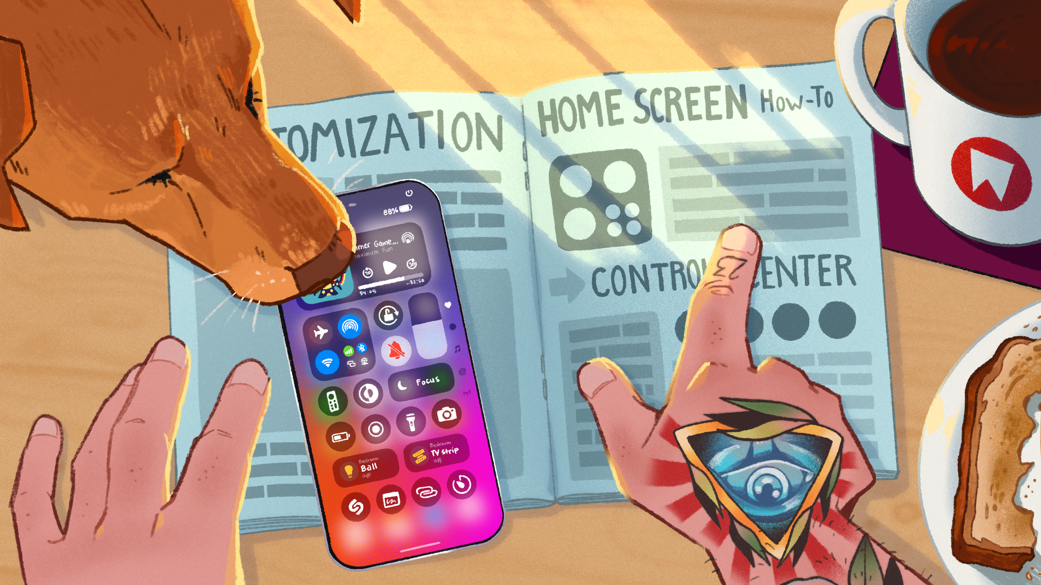 \n
\n Allison Johnson, writing for The Verge on the latest EU-mandated and Apple-designed changes to iOS in Europe:
\n\n\n They’re getting all kinds of stuff because they have cool regulators, not like, regular regulators. Third-party app stores, the ability for browsers to run their own engines, Fortnite_,_ and now the ability to replace lots of default apps? I want it, too! Imagine if Chrome on iOS wasn’t just a rinky dink little Safari emulator! Imagine downloading a new dialer app with a soundboard of fart sounds and setting it as your default! Unfortunately, Apple doesn’t seem interested in sharing these possibilities with everyone.\n
And:
\n\n\n It’s starting to look like the company sells two different iPhones: one for people in Europe, and one that everyone else can buy. That’s weird, especially since keeping things simple and consistent is sort of Apple’s thing. But the company is so committed to keeping the two separate that it won’t even let you update apps from third-party app stores if you leave the EU for more than a month.\n
As I wrote on Threads (much to the disbelief of some commentators), I personally feel like the “DMA fork” of iOS is the version of iOS I’ve wanted for the past few years. It’s still iOS, with the tasteful design, vibrant app ecosystem, high-performance animations, and accessibility we’ve come to expect from Apple; at the same time, it’s a more flexible and fun version of iOS predicated upon the assumption that users deserve options to control more aspects of how their expensive pocket computers should work. Or, as I put it: some of the flexibility of Android, but on iOS, sounds like a dream to me.
\nApparently, this thought – that people who demand options should have them – really annoys a lot of (generally American) pundits who seemingly consider the European Commission a draconian entity that demands changes out of spite for a particular corporation, rather than a group of elected officials who regulate based on what they believe is best for their constituents and the European market.
\nThat point of view does Apple a disservice: rather than appreciating how Apple is designing these new options and collaborating with regulators, some commentators are just pointing fingers at a foreign governmental body. From my European and Italian perspective, it’s not a good look.
\nI think that Apple is doing a pretty good job with their ongoing understanding of the DMA. It’s a process, and they’re doing the work. I don’t find the installation of third-party marketplaces as horrible as others have painted it, and I’m excited about the idea of more default apps coming to iOS. Whether you like it or not, this is the world we live in now. A law was passed, and iPhones (and iPads soon) must be made more versatile. As a result, iPhones are more fun for people like me (a clipboard manager! Fortnite!), while very little has changed for those don’t care about new options.
\nApple is adapting to this new reality. Perhaps more folks in the Apple community should, too.
\n\u2192 Source: theverge.com
", "content_text": "Allison Johnson, writing for The Verge on the latest EU-mandated and Apple-designed changes to iOS in Europe:\n\n They’re getting all kinds of stuff because they have cool regulators, not like, regular regulators. Third-party app stores, the ability for browsers to run their own engines, Fortnite_,_ and now the ability to replace lots of default apps? I want it, too! Imagine if Chrome on iOS wasn’t just a rinky dink little Safari emulator! Imagine downloading a new dialer app with a soundboard of fart sounds and setting it as your default! Unfortunately, Apple doesn’t seem interested in sharing these possibilities with everyone.\n\nAnd:\n\n It’s starting to look like the company sells two different iPhones: one for people in Europe, and one that everyone else can buy. That’s weird, especially since keeping things simple and consistent is sort of Apple’s thing. But the company is so committed to keeping the two separate that it won’t even let you update apps from third-party app stores if you leave the EU for more than a month.\n\nAs I wrote on Threads (much to the disbelief of some commentators), I personally feel like the “DMA fork” of iOS is the version of iOS I’ve wanted for the past few years. It’s still iOS, with the tasteful design, vibrant app ecosystem, high-performance animations, and accessibility we’ve come to expect from Apple; at the same time, it’s a more flexible and fun version of iOS predicated upon the assumption that users deserve options to control more aspects of how their expensive pocket computers should work. Or, as I put it: some of the flexibility of Android, but on iOS, sounds like a dream to me.\nApparently, this thought – that people who demand options should have them – really annoys a lot of (generally American) pundits who seemingly consider the European Commission a draconian entity that demands changes out of spite for a particular corporation, rather than a group of elected officials who regulate based on what they believe is best for their constituents and the European market.\nThat point of view does Apple a disservice: rather than appreciating how Apple is designing these new options and collaborating with regulators, some commentators are just pointing fingers at a foreign governmental body. From my European and Italian perspective, it’s not a good look.\nI think that Apple is doing a pretty good job with their ongoing understanding of the DMA. It’s a process, and they’re doing the work. I don’t find the installation of third-party marketplaces as horrible as others have painted it, and I’m excited about the idea of more default apps coming to iOS. Whether you like it or not, this is the world we live in now. A law was passed, and iPhones (and iPads soon) must be made more versatile. As a result, iPhones are more fun for people like me (a clipboard manager! Fortnite!), while very little has changed for those don’t care about new options.\nApple is adapting to this new reality. Perhaps more folks in the Apple community should, too.\n\u2192 Source: theverge.com", "date_published": "2024-08-25T14:43:27-04:00", "date_modified": "2024-08-25T14:45:42-04:00", "authors": [ { "name": "Federico Viticci", "url": "https://www.macstories.net/author/viticci/", "avatar": "https://secure.gravatar.com/avatar/94a9aa7c70dbeb9440c6759bd2cebc2a?s=512&d=mm&r=g" } ], "tags": [ "DMA", "EU", "Linked" ] }, { "id": "https://www.macstories.net/?p=76240", "url": "https://www.macstories.net/linked/the-sound-of-apple/", "title": "The Sound of Apple", "content_html": "I thoroughly enjoyed this two-part series on the Twenty Thousand Hertz podcast about sound design at Apple and the care that goes into crafting sound effects and alerts that complement the user experience (speaking of the parts of Apple I still love).
\nI’ll be honest: like many other people these days, I don’t often hear sound effects at all since my iPhone is constantly silenced because I don’t want to bother people around me. However, sound plays an essential role for accessibility reasons and is an entire dimension of software design that is not treated like an afterthought at Apple. I especially appreciated how both episodes went into explaining how particular sounds like Tapbacks, Apple Pay confirmation messages, and alarms were created thanks to members of Apple’s Design team, who participated in both episodes and shared lots of behind-the-scenes details.
\nI hope we get a third episode about sound design in visionOS eventually. (I listened to both episodes using Castro, which I’m using as my main podcast client again because its queue system is unrivaled.)
\n\n\n\u2192 Source: 20k.org
", "content_text": "I thoroughly enjoyed this two-part series on the Twenty Thousand Hertz podcast about sound design at Apple and the care that goes into crafting sound effects and alerts that complement the user experience (speaking of the parts of Apple I still love).\nI’ll be honest: like many other people these days, I don’t often hear sound effects at all since my iPhone is constantly silenced because I don’t want to bother people around me. However, sound plays an essential role for accessibility reasons and is an entire dimension of software design that is not treated like an afterthought at Apple. I especially appreciated how both episodes went into explaining how particular sounds like Tapbacks, Apple Pay confirmation messages, and alarms were created thanks to members of Apple’s Design team, who participated in both episodes and shared lots of behind-the-scenes details.\nI hope we get a third episode about sound design in visionOS eventually. (I listened to both episodes using Castro, which I’m using as my main podcast client again because its queue system is unrivaled.)\n\n\n\u2192 Source: 20k.org", "date_published": "2024-08-18T05:25:46-04:00", "date_modified": "2024-08-18T05:25:46-04:00", "authors": [ { "name": "Federico Viticci", "url": "https://www.macstories.net/author/viticci/", "avatar": "https://secure.gravatar.com/avatar/94a9aa7c70dbeb9440c6759bd2cebc2a?s=512&d=mm&r=g" } ], "tags": [ "design", "Linked" ] }, { "id": "https://www.macstories.net/?p=76238", "url": "https://www.macstories.net/linked/the-slow-decline-of-the-apple-cult/", "title": "The Slow Decline of the Apple \u201cCult\u201d", "content_html": "The headline may be a little provocative, but this article by Matt Birchler encapsulates a lot of the feelings I shared on the latest episode of Connected following Apple’s decisions regarding the Patreon iOS app.
\n\n\n Part of this is that Apple is no longer the underdog, they’re the biggest fish in the sea. It’s simply not as fun to root for the most successful consumer company of all time than to root for the upstart that’s trying to disrupt the big guys.
\nBut another part is that despite achieving massive success, Apple continues to make decisions that put it at odds with the community that used to tirelessly advocate for them. They antagonize developers by demanding up to one third of their revenue and block them from doing business the way they want. They make an ad (inadvertently or not) celebrating the destruction of every creative tool that isn’t sold by Apple. They antagonize regulators by exerting their power in ways that impact the entire market. They use a supposedly neutral notarization process to block apps from shipping on alternate app stores in the EU. Most recently they demand 30% of creators’ revenue on Patreon. No single action makes them the bad guy, but put together, they certainly aren’t acting like a company that is trying to make their enthusiast fans happy. In fact, they’re testing them to see how much they can get away with.\n
And:
\n\n\n And to be super clear, I think the vast majority of folks at Apple are amazing people doing amazing work, especially those in product, design, and development. There’s a reason that I use their products and there’s a reason I care enough to even comment on all this in the first place. The problems all stem from the business end of the company and I don’t know how to convince them that reputation matters. How do we convince them that they need the rebel spark like they used to have? How do we convince them there are more ways to increase their profits than by going after the paltry earnings of creators on Patreon?
\nIt’s a pretty dark place to be when Apple’s biggest, long time fans are hoping that the US government will step in to stop them from doing multiple things that they’re doing today.\n
I couldn’t have said it better myself. On the latest Connected, I argued that it almost feels like there are two Apples within Apple: the company that designs the hardware products and operating systems I still love using, which I find superior to most alternatives on the market today; and there’s the business entity, which is antagonizing developers, creators, governments, and, in doing so, alienating customers who have been supporting them for years.
\nI don’t know how to reconcile the two, and I don’t think I’m alone in feeling this way lately.
\n\u2192 Source: birchtree.me
", "content_text": "The headline may be a little provocative, but this article by Matt Birchler encapsulates a lot of the feelings I shared on the latest episode of Connected following Apple’s decisions regarding the Patreon iOS app.\n\n Part of this is that Apple is no longer the underdog, they’re the biggest fish in the sea. It’s simply not as fun to root for the most successful consumer company of all time than to root for the upstart that’s trying to disrupt the big guys.\n But another part is that despite achieving massive success, Apple continues to make decisions that put it at odds with the community that used to tirelessly advocate for them. They antagonize developers by demanding up to one third of their revenue and block them from doing business the way they want. They make an ad (inadvertently or not) celebrating the destruction of every creative tool that isn’t sold by Apple. They antagonize regulators by exerting their power in ways that impact the entire market. They use a supposedly neutral notarization process to block apps from shipping on alternate app stores in the EU. Most recently they demand 30% of creators’ revenue on Patreon. No single action makes them the bad guy, but put together, they certainly aren’t acting like a company that is trying to make their enthusiast fans happy. In fact, they’re testing them to see how much they can get away with.\n\nAnd:\n\n And to be super clear, I think the vast majority of folks at Apple are amazing people doing amazing work, especially those in product, design, and development. There’s a reason that I use their products and there’s a reason I care enough to even comment on all this in the first place. The problems all stem from the business end of the company and I don’t know how to convince them that reputation matters. How do we convince them that they need the rebel spark like they used to have? How do we convince them there are more ways to increase their profits than by going after the paltry earnings of creators on Patreon?\n It’s a pretty dark place to be when Apple’s biggest, long time fans are hoping that the US government will step in to stop them from doing multiple things that they’re doing today.\n\nI couldn’t have said it better myself. On the latest Connected, I argued that it almost feels like there are two Apples within Apple: the company that designs the hardware products and operating systems I still love using, which I find superior to most alternatives on the market today; and there’s the business entity, which is antagonizing developers, creators, governments, and, in doing so, alienating customers who have been supporting them for years.\nI don’t know how to reconcile the two, and I don’t think I’m alone in feeling this way lately.\n\u2192 Source: birchtree.me", "date_published": "2024-08-18T04:39:58-04:00", "date_modified": "2024-08-18T04:39:58-04:00", "authors": [ { "name": "Federico Viticci", "url": "https://www.macstories.net/author/viticci/", "avatar": "https://secure.gravatar.com/avatar/94a9aa7c70dbeb9440c6759bd2cebc2a?s=512&d=mm&r=g" } ], "tags": [ "apple", "Linked" ] }, { "id": "https://www.macstories.net/?p=76220", "url": "https://www.macstories.net/linked/developers-getting-access-to-nfc-transactions-via-the-secure-element-in-ios-18-1/", "title": "Developers Getting Access to NFC Transactions via the Secure Element in iOS 18.1", "content_html": "Earlier today, Apple announced another major new functionality coming to iOS 18.1: the ability for third-party apps to offer NFC transactions via the iPhone’s Secure Element:
\n\n\n Starting with iOS 18.1, developers will be able to offer NFC contactless transactions using the Secure Element from within their own apps on iPhone, separate from Apple Pay and Apple Wallet. Using the new NFC and SE (Secure Element) APIs, developers will be able to offer in-app contactless transactions for in-store payments, car keys, closed-loop transit, corporate badges, student IDs, home keys, hotel keys, merchant loyalty and rewards cards, and event tickets, with government IDs to be supported in the future.\n
This is coming in iOS 18.1, which will also mark the official debut of Apple Intelligence. Even better, Apple has published extensive documentation on the new APIs, from which I noticed one detail: in addition to overriding the iPhone’s side button double-click with a different app, a third-party app running in the foreground will still be able to initiate its own NFC transactions, even if you set a different default app.
\n\n\n Eligible apps running in the foreground can prevent the system default contactless app from launching and interfering with the NFC transaction.\n
And:
\n\n\n You can acquire a presentment intent assertion to suppress the default contactless app when the user expresses an active intent to perform an NFC transaction, like choosing a payment or closed-loop transit credential, or activating the presentment UI. You can only invoke the intent assertion capability when your app is in the foreground.\n
The irony of all this, of course, is that Apple is under regulatory scrutiny in both Europe and the United States regarding the inability for third-party developers to offer alternative wallets and tap-to-pay systems on iPhone. But as it’s becoming apparent lately, it seems there’s no greater project manager for new iOS features than the fear of regulation.
\n\u2192 Source: apple.com
", "content_text": "Earlier today, Apple announced another major new functionality coming to iOS 18.1: the ability for third-party apps to offer NFC transactions via the iPhone’s Secure Element:\n\n Starting with iOS 18.1, developers will be able to offer NFC contactless transactions using the Secure Element from within their own apps on iPhone, separate from Apple Pay and Apple Wallet. Using the new NFC and SE (Secure Element) APIs, developers will be able to offer in-app contactless transactions for in-store payments, car keys, closed-loop transit, corporate badges, student IDs, home keys, hotel keys, merchant loyalty and rewards cards, and event tickets, with government IDs to be supported in the future.\n\nThis is coming in iOS 18.1, which will also mark the official debut of Apple Intelligence. Even better, Apple has published extensive documentation on the new APIs, from which I noticed one detail: in addition to overriding the iPhone’s side button double-click with a different app, a third-party app running in the foreground will still be able to initiate its own NFC transactions, even if you set a different default app.\n\n Eligible apps running in the foreground can prevent the system default contactless app from launching and interfering with the NFC transaction.\n\nAnd:\n\n You can acquire a presentment intent assertion to suppress the default contactless app when the user expresses an active intent to perform an NFC transaction, like choosing a payment or closed-loop transit credential, or activating the presentment UI. You can only invoke the intent assertion capability when your app is in the foreground.\n\nThe irony of all this, of course, is that Apple is under regulatory scrutiny in both Europe and the United States regarding the inability for third-party developers to offer alternative wallets and tap-to-pay systems on iPhone. But as it’s becoming apparent lately, it seems there’s no greater project manager for new iOS features than the fear of regulation.\n\u2192 Source: apple.com", "date_published": "2024-08-14T19:34:12-04:00", "date_modified": "2024-08-14T19:34:12-04:00", "authors": [ { "name": "Federico Viticci", "url": "https://www.macstories.net/author/viticci/", "avatar": "https://secure.gravatar.com/avatar/94a9aa7c70dbeb9440c6759bd2cebc2a?s=512&d=mm&r=g" } ], "tags": [ "regulation", "Wallet", "Linked" ] }, { "id": "https://www.macstories.net/?p=76102", "url": "https://www.macstories.net/linked/earpods-rule/", "title": "EarPods Rule", "content_html": "Even though we have a podcast together, I promise I did not talk to my friend Brendon about something I started doing myself last month: using EarPods – yes, the old wired ones – as my “universal earbuds” that can connect to just about anything these days. In any case, Brendon came to the same conclusion:
\n\n\n At the death of my most recent pair of Beats Fit Pro — the left earbud started to emit a loud electrical sound every so often or just disconnect entirely — I decided to give up on them for the time being. I instead bought some wired Apple EarPods which I haven’t used since the final days of the iPod. It’s hard to overstate how much I’ve loved having them with me for the past month.\n
And:
\n\n\n I’m not about to wax poetic about all of the ways using wired headphones in 2024 “changes everything” like a clickbaity YouTube video, but I will say that the proliferation of USB-C on pretty much every device is slowly returning the EarPods to their once-ubiquitous days of the 3.5mm jack. Yes I’m using them on my iPhone when I’m commuting, doing chores around the house, meditating, and what-have-you — but being able to plug them into my gaming devices, laptop, and tablet does in some ways feel like a return to form when it comes to ease of use.\n
I’m still using AirPods when I want to listen to music or podcasts without bothering my girlfriend at home or when I’m taking the dogs for a walk (although the Meta Ray-Bans have replaced a lot of my AirPods usage outdoors – something I plan to write about soon). A few weeks ago, however, fed up with limitations of Bluetooth multipoint-enabled earbuds, I thought: maybe I should just get Apple’s $20 USB-C EarPods and stop worrying about which wireless earbuds I use with my Apple devices and various gaming handhelds.
\nI’m here to tell you, like Brendon, that those $20 earbuds still rule. The ubiquity of USB-C means I can use them with my iPhone, iPad, Legion Go, Steam Deck, and even more novel devices such as the RG Cube and ROG Ally X (stay tuned for my thoughts on these on a future episode of NPC). I don’t have to worry about battery life, pairing, or latency. Sure, there’s a wire, and there’s no noise cancelling when using them – but these are my “downtime earbuds” anyway, so I don’t care.
\nWireless earbuds – and specifically AirPods – are amazing. But if, like me, you often find yourself playing around with non-Apple devices and wishing you didn’t have to buy separate wireless earbuds for them…Apple’s EarPods are still great, and they’re better than ever thanks to USB-C.
\n
Hear me out: a single cable standard that ensures headphones can work with any device, with no concerns regarding wireless protocols, batteries, and latency. What a concept, right?
\u2192 Source: wavelengths.online
", "content_text": "Even though we have a podcast together, I promise I did not talk to my friend Brendon about something I started doing myself last month: using EarPods – yes, the old wired ones – as my “universal earbuds” that can connect to just about anything these days. In any case, Brendon came to the same conclusion:\n\n At the death of my most recent pair of Beats Fit Pro — the left earbud started to emit a loud electrical sound every so often or just disconnect entirely — I decided to give up on them for the time being. I instead bought some wired Apple EarPods which I haven’t used since the final days of the iPod. It’s hard to overstate how much I’ve loved having them with me for the past month.\n\nAnd:\n\n I’m not about to wax poetic about all of the ways using wired headphones in 2024 “changes everything” like a clickbaity YouTube video, but I will say that the proliferation of USB-C on pretty much every device is slowly returning the EarPods to their once-ubiquitous days of the 3.5mm jack. Yes I’m using them on my iPhone when I’m commuting, doing chores around the house, meditating, and what-have-you — but being able to plug them into my gaming devices, laptop, and tablet does in some ways feel like a return to form when it comes to ease of use.\n\nI’m still using AirPods when I want to listen to music or podcasts without bothering my girlfriend at home or when I’m taking the dogs for a walk (although the Meta Ray-Bans have replaced a lot of my AirPods usage outdoors – something I plan to write about soon). A few weeks ago, however, fed up with limitations of Bluetooth multipoint-enabled earbuds, I thought: maybe I should just get Apple’s $20 USB-C EarPods and stop worrying about which wireless earbuds I use with my Apple devices and various gaming handhelds.\nI’m here to tell you, like Brendon, that those $20 earbuds still rule. The ubiquity of USB-C means I can use them with my iPhone, iPad, Legion Go, Steam Deck, and even more novel devices such as the RG Cube and ROG Ally X (stay tuned for my thoughts on these on a future episode of NPC). I don’t have to worry about battery life, pairing, or latency. Sure, there’s a wire, and there’s no noise cancelling when using them – but these are my “downtime earbuds” anyway, so I don’t care.\nWireless earbuds – and specifically AirPods – are amazing. But if, like me, you often find yourself playing around with non-Apple devices and wishing you didn’t have to buy separate wireless earbuds for them…Apple’s EarPods are still great, and they’re better than ever thanks to USB-C.\nHear me out: a single cable standard that ensures headphones can work with any device, with no concerns regarding wireless protocols, batteries, and latency. What a concept, right?\n\u2192 Source: wavelengths.online", "date_published": "2024-07-24T14:58:41-04:00", "date_modified": "2024-07-24T14:58:41-04:00", "authors": [ { "name": "Federico Viticci", "url": "https://www.macstories.net/author/viticci/", "avatar": "https://secure.gravatar.com/avatar/94a9aa7c70dbeb9440c6759bd2cebc2a?s=512&d=mm&r=g" } ], "tags": [ "accessories", "Linked" ] }, { "id": "https://www.macstories.net/?p=76034", "url": "https://www.macstories.net/stories/ios-18-public-beta-preview/", "title": "iOS 18 After One Month: Without AI, It\u2019s Mostly About Apps and Customization", "content_html": "
iOS 18 launches in public beta today.
My experience with iOS 18 and iPadOS 18, launching today in public beta for everyone to try, has been characterized by smaller, yet welcome enhancements to Apple’s productivity apps, a redesign I was originally wrong about, and an emphasis on customization.
\nThere’s a big omission looming over the rollout of these public betas, and that’s the absence of any Apple Intelligence functionalities that were showcased at WWDC. There’s no reworked Siri, no writing tools in text fields, no image generation via the dedicated Image Playground app, no redesigned Mail app. And that’s not to mention the AI features that we knew were slotted for 2025 and beyond, such as Siri eventually becoming more cognizant of app content and gaining the ability to operate more specifically inside apps.
\nAs a result, these first public betas of iOS and iPadOS 18 may be – and rightfully so – boring for most people, unless you really happen to care about customization options or apps.
\nFortunately, I do, which is why I’ve had a pleasant time with iOS and iPadOS 18 over the past month, noting improvements in my favorite system apps and customizing Control Center with new controls and pages. At the same time, however, I have to recognize that Apple’s focus this year was largely on AI; without it, it feels like the biggest part of the iOS 18 narrative is missing.
\nAs you can imagine, I’m going to save a deeper, more detailed look at all the visual customization features and app-related changes in iOS and iPadOS 18 for my annual review later this year, where I also plan to talk about Apple’s approach to AI and what it’ll mean for our usage of iPhones and iPads.
\nFor now, let’s take a look at the features and app updates I’ve enjoyed over the past month.
\n\nThere are lots of app-related improvements in iOS 18, which is why I’m looking forward to the next few months on AppStories, where we’ll have a chance to discuss them all more in-depth. For now, here are my initial highlights.
\nI almost can’t believe I’m typing this in 2024, but as things stand in this public beta, I’m very excited about…the Calendar app.
\nIn iOS and iPadOS 18, the Calendar app is getting the ability to show your scheduled reminders alongside regular calendar events. I know, I know: that’s not the most incredible innovation since apps like Fantastical have been able to display events and tasks together for over a decade now. The thing is, though, with time I’ve realized that I don’t need a tool as complex as Fantastical (which is a great app, but its new business-oriented features are something I don’t need); I’m fine with Apple’s built-in Calendar app, which does everything I need and has an icon on the Home Screen that shows me the current date.
\nBy enabling the ‘Scheduled Reminders’ toggle in the app’s Calendars section, all your scheduled tasks from the Reminders app will appear alongside events in the calendar. You can click a reminder inside Calendar to mark it as complete or use drag and drop to reschedule it to another day. As someone who creates only a handful of calendar events each week but gives every task a due date and time, I find it very helpful to have a complete overview of my week in once place rather than having to use two apps for the job.
\n
Reminders alongside events in the Calendar app.
The integration even extends to Calendar’s Home Screen widgets, including the glorious ‘XL’ one on iPad, which can now show you reminders and events for multiple days at a glance.
\n
Reminders are also displayed in the XL Calendar widget on iPad. iOS and iPadOS 18 also include the ability to resize widgets without deleting and re-adding them from scratch every time.
Historically speaking, this is not the first time we’ve seen a direct, two-way communication between Apple apps on iOS: in iOS 12, Apple brought News articles to the Stocks app, which I covered in my review at the time as an exciting opportunity for system apps to cross-pollinate and for Apple to provide iOS users with an experience greater than the sum of its parts. This year, the company is going to much greater lengths with the same idea. Not only is Reminders data appearing inside Calendar, but tasks are interactive in the Calendar app, to the point where you can access the full-blown Reminders task creation UI from inside Calendar:
\n
The Reminders UI embedded within Calendar.
Does this mean the Calendar app has become the one productivity app to rule them all for me? Obviously not, since there are still plenty of reasons to open the standalone Reminders app, if only to browse my various lists and smart lists or use specific features like tagging and rich links. But the idea of providing a common ground between the two apps is solid, and as a result, I find myself spending more time managing my week inside the Calendar app now.
\nAs we’ll see later this year, these two apps aren’t the only ones becoming capable of talking to each other in iOS 18: Notes and Calculator will also get the ability to share Math Notes and allow users to edit the same document in two distinct places. This is a trend worth keeping an eye on.
\nSpeaking of Reminders, there are a handful of improvements in the app I want to mention.
\nFor starters, subtasks now appear in the ‘Today’ and ‘Scheduled’ lists as well as custom smart lists. Previously, reminders nested within a parent reminder would be hidden from those special views, which – again, as someone who schedules everything in his task manager – hindered the utility of subtasks in the first place. To give you a practical example, I have an automation that creates a new list for the next issue of MacStories Weekly every week (which I adapted from my Things suite of shortcuts), and one of the tasks inside that list is an ‘App Debuts’ parent reminder. When I come across an interesting app or update during the week, I save it as a subtask of that reminder. In iOS and iPadOS 18, those subtasks can appear in the ‘Today’ view on Saturday morning, when it’s time to assemble MacStories Weekly.
\n
Subtasks for a reminder in a specific list (left) can now appear in the Today page and other smart lists.
Although the ‘Today’ default smart list still doesn’t support columns, it now lets you customize the order of its default sections: all-day, overdue, and timed reminders.
\n
You can now customize the order of sections in the Today page.
I’m also intrigued by Apple’s promise of new Shortcuts actions for Reminders, though I suspect the work is unfinished and we’re only seeing partial results in this public beta. There is a new ‘Create Reminder’ action in Shortcuts (which I can only see on my iPhone, not on the iPad) that exposes more options for task creation than the old ‘Add New Reminder’ action.
\nNamely, this action now lets you enter properties for a list’s sections and assignees; strangely enough, the action doesn’t contain an option to enter a URL attachment for a task, which the previous action offered. I’m guessing that, as part of Apple Intelligence and with the ultimate goal of making Siri more integrated with apps, Apple is going to retool a lot of their existing Shortcuts actions. (It’s about time.) I wouldn’t be surprised if more apps follow Reminders in modernizing their Shortcuts integrations within the iOS 18 cycle because of Apple Intelligence.
\nAt long last – and the finally is deserved here – Apple has made a standalone Passwords app for iOS, iPadOS, and macOS. I (and many others) have been arguing in favor of cutting password management out of Settings to let it blossom into a full-blown app for years now; I’m not kidding when I say that, on balance, the addition of the Passwords app has been the most important quality-of-life improvement in iOS 18 so far.
\nI moved all of my passwords out of 1Password and into iCloud Keychain just before WWDC (following Simon’s excellent guide). As soon as I updated to iOS 18, they were all transferred to the Passwords app, and I didn’t have to do anything else. iCloud Keychain already supported key password management features like verification codes; with the Passwords app, you don’t need to go hunt for them inside Settings anymore thanks to a more intuitive UI that also adds some welcome options.
\nThe Passwords app has a design that’s reminiscent of Reminders, with pinned sections at the top for passkeys, logins that have one-time codes, Wi-Fi networks, security recommendations, and deleted items. With the exception of the Wi-Fi section, these aren’t new features, but the presentation makes them easier to find. These sections are followed by your shared groups, which aren’t new either, but are more discoverable and prominent. The design of login item pages is consistent with iOS 17’s old iCloud Keychain UI, but the app now supports multiple URLs for the same login; the main list view also includes sorting options.
\n
The Passwords app is my favorite addition of the year.
My favorite detail of the Passwords app, however, is this: if you need to quickly copy an item’s username, password, code, or URL, you can simply right-click it in the main view and copy what you need:
\n
This is a good menu.
The best thing I can say about Passwords is that it obliterated a particular kind of frustration from my life. With Apple’s app, I don’t need to worry about my password manager not working anymore. In fact, I’d argue that Passwords’ strongest quality is that you never think about it that much, and that means it’s doing its job.
\nThose who, like me, come from more than a decade of using 1Password and have witnessed the app’s slow descent into instability know what I’m talking about: having to constantly worry about the app’s Safari extension not working, search not bringing up results inside the app, or the extension auto-filling the wrong information on a page. With Passwords, all these issues have evaporated for me, and I can’t describe how happy it makes me that I just don’t have these thoughts about my password manager anymore.
\nDon’t get me wrong; there are features of 1Password that Apple’s Passwords app can’t match yet, and that I’m guessing will be the reason why some folks won’t be able to switch to it just yet. The biggest limitation, in my opinion, is the lack of secure attachments: if you want to store a file (like, say, a PDF document or an encryption key) associated with a login item, well, you can’t with Passwords yet.
\nThese limitations need to be addressed, and now that Passwords is a standalone experience, I’m more confident that Apple will have the headroom to do so rather than having to cram everything into a Settings page. Moving from 1Password to the Passwords app has been one of the most useful tech-related migrations I’ve made in recent memory; if you’re on the verge and primarily use Apple devices, I highly recommend taking the time to do it.
\nBeyond Apple Intelligence, I’d argue that the most important change of iOS 18 – and something you can try right now, unlike AI – is the redesigned Photos app. As I shared on MacStories a couple of weeks ago, I was initially wrong about it. Having used it every day for the past month, not only do I think Apple is onto something with their idea of a single-page app design, but, more importantly, the new app has helped me rediscover old memories more frequently than before.
\nThe concept behind the new Photos app is fairly straightforward to grasp, yet antithetical to decades of iOS UI conventions: rather than organize different app sections into tabs, everything has been collapsed into a single page that you can scroll to move from your library to various kinds of collections and suggestions. And that’s not at all; this fluid, single-page layout (which is powered by SwiftUI) is also highly customizable, allowing users to fine-tune which sections they want to see at the top in the main carousel and which pinned collections, albums, or trips they want to see further down the page.
\n
The new Photos UI on iPad.
It’s easy to understand why the move from a tabbed interface to a unified single-page design may – at least in theory – bolster discovery inside the app: if people aren’t using the app’s other sections, well, let’s just move all those sections into the screen we know they’re using. Or, think about it this way: we already spend hours of our lives discovering all kinds of digital information – news, music, memes, whatever – by scrolling. Why not use the same gesture to rediscover photos in our libraries, too? (The opposite of doomscrolling, if you will.)
\nWhat I think Apple designers have achieved with the new Photos app – and what I will explore more in-depth later this year in my review – is balance between tradition, discovery, and customization. By default, the new Photos app shows your usual grid of recent photos and videos at the top, occupying roughly 60% of the screen on iPhone. Immediately below, the app will automatically compile smart collections for recent days (where only the best shots are highlighted, removing stuff like screenshots and receipts) as well as your favorite people and pets. So if you’re looking for the photo you just took, you can still find it in the grid, but there’s also a chance something else may catch your eye down the page.
\n
Photos’ new UI.
The grid can be expanded to full-screen with a swipe, which reveals a new segmented control to enable the Years and Months views as well as a menu for sorting options and new filters to exclude media types such as screenshots and videos. The transition from half-grid to full-grid is incredibly smooth and pleasant to look at.
\n
Expanding the grid reveals new filters.
So that’s tradition: if you want to keep using the Photos app as a grid of photos, you can, and the app supports all the features you know and love in the grid, such as long presses to show context menus and drag and drop. This is where Photos bifurcates from the past, though: if you want, at this point, you can also keep scrolling to discover more, or you can spend some time customizing the look of the app to your needs and preferences.
\nThere are a lot of recommended sections (and more coming with AI in the future) and customization options – too many for me to cover in this preview article today. Allow me to highlight just a few. The main grid at the top of the app? That’s actually a carousel that you can swipe horizontally to move from the grid to other “pinned” sections, and you can customize which collections are displayed in here. In my app, I put my favorites, videos, photos of my dogs, featured photos, and screenshots (in this order) after the grid. This way, I can move to the right if I want to discover old favorites and memories, or I can quickly move the left to find all my screenshots quickly. Once again: it’s all about tradition, discovery, and customization.
\n
Customizing the carousel.
I’ve become a huge fan of Recent Days, which is a section that follows the grid, automatically groups photos by day, and sort of serves as a visual calendar of your life. Apple’s algorithm, in my experience, does a great job at picking a key photo from a particular day, and more often than not, I find myself swiping through this section to remember what I did on any given day.
\nI also like the ability to customize Pinned Collections, which is another section on the page and, effectively, a user-customizable space for shortcuts to your Photos library. You can pin anything in here: media types, specific albums, specific trips (which are curated by iOS 18), photos of your pets, photos of people and groups of people (also new in iOS 18), and more.
\n
Recent Days and Pinned Collections.
I’ll save more comments and tidbits on the redesigned Photos app for my iOS and iPadOS 18 review later this year. For now, though, I’ll say this: a month ago, I thought Apple was going to revert this drastic redesign like they did with Safari three years ago; now, I think Apple has created something special, and they should be diligent enough to iterate and listen to feedback, but also stick to their ideas and see this redesign through. The new Photos app allows me to see recently-taken pictures like before; at the same time, it gives me an easier, less disorienting way to discover forgotten moments and memories from my library that are continuously surfaced throughout the app. And at any point, I can choose to customize what I see and shape the app’s experience into something that is uniquely mine.
\nI was skeptical about iOS 18’s Photos app at first, but now I’m a believer.
\nApple’s progressive embrace of user customization on its mobile platforms isn’t new. (We could trace the company’s efforts back to iOS 12’s rollout of Shortcuts and, of course, iOS 14’s Home Screen widgets.) For the first time in years, however, I feel like a part of Apple’s customization features in iOS 18 aren’t meant for people like me at all. Fortunately, there’s another aspect to this story that is very much up my alley and, in fact, the area of iOS 18 I’m having the most fun tweaking.
\nLet’s start with the part that’s not for me this year: Home Screen customization and icon theming. At a high level, Apple is bringing three key changes to the Home Screen in iOS 18:
\nOf these three changes, I’ve only been using the setting that makes icons larger and hides their labels. I think it makes my Home Screen look more elegant and less crowded by getting rid of app and shortcut titles underneath their icons.
\n
Regular icons (left) compared to the new larger icon size in iOS 18.
As for the other two changes…they’re really not my kind of thing. I think the ability to freely rearrange icons on the Home Screen, going beyond the limitation of the classic grid, is long overdue and something that a lot of folks will joyfully welcome. Years ago, I would have probably spent hours making dynamic layouts for each of my Home Screen pages with a particular flow and order to their icons. These days, however, I like to use a single Home Screen page, with Spotlight and the App Library filling the gaps for everything else. And – as you’ve seen above – I like filling that Home Screen page to the brim with icons for maximum efficiency when I’m using my phone.
\nI don’t foresee a scenario in which I voluntarily give up free space on my Home Screen to make it more “aesthetic” – including on my iPad, where this feature is also supported, but I’d rather use the extra space there for more widgets. At the same time, I know that literally millions of other iPhone users will love this feature, so Apple is right in adding support for it. As a meme would put it, in this case, I think it’s best if people like me shut up and let other people enjoy things.
\nIt’s a similar story with icon tinting, which takes on two distinct flavors with iOS 18. Apps can now offer a dark mode icon, a great way to make sure that folks who use their devices in dark mode all the time have matching dark icons on their Home Screens. Generally speaking, I like what Apple is doing with their system apps’ icons in dark mode, and I appreciate that there are ways for developers to fine-tune what their icons should look like in this mode. My problem is that I never use dark mode – not even at night – since I find it too low-contrast for my eyes (especially when reading), so I don’t think I’m ever going to enable dark icons on my Home Screen.
\n
From left to right: large icons, dark mode icons (for some of my apps), and tinted icons.
The other option is icon tinting using a color picker, and…personally, I just don’t think it looks good at all. With this feature, you can effectively apply a color mask on top of every app icon and change the intensity of the color you’ve selected, thus completely disregarding the color palettes chosen by the app’s creator. To my eyes, the results look garish, to the point where even Apple’s promotional examples – historically, images that are meant to make the new version of iOS appear attractive – look awful to me. Are there going to be people out there who will manage to make a tinted layout that looks nice and that they’re going to love? I’m sure. And this is why user customization is important: we all have different tastes and needs, and I think it’s great when software doesn’t judge us for what we like (or dislike) and lets us shape the computer however we want.
\nI want to wrap up this story with the one customizable feature that I adore in iOS 18, and which I know is going to define my summer: the new Control Center.
\nIn iOS 18, Control Center is becoming a multi-page, customizable affair. Controls now come in multiple sizes, and they’re powered by the same technologies that allow developers to create widgets and Shortcuts actions (WidgetKit and App Intents). This rewrite of Control Center has some deep ramifications: for the first time, third-party apps can offer native controls in Control Center, controls can be resized like widgets, and there is a Controls Gallery (similar to the Widget Gallery on the Home and Lock Screens) to pick and choose the controls you want.
\n
The new Control Center can span multiple pages with support for resizable controls and third-party ones.
Given the breadth of options at users’ disposal now, Apple decided to eschew Control Center’s single-page approach. System controls have been split across multiple Control Center pages, which are laid out vertically (rather than horizontally, as in the iOS 10 days); plus, users can create new pages to install even more controls, just like they can create new Home Screen pages to use more widgets.
\nBasically, Apple has used the existing foundation of widgets and app intents to supercharge Control Center and make it a Home Screen-like experience. It’s hard for me to convey in an article how much I love this direction: app functionalities that maybe do not require opening the full app can now be exposed anywhere (including on the Lock Screen), and you get to choose where those controls should be positioned, across how many pages, and how big or small they should be.
\n
You can customize Control Center sort of like the Home Screen by rearranging and resizing controls. There is a Controls Gallery (center) and controls can be configured like widgets, too.
If you know me, you can guess that I’m going to spend hours infinitely tweaking Control Center to accommodate my favorite shortcuts (which you can run from there!) as well as new controls from third-party apps. I’m ecstatic about the prospect of swapping the camera and flashlight controls at the bottom of the Lock Screen (which are now powered by the same tech) with new, custom ones, and I’m very keen to see what third-party developers come up with in terms of controls that perform actions in their apps without launching them in the foreground. A control that I’m testing now, for instance, starts playing a random album from my MusicBox library without launching the app at all, and it’s terrific.
\nSo far, the new Control Center feels like peak customization. Power users are going to love it, and I’m looking forward to seeing what mine will look like in September.
\nThere’s a lot more I could say about iOS 18 and its updated apps today. I could mention the ability to create colored highlights in Notes and fold sections, which I’m using on a daily basis to organize my iOS and iPadOS research material. I could point out that Journal is receiving some terrific updates across the board, including search, mood logging based on Health, and integration with generic media sources (such as third-party podcast apps and Spotify, though this is not working for me yet). I could cover Messages’ redesigned Tapbacks, which are now colorful and finally support any emoji you want.
\nBut I’m stopping here today, because all of those features deserve a proper, in-depth analysis after months of usage with an annual review this fall.
\nShould you install the iOS and iPadOS 18 public betas today? Unless you really care about new features in system apps, the redesigned Photos app, or customization, probably not. Most people will likely check out iOS 18 later this year to satisfy their curiosity regarding Apple Intelligence, and that’s not here yet.
\nWhat I’m trying to say, though, is that even without AI, there’s plenty to like in the updated apps for iOS and iPadOS 18 and the reimagined Control Center – which, given my…complicated feelings on the matter is, quite frankly, a relief.
\nI’ll see you this fall, ready, as always, with my annual review of iOS and iPadOS.
\nYou can also follow our 2024 Summer OS Preview Series through our dedicated hub, or subscribe to its RSS feed.
\nFounded in 2015, Club MacStories has delivered exclusive content every week for nearly a decade.
\nWhat started with weekly and monthly email newsletters has blossomed into a family of memberships designed every MacStories fan.
\nClub MacStories: Weekly and monthly newsletters via email and the web that are brimming with apps, tips, automation workflows, longform writing, early access to the MacStories Unwind podcast, periodic giveaways, and more;
\nClub MacStories+: Everything that Club MacStories offers, plus an active Discord community, advanced search and custom RSS features for exploring the Club’s entire back catalog, bonus columns, and dozens of app discounts;
\nClub Premier: All of the above and AppStories+, an extended version of our flagship podcast that’s delivered early, ad-free, and in high-bitrate audio.
\nLearn more here and from our Club FAQs.
\nJoin Now", "content_text": "iOS 18 launches in public beta today.\nMy experience with iOS 18 and iPadOS 18, launching today in public beta for everyone to try, has been characterized by smaller, yet welcome enhancements to Apple’s productivity apps, a redesign I was originally wrong about, and an emphasis on customization.\nThere’s a big omission looming over the rollout of these public betas, and that’s the absence of any Apple Intelligence functionalities that were showcased at WWDC. There’s no reworked Siri, no writing tools in text fields, no image generation via the dedicated Image Playground app, no redesigned Mail app. And that’s not to mention the AI features that we knew were slotted for 2025 and beyond, such as Siri eventually becoming more cognizant of app content and gaining the ability to operate more specifically inside apps.\nAs a result, these first public betas of iOS and iPadOS 18 may be – and rightfully so – boring for most people, unless you really happen to care about customization options or apps.\nFortunately, I do, which is why I’ve had a pleasant time with iOS and iPadOS 18 over the past month, noting improvements in my favorite system apps and customizing Control Center with new controls and pages. At the same time, however, I have to recognize that Apple’s focus this year was largely on AI; without it, it feels like the biggest part of the iOS 18 narrative is missing.\nAs you can imagine, I’m going to save a deeper, more detailed look at all the visual customization features and app-related changes in iOS and iPadOS 18 for my annual review later this year, where I also plan to talk about Apple’s approach to AI and what it’ll mean for our usage of iPhones and iPads.\nFor now, let’s take a look at the features and app updates I’ve enjoyed over the past month.\nSupported By\nSetapp\n\n\nSetapp: End the search, start the work. One subscription to dozens of apps for Mac and iPhone.\n\ncrickets\nSo, Yeah, About iPadOS 18\nIn this article (and, most likely, in my review later this year), I will focus on iOS 18 and use screenshots taken on my iPhone 15 Pro Max. The reason is simple: if Apple isn’t working to fix the glaring limitations of iPadOS 18, which I documented in May, there is nothing new for me to say here.\nTo the best of my knowledge, there are two iPad-exclusive features in this year’s release: a redesigned tab bar for apps, and Smart Script to enhance and straighten Apple Pencil handwriting. I don’t use the Apple Pencil, so I don’t feel that I’m qualified to cover its new features in iPadOS 18. I’m also on the record as being skeptical regarding the new tab bar UI for iPad apps, which I have also been unable to test since none of the developers of my favorite third-party apps have adopted it in beta versions of their apps yet. Other features that we initially thought were going to be iPad-only (Math Notes and formatting external drives in the Files app) are also available on iOS.\nAt the very least, iPadOS received support for dynamic Home Screen layouts and icon theming this year, bucking the historical trend that forced iPad users to wait a year before getting the iPad version of any Home Screen changes.\nWhat a sad state of affairs it is when we have to be grateful that the iPad gets iOS’ latest features instead of rejoicing that Apple is devoting time and resources to iPad-specific enhancements. And yet here we are, once again.\nApps\nThere are lots of app-related improvements in iOS 18, which is why I’m looking forward to the next few months on AppStories, where we’ll have a chance to discuss them all more in-depth. For now, here are my initial highlights.\nReminders and Calendar, Together At Last\nI almost can’t believe I’m typing this in 2024, but as things stand in this public beta, I’m very excited about…the Calendar app.\nIn iOS and iPadOS 18, the Calendar app is getting the ability to show your scheduled reminders alongside regular calendar events. I know, I know: that’s not the most incredible innovation since apps like Fantastical have been able to display events and tasks together for over a decade now. The thing is, though, with time I’ve realized that I don’t need a tool as complex as Fantastical (which is a great app, but its new business-oriented features are something I don’t need); I’m fine with Apple’s built-in Calendar app, which does everything I need and has an icon on the Home Screen that shows me the current date.\nBy enabling the ‘Scheduled Reminders’ toggle in the app’s Calendars section, all your scheduled tasks from the Reminders app will appear alongside events in the calendar. You can click a reminder inside Calendar to mark it as complete or use drag and drop to reschedule it to another day. As someone who creates only a handful of calendar events each week but gives every task a due date and time, I find it very helpful to have a complete overview of my week in once place rather than having to use two apps for the job.\nReminders alongside events in the Calendar app.\nRight now, the ability to use drag and drop to reschedule reminders in the calendar only works on iPad, not on iPhone.\n\nThe integration even extends to Calendar’s Home Screen widgets, including the glorious ‘XL’ one on iPad, which can now show you reminders and events for multiple days at a glance.\nReminders are also displayed in the XL Calendar widget on iPad. iOS and iPadOS 18 also include the ability to resize widgets without deleting and re-adding them from scratch every time.\nHistorically speaking, this is not the first time we’ve seen a direct, two-way communication between Apple apps on iOS: in iOS 12, Apple brought News articles to the Stocks app, which I covered in my review at the time as an exciting opportunity for system apps to cross-pollinate and for Apple to provide iOS users with an experience greater than the sum of its parts. This year, the company is going to much greater lengths with the same idea. Not only is Reminders data appearing inside Calendar, but tasks are interactive in the Calendar app, to the point where you can access the full-blown Reminders task creation UI from inside Calendar:\nThe Reminders UI embedded within Calendar.\nDoes this mean the Calendar app has become the one productivity app to rule them all for me? Obviously not, since there are still plenty of reasons to open the standalone Reminders app, if only to browse my various lists and smart lists or use specific features like tagging and rich links. But the idea of providing a common ground between the two apps is solid, and as a result, I find myself spending more time managing my week inside the Calendar app now.\nAs we’ll see later this year, these two apps aren’t the only ones becoming capable of talking to each other in iOS 18: Notes and Calculator will also get the ability to share Math Notes and allow users to edit the same document in two distinct places. This is a trend worth keeping an eye on.\nSpeaking of Reminders, there are a handful of improvements in the app I want to mention.\nFor starters, subtasks now appear in the ‘Today’ and ‘Scheduled’ lists as well as custom smart lists. Previously, reminders nested within a parent reminder would be hidden from those special views, which – again, as someone who schedules everything in his task manager – hindered the utility of subtasks in the first place. To give you a practical example, I have an automation that creates a new list for the next issue of MacStories Weekly every week (which I adapted from my Things suite of shortcuts), and one of the tasks inside that list is an ‘App Debuts’ parent reminder. When I come across an interesting app or update during the week, I save it as a subtask of that reminder. In iOS and iPadOS 18, those subtasks can appear in the ‘Today’ view on Saturday morning, when it’s time to assemble MacStories Weekly.\nSubtasks for a reminder in a specific list (left) can now appear in the Today page and other smart lists.\nAlthough the ‘Today’ default smart list still doesn’t support columns, it now lets you customize the order of its default sections: all-day, overdue, and timed reminders.\nYou can now customize the order of sections in the Today page.\nI’m also intrigued by Apple’s promise of new Shortcuts actions for Reminders, though I suspect the work is unfinished and we’re only seeing partial results in this public beta. There is a new ‘Create Reminder’ action in Shortcuts (which I can only see on my iPhone, not on the iPad) that exposes more options for task creation than the old ‘Add New Reminder’ action.\nThe ‘Create Reminder’ action was introduced in developer beta 2 of iOS 18; it still works in developer beta 3 and the public beta, but I can’t find it anymore in the Shortcuts action library. I hope it comes back soon.\n\nNamely, this action now lets you enter properties for a list’s sections and assignees; strangely enough, the action doesn’t contain an option to enter a URL attachment for a task, which the previous action offered. I’m guessing that, as part of Apple Intelligence and with the ultimate goal of making Siri more integrated with apps, Apple is going to retool a lot of their existing Shortcuts actions. (It’s about time.) I wouldn’t be surprised if more apps follow Reminders in modernizing their Shortcuts integrations within the iOS 18 cycle because of Apple Intelligence.\nPasswords: The “Finally” of the Year\nAt long last – and the finally is deserved here – Apple has made a standalone Passwords app for iOS, iPadOS, and macOS. I (and many others) have been arguing in favor of cutting password management out of Settings to let it blossom into a full-blown app for years now; I’m not kidding when I say that, on balance, the addition of the Passwords app has been the most important quality-of-life improvement in iOS 18 so far.\n\nThe addition of the Passwords app has been the most important quality-of-life improvement in iOS 18.\n\nI moved all of my passwords out of 1Password and into iCloud Keychain just before WWDC (following Simon’s excellent guide). As soon as I updated to iOS 18, they were all transferred to the Passwords app, and I didn’t have to do anything else. iCloud Keychain already supported key password management features like verification codes; with the Passwords app, you don’t need to go hunt for them inside Settings anymore thanks to a more intuitive UI that also adds some welcome options.\nThe Passwords app has a design that’s reminiscent of Reminders, with pinned sections at the top for passkeys, logins that have one-time codes, Wi-Fi networks, security recommendations, and deleted items. With the exception of the Wi-Fi section, these aren’t new features, but the presentation makes them easier to find. These sections are followed by your shared groups, which aren’t new either, but are more discoverable and prominent. The design of login item pages is consistent with iOS 17’s old iCloud Keychain UI, but the app now supports multiple URLs for the same login; the main list view also includes sorting options.\nThe Passwords app is my favorite addition of the year.\nMy favorite detail of the Passwords app, however, is this: if you need to quickly copy an item’s username, password, code, or URL, you can simply right-click it in the main view and copy what you need:\nThis is a good menu.\nThe best thing I can say about Passwords is that it obliterated a particular kind of frustration from my life. With Apple’s app, I don’t need to worry about my password manager not working anymore. In fact, I’d argue that Passwords’ strongest quality is that you never think about it that much, and that means it’s doing its job.\nThose who, like me, come from more than a decade of using 1Password and have witnessed the app’s slow descent into instability know what I’m talking about: having to constantly worry about the app’s Safari extension not working, search not bringing up results inside the app, or the extension auto-filling the wrong information on a page. With Passwords, all these issues have evaporated for me, and I can’t describe how happy it makes me that I just don’t have these thoughts about my password manager anymore.\nDon’t get me wrong; there are features of 1Password that Apple’s Passwords app can’t match yet, and that I’m guessing will be the reason why some folks won’t be able to switch to it just yet. The biggest limitation, in my opinion, is the lack of secure attachments: if you want to store a file (like, say, a PDF document or an encryption key) associated with a login item, well, you can’t with Passwords yet.\nApple’s Notes app can’t act as backup here since it still can’t lock notes that contain attachments such as PDFs. I also find it quite strange that I can look up my known Wi-Fi networks in the Passwords app, but if I want to find my saved credit cards, I still need to open the Settings app. Ideally, I should be able to see my saved credit cards in the Passwords app and store all kinds of secure attachments in Notes.\n\nThese limitations need to be addressed, and now that Passwords is a standalone experience, I’m more confident that Apple will have the headroom to do so rather than having to cram everything into a Settings page. Moving from 1Password to the Passwords app has been one of the most useful tech-related migrations I’ve made in recent memory; if you’re on the verge and primarily use Apple devices, I highly recommend taking the time to do it.\nThe New Photos App: Tradition, Discovery, and Customization\nBeyond Apple Intelligence, I’d argue that the most important change of iOS 18 – and something you can try right now, unlike AI – is the redesigned Photos app. As I shared on MacStories a couple of weeks ago, I was initially wrong about it. Having used it every day for the past month, not only do I think Apple is onto something with their idea of a single-page app design, but, more importantly, the new app has helped me rediscover old memories more frequently than before.\nThe concept behind the new Photos app is fairly straightforward to grasp, yet antithetical to decades of iOS UI conventions: rather than organize different app sections into tabs, everything has been collapsed into a single page that you can scroll to move from your library to various kinds of collections and suggestions. And that’s not at all; this fluid, single-page layout (which is powered by SwiftUI) is also highly customizable, allowing users to fine-tune which sections they want to see at the top in the main carousel and which pinned collections, albums, or trips they want to see further down the page.\nThe new Photos UI on iPad.\nIt’s easy to understand why the move from a tabbed interface to a unified single-page design may – at least in theory – bolster discovery inside the app: if people aren’t using the app’s other sections, well, let’s just move all those sections into the screen we know they’re using. Or, think about it this way: we already spend hours of our lives discovering all kinds of digital information – news, music, memes, whatever – by scrolling. Why not use the same gesture to rediscover photos in our libraries, too? (The opposite of doomscrolling, if you will.)\nWhat I think Apple designers have achieved with the new Photos app – and what I will explore more in-depth later this year in my review – is balance between tradition, discovery, and customization. By default, the new Photos app shows your usual grid of recent photos and videos at the top, occupying roughly 60% of the screen on iPhone. Immediately below, the app will automatically compile smart collections for recent days (where only the best shots are highlighted, removing stuff like screenshots and receipts) as well as your favorite people and pets. So if you’re looking for the photo you just took, you can still find it in the grid, but there’s also a chance something else may catch your eye down the page.\nPhotos’ new UI.\nThe grid can be expanded to full-screen with a swipe, which reveals a new segmented control to enable the Years and Months views as well as a menu for sorting options and new filters to exclude media types such as screenshots and videos. The transition from half-grid to full-grid is incredibly smooth and pleasant to look at.\nExpanding the grid reveals new filters.\nSo that’s tradition: if you want to keep using the Photos app as a grid of photos, you can, and the app supports all the features you know and love in the grid, such as long presses to show context menus and drag and drop. This is where Photos bifurcates from the past, though: if you want, at this point, you can also keep scrolling to discover more, or you can spend some time customizing the look of the app to your needs and preferences.\nThere are a lot of recommended sections (and more coming with AI in the future) and customization options – too many for me to cover in this preview article today. Allow me to highlight just a few. The main grid at the top of the app? That’s actually a carousel that you can swipe horizontally to move from the grid to other “pinned” sections, and you can customize which collections are displayed in here. In my app, I put my favorites, videos, photos of my dogs, featured photos, and screenshots (in this order) after the grid. This way, I can move to the right if I want to discover old favorites and memories, or I can quickly move the left to find all my screenshots quickly. Once again: it’s all about tradition, discovery, and customization.\nCustomizing the carousel.\nI’ve become a huge fan of Recent Days, which is a section that follows the grid, automatically groups photos by day, and sort of serves as a visual calendar of your life. Apple’s algorithm, in my experience, does a great job at picking a key photo from a particular day, and more often than not, I find myself swiping through this section to remember what I did on any given day.\nI also like the ability to customize Pinned Collections, which is another section on the page and, effectively, a user-customizable space for shortcuts to your Photos library. You can pin anything in here: media types, specific albums, specific trips (which are curated by iOS 18), photos of your pets, photos of people and groups of people (also new in iOS 18), and more.\nRecent Days and Pinned Collections.\nI’ll save more comments and tidbits on the redesigned Photos app for my iOS and iPadOS 18 review later this year. For now, though, I’ll say this: a month ago, I thought Apple was going to revert this drastic redesign like they did with Safari three years ago; now, I think Apple has created something special, and they should be diligent enough to iterate and listen to feedback, but also stick to their ideas and see this redesign through. The new Photos app allows me to see recently-taken pictures like before; at the same time, it gives me an easier, less disorienting way to discover forgotten moments and memories from my library that are continuously surfaced throughout the app. And at any point, I can choose to customize what I see and shape the app’s experience into something that is uniquely mine.\nI was skeptical about iOS 18’s Photos app at first, but now I’m a believer.\nUser Customization: Home Screen Icons and Control Center\nApple’s progressive embrace of user customization on its mobile platforms isn’t new. (We could trace the company’s efforts back to iOS 12’s rollout of Shortcuts and, of course, iOS 14’s Home Screen widgets.) For the first time in years, however, I feel like a part of Apple’s customization features in iOS 18 aren’t meant for people like me at all. Fortunately, there’s another aspect to this story that is very much up my alley and, in fact, the area of iOS 18 I’m having the most fun tweaking.\nLet’s start with the part that’s not for me this year: Home Screen customization and icon theming. At a high level, Apple is bringing three key changes to the Home Screen in iOS 18:\nYou can now place app icons and widgets anywhere, leaving empty spaces around them.\nYou can make app icons larger, hiding their text labels in the process.\nYou can switch app icons to a special dark mode version, as well as apply any color tint you like to them.\nOf these three changes, I’ve only been using the setting that makes icons larger and hides their labels. I think it makes my Home Screen look more elegant and less crowded by getting rid of app and shortcut titles underneath their icons.\nRegular icons (left) compared to the new larger icon size in iOS 18.\nAs for the other two changes…they’re really not my kind of thing. I think the ability to freely rearrange icons on the Home Screen, going beyond the limitation of the classic grid, is long overdue and something that a lot of folks will joyfully welcome. Years ago, I would have probably spent hours making dynamic layouts for each of my Home Screen pages with a particular flow and order to their icons. These days, however, I like to use a single Home Screen page, with Spotlight and the App Library filling the gaps for everything else. And – as you’ve seen above – I like filling that Home Screen page to the brim with icons for maximum efficiency when I’m using my phone.\nI don’t foresee a scenario in which I voluntarily give up free space on my Home Screen to make it more “aesthetic” – including on my iPad, where this feature is also supported, but I’d rather use the extra space there for more widgets. At the same time, I know that literally millions of other iPhone users will love this feature, so Apple is right in adding support for it. As a meme would put it, in this case, I think it’s best if people like me shut up and let other people enjoy things.\nIt’s a similar story with icon tinting, which takes on two distinct flavors with iOS 18. Apps can now offer a dark mode icon, a great way to make sure that folks who use their devices in dark mode all the time have matching dark icons on their Home Screens. Generally speaking, I like what Apple is doing with their system apps’ icons in dark mode, and I appreciate that there are ways for developers to fine-tune what their icons should look like in this mode. My problem is that I never use dark mode – not even at night – since I find it too low-contrast for my eyes (especially when reading), so I don’t think I’m ever going to enable dark icons on my Home Screen.\nFrom left to right: large icons, dark mode icons (for some of my apps), and tinted icons.\nThe other option is icon tinting using a color picker, and…personally, I just don’t think it looks good at all. With this feature, you can effectively apply a color mask on top of every app icon and change the intensity of the color you’ve selected, thus completely disregarding the color palettes chosen by the app’s creator. To my eyes, the results look garish, to the point where even Apple’s promotional examples – historically, images that are meant to make the new version of iOS appear attractive – look awful to me. Are there going to be people out there who will manage to make a tinted layout that looks nice and that they’re going to love? I’m sure. And this is why user customization is important: we all have different tastes and needs, and I think it’s great when software doesn’t judge us for what we like (or dislike) and lets us shape the computer however we want.\nI want to wrap up this story with the one customizable feature that I adore in iOS 18, and which I know is going to define my summer: the new Control Center.\nIn iOS 18, Control Center is becoming a multi-page, customizable affair. Controls now come in multiple sizes, and they’re powered by the same technologies that allow developers to create widgets and Shortcuts actions (WidgetKit and App Intents). This rewrite of Control Center has some deep ramifications: for the first time, third-party apps can offer native controls in Control Center, controls can be resized like widgets, and there is a Controls Gallery (similar to the Widget Gallery on the Home and Lock Screens) to pick and choose the controls you want.\nThe new Control Center can span multiple pages with support for resizable controls and third-party ones.\nGiven the breadth of options at users’ disposal now, Apple decided to eschew Control Center’s single-page approach. System controls have been split across multiple Control Center pages, which are laid out vertically (rather than horizontally, as in the iOS 10 days); plus, users can create new pages to install even more controls, just like they can create new Home Screen pages to use more widgets.\nBasically, Apple has used the existing foundation of widgets and app intents to supercharge Control Center and make it a Home Screen-like experience. It’s hard for me to convey in an article how much I love this direction: app functionalities that maybe do not require opening the full app can now be exposed anywhere (including on the Lock Screen), and you get to choose where those controls should be positioned, across how many pages, and how big or small they should be.\nBefore the final release, I hope Apple makes it easier to move controls around and adds a way to move multiple controls of the same size at once. Right now, reorganizing controls in Control Center can be very tiresome, with buttons seemingly shifting around at random. The process should be easier.\n\nYou can customize Control Center sort of like the Home Screen by rearranging and resizing controls. There is a Controls Gallery (center) and controls can be configured like widgets, too.\nIf you know me, you can guess that I’m going to spend hours infinitely tweaking Control Center to accommodate my favorite shortcuts (which you can run from there!) as well as new controls from third-party apps. I’m ecstatic about the prospect of swapping the camera and flashlight controls at the bottom of the Lock Screen (which are now powered by the same tech) with new, custom ones, and I’m very keen to see what third-party developers come up with in terms of controls that perform actions in their apps without launching them in the foreground. A control that I’m testing now, for instance, starts playing a random album from my MusicBox library without launching the app at all, and it’s terrific.\nSo far, the new Control Center feels like peak customization. Power users are going to love it, and I’m looking forward to seeing what mine will look like in September.\niOS and iPadOS 18\nThere’s a lot more I could say about iOS 18 and its updated apps today. I could mention the ability to create colored highlights in Notes and fold sections, which I’m using on a daily basis to organize my iOS and iPadOS research material. I could point out that Journal is receiving some terrific updates across the board, including search, mood logging based on Health, and integration with generic media sources (such as third-party podcast apps and Spotify, though this is not working for me yet). I could cover Messages’ redesigned Tapbacks, which are now colorful and finally support any emoji you want.\nBut I’m stopping here today, because all of those features deserve a proper, in-depth analysis after months of usage with an annual review this fall.\nShould you install the iOS and iPadOS 18 public betas today? Unless you really care about new features in system apps, the redesigned Photos app, or customization, probably not. Most people will likely check out iOS 18 later this year to satisfy their curiosity regarding Apple Intelligence, and that’s not here yet.\nWhat I’m trying to say, though, is that even without AI, there’s plenty to like in the updated apps for iOS and iPadOS 18 and the reimagined Control Center – which, given my…complicated feelings on the matter is, quite frankly, a relief.\nI’ll see you this fall, ready, as always, with my annual review of iOS and iPadOS.\nYou can also follow our 2024 Summer OS Preview Series through our dedicated hub, or subscribe to its RSS feed.\nAccess Extra Content and PerksFounded in 2015, Club MacStories has delivered exclusive content every week for nearly a decade.\nWhat started with weekly and monthly email newsletters has blossomed into a family of memberships designed every MacStories fan.\nClub MacStories: Weekly and monthly newsletters via email and the web that are brimming with apps, tips, automation workflows, longform writing, early access to the MacStories Unwind podcast, periodic giveaways, and more;\nClub MacStories+: Everything that Club MacStories offers, plus an active Discord community, advanced search and custom RSS features for exploring the Club’s entire back catalog, bonus columns, and dozens of app discounts;\nClub Premier: All of the above and AppStories+, an extended version of our flagship podcast that’s delivered early, ad-free, and in high-bitrate audio.\nLearn more here and from our Club FAQs.\nJoin Now", "date_published": "2024-07-15T16:22:37-04:00", "date_modified": "2024-07-15T19:19:01-04:00", "authors": [ { "name": "Federico Viticci", "url": "https://www.macstories.net/author/viticci/", "avatar": "https://secure.gravatar.com/avatar/94a9aa7c70dbeb9440c6759bd2cebc2a?s=512&d=mm&r=g" } ], "tags": [ "iOS 18", "iPadOS 18", "Summer OS Preview 2024", "stories" ] }, { "id": "https://www.macstories.net/?p=75954", "url": "https://www.macstories.net/linked/apple-executives-on-the-photos-overhaul-in-ios-18/", "title": "Apple Executives on the Photos Overhaul in iOS 18", "content_html": "Alvin Cabral, writing for The National, got a nice quote from Apple’s Billy Sorrentino on the redesigned Photos app in iOS 18:
\n\n\n “As our features, users and libraries have grown, so has the density of the [Photos] app. So rather than hunt and peck throughout, we’ve created a simple streamlined single view photos experience based on deep intelligence,” Billy Sorrentino, senior director at Apple’s human interface design unit, told The National.
\n“Ultimately, we wanted to remove friction” in how Photos is used, he added.\n
It’s been a few weeks since I installed iOS 18 on my primary iPhone, and I feel pretty confident in saying this: I was wrong about the new Photos app at first.
\nI’ll reserve more in-depth comments for the public beta and final release of iOS 18; of course, given the drastic redesign of the app, there’s also a chance Apple may scrap their plans and introduce a safer update with fewer structural changes. However, over the past few weeks, I noticed that not only do I find myself discovering more old photos in iOS 18, but the modular approach of the more customizable Photos app really works for me. I was able to fine-tune the top carousel to my liking, and I customized pinned collections with shortcuts to my favorite sections. Put simply, because of these changes, I use the Photos app a lot more and find navigating it faster than before.
\nAnecdotally, when I showed my girlfriend the new Photos app, she argued that the single-page design should be nicer than iOS 17 since she never used the other tabs in the app anyway. I don’t think she’s alone in that regard, which is why I believe Apple should stick with this major redesign this time around.
\n\u2192 Source: thenationalnews.com
", "content_text": "Alvin Cabral, writing for The National, got a nice quote from Apple’s Billy Sorrentino on the redesigned Photos app in iOS 18:\n\n “As our features, users and libraries have grown, so has the density of the [Photos] app. So rather than hunt and peck throughout, we’ve created a simple streamlined single view photos experience based on deep intelligence,” Billy Sorrentino, senior director at Apple’s human interface design unit, told The National.\n “Ultimately, we wanted to remove friction” in how Photos is used, he added.\n\nIt’s been a few weeks since I installed iOS 18 on my primary iPhone, and I feel pretty confident in saying this: I was wrong about the new Photos app at first.\nI’ll reserve more in-depth comments for the public beta and final release of iOS 18; of course, given the drastic redesign of the app, there’s also a chance Apple may scrap their plans and introduce a safer update with fewer structural changes. However, over the past few weeks, I noticed that not only do I find myself discovering more old photos in iOS 18, but the modular approach of the more customizable Photos app really works for me. I was able to fine-tune the top carousel to my liking, and I customized pinned collections with shortcuts to my favorite sections. Put simply, because of these changes, I use the Photos app a lot more and find navigating it faster than before.\nAnecdotally, when I showed my girlfriend the new Photos app, she argued that the single-page design should be nicer than iOS 17 since she never used the other tabs in the app anyway. I don’t think she’s alone in that regard, which is why I believe Apple should stick with this major redesign this time around.\n\u2192 Source: thenationalnews.com", "date_published": "2024-07-08T06:41:04-04:00", "date_modified": "2024-07-08T06:41:04-04:00", "authors": [ { "name": "Federico Viticci", "url": "https://www.macstories.net/author/viticci/", "avatar": "https://secure.gravatar.com/avatar/94a9aa7c70dbeb9440c6759bd2cebc2a?s=512&d=mm&r=g" } ], "tags": [ "iOS 18", "photos", "Linked" ] }, { "id": "https://www.macstories.net/?p=75885", "url": "https://www.macstories.net/linked/ipados-18-adds-support-for-formatting-external-drives/", "title": "iPadOS 18 Adds Support for Formatting External Drives", "content_html": "Nice find by Kaleb Cadle in the first beta of iPadOS 18:
\n\n\n Now in the Files app on iPadOS 18, when we right click or hold press on an external drive and select “Erase”, new options appear for reformatting the drive. Currently, the format options here are APFS, ExFAT, and MS-DOS (FAT), the same format options available in Disc Utility. This is a major improvement for iPad power users and it will be interesting to keep an eye out for new improvements to this functionality and others within the Files app over the course of the iPadOS 18 beta cycle. It seems Apple may be taking a similar tact to the way they incorporated much of the functionality of the Preview app into the Files app via Quick Look, but now with functionality from Disc Utility.\n
Check out the blog post for a screenshot of what the feature looks like. Given the growing number of handhelds that store their games (or OS) on SD cards that I have to manage for NPC now, I’m very glad I no longer have to use my Mac to reformat those drives.
\n\u2192 Source: kalebcadle.substack.com
", "content_text": "Nice find by Kaleb Cadle in the first beta of iPadOS 18:\n\n Now in the Files app on iPadOS 18, when we right click or hold press on an external drive and select “Erase”, new options appear for reformatting the drive. Currently, the format options here are APFS, ExFAT, and MS-DOS (FAT), the same format options available in Disc Utility. This is a major improvement for iPad power users and it will be interesting to keep an eye out for new improvements to this functionality and others within the Files app over the course of the iPadOS 18 beta cycle. It seems Apple may be taking a similar tact to the way they incorporated much of the functionality of the Preview app into the Files app via Quick Look, but now with functionality from Disc Utility.\n\nCheck out the blog post for a screenshot of what the feature looks like. Given the growing number of handhelds that store their games (or OS) on SD cards that I have to manage for NPC now, I’m very glad I no longer have to use my Mac to reformat those drives.\n\u2192 Source: kalebcadle.substack.com", "date_published": "2024-06-23T08:34:18-04:00", "date_modified": "2024-06-23T08:34:18-04:00", "authors": [ { "name": "Federico Viticci", "url": "https://www.macstories.net/author/viticci/", "avatar": "https://secure.gravatar.com/avatar/94a9aa7c70dbeb9440c6759bd2cebc2a?s=512&d=mm&r=g" } ], "tags": [ "iPadOS", "iPadOS 18", "Linked" ] }, { "id": "https://www.macstories.net/?p=75789", "url": "https://www.macstories.net/linked/the-issues-of-ipados-18s-new-tab-bars/", "title": "The Issues of iPadOS 18\u2019s New Tab Bars", "content_html": "Earlier today on Mastodon, I shared some concerns regarding the Books app in iPadOS 18 and how Apple implemented the new tab bar design in the app. Effectively, by eschewing a sidebar, the app has returned to feeling like a blown-up iPhone version – something I hoped we had left behind when Apple announced they wanted to make iPad apps more desktop-class two years ago.
\nUnfortunately, it gets worse than Books. As documented by Nico Reese, the developer of Gamery, the new tab bars seem to fall short of matching the previous design’s visual affordances as well as flexibility for developers. For starters, the new tabs are just text labels, which may work well in English, but not necessarily other languages:
\n\n\n Since the inception of the iPhone, tabs in a tab bar have always included a glyph and a label. With the new tab style, the glyphs are gone. Glyphs play a crucial role in UX design, allowing users to quickly recognize parts of the app for fast interaction. Now, users need to read multiple text labels to find the content they want, which is slower to perceive and can cause issues in languages that generally use longer words, such as German. Additionally, because tab bars are now customizable, they can even scroll if too many tabs are added!\n
You’ll want to check out Nico’s examples here, but this point is spot-on: since tab bars now sit alongside toolbar items, the entire UI can get very condensed, with buttons often ending up hidden away in an overflow menu:
\n\n\n Although Apple’s goal was to save space on the iPad screen, in reality, it makes things even more condensed. Apps need to compress actions because they take up too much horizontal space in the navigation bar. This constant adjustment of button placement in the navigation bar as windows are resized prevents users from building muscle memory. The smaller the window gets, the more items collapse.\n
If the goal was to simplify the iPad’s UI, well, now iPad users will end up with three ways to navigate apps instead of two, with the default method (the top bar) now generally displaying fewer items than before, without glyphs to make them stand out:
\n\n\n For users, it can be confusing why the entire navigation scheme changes with window resizing, and now they must adjust to three different variations. Navigation controls can be located at the top, the bottom, or the left side (with the option to hide the sidebar!), which may not be very intuitive for users accustomed to consistent navigation patterns.\n
The best way I can describe this UI change is that it feels like something conceived by the same people who thought the compact tab bar in Safari for iPad was a good idea, down to how tabs hide other UI elements and make them less discoverable.
\nNico’s post has more examples you should check out. I think Marcos Tanaka (who knows a thing or two about iPad apps) put it well:
\n\n\nIt makes me quite sad that one of the three iPad-specific features we got this year seems to be missing the mark so far. I hope we’ll see some improvements and updates on this front over the next three months before this feature ships to iPad users.
\n\u2192 Source: gamery.app
", "content_text": "Earlier today on Mastodon, I shared some concerns regarding the Books app in iPadOS 18 and how Apple implemented the new tab bar design in the app. Effectively, by eschewing a sidebar, the app has returned to feeling like a blown-up iPhone version – something I hoped we had left behind when Apple announced they wanted to make iPad apps more desktop-class two years ago.\nSupported By\n1Password\n\n\n1Password Extended Access Management: Secure every sign-in for every app on every device\nUnfortunately, it gets worse than Books. As documented by Nico Reese, the developer of Gamery, the new tab bars seem to fall short of matching the previous design’s visual affordances as well as flexibility for developers. For starters, the new tabs are just text labels, which may work well in English, but not necessarily other languages:\n\n Since the inception of the iPhone, tabs in a tab bar have always included a glyph and a label. With the new tab style, the glyphs are gone. Glyphs play a crucial role in UX design, allowing users to quickly recognize parts of the app for fast interaction. Now, users need to read multiple text labels to find the content they want, which is slower to perceive and can cause issues in languages that generally use longer words, such as German. Additionally, because tab bars are now customizable, they can even scroll if too many tabs are added!\n\nYou’ll want to check out Nico’s examples here, but this point is spot-on: since tab bars now sit alongside toolbar items, the entire UI can get very condensed, with buttons often ending up hidden away in an overflow menu:\n\n Although Apple’s goal was to save space on the iPad screen, in reality, it makes things even more condensed. Apps need to compress actions because they take up too much horizontal space in the navigation bar. This constant adjustment of button placement in the navigation bar as windows are resized prevents users from building muscle memory. The smaller the window gets, the more items collapse.\n\nIf the goal was to simplify the iPad’s UI, well, now iPad users will end up with three ways to navigate apps instead of two, with the default method (the top bar) now generally displaying fewer items than before, without glyphs to make them stand out:\n\n For users, it can be confusing why the entire navigation scheme changes with window resizing, and now they must adjust to three different variations. Navigation controls can be located at the top, the bottom, or the left side (with the option to hide the sidebar!), which may not be very intuitive for users accustomed to consistent navigation patterns.\n\nThe best way I can describe this UI change is that it feels like something conceived by the same people who thought the compact tab bar in Safari for iPad was a good idea, down to how tabs hide other UI elements and make them less discoverable.\nNico’s post has more examples you should check out. I think Marcos Tanaka (who knows a thing or two about iPad apps) put it well:\n\n\nIt makes me quite sad that one of the three iPad-specific features we got this year seems to be missing the mark so far. I hope we’ll see some improvements and updates on this front over the next three months before this feature ships to iPad users.\n\u2192 Source: gamery.app", "date_published": "2024-06-14T20:01:49-04:00", "date_modified": "2024-06-16T15:32:13-04:00", "authors": [ { "name": "Federico Viticci", "url": "https://www.macstories.net/author/viticci/", "avatar": "https://secure.gravatar.com/avatar/94a9aa7c70dbeb9440c6759bd2cebc2a?s=512&d=mm&r=g" } ], "tags": [ "iPadOS 18", "UI", "WWDC 2024", "Linked" ] } ] }