iOS 18.1, iPadOS 18.1, and macOS 15.1 aren’t quite out the door, but Apple has already updated its developer betas with the next round of upcoming Apple Intelligence features. Developer betas of iOS 18.2, iPadOS 18.2, and macOS 15.2 are now available for download and include the following:
- image generation in the form of Image Playground and Image Wand;
- Genmoji (iOS and iPadOS only)
- Visual Intelligence (iPhone 16 line only)
- ChatGPT integration with Siri; and
- new text manipulation features.
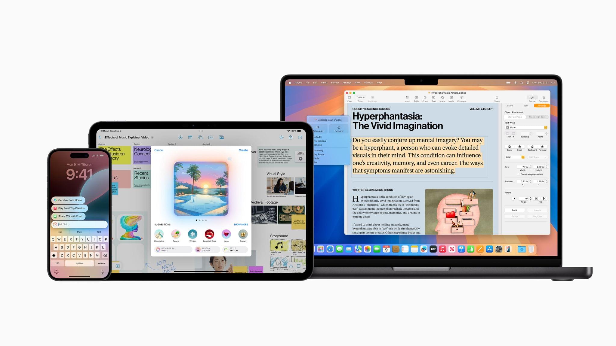
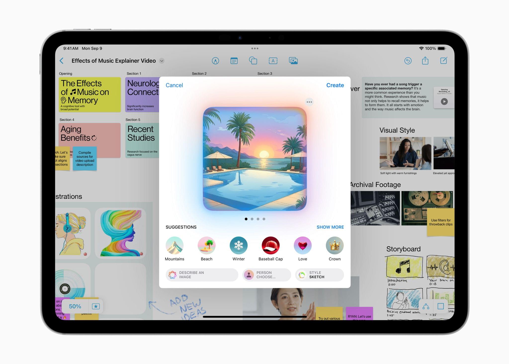
Image Playground is a feature that allows you to create images in two styles using in-app themes and other tools. Image Playground is available in apps like Messages, Freeform, Pages, and Keynote, but it’s also a standalone app. Regardless of where you use it, Image Playground looks like it’s designed to make it easy to create animated and sketch-style images using a variety of tools such as suggested concepts that pull from the context the image is created in, like a Messages thread. Creations can be previewed, there’s a history feature that allows you to undo changes made to images, and images are saved to an Image Playground Library that syncs across devices via iCloud.
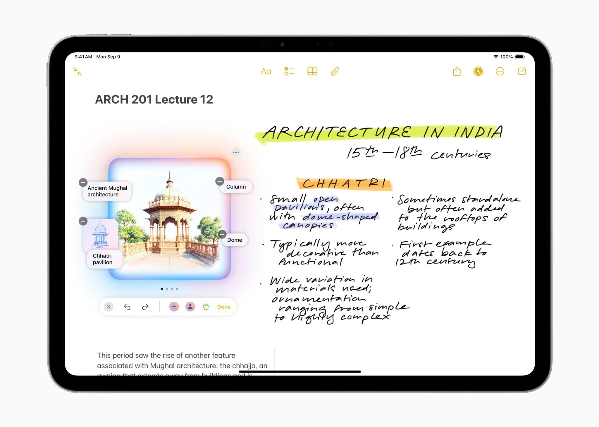
Image Wand, which appears in the Apple Pencil tool palette, takes a rough hand-drawn sketch, photo, or note and turns any of them into an image similar to one created by Image Playground. Image Wand can be further refined by adding text, and if you circle a blank space, it will use surrounding text to build an image.
Also, Genmoji – which is only in the iOS and iPadOS betas for now – allows you to create emoji-style images that can be used in Messages and other apps as decorative stickers. Inputs can include a text description, people in your contacts, friends and family recognized in Photos, and characters created from whole cloth.
Visual Intelligence has been added to the Camera Control on the iPhone 16 line too. The feature lets you look up details about a place and work with text, copying, reading, summarizing, and translating it.
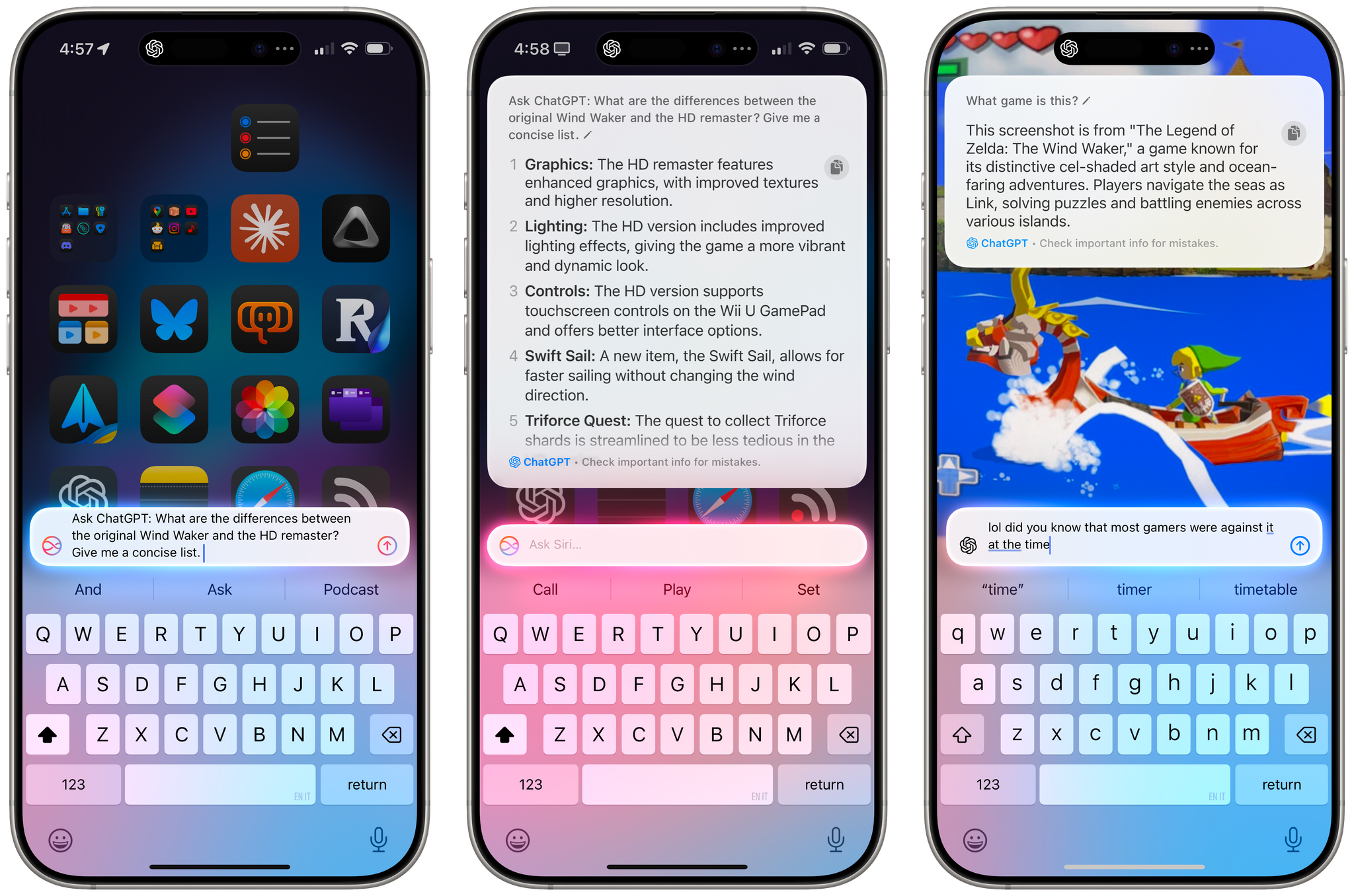
The next betas also integrate ChatGPT into Siri. As demoed at WWDC, you can opt to pose queries to ChatGPT without disclosing you identity or IP address and without the prompts being used to train OpenAI’s large language models. The ChatGPT integration is free and does not require an account with OpenAI either.
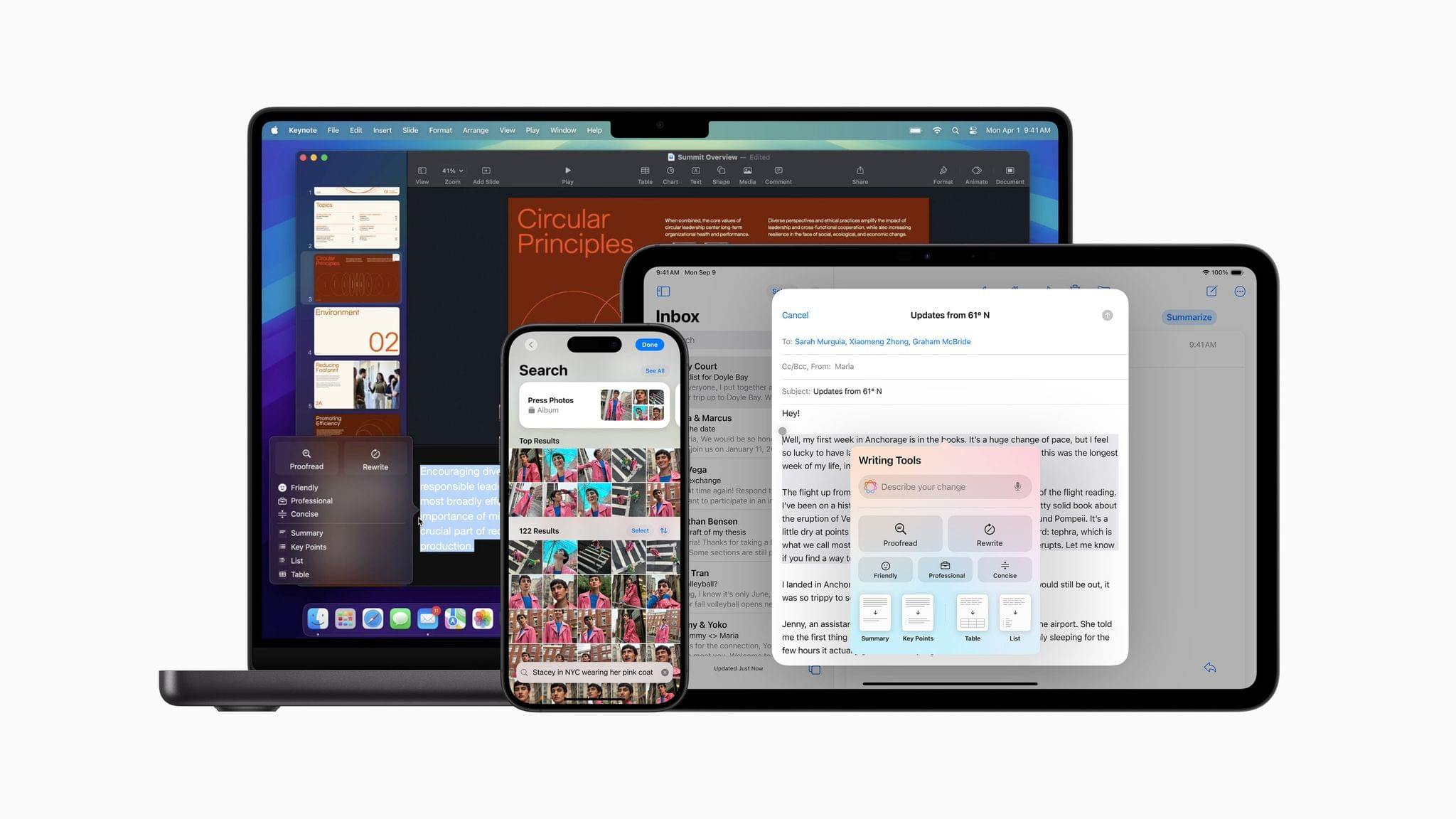
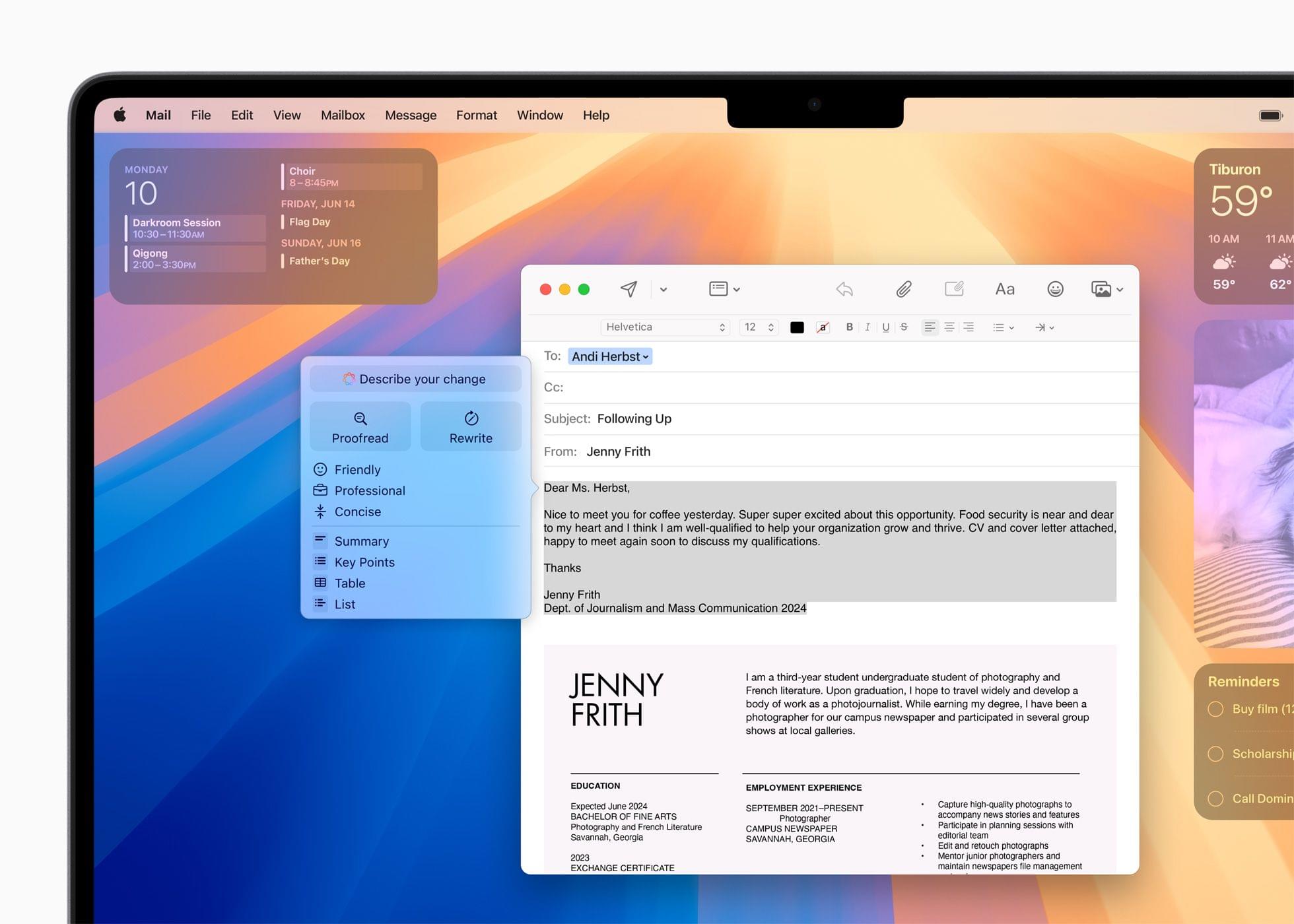
Finally, Apple has built a new Writing Tool that provides additional flexibility when manipulating text. From the Writing Tools UI, you’ll be able to submit a prompt to alter any text you’ve written. For instance, you could have Apple Intelligence make you sound more excited in your message or rewrite it in the form of a poem, neither of which is possible with the Writing Tools found in iOS and iPadOS 18.1 or macOS 15.1.
For developers, there are also new APIs for Writing Tools, Genmoji, and Image Playground.
As we’ve covered before, Apple’s AI models have been trained on a mix of licensed data and content from the web. If you’re a publisher or a creator who doesn’t want to be part of those models, you can opt out, but it doesn’t work retroactively. In other words, opting out won’t remove any data already ingested by Apple’s web crawlers, but it will work going forward.
I’m not a fan of generative AI tools, but I am looking forward to finally going beyond tightly controlled demos of these features. I want to see how well they work in practice and compare them to other AI tools. Apple appears to have put a lot of guardrails in place to avoid some of the disasters that have befallen other tech companies, but I’m pretty good at breaking software. It will be interesting to see how well these tools hold up under pressure.